"Back in my graduate school days at Dear Old Penn, I longed to own a sports car. But my budget couldn't be stretched far enough to justify the purchase of the current Datsun sports car, which seemed to be the best fit so far as price and features were concerned."
One set of alternatives included the Triumph Spitfire and Austin-Healey Sprite, but these seemed too small from a practicality standpoint. As for the alternative: larger Triumphs, Healeys and Corvettes were much too costly. The closest match was the MGB -- very slightly larger than the 1500/1600 Datsuns and more powerful. But it also was priced too high. So was the Datsun, as I mentioned, but to a lesser extent. (Once I got a decent full-time job I bought a Porsche 914.)
Like the MGB, Datsun 1500 styling was not flamboyant -- or even very distinctive. I would call the design "practical." And slightly better than that of the MGB, as I will note below.
Photos below are via Bring-a-Trailer Auctions.
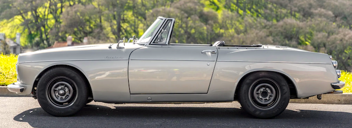
This is a 1965 Datsun 1500. The other Datsun photos are of this car.
Comparison photo of a 1963 MGB. Headlight assemblies and related bodywork are similar. The MGB grille is more interesting than that of the Datsun. The latter's front end and hood are more compact and purposeful-seeming. The Datsun fender line is more varied, more interesting.
A compact-appearing design. The forward slope of the rear fender trailing edge adds to this -- if a stylist wanted to increase visual length, the slope would be in the opposite direction.
The rear end is unrelated to the sides. That is, side-sculpting and detailing (the chrome strip) do not curve around to the rear and across parts of it, as is commonly found.
Lights are distinct, not placed in a multi-feature assembly. In the context of the 1960s and beyond, this appears as a "cheap" solution. The MGB was better here.
The subtle curve is the rear fender basically saves the design from being a bland box.
No guards on this car's bumper. Other Datsun 1500s had them, however.
The grille design is functional. Yet it could use something to make it less bland. Even a slightly wider frame. But not the elaborate frontal concoctions often found on 1950s Japanese cars.
Despite my picky comments, this is a nice design. The faceted hood front is an interesting touch.
Aside from the chopped-off, cheap-looking rear panel, the car looks nice from this perspective.
An all-open view.
The dashboard.


2 comments:
This Datsun 1500 (Fairlady) really takes me back! The design may be subtle, but it has its own unique charm. I wonder how many of these classic models are still around today, and the challenges involved in keeping them in pristine condition. I imagine exotic car transport companies must take extra care when moving rare beauties like these. The thought of shipping one across the country sounds nerve-wracking but fascinating!
I think this Datsun's color, or lack thereof, along with the restorer's choice to use clear/white rather than amber front turn signals do the car no favors. Until I saw the taillights I thought the pictures were black-and-white with the grass selectively colored.
Post a Comment