Showing posts with label Continuity. Show all posts

Thursday, September 12, 2019

1932 Packard: Extending the Brand Theme

A while ago I wrote an e-book about automobile brand identification themes -- you can see the link on the right-hand panel.  I noted that the strongest visual continuity over time would usually be found in luxury brands, an important example being Packard.

Not long ago I visited the Nethercutt museum in Sylmar, California that featured many luxury cars from the 1920s and 1930s.  One such was a 1932 Packard Twin-Six (V-12) Convertible Roadster with a body by Dietrich.

When reviewing the photos I took, I noticed an interesting detail that I had been aware of in times past, but had forgotten.  I'll explain in the captions of the images below (click on them to enlarge).


Gallery

1934 Packard Super Eight Coupe Roadster, RM Sotheby's photo.  Packards had three main identification elements, at least two of which were present at any time.  The car shown above features all three: (1) the ox-yoke motif at the upper part of the grille, (2) the pen-nib arrow along the side of the hood, and (3) red hexagons on the hub caps.

This 1951 Packard 400 retains all three items, though the grille form is slightly stylized to accommodate early 1950s styling fashions.

Now for some 1932 Packards similar to the featured car.  This is a Rumble Seat Roadster.

Here is another Roadster.  All three brand elements are seen here.

The Convertible Roadster by Dietrich as found in the museum.

Again, the three brand elements car be found in this photo.  But there is a fourth item -- a variation on the grille theme.  Look carefully at the headlight bezels.  They are not uniformly shaped all around.  And the headlight glass is not flat or uniformly bulged.  That glass comes to a shallow V in plan view mimicking the form of the grille, and the bezel conforms to this.  Moreover, the bezels are slightly hooded in an irregular departure from a smooth transition.  This transition  is actually a subtle evocation of the upper shape of the grille opening.

Front view of the car.  If you look carefully at the headlight bezels you might detect their echo of the upper grille form.

Monday, October 9, 2017

Cadillac's 1948 Redesign Brand Image Continuity

I point out in my e-book "How Cars Faced the Market" that upscale makes tend to maintain visual brand identification continuity over a body redesign transition.  I dealt here with example of top-of-the-line Oldsmobiles that received General Motors' new C-body for the 1948 model year.  It turned out that Oldsmobile stylists did a good job of carrying over the grille theme and side trim to the new shape.

The only other GM division using the 1948 C-body that model year was Cadillac.  The present post treats how Cadillac made its transition from 1947.

Gallery


To set the stage, here are two Hyman auction photos of a 1947 Cadillac 62.  Details to consider include the grille, chromed side trim and the backlight window.

I'm also including this Bonhams photo of a '47 62 Cabriolet because this car has the more common running lights that flank the grille.

Front view of a 1948 Cadillac via Mecum Auctions.  Its grille retains egg-crate gridding, a theme used by Cadillac for many decades.  The stacked, two-level profile of the grille is carried over, but the opening is smaller and the design is simplified.  The V-plus-crest theme at the front of the hood is retained, though details vary.  The rectangular flanking running lights are another carryover.

Side trim is quite similar for both model years, especially the rock-guard-plus-strip on the rear fender.  Also, aside from the chrome panel by the front wheel opening, both designs otherwise lack major side brightwork.

The rear has the least brand retention compared to 1947.  Placement of the V-plus-crest on the trunk as well as the hood serves as brand identification (the tail fins became a strong Cadillac symbol, but this wasn't known when the car was styled).  The one aft-end carryover is the three-piece backlight theme.  All things considered, the Oldsmobile team maintained brand consistency somewhat better than did Cadillac stylists.  Barrett-Jackson photo.

Monday, January 18, 2016

Pontiac Silver Streak Evolution

Pontiac (background here) was for decades General Motors' second rung in its price/prestige hierarchy ladder, nested between entry-level Chevrolet and mid-range Oldsmobile.  For many years Pontiacs carried a strong visual identifier in the form of Silver Streaks -- bands of parallel chromed ridges running down the hood, sometimes over the grille, and for a while even along the center of the trunk.  I wrote about the initial Silver Streaks here.

Silver Streaks were found on Pontiacs for model years 1935-1956 inclusive, aside from 1943-45 when no cars were made due to World War 2.

One task Pontiac stylists faced was keeping the motif fresh-looking model year after model year.  What they produced is pictured below.

Gallery

1935
The theme started with a broad band containing many little streaks.

1936
No real difference for 1936.  Note that headlights are now attached to the main body rather than the catwalks.

1937
The streak band has been narrowed and emerges on the trunk.

1938
Minor streak changes for '38.

1939
For 1939 the motif is echoed by grille bars.

1940
Another new body, but the streaks retain their familiar form.

1941
The band widens for 1941.  The five streaks are now noticeably separated.  An echo of the previous streak design is seen below the headlights.

1942
Not much change for '42.

1946
The post-war grille had minor changes, but the streaks are as they were.  This is an interesting advertisement because it shows all the previous streak-bearing Pontiac front ends.

1947
Sales photo.  The grille is changed, but not the streaks.

1948
These Pontiacs have only three streaks, two narrow ones plus a larger central one.

1949
The redesigned '49s return to five streaks, but the larger central streak is retained.

1950

1951

1952
1950-52 Pontiac streaks are essentially the same.

1953
For the first time, we find split sreaks.

1954
Back to five streaks, but they are all the same size -- narrow.

1955
Another redesigned body.  There are two widely spaced streak sets.  Not visible are streak bands on the small rear fender fins.

1956
Barrett-Jackson auction photo.  The final model year for streaks.  They are essentially the same as the 1955 version.

Monday, April 27, 2015

Pontiac's Consistent 1949-1954 Grille Theme

Some automobile marques maintained grille themes for decades.  Examples include Rolls-Royce, Packard and BMW.  Others redesigned grilles on a seemingly whimsical basis; Plymouth comes to mind.  Then there are cases where a grille theme may persist for several model years, only to be discarded and replaced by a considerably different design.  For example, I wrote about Ford's spinner theme here.

Another example of a grille theme that lasted for more than three or so years comes from the same time frame.  The present post deals with Pontiac grilles from the 1949 model year through 1954.  The theme featured a large, horizontal chromed bar, usually with a medallion at its center.  Below, and, on one occasion, above the bar as well were chromed "teeth" found most years.  Other strong chromed elements were added and changed from year to year.

This theme worked well while it lasted.  But by the mid-1950s, bold chromed shapes were beginning to fall out of fashion, so Pontiac stylists began to explore other themes.

Gallery

This 1948 Pontiac's grille carried the previous theme.  I include this photo to set the scene.

Pontiac was completely restyled for 1949.  Here is the first iteration of the grille theme under discussion.  There is the bold, horizontal bar with "teeth" below it and a centered medallion.  Atop the bar are raised strakes aligned with the teeth below.

Pontiac's 1950 facelift dropped the teeth and replaced them with curved vertical bars.

1951 Pontiacs went back to teeth, though fewer of them.  A truncated V-shape was added towards the center, helping to frame the medallion.  I consider this and the '49 grilles the most successful examples of the theme.

Grilles on 1952 models were about the same as in 1951.  The difference was a fussy little faux air intake implanted on the upper framing chrome ensemble.

1953 Pontiacs got newer bodies that look suspiciously like hand-downs from older GM "B" bodies.  Teeth are absent from the grille, and the V had been upended in one of those "let's pull the old switcheroo" moments of styling creativity.  Actually, not a bad design, though not as nice as 1949 or 1951.

Pontiac stylists knew a new grille theme would be on the redesigned 1955 models, so for 1954 we find what seems to be a transitional design.  The central bar is split into a highly stretch oval that vaguely echoes the shape of the air intake opening.

The all-now 1955 Pontiac retained the horizonal bar as a visual element, though in fact it is the front bumper.  Teeth and other older ornamentation are gone, however, not to return.

Monday, August 4, 2014

Buick Encore: Stuffing Styling Themes Into a Small Package

A rough styling / brand management rule of thumb is that the higher a marque ranks in a manufacturer's portfolio range, the more likely attention will be paid to preserving that brand's visual identity.

An interesting example is the Encore, a small crossover SUV introduced by Buick a few years ago.  Back in its glory years, General Motors positioned Buick right below Cadillac in its brand hierarchy, with Oldsmobile, Pontiac and Chevrolet trailing off towards the low price end.  Brand identity was reinforced by styling details such as grilles with vertical bars, "portholes" on the front fenders, the Sweepspear side accent, along with lesser elements.

Times changed, and General Motors sank into a bankruptcy that forced the elimination of the Saturn and Pontiac brands (Oldsmobile was killed a few years before).  Remaining brands are Chevrolet, Buick and Cadillac, along with exclusively truck-and-SUV GMC.

Embarrassed in the early 1980s by car models based on the same platform that looked very similar across most of its brands, GM moved to restore the visual distinctiveness its brands had during the 1940s and 50s.  This effort was strongly in place by the time of the 2009 bankruptcy and has continued since then.  Buick, being placed above Chevrolet in the GM hierarchy, seems to be seeking to retain its near-luxury image, even amongst its models that fall into the mid-price slot.  Its strategy has been to revive early-1950s styling cues in modified form and retain them from model year to model year.

So when the small Encore model was introduced, many of those styling details were crammed onto its small form.  Shall we take a look?

Gallery

1952 Buck Super
To set the stage, this Buick advertising illustration shows the styling cues from the brand's heyday.  Note the vertical grille bars, the non-functional portholes, the Sweepspear, the crest on the front of the hood, and the character line sculpting on the hood.  These details made it perfectly clear that the car was indeed a Buick; no real need for the word "Buick" on the upper grille bar.

2013 Buck LaCrosse
The LaCrosse is Buick's current top-of-the-line sedan.  The grille has vertical bars and a stylized crest.  Air vents are atop the fenders, a gesture to the old porthole theme.  A character line on the sides echoes the Sweepspear.

2013 Buck Verano
Veranos are smaller than LaCrosses, but retain the grille and vent details.  Missing is the Sweepspear, though I suppose the up-sweep character line along the bottom of the doors might be interpreted as an upside-down spear.

2013 Buck Encore
The quite small Encore takes the Verano's brand identification details pretty much as given, even the side-sculpting theme.  The result is a too-busy look.  But I think that has more to do with the somewhat confused appearance from the rear door hinges on back than the retention of Buick styling cues.  I would tidy up the clutter below the front impact panel, enlarge the rear door windows and eliminate or tone down the lower side character indentation for starters.

Thursday, July 25, 2013

Vauxhall's Concave Accents

In the early days of the automobile industry, a number of manufacturers tried to establish stylistic iconography so as to make their cars instantly recognizable.  Examples include Rolls-Royce's "tombstone" radiator/grill ensemble and Packard's red hexagons on wheel hubs and hubcaps.  This worked fairly well from around 1910 into the early 1930s when automobile hoods, headlamps, bumpers and fenders were the major visual elements of the car's front end, and they were physically distinct.   Blending of these elements began in earnest starting around the 1934 model year, and by 1950 most cars had so-called "envelope bodies" where all those bits except the bumpers were integrated into one mass.  This usually made it difficult to maintain distinguishing iconography.

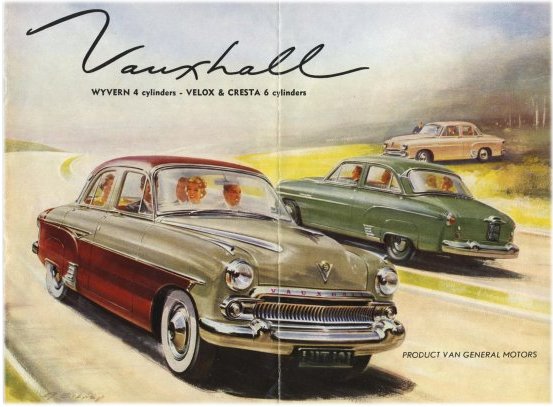
A case in point is the British brand Vauxhall (Wikipedia entry here).  Before 1910, Vauxhall came up with the idea of placing tapered, concave depressions on each side of the hood where it transitions from horizontal to vertical.  Visually, these seem to be scooped out from the hood mass.  British car styling being conservative and World War 2 having dealt a serious blow to the economy, Vauxhall cars didn't receive fully envelope-styled bodies until the early 1950s.  Nevertheless, these concave streaks continued on Vauxhalls until the 1957 model year began their disappearance.

Gallery

1909 Vauxhall

1920 Vauxhall D Type

1927 Vauxhall Type 30-98
These Vauxhalls are from the era when exterior components were separate units.  The tapered depression is clearly seen on the 1920 and 1927 vehicles.

1936 Vauxhall Big Six

1939 Vauxhall advertisement
By the mid to late 1930s, Vauxhall bodies were becoming increasingly rounded, yet stylists still had no difficulty incorporating the traditional hood accents.

1948 Vauxhall Wyvern or Velox
Vauxhall's first post-war body retained a tall hood that could support the accents (which were embellished by chrome plating).  But there was now a disconnect with the grille which was horizontal and low.

1955 Vauxhall brochure cover
Another complete body restyling appeared in the mid-50s, the transition to the envelope type being completed.  The hood was now lowered, leaving less room for the accents.  Another complete restyling came in the form of the 1957 Vauxhall Victor whose hood was lower than the fender tops.  There being no place for the accents, they finally disappeared.