Monday, September 30, 2024

1935 Chevrolet, Ford and Plymouth Sedans Compared

For part of the 1930s, America's "Big Three" carmakers happened to launch redesigns the same model years -- 1935 and 1937.  Not all brands were affected, but most were, including the highest-production ones: Chevrolet, Ford and Plymouth.  Their four-door sedan designs are the subject of this post.  I previously compared those brands' 1940-41 redesigns here.

An interesting fact is that the '35 Ford and Plymouths designs were largely the work of the same man, as noted in my 1996 edition of the classic book A Century of Automotive Style by Michael Lamm and David Holls. They state:

"The 1935 Ford and the 1935 Chrysler/Desoto Airstreams were Phil Wright creations." (Page 80)

"Briggs again stepped in to help style the 1935 Ford and its 1936 facelift. The 1935 model was done by Phil Wright at Briggs; Holden (Bob) Koto did the 1936 grille, hood and fender changes, also at Briggs." (Page 125)

"Meanwhile, Ralph Roberts at Briggs asked Phil Wright to design what became the 1935 Airstream series." (Page 157)

Technically, 1935 Plymouths were not Airstreams, a model name given to non-Airflow Chryslers and DeSotos.  But the body design was essentially the same, as Chrysler Corporation was entering a long period (through the 1952 model year) where all its divisions marketed variations on common body platforms.

The mid-1930s was a time when car designs were in a period of rapid evolution in the direction of integrated elements and stylistic streamlining, a process that can be said to have been completed by the arrival of the 1949 Ford.  Body-making technology was moving in the direction of all-steel, and away from metal panels attached to wood framing.  One aspect of this was the appearance of roofs without fabric inserts.  

Automobile glass-forming technology was only beginning to reach practical availability of curved glass, so most car glass was still in the form of flat panels.

Gallery

1935 Chevrolet Master DeLuxe - car-for-sale photos
Only Master DeLuxe Chevys got new bodies for 1935; the Chevrolet Standard series carried over the previous body.  Note the all-steel top, unlike the old-type tops shown on the Ford and Plymouth below.  A good deal of large-radius metal rounding is present because that was the economical production stamping technology state of the art.  Those rounded window profiles were a styling feature intended to be in synch with the rounded body features.  The result was a heavy, bulbous appearance that was slowly eliminated in future General Motors 1930s redesigns.

1935 Ford DeLuxe Fordor - car-for-sale photos
Fords tended to look "leaner and meaner" than GM cars during the Thirties.  The windshield is flat, not V'd.  Front-end elements are not integrated compared to the Chevrolet -- especially the horns.  Fenders are S-curve (ogive) shape, a fading concept.

1935 Plymouth DeLuxe - Mecum Auctions photos
Also a flat windshield.  The general feeling is similar to Ford's.  This is not surprising given the Briggs bodies styled by the same designer.

1935 General Motors A-bodies featured B-pillar-hinged "suicide" front doors, corrected to A-pillar hinging for 1936.  Fenders are large, clamshell affairs.  Note the highly rounded window profiles.

This Ford lacks an attached trunk, though those were available on Fordor Touring Sedans.  Window profiles are less rounded than on the Chevrolet.

Plymouth's passenger greenhouse is less rounded than even the Ford's, though that would change on the 1937 redesign.  Fenders are similar to the Chevy's, but not so bulky.

The Chevrolet's aft end seems bulky, having prominent rounded surfaces and window framing.

"Slantback" rear has no trunk or any opening to the behind-the-seat storage area.  And the spare tire is mounted externally.  The raised "character" ribs are bold and extensive.  They add some visual interest and help tie the designed together.  But they verge on fussiness.

This Plymouth has an integral trunk that carries the spare tire along with some luggage.  Aside from the more rectangular windows, this car's design strikes me as being partway between the Ford and the Chevy.

Thursday, September 26, 2024

405 - The Only Four-Door Bristol

With one exception, all Bristol cars were two-door models.  The exception was the Bristol 405, Wikipedia entry here.  It is the subject of today's post.

The 1954-1958 Bristol 405 (and the 2-door 404 of 1953-1955) marked the end of the classic 401-403 series design produced 1949-1955.  I wrote about the Bristol 401 here.

Apparently the 405's saloon (sedan) configuration was distant enough from Bristol's high-performance luxury market-target that its replacement 406 model reverted to 2-door status.

Images below are of a for-sale Bristol 405 located in Tasmania.

Gallery

Previous Bristols featured the prewar BMW grille theme.  The grille we see here is hard to explain.  The opening is nondescript, the grille mesh is recessed a couple inches.  I suppose this could be rated as "distinctive."  But not in a positive sense.

Frontal sheet metal sculpting features complex shapes that do not relate well to one another.  The grille opening was slightly widened on the redesigned Bristol 406, and minor brightwork added on the 407.  It wasn't until the entry of the Bristol 408 in 1963 that a more conventional Bristol grille appeared.

The passenger compartment greenhouse is a rounded fastback with large windows.  This contrasts somewhat uneasily with the long, rather flat hood line.  Note how narrow the front door is compared to the back-seat door.  A three-inch (73.5 mm) rearward adjustment to the B-pillar might have improved the appearance.

Those small, odd tail fins preview a somewhat similar touch found on Bristols 406 to 410 (1957-1969).  For some reason, I rather like the fastback zone (apart from those fins).  Especially that large, three-piece backlight window.

Monday, September 23, 2024

Expanding the 1941 Packard Clipper Line for 1942

Into the 1930s, Packard was considered by many to be America's leading luxury automobile brand.   But the Great Depression of that decade was harsh to firms making expensive cars.  Packard management was faced with the decision to either (1) continue exclusively in the high-price field and risk corporate failure through low sales, or (2) enter the middle price range, running the risk of lowering the brand's prestige.  They opted for the second alternative, launching the 120 line in 1935.  Ford's Lincoln brand did the same sort of thing for 1936 when the Lincoln-Zephyr was launched.

Medium-range Packards were redesigned for 1938, so 1941 was a logical time for another redesign.   That yielded the 1941 Packard Clipper (Wikipedia Clipper entry here).

The '41 Clipper was added to the non-redesigned  carryover line from 1940.  Its wheelbase was 127 inches (3226 mm), the same as Packard's 120, 160 and 180 models.  For 1942, the Clipper line was expanded, as is described below.

The United States' entry into World War 2 resulted in curtailed car production by February 1942, so 1942 models (20th Series, in Packard's terms) were and are comparatively scarce.  Presumably a line of convertibles would have been added in 1943 or 1944, but in fact did not appear until Packard's heavily facelifted 22nd Series arrived for 1948.

Gallery

1941 Packard Clipper Touring Sedan - car-for-sale photo
This was an excellent design that combined contemporary design elements with inherited detail touches such as the vertical grille.

The hood is suitably long.

The curved character line extending along the C-pillar across the trunk is another more traditional detail.

1942 Packard Clipper Custom Super Eight Touring Sedan - Mecum Auctions photo
This is the equivalent 1942 model.  The most noticeable difference is the group of horizontal "speed lines" wrapping around the front fenders.  This detail was absent from the new entry-level '42 Clippers.

1942 Packard Clipper Special Eight Touring Sedan - unknown photo source
The wheelbase for entry-level Clippers was 120 inches (3048 mm).  Note the carryover 1941 grille without the flanking speed lines.

1942 Packard Clipper Special Six Touring Sedan - car-for-sale photo
The shorter wheelbase yielded a stubbier hood.

1942 Packard Clipper Special Six Club Sedan - Mecum
The new body style added for 1942 was the 2-door fastback Club Sedan.  It was also used for a Business Coupe that looked the same.

The passenger compartment greenhouse had a heavy appearance due to all its sheet metal coupled with fairly small side windows.  The car's profile looked better on 160s and 180s with their longer wheelbases and hoods.

The lens used for this photo probably exaggerates the fastback feature.  Nevertheless, the heaviness spoils any sportiness.

Thursday, September 19, 2024

Toyota Prius' Five-Generation Evolution

I previously wrote about the styling evolution of Toyota's hybrid Prius here.  The present post updates that with views of the 5th-generation model that appeared in the USA in 2023.  The Wikipedia entry for Prius is here.

Aside from 1st-generation Priuses, the basic design concept has continued to the present.  As noted below, 2nd-through-4th generation Priuses retained the same wheelbase -- something a little unusual in an era where car models often become larger generation-by-generation.  That said, the most recent Prius wheelbase grew two inches (50 mm) longer.

Images below are via Toyota

Gallery

2000 Prius: Wheelbase 100.4 Inches (2550 mm)
The initial Prius was short and chunky-looking.

2004 Prius: Wheelbase 106.3 Inches (2700 mm)
The next generation design set the theme for Prius styling to date.  Unlike the original design, this body shows greater reliance on wind tunnel testing that required a longer wheelbase to accommodate the new shape.

2010 Prius: Wheelbase 106.3 Inches (2700 mm)
Different in detail, but essentially the same theme.  Note that the high point of the roof is slightly aft of the B-pillar, whereas previously it was a little forward of it.

2016 Prius: Wheelbase 106.3 Inches (2700 mm)
Cladding is more sculpted, in line with current styling fashion.  The roof's high point is forward again, peaking ahead of the the driver's face.  I find this the least-attractive Prius aside from the original: needlessly fussy.

2024 Prius: Wheelbase 108.3 Inches (2750 mm)
The current Prius' roof seemingly peaks abaft of the B-pillar again.  The longer wheelbase permits a more steeply angled windshield, probably improving aerodynamic efficiency.  Sculpting is more subtle, in line with current fashions for all-electric cars.

The sweep from one headlight assembly to the other is also in line with electric car fashion.  The overall frontal styling is attractive -- simple, but not excessively so.

Rear styling contains details that do not relate well to each other, a concession to current fashion.  At least the sculpting is fairly muted, helping to relate to the rest of the car.

Monday, September 16, 2024

First Bristol - the 400

Before the classic Bristol 401 design whose development I wrote about here, there was the 1946-1950 Bristol 400.

As the link explains, when World War 2 ended, the Bristol Aeroplane Company decided to add automobiles to its product portfolio.  To expedite the development program, Bristol bought the small, BMW-oriented English carmaker Frazer-Nash in 1946, also acquiring data on the prewar BMW 328 motor from Eisenach in a war reparations deal.  The result of this complexity was that Bristol used its version of the 328 sports/racing motor for its new car line.

The chassis of the new Bristol was derived from the frame of the BMW 326 sedan, though its body was a coupé more in line with the BMW 327, the coupé variant of the 326.  I wrote about those designs here.

As background, here are relevant wheelbase numbers: The BMW 327 coupé's was 108 inches (2750 mm); the BMW 326 sedan's was 113 inches (2870 mm); and the Bristol 400's was 114 inches (2793 mm).

The Gallery below includes an image of a BMW 327 for reference, even though the Bristol design is not credited as being related.  Bristol 400 images below are from Iconic Auctioneers.  The photo of the BMW is of a car listed for sale.

Gallery

1938c. BMW 327 Coupé
The nearest-related BMW design to the Bristol 400.

1948 Bristol 400 Coupé
A bit contrary to what I noted above, there are indeed some superficial resemblances to the BMW 327 -- though  most cars from the same general era share thematic features.  That said, note the overall profiles, the hood cutlines and the door arrangement.  Passenger compartment greenhouses are similar aside from the B-pillars and related quarter windows.  They share the same turn-indicator wand position abaft of the pillar.  The six-inch (147 mm) wheelbase difference seems to be found forward of the rear fender.

Frazer-Nash style, the Bristol features a BMW-type grille.

The rear is rather dumpy-looking.

Just for fun, here's an all-open view.

The dashboard seems very basic for a high-price car.

Thursday, September 12, 2024

1939 Lancia Astura "Málaga" by Pinin Farina

Italy's Lancia firm's model portfolio in the 1930s ranged from small sedans to long-wheelbase luxury cars. One of the latter lines was the Astura.  Some Asturas were sedans, but the most stylish were cabriolets, especially those designed by Pinin Farina.  Iwrote about some of those here.

One of the best-known Farina Astura cabriolets has been called the "Málaga" Astura.  That's because it has been displayed at the Museo Automovilistico y de la Moda in Málaga, Spain, based on the collection of the Portuguese João Manuel Magalhães.

Gallery

1936 Lancia Astura Cabriolet Series III "Tipo Bocca" by Pinin Farina - RM Sotheby's photo
An earlier Farina Astura cabriolet.  This post's feature car differs mostly at the front end and the aft fender spats.  Though also note that door hinging is reversed.  It also seems to have a longer wheelbase.

1939 Lancia Astura Cabriolet "Málaga" by Pinin Farina
This photo and the one below were taken by me in 2018 at the museum.  The others are from sources I cannot presently identify.  That black line across the image is a wire serving as a warning device to keep viewers away from the cars on display.  Note the horizontal divider on the windshield -- the upper segment pivots down forward.

The prow of the engine compartment is sharper, more aggressive than on previous versions.  Some date this car to 1938, but its grille design is in line with some 1939 Asturas such as the Berlina built for Galeazzo Ciano.  The museum's information card at the time I visited had this as a 1939 model.

Showing some of the rear end.  Much of the trunk is probably devoted to housing the spare tire.  The openings on the aft fender spats might (1) be for style only, (2) provide more air for brake cooling, or (3) might be for both.  Though if cooling was very important, then no spats should be there.

The design is especially attractive seen from the side.  Though the spat openings detract slightly aesthetically, they add visual interest.

Monday, September 9, 2024

Chrysler 1963 Turbine Car Walkaround


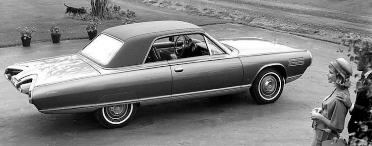
Chrysler Corporation funded studies of turbine power plants that in 1954 resulted in a turbine-powered Plymouth Belvedere followed in 1956 by another Plymouth with a similar engine.  Then in the early 1960s other experimental turbine vehicles were built and tested.  1962 saw the construction of five prototypes bearing Chrysler-styled, Ghia-built bodies and Chrysler innards.  These were followed by a short production run of 50 cars used for both publicity and testing by potential customers.  This is explained in the Wikipedia entry here.  I wrote about some of the styling development here.

After the testing program was completed, 46 of those turbine cars were destroyed.  Remaining cars are either in the manufacturer's hands or in museums.  However, one that at the time was in private hands (2021) was auctioned and later placed in a museum.  Walkaround photos below are of that car.

Elwood Engel became head of Chrysler styling in November 1961 following a career at Ford where he was responsible for the successful designs of the 1961 Continental and Ford Thunderbird.  The character of the latter was carried over to the 1963 Turbine Car.

Black and white photos above are from Chrysler, those in the Gallery are from Hyman, Ltd.

Gallery

Those jet intake designs surrounding the headlights might or might not be functional.  These being concept cars of a sort, front bumper protection is questionable.

Those headlight area assemblies shout "jet-propelled," but unbalance the car's overall design as seen from this angle.

From the side we see early-1960s Elwood Engel styling themes, especially the blind greenhouse quarter panels and the chrome strip atop the fender.

The rear shows more jet-fighter jazz grafted onto what might well be a Ford Thunderbird.

Those "exhaust nozzles" are placed too close to the car's centerline for my visual comfort.  And, though cutlines are hard to spot, there is indeed a trunk lit.  The spare tire takes up the central part of the trunk, leaving little room for suitcases.


The grey area below the low character line helps to visually reduce the body's already low height.  The car looks good seen from the side.

I'm not sure about those parallel strips on the front fender.  They aren't functional in any sense, and add nothing to the design composition.

Interior view.  Note the odd turbine-feature towards the front of the seat divider.  More concept car jazz.