Thursday, June 30, 2022

Lincoln's Unrealized 05L V-12 Design

The book "Ford Design Department Concept & Show Cars 1932-1961" by Jim and Cheryl Farrell (Amazon link here) is a treasure chest of information.  For example, on pages 40-43 I was surprised to learn of a proposed successor to Lincoln's V-12 K-series luxury cars that were bocoming dated by the mid-1930s.

Well, "reminded" might be more accurate than having learned, because years before I must have come across the same design on pages 166-167 of "Edsel Ford and E. T. Gregorie" by Henry Dominguez (link here).

The Farrell's book notes that Bob Gregorie and his Ford styling staff were inexperienced regarding large cars such as the proposed K successor code named 05L that would have a wheelbase of 142 inches (3607 mm).  They mention "As war with Germany approached, both Edsel Ford and Gregorie became concerned about the strong teutonic, military look of the 05L, and a conscientious effort was made to tone it down... [A]lterations were made, but a final design was never settled before work was stopped on the car in late 1940."  

Whether or not the 05L's front looked German, the rest of the design was similar to that of General Motors' upscale sedans of the time.

Gallery

First, views of the full-scale 05L clay as of 28 September 1938, not long after the project was launched.  Even though V'd windshields were becoming the standard at the time, this car was given an old-fashioned flat, one-piece windshield.  Such were found on contemporary Chrysler Corporation cars and the Lincoln-Zephyr.

Although the body is rounded, in line with mid-to-late 1930s American styling fashion, the hood has an angular prow faintly suggestive of 1936 Cords.  The father front fender had a faired-in headlight assembly similar to that of production 1938 Lincoln-Zephyrs.  The grille features narrow, vertical bars.

The finished clay, this view featuring the front end.  The central face has the shape of early-30s grille frames.  But this being during the transition to lower, horizontal grilles, the top part is masked off.  It seems Gregorie's crew was trying unsuccessfully to be both traditional-upscale and modern.  I'm not sure I'd call the design German, though it does have a harsh feeling.

A 31 September 1939 photo of a later grille design.  As the Farrells point out, it's similar to that used on the 1940 Ford DeLuxe.  Not something one would expect to see on a luxury V-12 automobile.

A coupe variant.

Now to focus on the main body viewed from the left rear quarter.  The body is massive and does not look at all beyond what was current in 1938.  Perhaps the thinking was that wealthy potential buyers had very conservative tastes.  Which was a fairly true assessment, though a light touch of styling trend-extension plus some elegance (quite lacking on this model) might have worked well in the market.

Here is a for-sale 1938 Cadillac Series 65 sedans car with a shorter wheelbase.  Note the similarity of the rear end designs, though the Lincoln's trunk is body-width.

Auction image of a 1938 Cadillac Fleetwood Imperial Limousine, a luxury car about the same size as the proposed Lincoln.  Again, the main bodies are similar.

1938 Buick Series 90 Touring Sedan, Mecum auction photo.  Same body as the Cadillac

Same car.  The Lincoln had a higher beltline, creating a more massive feeling.

Monday, June 27, 2022

1968 Dodge Coronet and Charger Coupés

The 1968 second-generation Dodge Charger was one of the most iconic American designs of that decade.  I recently wrote about its styling background here.

The Charger was essentially a Dodge Coronet coupe with revised side and front sheetmetal along with some other changes.  Those differences are discussed in the Gallery below.  Most images are of for-sale cars.

Gallery

1968 Dodge Coronet Super Bee
The basis for the Charger.  It being the USA in the 1960s, there was considerable front and rear overhang.  Most of the side sculpting is on the rear fender area.  Note the two odd shapes that suggest exhaust vents, but are not.

1968 Dodge Charger R/T
The Charger has considerably less sculpting.  Those faux-exhausts are retained, now placed on the door.  The upper one serves to anchor the forward edge of the long rear fender.  Windshields and side windows are the same on both cars, though the Charger has a different roof profile towards the rear.  Its front fender / hood profile is more tapered than the Coronet's.  Wheel openings and door cutlines are the same on both cars.

1968 Dodge Coronet Super Bee
As mentioned, the front is more blunt than the Charger's.

1968 Dodge Charger
Beltlines are actually the same, but the rear fenderline and side sculpting change the character of the underlying design.

1968 Dodge Coronet Super Bee
The Coronet has a conventional for-the-time backlight window.

1968 Dodge Charger - factory photo
The Charger's backlight is flat, flanked by sail panels that serve to alter the roof profile.  Its bumper and tail lights also differ.

Thursday, June 23, 2022

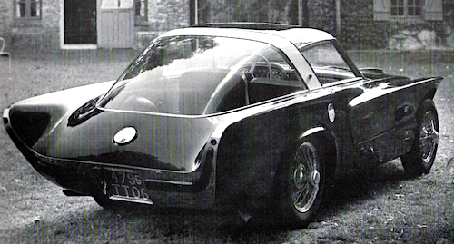
Pegaso Z-103 with Panoramic Windshields

The mid-1950s fad of panoramic or wraparound windshields was of General Motors origin, but such windshields soon appeared in Europe as well.

GM's first production wraparounds appeared on low-volume 1953 Oldsmobile and Cadillac convertibles whose basic bodies had been in production for several years.  For 1954, GM's Oldsmobiles, Buicks and Cadillacs received new bodies where wraparounds were a design feature.  Model year 1955 saw other American carmakers incorporating panoramics.  Ford, Mercury, Nash, Hudson and Packard grafted such windshields onto older body designs. 

Spain's Pegaso Z-102, a low-production sports car,  retained conventional windshields over its existence.   But the company's Z-103 variant had panoramic windshields.

The Z-103 seems to have been an attempt to market a car with a less-complicated motor.  According to the link above, only perhaps three cars were made.  However, there is uncertainty decades after the reality.

Gallery

1954 Pegaso Z-102 Berlinetta by Touring - for sale photo
Only about 80 Pegaso cars were ever made -- sources vary.  Probably the most common bodies were by Touring, as seen here.

1955 Pegaso Z-103 Coupe by Touring - unknown photo source
When given the task of clothing the Z-103, this was Touring's first try.  The fenderline is similar to their Z-102 design, but the cabin greenhouse has a panoramic windshield.

1955 Pegaso Z-103 Coupe by Touring - unknown photo source
This is probably the same car as in the previous image after a restoration.  Its top is a two-window, not a four-window style and is rather squared-off.

1956 Pegaso Z-103 Panorámica by Touring - unknown photo source
If Internet sources can be believed, the following year Touring created this body that is more in line with their Z-102s.

Differences include the front fender vents, a smoother hood and real bumpers.

The aft end also differs from Z-102s, but only in some superficial details -- the basic body panels are the same.  What also is similar is the passenger compartment greenhouse, aside from the windshield.  Compare the window and backlight design to that in the following image.

1954 Pegaso Z-102 Berlinetta by Touring

1955 Pegaso Z-103 Spider by Serra - unknown photo source
Barcelona coach builder Serra also made a body for the Z-103.  It's a spider or roadster type with the panoramic windshield.  Like most Pegasos, it lacks a front bumper.

Monday, June 20, 2022

Raymond Lowey Custom Cars

Raymond Loewy (1893-1986), Wikipedia entry here, was a famed industrial design pioneer.

He and his firm did considerable automobile styling work.  Early in his career he provided designs for Hupmobile.  But he is best known for Studebaker designs created by professional car stylists he employed.  As was his right for marketing and other business purposes, Loewy was credited as the designer.  The same can be said for General Motors' Harley Earl who seldom lifted a pencil yet set GM's design themes for three decades.

Below are images of cars Loewy had created for himself.  Presumably these reflected his personal taste or otherwise dealt with some design ideas he wished to investigate.

Gallery

1941 Lincoln Continental
One of his best known custom cars.  The removable roof section above the front seat makes the car a coupe de ville, unlike stock Continental coupes.

I consider this the best of Loewy's personal designs.

1941 Cadillac 62 Convertibe
Loewy purchased this car in 1943; this is the only photo of it I could find on the Internet.  The fenderline is based on that found on some 1942 Buick models.

1954 Jaguar XK140
Unlike the previous two examples, this design incorporates no styling features of the host brand.

This view shows details in the spirit that Chrysler's Virgil Exner used on concept cars a few years later.

1957 BMW 507
Again, totally unlike the host design, a classic by Albrecht von Goertz.

Its general feeling is suggestive of Loewy's classic 1962 Studebaker Avanti in this photo from an unknown source.

1959 Cadillac - Barrett-Jackson photos
The passenger compartment is stock '59 Caddy, the rest is Loewy.  The front is rather ugly, though a design purist might praise it for being simple and functional.

Rear styling is more successful.  Loewy eliminated the large, bizarre tailfins.  The side light assembly on the rear fender is a questionable touch.

1960 Lancia Flaminia
Loewy and his wife pose by his customized Lancia.  He retained the large grille opening, but reshaped its profile.

Many Flaminia coupés had custom bodies, so Loewy's effort needs evaluation on its own terms.  My take is that the front is needlessly fussy.  The aerodynamic spoiler on the roof does relate to the C-pillar but spoils the roofline's visual flow.

Again, the rear styling is better than the front's.  That said, I find the backlight window too large and the C-pillar too thin.  This and the previous image are from unknown sources.

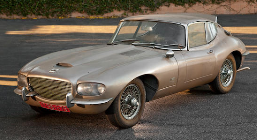
1966 Jaguar XKE
Bonhams photos of a car in need of restoration.  Many consider XKE design a classic, though I don't like its proportions.  Loewy gave it a new front end that's not as good as the original.

The rear got a revised C-pillar / window profile along with minor changes to the tail lights and other minor items.

Thursday, June 16, 2022

Three Graham Cabriolets

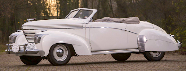
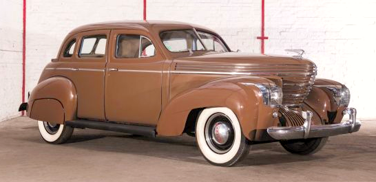
The Graham brand was fighting for its existence in the late 1930s.  One of its final calls for drastic action was the 1938 "Shark Nose" model designed in part by Amos Northup.  It was an interesting design that I like.  Sales were poor and Graham's next move was to base its cars on Cord bodies.

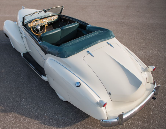
For model year 1938 Graham offered only four-door sedans.  A two-door "Combination Coupe" was added for 1939.  There were no production convertibles offered either year.  However, two of the 1938-39 Grahams shipped to Europe received custom cabriolet bodies by French carrosseries Saoutchik and Pourtout.

Finally, there was a third Graham convertible coupe built.   This was in the United States under Graham's auspices, according to Internet sources.

Gallery

1938 Graham 4-door sedan - for sale photo
Here is an example of a Shark Nose Graham.

1938 Graham Cabriolet by Saoutchik - at Cannes
When this car was new.

1938 Graham Cabriolet by Saoutchik - photo via RM Sotheby's
As the car looked recently.

1939 Graham 97 Cabriolet by Pourtout - Artcurial auction photo
It was delivered in June 1939 to the father of writer Françoise Sagan, as reported here.

The Saoutchik beltline dip is exaggerated by a touch of dark paint.  The windshield is flat, one-piece, unlike the V'd windshields on the Pourtout and stock Grahams.

The Pourtout features the typical 1930s French downward curving beltline.  Also, the back seat appears to be eliminated.  For some reason Pourtout's side chrome strip is nearly identical to that of Saoutchik's Graham, a car that was probably built earlier.

Rear quarter view.

The Saoutchik Graham has a sculpted tail fin on its trunk lid.  The running boards are more prominent than those on Pourtout's car.

Another dramatic Saoutchik touch is the door opening.

Pourtout Graham with its top down.

1939 Graham Convertible Coupe - unknown source
This is the American example.  Note its American style horizontal beltline.

Monday, June 13, 2022

What Were They Thinking: Armstrong Siddeley Sapphire 234

The United Kingdom along with its allies won World War 2, but the aftermath was economically painful.   For automobile makers in the UK and elsewhere, prewar model production resumed while efforts were made to get new designs into production.  Given the weak state of the British economy, development funding was hard to find once wartime profits had been burned off because sales levels were low domestically.  Much production, such as it was, was earmarked for North American and other overseas markets with the objective of bringing cash to the country.

Armstrong Siddeley, a defense manufacturer and carmaker, didn't come up with a true postwar model until 1955 when it launched the Sapphire 234 and 236 models.  These sold poorly: 803 and 603 units respectively during a three-year run.

Those model numbers are confusing, because the 234 four-cylinder model was a much better performer than its six-cylinder 236 counterpart.  This difference is reflected in current sales and auction prices for the few remaining cars.

So far as this blog is concerned, styling of the 34s and 236s was odd, even strange so far as the rear two-thirds of the body is concerned.  At this late date, I don't know why the design was the way it was.  Poor styling talent?  Bad management decisions?  A small development budget?  The result makes me wonder: What Were They Thinking?

Let's take a look.

Gallery


Armstrong Siddeley Sapphire 346 - factory retouched photo
This is the 1953-58 car Armstrong Siddeley relied on to the tune of 7,697 being sold.

Armstrong Siddeley Sapphire 234? - factory photo
And here is the subject of this post.

1956 Armstrong Siddeley Sapphire 236 - HandH auction photo
Forward of the cowling, the design is typical of late-1940s - early 1950s British styling that featured a traditional grille mated to curved front fenders.

Armstrong Siddeley Sapphire 234 - unknown photo source
As mentioned, the problem is abaft of the cowling.  The passenger compartment greenhouse seems crudely formed and old-fashioned for 1955.  Note how flat the side is on the front door.

Armstrong Siddeley Sapphire 235 - also unknown
I think the strange detail is the forward section of the rear fenderline, that transition to a short horizontal fold on the rear door.  If it were in conjunction with a horizontal chrome strip running along the length of the side, it would make sense.  But there was never such a chrome strip, so far as I can tell from Internet images.

1957 Armstrong Siddeley Sapphire 234 - for sale photos
Now for an abbreviated walkaround of a 234 found in Australia.  As noted, the front is conventional British.

The hood is long.  From the cowl forward, the design reminds me of the MGA sports car's front.
The trunk could have been more squared off, providing more carrying capacity while improving the looks of the car.  The shape of the backlight window is awkwardly old-fashioned.