Thursday, November 29, 2018

The Prewar Opel Olympias and Kadetts Get a Facelift

After General Motors acquired Germany's Opel brand around 1930, it took several years before Opel styling got an American appearance.   As I noted here in reference to Opel Admirals, GM sent a small group of stylists to Germany with the mission of establishing a styling studio following GM's Detroit practice.  I mentioned that the first result was the 1939 Open Kapitän.

Actually, that car was the first complete design,  But the team's influence was seen earlier in the 1937-vintage facelifts of Opel's Kadett and Olympia models.  Those cars were new to Opel's line in 1935-36, and featured a form of monocoque construction, a first for Opel.  The bodies were essentially the same, with the Olympia having a wheelbase 33 mm (1.3 inches) longer than the Kadett.  Visually, the main differences were in the grille and hood ventilation detailing.

The 1937 GM-inspired facelifts largely took the form of bold, American-style grilles, as can be seen below.

Gallery


Two factory photos of the 1936 Opel Kadett.


Auction photos of a 1936 Opel Olympia (the name inspired by the 1936 Berlin Olympic games).  The Olympia lacks the Kadett's strong vertical grille bar.  Hood side-venting differs.  There are minor sheet metal and trim differences in the C-pillar belt line area.  The wheels also differ.  But overall, the designs are almost entirely the same.  Now for the facelifts ...

1938 vintage Opel Kadett 4-door Limousine.

A 1938 Chevrolet Master DeLuxe sedan, Barrett-Jackson auction photo.  Note the similarities of the grille bars: GM's new German-based stylists had a strong sense of the design directions of the corporation's American brands when they left Detroit and must have exchanged styling information while they were in Rüsselsheim.

1938 Opel Olympia, image source unknown to me, but plentiful on the Web.  Its grille is slightly larger and bolder than the Kadett's.  Hood side vent ornamentation differs as does bits of sheet metal at the base of the C-pillar.

This Kadett image can be found here and there on the Internet.  It differs from late '30s Kadetts and Olympias in that the trunk is smoothly integrated with the rest of the lower body.  Also, the fenders have been reshaped.  There was never a production version of this, so my best guess is that it was a styling proposal, perhaps intended for production in 1942 or thereabouts.  Inform in comments if more about this car is known.

Monday, November 26, 2018

Cadillac's Sharpened Front Fenders, 1934-1935

General Motors' top-of-the-line Cadillacs and LaSalles were redesigned for the 1934 model year.  LaSalle styling was more memorable than Cadillac's, if the attention automobile historians give it is any indication.  Even I wrote about it here.

But what about Cadillac?  It was only recently that I finally noticed an unusual and distinctive styling feature -- the shape of the front part of front fenders on V8 and V12 Caddies.  This feature was carried over in the 1935 model year and abandoned for 1936.

The feature is hard to describe, so it's best to jump straight into Gallery photos.

Gallery

1934 Cadillac Coupe, Hyman auction photo.  Note the profile of the car's right front fender.  There's a horizontal fold line at the most forward part of that fender.

This is a 1934 LaSalle, RM Sotheby's photo.  Front fenders are the same as Cadillac's, except the forward profile is a single curve.

Move actress Jean Harlow posing by a 1934 Cadillac V12 that has the sharpened front fender design.

But the 1934 Cadillac V16 Formal Sedan in this RM Sotheby's photo has rounded fender fronts.  Only V8s and V12s got the sharpened ones, it seems.

Frontal view of a 1935 Cadillac Coupe.  This image shows the sculpting more clearly.  A major difference between 1934 and 1935 Cadillacs and LaSalles is the replacement of the delicate '34 "biplane" style bumpers with solid, one-piece items.

Another Mecum auction photo of the same car, again clearly showing how the front fenders were sculpted.

Frontal view of a 1935 LaSalle, "for sale" photo.

1935 Cadillac V12 Fleetwood Town Cabriolet, Bonhams photo.  Again, V12s got those sharpened fenders.

Finally, a 1935 Cadillac V16 with its conventional-looking front fenders.  This time the actress is Marlene Dietrich.

Thursday, November 22, 2018

Studebaker's 1952-Only Hardtop Coupe

Hardtop convertibles ... hardtop coupes ... whatever the name, were an automotive sales sensation starting in 1949 when they were introduced as part of General Motors' C-body line.  I wrote about them here.

And as I posted here, other car makers followed as quickly as they could manage to do so.  Most Chrysler Corporation brands got them for 1950.  Ford, Hudson and Packard launched theirs for 1951.  The following model year, 1952, brought in most of the laggards: Mercury, Lincoln, Nash and Studebaker.

All of the 1952 class except Studebaker had to wait until then because they got redesigned bodies for '52.  Their previous bodies were not suited for incorporating convertible-like cars with metal tops, whereas their redesigned bodies had hardtops in mind from the start.

Studebaker is an interesting case because management dithered, finally allowing a hardtop model for the final year of its 1947 body.  That is, that particular model was only in production for one model year, an economically risky proposition given tooling costs.  Richard Langworth briefly dealt with the 1952 Starliner (as it was called) here, pages 50-51.

The Starliner coupe was an attractive addition to Studebaker's line, as can be seen below.  Images are via the automobile consignment firm Streetside Classics unless otherwise noted.

Gallery

A fine photo via Wikipedia that I used in the second link above.  The roofline and windows are based on the 1949 GM version, though had to be adapted to Studebaker's sloping rear deck.

For context, a McCormick's auction photo of a 1952 Starlight coupe, Studebaker's previous mainline sporty model.  The Starliner was more closely related to the firm's convertibles, however, due to the need for a truncated B-pillar and two roll-down side windows.

In model year 1952 Studebaker lost its airplane-inspired frontal styling as it transitioned to the sensational forthcoming 1953 redesign.  The two-segment grille hints at the '53s.

The camera's wide-angle lens slightly exaggerates slopes of the hood and rear deck.

The central segment of the backlight would have looked better if its upper edge was straighter.

Close-up view of the new grille.  That white spot shown above the hood is actually a reflection off the windshield, and not part of the car.

Monday, November 19, 2018

Borgward's Large P100 Sedan

The last all-new model from Borgward was the P100, a large (by Borgward standards) 4-door sedan intended to compete with some Mercedes models.  According to the link, 2,530 were built 1959-61, at which point Borgward was rendered kaput.  However, production was continued in Mexico in the late 1960s.

Some credit the styling of the P100 to Pietro Frua, though this site devoted to Frua has a question mark [?] by the car (scroll down to 1959).  If Frua wasn't the stylist, then it is likely that another Italian or perhaps a German heavily influenced by Italian design did the work.  It certainly looks Italian in spirit with some late-1950s German touches.

Gallery

1961 Borgward P100 for sale.  Usually the diamond-shaped Borgward logo on grilles was uncomfortably large, but on the P100 it's surprisingly discrete.

Factory photo: note the Hamburg license plate.

Probably the same car seen from a different viewpoint.  The windshield is wrapped slightly and is quite tall, extending about to the high point of the roof.

Left side.  Very much a "three-box" design.  Little side sculpting or decoration.  The wrapped backlight window is perhaps the most Germanic touch.

Rear quarter view via Wikimedia.  The main side sculpting was a high fender line crease, the upper side of it becoming an extension of the belt line that transitions to a mini tail fin.  All this does provide some relief to potential side blandness (see the previous image), but the fins strike me as being a bit silly.  Rear end styling is slightly awkward because the round light assemblies clash with the rounded-rectangular chromework.  The fins also do not relate to other rear elements.

Thursday, November 15, 2018

Cadillac Side Trim Theme: 1948-1959

I tend to write quite a bit about visual automobile brand continuity features or their lack.  Usually this has to do with the car's grille and other "facial" ensemble details.  While it's not universal, it's fairly common that the more upscale the brand, the more likely there will be continuity.  Long-term examples include grilles of Rolls-Royces and Packards.  For most of the past 80 years, Cadillac has had an "egg-crate" theme on its grilles.

During the 1950s Cadillac also maintained a side-trim theme, the subject of this post.  It wasn't as long-lasting as Buick's Sweepspear of the 1950s that returned in recent years, but it lasted a long time for a non-frontal theme.

Gallery

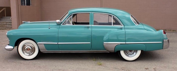
1948 Cadillac Series 62 Sedan - Barrett-Jackson auction photo
Most redesigned 1948 Cadillacs had rock guards on the lower leading edge of their rear fenders -- standard practice for many US brands.

1948 Cadillac Fleetwood Sixty-Special - Mecum auction photo
But the top of the line (not counting Series 75 limousines) Sixty-Specials were given a rock guard that wrapped most of the way around the reshaped fender's leading edge.  That part was essentially vertical, and verticality at that general location became the key to an ornamentation theme that lasted through the 1950s.

1950 Cadillac Series 62 Coupe de Ville - Mecum photo
Cadillacs were redesigned for the 1950 model year.  They were big, long cars which was why they were able to carry the vertical element where the rear fender begins.  The usual styling approach was and is to emphasize horizontality in order to make a car look longer and lower than if it were unadorned.  Another interesting detail in that vertical element is that it is a fake air intake -- something that became something of a styling fad two years later on hoods and sides of the redesigned 1952 Ford Motor Company line.  For some reason, the public and car buff press didn't make a big deal of Caddie's faux scoops at the time.

1950 Cadillac Series 62 Sedan - Mecum photo
This photo shows the blackened bits that provide the appearance of an air intake.

1954 Cadillac Sedan - factory photo
This feature was carried over to redesigned '54 Cadillacs, though the black painted bits are now simply chromed.

1955 Cadillac Fleetwood Sixty-Special Sedan - Barrett-Jackson photo
Facelifted 1955 Cadillacs lost the complete vertical strip.  Now it transitioned to the horizontal chrome strip that started at the grille, passed along the top of the front wheel opening and then continued aft.  This was used for 1956 models too.

1957 Cadillac Coupe de Ville - "for sale" photo
Cadillac's next redesign found the vertical element diminished further, though it remains where an actual air scoop for rear brake cooling might be needed.

1958 Cadillac Coupe de Ville - Barrett-Jackson photo
The next year verticality is in the form of a stack of horizontal chrome strips.

1959 Cadillac Fleetwood Sixty-Special - factory photo
The air scoop theme returned for the last time in 1959, but only on Sixty-Specials.

1959 Cadillac Series 62 Sedan - Mecum photo
Here is what other Cadillac four-door hardtops looked like.

1960 Cadillac Eldorado - factory photo
Cadillacs for 1960 were all slab-sided like this Eldorado.

Monday, November 12, 2018

General Motors' 1968 "Muscle Car" Styling

Among the things noteworthy regarding American cars in the 1960s were the "Pony Car" and "Muscle Car" categories.  The former were Ford Mustangs (hence the "pony" name) and similar competing cars.  Muscle Cars were high-performance automobiles.  This Wikipedia entry cites a huge number of models as being of the muscle variety, so to my mind isn't very useful.  For what little it's probably worth, so far as I'm concerned a Muscle Car is a 1960s American automobile smaller than a "standard size" car, larger than a sub-compact, with a powerful motor and having a hardtop coupe body.

Examples would include some cars using General Motors' redesigned for 1968 A body hardtop coupe format.  In the Gallery below I present some of these, indicating what steps GM stylists and marketers used to make them visually distinctive.  As usual, images are of cars for sale unless otherwise noted.
Gallery

The entry-level basis for those muscle cars was the Chevrolet Chevelle 300 coupe.  Not a muscle car at all, and with a B-pillar.

Rear quarter view.  An attractive design, though the shape of the quarter windows somewhat restricted outside views for back seat passengers.

Chevrolet's muscle car version was the Chevelle SS 396 as seen in this Mecum auctions photo.  Muscle cars often got aftermarket wheels, so tend to ignore these as not necessarily being part of the factory designs.  The SS is distinguished largely via a black paint stripe along the lower body that then draped over the front of the hood.

Quarter view of a different SS showing the stripe.

Moving up GM's brand hierarchy, here is a Pontiac GTO shown in a Barrett-Jackson auctions photo.  Besides the distinctive two-part Pontiac grille, the quarter windows are larger and differently shaped than those on Chevelles.  No paint stripes here -- a clean body aside from chromed wheel opening surrounds.

But some GTOs received the faddish (in the 1960s and 1970s) vinyl top coverings (Barrett-Jackson image).  GM A-body coupes lacked sculpting in the C-pillar zone that would have provided a strong basis for defining the vinyl coverage.  The result can somewhat arbitrary, but Pontiac stylists used the bottom edge of the backlight and a subtle kink in the quarter window framing to anchor the vinyl.

Next we have Oldsmobile's 442 (sometimes 4-4-2) in another Barrett-Jackson photo.  Its muscle car status is revealed by that vertical stripe.

Mecum photo of an Oldsmobile 442 Hurst Coupe.  The stripe here begins along the quarter window and then follows the fender line.  The trunk also is painted black.  The quarter window shape in similar to the Chevelle's, but slightly more rounded.

Buick A-body hardtop coupes were sometimes given muscle car- type mechanicals, but there was no distinctive model name.

Shown in these Mecum photos is a Skylark hardtop coupe.  Quarter windows have a pointed shape.  The vinyl placement is less related to body sculpting than on the GTO shown above.

So GM's A-body muscle cars for 1968 were made distinctive via decal and paint-pot styling.  I notice two air scoops on the hood of the GTO, but they are small and so far as I can tell, any other unique metalwork is subtle and limited.

Thursday, November 8, 2018

Ford Handed-Down Grilles, 1938-1940

In the 1930s there was a brief, limited fad that called for different grille designs for a brand's entry and prestige models.  For example, 1933-1938 Oldsmobile eight cylinder cars had grilles that differed from those on six-cylinder models.  Differences were minor 1933-35 and major 1936-38.

Ford picked up on this idea for model years 1938-1940, but with a twist.  The grille theme on 1937 Fords was carried over on 1938 Standard Fords (the entry-level models), while De Luxe Fords received a different design.  Then for 1939 Standard Fords got a variation on the '38 De Luxe grille and De Luxe Fords had a new design.  For 1940, the lines had slightly different designs, but there was still carry-over from the previous year.  And 1941 Ford grilles were essentially the same across the board.

Gallery

A 1937 Ford Fordor sedan, factory photo.

Mecum auction photo of a 1938 Ford Standard Tudor.  Its grille differs from 1937 grilles in detail, but the design feeling is clearly the same.

Here is a 1938 Ford De Luxe Tudor with its different grille design.  Its rear end has also been slightly redesigned.

1939 Ford Standard Coupe, RM Sotheby's photo.  Its grille design is a facelift of that of the '38 De Luxe.

This is a "for sale" photo of a 1939 Ford De Luxe Tudor showing its new grille design.

The '39 De Luxe grille was carried over almost totally for 1940 Ford Standards such as this coupe (Mecum photo).

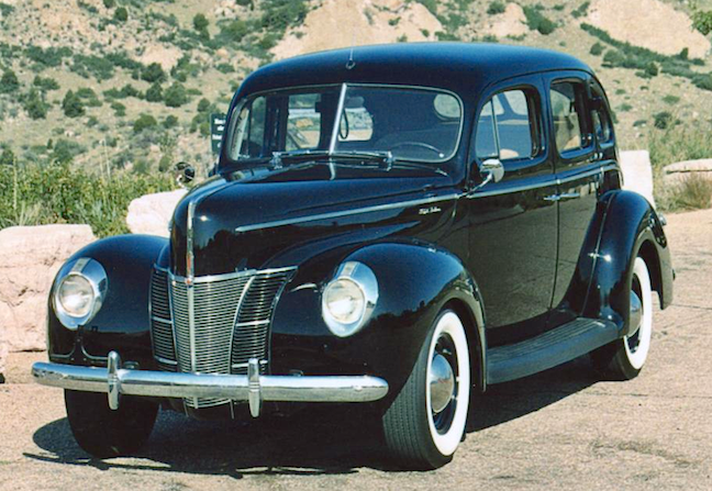
Instead of totally new grilles, De Luxe Ford grilles used almost the same opening as in 1939 (and on '40 Standards), but had a different arrangement of grille bars as well as slightly different hood shaping.  Barrett-Jackson photo.