I just got my copy of David Apatoff's long-awaited book about Bernie Fuchs, who many of us consider the greatest illustrator active in the waning days of large-circulation, general-interest magazines. Actually, Fuchs can be ranked as one of the very best American illustrators ever.
During his brief career-building phase (he rocketed to the top by the time he was in his late 20s) Fuchs spent a few years in Detroit working on advertisement and brochure illustrations for automobiles. He mostly did backgrounds and settings, leaving rendering of the car to a specialist. But Apatoff's book suggests that he might have illustrated cars from time to time: he definitely paid close attention to how that was done.
Because of that background, he wasn't afraid to include cars in some of his advertising and editorial assignments, and those cars were easy to identify. That is, he didn't invent his own designs for generic cars.
This is in contrast to the depiction of automobiles on covers of the Saturday Evening Post, the leading American general-interest magazine for most of the first two-thirds of the 20th century. I did a Google search for usable images of Post covers that included automobiles for inclusion in this blog post. I didn't turn up every Post cover from 1945 through 1959 (my target era). All covers can be found on the Post web site, but they are watermarked and therefore not usable here. What I found was that most car designs were totally made up by the illustrator. In a few cases, cars pictured were close to actuality, but partly hidden by other subject matter.
Why did this happen? The Saturday Evening Post was a favorite "ad buy" for advertising agencies with automotive clients. Every issue could be counted on having a number of car ads. So my guess is that the magazine's editors and art directors instructed illustrators to avoid portraying actual cars, this so that advertisers would not be offended. ("Hey, guys, we spend tons of money on Chevrolet ads and your latest cover featured a Ford!! Are you giving them a free plug or something? We just might switch more of our budget to Life and Collier's.")
If anyone knows for sure why the Post featured generic cars, please let us know in Comments.
Fuchs story illustration showing a mid-1950s Volkswagen. Click on the Fuchs images to enlarge.
At the left is a 1960 DeSoto. Behind it, across the street, is a 1959 Plymouth. I'm not sure why Bernie was featuring Chrysler Corporation products here.
This Fuchs view of the Brooklyn baseball stadium in the late 1940s might have been painted in the mid-1970s, judging by the style. The blue car at the right is a 1946-48 vintage Chrysler. Note that Fuchs has a blurred image of a man screening part of the sharply-done car. Amazing how he combined the two styles without destroying the car's details. He must have painted the car first and very carefully added the man and his hat. The car behind the Chrysler is a 1946 Buick.
Here Fuchs fudged things slightly. The car is a 1957 Imperial (yet another Chrysler product). But he didn't paint a small point on the chrome strip above the headlights, above which was a small crest. That is, he very thinly disguised the car.
Saturday Evening Post - 24 March 1945
This wartime illustration, when no American cars were being built, shows a 1941 Ford. A reference book of mine has a photo of what seems to be this car -- same police sign, same license plate.
Saturday Evening Post - 22 September 1951
This police car is a 1949 or 1950 Ford. However, clipping off the front and rear ends and placing the man in front of the car make it hard to identify for many people.
Saturday Evening Post - 8 September 1956
One last Post example of an identifiable car. It is a 1954 Mercury with some distinctive side trim abaft of the door missing. Placing all the camping stuff in front of the car also helps to disguise it. The image's watermark is because this is a slightly cleaned-up cover by a poster-selling firm.
Saturday Evening Post - 3 October 1953
Now we show what was typical for the Post. The front of the car is somewhat like a 1950 Cadillac, but the rest is nondescript.
Saturday Evening Post - 4 August 1956
These cars look vaguely like early '50s General Motors models, but they lack brand identification ornamentation.
Saturday Evening Post - 8 December 1956
The cars pictured in this cover are totally contrived (though the side trim on the red car is similar to some 1956 Fords).
Saturday Evening Post - 15 November 1958
The wraparound windshield is similar to 1954-56 General Motors "C" body cars, but the rest of the car illustrated here is imaginary.
Saturday Evening Post - 21 May 1949
A totally imaginary design. However, in the background is what looks like a Jeep station wagon.
Saturday Evening Post - 1 August 1959
The cars in the foreground are imaginary, but farther away I notice shapes and trim that remind me of mid-50s production cars. But their images are so tiny and partial that it doesn't matter.
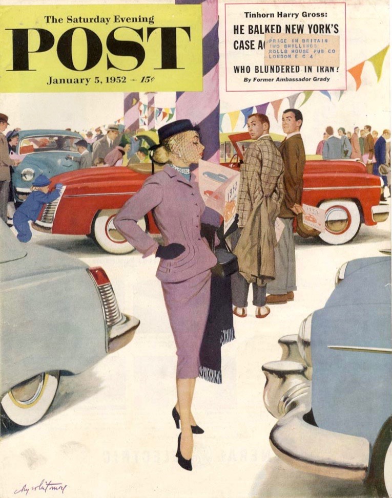
Saturday Evening Post - 5 January, 1952
I used this Coby Whitmore cover in another Art Contrarian post. Whitmore was a total car guy and knew full well what different brands looked like. But had to come up with his own designs here.


1 comment:
Was thinking of you and your old 2blowhard days & cars' effect on young men when I saw a lovely Triumph like one my husband drove back in the '60's. When I walked across the parking lot to take a picture for him I noticed 2 maybe 9 yr old boys ohing and ahing the "awesome old car". All is not lost...
Post a Comment