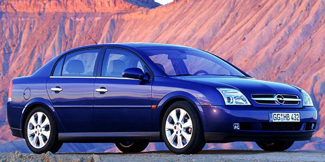
The other subject, an Opel Vectra, can be referenced here by scrolling to "Vectra C (2002–2009)." Both cars were among those sharing the General Motors Epsilon platform. As it happened, their styling is almost identical, unlike some other contemporaneous platform-mates such as the Saab 9-3, Pontiac G6, and Fiat Croma.
I rented a Malibu about ten years ago in Las Vegas and was surprised by its peppy performance. On the other hand, I was not impressed by its styling. Let's take a look at those Malibus and Vectras.
An Opel Vectra from around 2002 is in the upper image and a 2004 Chevy Malibu is below it. As noted, styling is almost identical. The most noticeable differences include the grille-headlight ensembles and the side character lines.
The rear ends also got different shaping. To me, the Vectra is the better looking car because its character line near the upper part of the fender is stronger and more simple. For some reason the Malibu was given upwards-sweeping curved lines above the front and rear wheel openings that seem at odds with the rest of the design.
Another serious aesthetic problem found on the Malibu is the overall shape of the sides. Compared to many other early 2000s cars, the sides seem more vertical and the doors very thin, what with the windows seemingly almost flowing into the doors. This created a boxy look to the car that's at odds with the aerodynamic styling that has been common for the last 25 or more. Note that the Vectra has a small, but distinct shoulder ridge as a side-effect of its fender character line. This distances it from the flat, slab-sided feeling of the Malibu.


No comments:
Post a Comment