Monday, September 28, 2015

1937-1940 Adler Typ 10 2.5 Litre Streamlined Sedan

Not a perfect design, but one that I find likable for a 1930s Art Deco kind of streamlining, is the Adler 2.5 Litre, also known as the Typ 10.  Its Wikipedia entry is here, mentioning that the car's drag coefficient was a very respectable 0.36.

Some 21,249 units were built 1937-1940 in three types: a four-door sedan, a coupe and a cabriolet.  The sedan is dealt with here.

Gallery

A movie garage scene showing an Adler 2.5, image via imcdb.org.

Adler advertisement with artwork by the great Berndt Reuters.  Its streamlining (Stromform) is stressed.  The copy claims passenger capacity as 5-6, but given its 2,800 mm (110.2 in) wheelbase and 1,740 mm (68.5 in) width, I'd say that realistically it could hold four people in reasonable comfort.

Front view on a brick test track.  The grille bars translate into grooved hood decoration.  In the American context, this is sort of a combination of the 1934 Chrysler Airflow and a 1936 Pontiac.  It works well.  Notice the large Adler eagle symbol at the transition point.  The German word for eagle is adler.

Adler 2.5 body with doors and interior fixtures removed.

The 2.5 has a long hood to accommodate its in-line six cylinder motor.  The windshield's slope is extreme for its time, and contributed to its low drag coefficient.  The teardrop curve of the roofline is strong and echoed by the drop-off of the side window profile.  There is a character line from the front of the car, along the edge of the hood and just below the windows, trailing off towards the rear of the car.  The high point of its arc is located approximately at the A-pillar.  Interestingly for a streamlined car, the fenders are distinct shapes, the rear one lacking wheel spats (covers).  A curious detail is the slightly bug-eyed headlight fixtures located Airflow-fashion on the car body and not the fenders.  Not attractive: the ideal (and perhaps too costly) alternative would have been to recess the headlights into the curved front panels.  The low running or fog lights on the front fenders are also awkward details.

This shows the rear.  Nice and clean.  I'm guessing that the backlight windows are placed too low for adequate viewing to the rear.  The reason for this placement seems to be the sliding sun-roof; note the tracks extending down beyond the upper edges of the backlights.

Just because... another Berndt Reuters illustration of an Adler 2.5 sedan.

Thursday, September 24, 2015

Vectra and Malibu, GM Epsilon Siblings

Chevrolet has used the word Malibu (the name of a posh coastal town west of Los Angeles) for various models off and on for more than half a century, as this Wikipedia entry indicates.  If you scroll down to where it says "Sixth generation (2004–2007)" you will find one of the subjects of this post.

The other subject, an Opel Vectra, can be referenced here by scrolling to "Vectra C (2002–2009)."  Both cars were among those sharing the General Motors Epsilon platform.  As it happened, their styling is almost identical, unlike some other contemporaneous platform-mates such as the Saab 9-3, Pontiac G6, and Fiat Croma.

I rented a Malibu about ten years ago in Las Vegas and was surprised by its peppy performance.  On the other hand, I was not impressed by its styling.  Let's take a look at those Malibus and Vectras.

Gallery


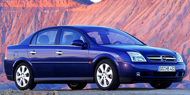
An Opel Vectra from around 2002 is in the upper image and a 2004 Chevy Malibu is below it.  As noted, styling is almost identical.  The most noticeable differences include the grille-headlight ensembles and the side character lines.


The rear ends also got different shaping.  To me, the Vectra is the better looking car because its character line near the upper part of the fender is stronger and more simple.  For some reason the Malibu was given upwards-sweeping curved lines above the front and rear wheel openings that seem at odds with the rest of the design.

Another serious aesthetic problem found on the Malibu is the overall shape of the sides.  Compared to many other early 2000s cars, the sides seem more vertical and the doors very thin, what with the windows seemingly almost flowing into the doors.  This created a boxy look to the car that's at odds with the aerodynamic styling that has been common for the last 25 or more.  Note that the Vectra has a small, but distinct shoulder ridge as a side-effect of its fender character line.  This distances it from the flat, slab-sided feeling of the Malibu.

Monday, September 21, 2015

John Tjaarda's Streamlined Sterkenburg

1930s attempts at streamlined automobiles seldom fail to interest me.  The efforts were earnestly done, but limitations of engineering and materials states of the art in those days resulted in what to our eyes are quaint, awkward-appearing vehicles.

Not all of what are now called concept cars resulted in production models.  But perhaps the best-known successful concept-to-production evolution was from Briggs, whose lead stylist was John Tjaarda.  The resulting production car was the 1936 Lincoln Zephyr, a sub-luxury model that most observers credit with saving the upscale brand from extinction.  More information about this can be found here.

Along with streamlining, another popular avant-garde automotive concern during the 1930s and for a decade or two beyond was placing a car's motor at the rear.  I find this preoccupation puzzling because having the engine in the rear has few advantages and many defects.  So the notion that streamlined, rear-engine cars were the wave of the future was most likely the product of group-think rather than rational thought.

As it happened, Tjaarda's rear-engine Sterkenburg concepts (the name having to do with Tjaarda's ancestry and its lands near Utrecht in the Netherlands) evolved to the front-engine Zephyr.  This was a good thing.

Gallery

The 1936 Lincoln Zephyr, end-result of the concepts shown below.

Tjaarda (I think) posed by what seems to be his first Sterkenburg-type concept.  I do not know if it's an actual automobile or simply a body mock-up, though I suspect it's the latter.  Very low for its day and very racy towards its rear -- it would be appropriate for a 1930s pulp science-fiction magazine's cover art.  Assuming this is from about 1930, the strongly V'd windshield is also an advanced feature.  The front fenders are probably less aerodynamic than they look, and the separate headlight units are definitely drag-producers.

A running circa-1933 rear-engine prototype from Briggs.

Rear 3/4 view of the same car.

Tjaarda's patent drawings dated 1 November 1933 of the Sterkenburg displayed by Ford at the 1934 Chicago Century of Progress World's Fair.

The car on display.  It seems to be a facelifted, mockup version of the running prototype pictured above.

Another view of the Sterkenburg concept mockup.  Signs credit it as a Briggs product.


These are photos of a Briggs prototype with a front-mounted motor that appears to be an evolutionary step towards the '36 Zephyr.  Note that the front fenders flow over the rear-hinged (suicide) front door.  Flow-over fenders didn't reach production in America until the 1941 Cadillac Sixty Special appeared.  The grille-hood combination is not very different from that on the unsuccessful 1934 Chrysler and DeSoto Airflows.  When the Zephyr was launched, it featured a more conventional ship's prow grill designed by Bob Gregorie of Ford.

Thursday, September 17, 2015

Nissan Murano's Three Generations

The Nissan Murano crossover SUV was introduced to the American market for the 2003 model year and new versions followed for 2009 and 2015, as this link indicates.

All three have essentially the same wheelbase and the first two have quite similar basic bodies, so just by looking at them, I can't be sure that the 2009 Muranos isn't a major facelift of the original.  The 2015 Murano has similar doors, but the top has a stronger curve front and rear, so at a minimum there was major work done.  (Murano mavens, please comment regarding these observations.)

The initial Murano featured a somewhat symmetrical front/rear fender profile that displeased me when I first saw it.  It gave the vehicle a static appearance.  Apparently Nissan stylists, the car-buying public or both came to a similar conclusion because that feature was ever more strongly eliminated in the succeeding models.

Gallery

2003 Nissan Murano.  Murano is an island cluster in the Venice Lagoon between the Venice proper and the mainland.  It is noted for its glassware.  Note the character line on the fender and how it strongly curves downward near the front and rear wheel openings.  It is these similar curves that create an almost-symmetrical, static feeling to the design.

Front 3/4 view of the 2003 model.  Note the shape of the side windows and the door cut-lines.

This is a 2009 Murano  Its windows and doors are about the same as those on the 2003.  The front character line curve has been eliminated, replaced by a large lip around the wheel opening.  This eliminates the static, symmetrical feel of 2003 styling.  Sheet metal on the doors had been replaced to yield a more sculptured look.

The 2015 Murano.  I might have more to say about its design in a future post.  For now, I'll note that styling has gone into the current fad of rococo overkill.  Observe that the door cut lines remain similar to those of the original Murano.

Monday, September 14, 2015

Were 1939 Chryslers, DeSotos and Dodges Totally Restyled?

I don't have a definite answer to the question posed in this post's title.  That would have to come from Chrysler archives, an automobile restoration expert or perhaps a knowledgeable member of a club devoted to one of the Chrysler Corporation brands active in the 1930s.

My strong suspicion, however, is that the answer is "no," even though various publications in my automobile library state otherwise.

Let's begin with the setting.  Chrysler Corporation's 1938 brands (Plymouth, Dodge, DeSoto and Chrysler, in ascending price order) shared a typically rounded, heavy-looking basic body whose style was in line with cars from General Motors and other firms.  However, cars such as the Lincoln Zephyr and Cadillac Sixty Special along with the usual Detroit scuttlebutt must have made it clear to Chrysler management that competitors would be offering sleeker designs for the 1939 model year.

Chrysler did plan a total redesign of its line for 1940, but it probably became obvious that its 1939 line had to be freshened to remain competitive until the 1940 cars appeared.  So 1939 Chryslers, DeSotos and Dodges were given a truly major facelift, a facelift with plenty of new sheet metal and reworked tops that gave the appearance of a complete redesign.  Plymouths were given a less-comprehensive, but still extensive, facelift.

I'll use Plymouth to begin making my case.

The profile view of a 1938 Plymouth at the lower-right corner of this ad serves as our reference.   Items to note are the hood cut-line, the shapes of the doors and their hinging.  The area in the vicinity of the hood cut and the front door's forward cut is especially important because, beneath the sheet metal lies the cowling and firewall, usually cited as the most expensive and change-resistant parts of non-unitary car bodies.

This is an image of a 1939 Plymouth captured from a 1939 European film by imcdb.org.  The body aft of the hood is essentially the same as for 1938 Plymouths.

The image in this 1939 Plymouth ad is an illustration, but serves our needs.  Almost all the front of the car has been facelifted, largely eliminating the bulbous look of the 1938s.  Another facelift feature is the replacement of the flat windshield by a V'd, two-piece windshield, something that required some adjustments to metal stampings for the roof.  Note that the cutline at the rear of the hood is unchanged.  This strongly suggests that the firewall - cowling structure is that from 1938.

More baseline photos.  The upper one is a sales photo side view of a 1938 Dodge, the lower is of a 1938 DeSoto.  These brands along with Chrysler got the extreme facelift.

Compare this 1939 DeSoto with the 1938 model in the previous image.  Like 1939 Plymouths, the front ends and windshields are new. Also changed are the rear of the car along with the upper part of the rear doors and associated windows.  Due to this, the door hinge on the C-pillar was lowered, but the other rear door hinge remains as before.  The lower forward door hinge is as it was, but the upper hinge has been made internal.  The hood cutline seems to have been changed slightly towards the bottom to accommodate the reshaped front fenders.

Two more examples of 1939 Chrysler Corporation cars.  As noted in the image, the first is a Dodge.  The lower photo is of a Chrysler Royal.  Again, pay attention to the hinges and cut-lines.

One thing that puzzles me is why the Plymouth wasn't facelifted as completely as its senior brothers; after all, Plymouth production amounted to more than 40 percent of the Corporation's total, which would have helped amortize the tooling expenses for the other brands.  Perhaps it had to do with Ford's late-1930s practice of having its less-expensive range featuring style characteristics of the previous year's top line.  That is, maybe Chrysler was simply following a fad.  Or perhaps, because of that fad, they thought they could save tooling expenses on Plymouth and get away with it in the marketplace.

Thursday, September 10, 2015

The Tiny 1954 Nash Metropolitan

The Nash Metropolitan (produced 1953-1961, first marketed in 1954) was designed in the United States, built in England using an Austin motor, and exported to North America.  A detailed Wikipedia entry on Metropolitan is here.

Even though many people were not enthusiastic about it (I never did come to terms with any car with tiny wheels), more than 80,000 were eventually sold in the USA and another 15-20,000 elsewhere.  Not long ago, Metropolitans became something of a cult-car here, though that enthusiasm seems to have faded as best I can tell.

The Metropolitan design was conceived by William J. (Bill) Flajole whose concept was accepted by Nash-Kelvinator's creative president George Mason in the form of the NXI show car of 1950.   Some NXI styling cues appeared on the redesigned 1952 full-size Nash line, as shown below.

Those small wheels aside, the Metropolitan was cute, distinctive, and American-looking, quite unlike most other very small cars designed in the early 1950s.

Gallery

A 1954 Nash Metropolitan publicity photo.  Like all Nashes at the time, it had partly-enclosed wheels.  Given the tiny size of the Metropolitan's wheels, I doubt that full-size cut-outs would have improved the design.  The "airscoop" on the hood is decorative, not functional.  Its spare tire is mounted at the rear as a Continental Kit.


Two views of the 1950 NXI concept car designed by Flajole.  No Continental Kit here, the spare tire being stuffed in the rear about where the gas tank should be located.  The low hood and the grooved panel on the doors showed up on full-size Nashes for 1952-54.  These styling cues along with the covered wheels clearly proclaimed Nash identity for the new '54 Metropolitan.

Here is a 1952 Nash Ambassador two-door sedan for comparison.

Metropolitans came as coupes and convertibles.  That's a full-size Nash lurking in the garage.

This publicity photo of a 1960 Metropolitan shows plenty of pretty girls along with how the Metropolitan was facelifted.  Changes include a mesh grille and two-tone paint, the darker color always above the off-white.

Monday, September 7, 2015

Late-1930s Škoda Superbs

Škoda, the Czech automobile company (now owned by Volkswagen) offered lines of cars in the 1930s ranging from small to large.  Overall sales volumes were tiny by today's standards and those of the large-size Superb line were verging on microscopic: about 900 of all types were built during the 1934-1939 model years.

I wonder if the Superb line was ever profitable, given that at least three body styles were used over that period.  However, we need to remind ourselves that many car bodies were built differently in those days.  For one thing, very few cars had monocoque or unitized construction as is the case for most cars today.  Also, many car bodies, including Škoda's, were not all-steel, continuing the practice of framing a body using wood and then applying a metal skin.  It's likely that Škoda Superbs were built using a good deal of hand labor and that prices were quite high -- knowledgeable readers are encouraged to comment if clarification on these points is required.

Shown below are examples of five types of Superbs.

Gallery

1934 (ca.) Škoda Superb Type 640
Note that the car shown has right-hand drive. Following the 1939 German take-over, Czech cars had to have left-hand drive, as was the practice in Germany.

1936 Škoda Superb Type 902
The body of this 902 looks French, reminding me of Citroën's Traction Avant introduced in 1934.

1938 Škoda Superb Type 913
The styling of this 913 is not very different from that of American cars of 1936, the same year 913s were launched.

1939 (ca.) Škoda Superb Type 924
Type 924 appeared in 1938, and seems to be a facelifted 913 with front end styling in line with contemporary American cars.

1939 (ca.) Škoda Superb Type 919
The same might be said regarding this 919, only 12 of which were built.

Thursday, September 3, 2015

Last of the Pierce-Arrows

Pierce-Arrow (1901-1938) of Buffalo, New York was a maker of luxury automobiles that failed to survive the Great Depression of the 1930s.  A brief history of the firm is here.

From 1928 into 1933 Pierce was owned by Studebaker, which did survive the Depression, but with difficulty.  Pierce-Arrow developed its final restyling towards the end of the Studebaker relationship with new lines introduced for the 1934 model year.

Pierce-Arrow was doomed no matter how good the redesign might have been.  This was  because sales probably could not have recovered to the point that a late-1930s restyling could have been afforded.  Unfortunately, the 1934 design had at least one flaw that limited its success, as we shall see below.

Gallery

This advertising art shows a 1932 Pierce-Arrow sedan.  Headlights perched atop the fenders was a Pierce-Arrow visual trademark dating back to 1913, though buyers had the option of conventional headlights.  I never liked Pierce's headlight assembly because it looked awkward, as if the lamp was stuck on the end of a horn; their cars with ordinary headlamps looked nicer.  Also note the flat, one-piece windshield that was virtually universal that model year and how the A-pillar blends with the cowling and hood.


Shown here are sporty restyled 1934 Pierce-Arrows.  The upper photo is from Auctions America, the lower from RM Auctions.  Pierce also made large, bulky six-window sedans.  The redesigned fender top headlights no longer have the previous "trumpet" look, which was good.  The main feature that was out of step with the times is the high roofline curving upwards from the top of the windshield -- clumsy.  Retained is the A-pillar treatment noted above; for '34 it helps emphasize the unfortunate windshield treatment.

Pierce-Arrow's last grasp for survival was its 1936 model year facelift of the 1934 design.  The shape of the grille opening was slightly changed, but the main effort and expense was new fenders.

This Auctions America photo of what looks to be an unrestored 1936 Deluxe 8 Sedan reveals the same windshield-top combination from 1934.  The problem for Pierce was that competing cars were coming out with two-piece V'd windshields, making the already awkward design seen here seem old-fashioned.

Finally, a sporty V-12 Club Sedan from Mecum Auctions.  A taller V'd windshield here would have yielded a car with nearly-competitive styling.