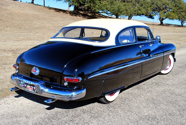
For readers not familiar with the Mercury brand, its Wikipedia entry is here.
Once the 1949-51 Mercurys went out of production and their prices as used cars fell, they became highly popular as bases for kustom-kar hot rods. I'm pretty sure that most of the existing Mercurys from that era are customized versions because I had a hard time finding images of stock Mercurys for this post.
A major problem facing American stylists in the late 1940s was that cars were still fairly tall, and the fashion for fenders was to the flow-through variety. One solution was slab-sided fenders: Packard, Nash and Kaiser-Frazer took that path, and the result was a ponderous appearance. (Hudson did the same, but its cars were low, so the problem wasn't there.) A better solution was to have the front fender flow through over the rear doors while preserving separate rear fenders. This reduced the slab effect, especially if the fender lines were a few inches below the window sills. Studebaker, General Motors and Chrysler took this route.
1949 Mercury
It's a large, late 40s car, yet it looks sleek. Here you can see Gregorie's fender design as well as how the side curve of the hood continues over the front door to become the rear fender. The dropped front fenderline breaks up the side bulk. Another interesting touch is that the chromed grille "floats" in the radiator intake hole. Were the opening outlined by chrome strips, the front of the car would probably have looked heavier.
1950 Mercury advertisement
Styling was virtually unchanged for 1950, so I include this because it has different perspectives of the design.
1950 Mercury Monterey - sales photo
The Monterey for 1950 had a padded, vinyl top. The backlight or rear window was a single piece of glass that year; the '49s had a three-piece rear window. It was the aspect of the design shown here that received the bulk of the facelift.
1951 Mercury advertisement
The 1951 facelift here, this advertisement providing multiple views. The grille was extended forward to form more of a point than the earlier rounded version. This might have been an improvement. However, a horizontal chromed strip was at the lower front edge of the hood, presumably to jazz things up and match what competing cars had. The rear window was considerably enlarged. Its new profile might not have worked well with the 1949-50 rear end. But the other important change was the extension of the rear fenders to give Mercurys a longer, more squared-off look, perhaps to help ready the public for the boxy-looking oncoming 1952s.
1951 Mercury Monterey - Mecum auction photo
The higher, longer, more squared-off rear fender adds bulk to Gregorie's graceful design.
1951 Mercury Monterey - Mecum auction photo
The rear looks awkward in comparison to the earlier models. A one-word description of the appearance would be "pinched." No wonder Mercury's sales rank dropped in 1951.


1 comment:
I have always liked the uniqueness of the '51. Your critique is very good though. It caused me to look at the car a completely different way, perhaps the best goal of excellent analysis.
Post a Comment