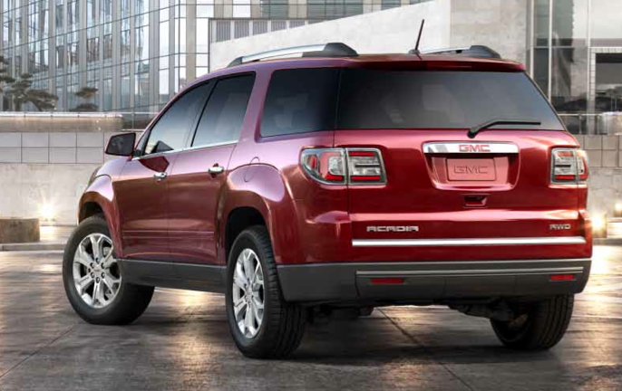
I found the Acadia styling quite pleasing, given its dimensions and other market niche requirements. As best I can analyze this for now, factors include: the body is somewhat rounded rather than being squared-off; the large lips around the wheel openings help reduce the feeling of bulk, as do the character line along the door handles and the shaping at lower-door level; and finally, the grille-headlamp ensemble that is clearly separated from the bumper-air-intake ensemble below it.
Then, for 2013, the Acadia was given a facelift to "freshen" its appearance. As with most facelifts, it was a change for the worse, or so I think. Below are comparison images of the 2007 and 2013 designs. The original design is at the top and the facelift is at the bottom of each image pairing.
The most drastic changes involve the Acadia's "face." The headlamp units are more angular and incorporate those faddish LED light strings. Whereas the 2007 headlamp units presented a tranquil appearance, the 2013 has a harsh, rather angry expression for its "eyes." Lost is the upper-lower distinction of the vehicle's face; now there is a larger grille opening that drops down into the bumper zone. The removal of the edge-to-edge horizontal divider panel transforms the design from a comparatively light or airy one to a heavy, truck-like one that clashes with the side details established in 2007 to lighten the effect of a large vehicle.
Changes to the rear are minor and do not alter the character of the design. The most obvious change is the addition of faux-wraparound rear window glass whose only "function" is to reduce the number of elements in the name of visual simplification.


3 comments:
Don, One of my golf girl friends bought a new Acadia last week because she & her hubby liked mine so much. I parked next to her to compare vehicles. My first reaction from looking at the rear of both was, "OMG, it looks like a VAN." The new Acadia appears to be about 2 inches shorter (not length...tall) than my 2012 and the wraparound rear window kills the sturdier SUV look.
As you follow these things, what's with the engineers and the front grill on trucks/SUVs? The grills are growing so large that they make the vehicle appear like it's going to flip over. Is that some marketing thingy to appeal to the guys??? No offense, but it's ridiculous and ruins the stylish look of the Acadia. We are on our second Acadia and were planning to buy another one late summer, but now I don't know. The grill and the wrap-around rear window... looks like a VAN. Wonder if GM listens to their customer feedback??
flagwavr -- I used to consult for GM, but that was not styling related. So I'm just speculating here.
My guess is that, since GMC is the corporation's truck division (yes, Chevrolet makes trucks too, but still...), somebody in styling or division marketing or management decided that all Jimmies must look truck-like. Hence the bolder grille. Note that truck grilles for restyled pickups are getting almost (?) too bold, so in a way the new Acadia design is comparatively modest, unfortunate though it is.
The most obvious change is the addition of faux-wraparound rear window glass whose only "function" is to reduce the number of elements in the name of visual simplification.
Post a Comment