Monday, September 30, 2013

Voisin 1931: Ultimate "Functional" Design

I got a big dose of Modernist brainwashing in Arthur Herrman's class on architectural history at the University of Washington.  He hammered away about function being the root of form along with the need for "honesty" to building materials.

There's nothing wrong with the idea of paying attention to function, ergonomics, economy of materials and a host of other concepts.  But when theoretical ideals become a kind of perfection that must be sought at all costs, aesthetic sterility is an unintended, but likely, byproduct.

This function/form ideal has been most pronounced in the fields of architecture and industrial design, yet not so much where automobile styling is concerned.  I think the reason is that a primary function of a car's appearance is to entice someone to buy it -- something quite different from mechanical or structural functionality.  So the people in charge of studios dealing with the styling of production cars need to be commercially as well as aesthetically conscious even though some underlings might be functionalists of the purist industrial design stripe.

At times, the purists assert themselves and bland, blob-like cars enter dealer showrooms.  Such was the case for certain General Motors products during the late 1990s.  Yet to my thinking this was a faux functionality, a blend of aerodynamically efficient forms and elimination of ornamentation.  Other functions such as location of the motor and space for carrying luggage were not starkly obvious (though most people, from experience, knew which parts of these cars related to such functions).

 I draw the conclusion that aerodynamic functionality, in light of current regulations imposed on the automobile industry, trumps all other possibilities and therefore calls into question the purist possibility of designing a car that maximizes the form/function ideal.

Just for fun, what might an automobile look like if aerodynamic efficiency was set aside and remaining functions were stressed.  Let's also leave out cars from the pioneering days when, for instance, the best placement of the motor was being sorted out by trial and error.  If we consider cars designed and built from the early 1920s onward, my candidates for ultimate functional design are certain models of the Voisin brand, brainchild of French aviation pioneer Gabriel Voisin (1880-1973).  In particular, I am thinking of his cars for 1931 and to some degree a few years earlier.  Example images found on the Internet are shown below.

Gallery


Voisin C14 - c.1931
Voisin, a friend of the architect Le Corbusier (they were involved with the 1925 Plan Voisin for a redesigned Paris), must surely have been acquainted with the maxim "form follows function."  So by the late 1920s his C14 line of cars visually stressed various functions to a virtually uncompromised degree.
Separately stated elements include: the passenger compartment; the engine compartment with the radiator at the front and the hood; fenders positioned close to the wheels so as to protect against splashes and road debris; storage boxes by the sides of the hood; running boards; a distinct luggage trunk; and the spare tire at the rear.


Voisin C22 - c.1931
The Voisin C22 model carries the same theme, but with a more aggressive appearance resulting from its "underslung" chassis (axles and springs are above the chassis side rails rather than below, permitting a body riding closer to the ground).  The effect is enhanced in the car shown here because it is a single-seat coupé body type and culminated thanks to the proportionally large diameter of the wheels.

Voisin C20 "Mylord" - 1931
More of the same is seen in this rare C20 model.

As it happens, I like the styling of these Voisins, finding them exotic and exciting, especially the C20 and C22 models.  Aside from their comparatively small frontal areas, they have few aerodynamic benefits, so are at their best as town cars.  I doubt that the functionality factor affects my judgment because those same elements, if proportioned differently (as a short, tall car for instance) would not seem exotic or exciting to me at all.

Thursday, September 26, 2013

MG Magnette ZA Saloon

I just checked the calendar, did some quick arithmetic and figure that readers of this blog under age 45 wouldn't have been able to buy a classic MG sports car, the last being the MGB whose production ended in 1980.  (Yes, there were successor MGs, but they earned little market acceptance.)  MG sports cars were probably at their peak of mind-share in the USA from the mid-1950s to the late 1960s when more advanced sports cars such as the Datsun 240Z and Porsche 914 came on the scene.

While Americans thought of MG being a sports car, for a while the brand also included sedans ("saloons" as they're called in their homeland).  Some of those sedans, called Magnettes, were actually exported to the USA and I saw some on the streets and roads of western Washington state when I was young.  Matter of fact, I even rode in one because a fraternity brother owned a Magnette ZA model (produced 1953-56) and drove some of us around the Olympic Peninsula.  I enjoyed the ride as best I could, given that I was hung over from too much tequila and beer.  That was because I rather liked the styling as an example of combining traditional British design with an envelope-type body.

The Wikipedia entry dealing with all the various Magnettes is here. It notes that the designer (not the stylist, in this particular case) was Gerald Palmer, who I'll write more about later.  The other point needing mention is that the Magnette shared its body with the Wolseley 4/44, a necessary production economy.

Then things began to go downhill styling-wise with the facelifted Magnette ZB (built 1956-58).  It got new chrome trim that was sometimes used as the dividing point for the then-fashionable two-tone color schemes.  Worse was the enlargement of the back window.  Worse from a traditional-British styling standpoint, though better in terms of outside visibility for the driver.

Here is the photographic evidence.

Gallery

MG Magnette ZA general view
Aside from the traditional vertical grille and narrow hoodline, the Magnette's styling is a nice version of what American stylists were doing for circa-1949 models (the British tended to be conservative when it came to styling, so the Magnette was behind the American fashions by the time it appeared).  For example, the front fender flows through the rear door and there is a sketched-in rear fender.  The tops of these fenders are several inches below the side windows in the vein of Harley Earl's 1948-49 General Motors cars, a device that reduced the appearance of bulk on the sides.  The one-piece curved windshield is another modern touch.  The grille, while traditional, has a whiff of post-war styling in that it curves backwards toward its top.  While not a great design, it nevertheless is pleasing.

Advertising material showing rear window
Besides the vertical grille, the other pre-contemporary styling feature is the small back window, such windows being a little larger in most of those 1949 vintage American automobiles and much larger by 1953 when the Magnette first appeared.  It does fit well with the somewhat formal theme of the overall design.

Brochure showing color schemes

Instrument panel
The instrument panel is interesting. For one thing, it is sheathed in wood in the traditional British way, giving it a nice touch of quality.   Note that the framing around the main instrument cluster mimicks the traditonal MG hexagon pattern seen in full on the steering wheel hub.

Magnette ZB
I mentioned above that I didn't care for changes made for the ZB version of the Magnette.  The widened rear window, alterations in chrome trim and two-tone paint can be seen in this photo I found on the Web.  While this facelift was minor, enough was done to significantly degrade the initial design.

Monday, September 23, 2013

Cadillac Allanté: Farmed-Out Styling

Although hiring outside consultants such as Italdesign Giugiaro to create production automobile designs is an accepted practice outside the United States, it is essentially unheard of for an American manufacturer to do this.  I say "essentially" because there was at least one* important instance of this, an instance that should have been embarrassing (and probably was, to some stylists).  Embarrassing because the company that hired out the styling job as well as the building of production bodies was General Motors, where the internal styling studio was first developed.

The product was the Cadillac Allanté, a two-passenger sporty car styled and partly built 1987-93 by Pininfarina, an Italian coachbuilding firm.  I'm not sure what General Motors' rationale was for this.  It probably could be looked up someplace, but I haven't the heart to do so because what matters is that it was a mistake that was obvious to many at the time, me included.  According to data in the Wikipedia entry on the Allanté, production over a seven-year run proved to be around half of what was expected on an annual basis.

Since Pininfarina was a firm well-known to sophisticated car buyers, GM touted the fact that the Allanté was indeed designed and the body built by it, rather than Cadillac.  That was supposedly a big plus factor.  But the coin had another side.  If Pininfarina was so wonderful, that implied that Cadillac stylists were not as good.  Therefore, the styling that the rest of the Cadillac line sported was not first-rate, something for potential buyers of prestige cars to ponder.

Problems, problems.  The final problem, so far as I am concerned is that the Allanté's styling wasn't outstanding.  The design was mediocre.

Gallery

Allanté convertible show front styling

Allanté brochure showing hard and soft tops

Allanté rear styling

Reduced to its essence, the design is something close to a brick-shape with three character lines extending all the way around.  The upper one coincides with the top of the tail light assembly and almost aligns with the top of the grille and headlamps.  The second one aligns with the lower edges of those front and rear features.  The lowest such line is painted red and isn't aligned with any other feature.  The only serious relief from this horizontal theme is a slight fender line dip along the cockpit that transforms into an upwards kick between the rear of the door and the front of the wheel housing.

Perhaps the intent was to have the Allanté seem dignified, as would be befitting a Cadillac.  Instead, the result is boring.  At least Cadillac management learned not to repeat the mistake in the 20 years since the project was abandoned.

* * * * *

* Actually, there also was the case where Nash hired Pinin Farina (himself) to provide a design for the 1952 full-size Nash line.  Advertisements stressed his contribution, but automobile historians tend to agree that much of the production design originated in the Nash styling studio.  Around that time, Nash also marketed the Nash-Healy sports car, a low-volume model that also had some foreign roots.  But Nash was not an industry leader as was the case of General Motors and its flagship Cadillac brand.

Thursday, September 19, 2013

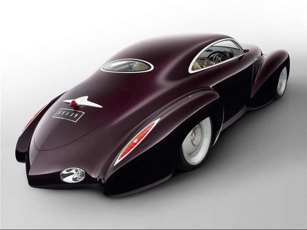
Holden EFIJY Concept 'Rod

Holden is an Australia-based subsidiary of General Motors that designs and engineers part of its product line, the balance being sourced from elsewhere in GM.

It seems that, fifty years later, a soft spot remained in Holden's heart for its early 1950s FJ model, because it served as inspiration for a retro hot rod styling exercise called the EFIJY (background information here and here).

Gallery

Holden FJ (1953-56)
The original FJ had a rather simple design that looked like a slightly scaled-down version of GM's "torpedo" bodies seen on circa-1941 Pontiacs, Oldsmobiles and such.  Features included the line of the hood shoulder transitioning into a bulge just below the side windows that, in turn, transitioned to the "bustle back" trunk.  Fenders are separate, unlike the postwar flow-through style seen on 1950-vintage GM American makes.  The single flashy element was a grille featuring bold, heavy chrome sculpting in the spirit of contemporary American practice.

Holden EFIJY concept car - 2005
The EFIJY follows FJ styling themes in that it has (1) separate fenders, (2) a divided windshield, (3) a high, tapered hood with blending to the trunk area and (4) a close copy of the FJ grille design.

I think the design is a snazzy version of Retro, with one exception.  That exception is the rear, which I dislike. Well, maybe it isn't quite as odd as it looks in the photo which was probably taken with a wide-angle lens.
What's wrong?  For one thing, the boat-tail plan-view taper of the trunk extends too far to the rear.  It ought to terminate at the rear fenders end-points or only very slightly behind them.  That defect corrected, then the back window should be a little bigger with larger radius curves at the outer edges.  The license plate box is poorly placed because a license cannot be read at that angle; be practical and tuck it under the boat tail lip on one side.  Then get rid of the chrome trunk-handle-cum-brakelight and put a discrete handle at the rear of the trunk opening.

Monday, September 16, 2013

The Mercedes-Envy Years

I suppose one could write it off as a zeitgeist thing, but at the time there were plenty of not-quietly-spoken words to the effect that American cars were being styled as wannabe Mercedes'.

On the zeitgeist side of the argument, I could mention that, since automobile styling has a significant fashion component, the late 1970s and early 1980s marked a shift away from somewhat rounded bodies such as Chrysler Corporation's "fuselage" styling from 1969, Buick's Riviera with its curious "boat-tail" greenhouse, and Ford's Torinos.  That shift wasn't all that great, but nevertheless a visible change to more angular bodies with thin roofs and proportionally taller greenhouses and proportionally shorter lower bodies.  At the time, the effect struck potential buyers as being clean and crisp as opposed to soft and sometimes fussy.

There was another factor: the reaction by the market and the federal government to the 1973 oil crisis that for several months featured gasoline shortages and higher prices.  In response, automobile makers introduced smaller, more fuel-efficient cars.

Finally, there was the growth of sales of non-American cars in the American market.  At the low end of the size-price continuum were Japanese cars.  But the higher-price part of the market saw inroads by German brands, especially in the form of the Mercedes-Benz W116 series.  For some time, Mercedes cars had featured flat roofs and proportionally tall greenhouses.  But now Detroit styling was adopting these styling cues, perhaps in part because of the fact that Mercedes was challenging Cadillac as the leading prestige mass-market brand in America.

And it is here that the zeitgeist explanation loses some of its force, because American stylists began mimicking Mercedes grilles on the Mercedes-like bodies they were crafting.

Gallery

1972 Mercedes-Benz W116 (280 SE)
Here is a Mercedes that American stylists would have been familiar with when they were working on redesigns for the late 1970s.

1979 Chevrolet Caprice
Caprice/Impala styling in the late 70s wasn't as Mercedes-like as the designs shown below.  But it nevertheless was typical of the times.

1978 Ford Fairmont
The Fairmont is technically a six-window rather than a four-window sedan.  Aside from that, it follows the Mercedes formula.  Note that the grille is horizontally sectioned into thirds using larger chrome strips, like the grille on the Mercedes shown above.

1976 Plymouth Volaré
1977 Dodge Aspen
The Volaré and Aspen are pretty much the same car, part of the long-term Chrysler practice that culminated in the termination of the Plymouth brand.  Here again, the styling seems Mercedes-inspired.  Moreover, the Volaré, like the Fairmont, has its grille sectioned horizontally Mercedes-style.

Thursday, September 12, 2013

Plymouth's All-Metal Station Wagon

In the United States, a large share of passenger vehicle sales are for what are essentially station wagons.  I'm referring to SUVs (sport-utility vehicles) and "Cross-overs," (passenger car platform versions of SUVs) whose market share in the USA for the first six months of 2013 was 37 percent.  Their market share where light-duty trucks are added to the mix was 23 percent.

When I used the phrase "essentially station wagons" (or "brakes" as they are called in Britain and some other parts of Europe) my point is that the interior layout of the cabin for SUVs is the same as it was for traditional station wagons.  That layout is comprised of: (1) a front seat area for the driver and passenger; (2) a seat behind that for passengers, the seat back designed to fold forward to increase cargo space; and (3) a roof-high area at the rear for cargo or, in some cases, a third row of seats.

What made station wagons and SUVs practical was the 1949 Plymouth's introduction of an all-steel body for the station wagon type car.

Original 1920s and 1930s station wagons, in the American sense, were sedans or perhaps light trucks that were given a long, box-like passenger/cargo area that extended to the rear bumper.  These vehicles were used to meet people and their luggage arriving at a (usually) rural train station for further transport to a hotel, resort or country residence -- hence the name "station wagon."

This special bodywork extended from the cowl/windshield of the car to the rear bumper and was constructed mostly of wood.  Since most cars of the 1920s and early 30s had bodies framed in wood (with metal cladding), this was simply an inexpensive means for yielding handy station wagons, a very low-production sort of car in those days.  By the late 1930s, car construction became all-metal, yet station wagons continued to have wood for the passenger/cargo area (though roofs might be metal).  These station wagons could not be integrated into a normal production line, thanks to the use of wood.  So cars with partly completed bodies would be pulled off the line and sent to a special shop or an outside contract builder for construction and installation of the station wagon bits.

By the 1940s, use of wood construction for station wagons had become a matter of tradition rather than practicality.  For example, the special assembly mentioned above usually made wagons the most expensive body type for a brand.  Then there was the matter of maintenance of the wooden bodies.  They came from the factory varnished for weather protection, and the varnish had to be maintained, an expensive, time-consuming task.  (Many owners gave up maintenance after their wagon was a few years old, so older models often got pretty ratty looking.)

The obvious way to reduce purchase and maintenance costs -- in turn, encouraging increased sales -- was to simply eliminate the use of wood.  But it took until the 1949 model year for that to happen in the form of the Plymouth Suburban.

This is publicity material for the 1949 Plymouth station wagon, a traditional model with wood components.  The roof and rear fenders are clearly metal.  The front door could be metal (or partly so) as well, because the front fender fade-away can be seen on the panel which might have a dark wood pattern decal laid over it.

And here is the all-metal Plymouth Suburban.  Unlike the traditional station wagon, this car is a two-door rather than a four-door.  But it was practical to maintain and less expensive to buy, now being cheaper than Plymouth's fanciest convertible.  Over the next few years, all-steel station wagons became the norm in America.

Monday, September 9, 2013

Look-alikes: Mid-1970s Ford LTD & Dodge Monaco

Though I'm a firm believer in the existence of styling fads and fashions, there are times that cars from different manufacturers are so similar that even I am surprised.  One instance is from nearly 40 years ago when the last generation of really large American cars was on the road, before the 1973 oil crisis' impact could affect design.  The cars were Ford's LTD four-door sedans that first appeared for the 1973 model year and Dodge's Monaco four-door sedans launched the following year.

At the time the Monacos started appearing, I was familiar with the '73 LTD styling and regarded the Monaco as a copycat design.  Then I began to wonder about Chrysler Corporation's viability if it was becoming a styling imitator rather than an innovator.  Actually, this concern proved to be well-founded, because Chrysler's financial position deteriorated to the point that it had to accept a federal government bail-out in 1979.

In retrospect, aside from the possibility that Chrysler hires of Ford stylists around 1971 tipped off what Ford was planning for 1973, it's likely that similarities were a matter of parallel thinking in terms of product packaging for full-size sedans as well as the prevailing styling zeitgeist.  There must be retired Chrysler stylists active at the time who could step forward to explain what probably did cause the lookalike situation.

For now, let's take a look at the cars.

Gallery

The upper image is of a 1975 LTD that, aside from grille details, was similar to the 1973 model.  The lower image is a Monaco, also a 1975 model and posed with the principality as background.  Similarities include the upper bodies whose general shapes, window shapes and even the little fender line notches at the lower rear of the back side window framing.  Lower bodies differ in details, but their basic forms are similar enough that they look like they could have been sheet metal variations on the same underlying structure.

The Ford is at the top of this pairing too; it's a 1973 model. The Monaco in the lower photo is a 1975 model. That's the Hôtel de Paris in the background and a bit of the Monte Carlo casino is visible at the left.  Similarities here include the shape of the back windows, the centerline creases on the trunks, and the rectangular taillights.  Side sculpting differs somewhat, but easily might have been a matter of treatments for different brands from the same manufacturer.