Thursday, October 31, 2024

The Last Imperial (and Dodge Mirada)

Chrysler Corporation used the name "Imperial" as a model name and a brand name off and on from the late 1920s into the early 1980s.  The model name was applied to the most upscale line of  the Chrysler brand.  At others times, the Imperial brand was the top of the entire Chrysler Corporation line.

Today's post features the last of the Imperial brand -- Wikipedia entry here.  Its body/platform also was used by the 1980-1983 Dodge Mirada, also treated here, and the Chrysler Cordoba.  The Imperial version was introduced for 1981.  Its production over model years 1981-1983 was only 12,385.

The most noticeable styling difference among the three was that the Imperial's rear featured a variation on English "razor-edge" design.  The American verson was a minor styling fad for luxury cars in the late 1970s and early 1980s.  I wrote about that here.

Gallery

1981 Imperial - Mecum Auctions photos
Another fad was placing Rolls-Royce inspired grilles on American luxury brand cars.  In this case, it's flanked by headlight doors, creating a clear appearance for the front end.

1980 Dodge Mirada - brochure image
The Dodge version's grille is also simple, but slightly heavier due to the thick grille bars.

A long hood created by considerable front overhang.  The trunk has a tacked-on appearance created in part by the fastback sculpting that extends the roofline.

1980 Dodge Mirada - Mecum Auctions photo
The Dodge's styling is more conventionally of its time regarding the C-pillar to rear-end zone.  That includes the fussier window treatment.

The Imperial's distinctive rear is comprised of simple elements that relate to each other.  Except for the tacked-on trunk shape caused by the C-pillar's aft crease line.  Like the other cars mentioned in the previous link, the rear end doesn't seem quite correct.

1980 Dodge Mirada - brochure image
What Imperial stylists had to work from.

Monday, October 28, 2024

Some Cadillacs Launched Just Before the 1995 Sales Decline

Cadillac annual production was consistently in the 200,000 to 400,000 range from the early 1970s into the early 1990s.  Then in 1995 the numbers fell to below 200,000.  Why?

I don't know all the contributing factors.  Maybe some business school case studies have done something like that.  I do think that the advent of Toyota's Lexus brand in 1989 might have been one, though its sales did not ramp up from initial levels until 1998.  Then there was the prestige image of German brands Mercedes, BMW and Audi that had been encroaching on what was once Cadillac's supremacy in America.  Other rivals for luxury car dollars included Lincoln and Nissan's new-for-the-1990s Infiniti.

Might the cause have been Cadillac's mid-1990s styling?  Let's consider that.

This post deals with the Cadillac Fleetwood of model years 1993-1996, and the seventh-generation (according to Wikipedia) DeVille of 1994-1999.  The former had rear-wheel drive on a 121.5 inch (3,086 mm) wheelbase, whereas the latter was front-wheel drive on a wheelbase of 113.8 inches (2,890 mm).  The Fleetwood was built on General Motors' D platform, the DeVille on the K platform.

Despite those differences, the cars looked similar.  Photos below are of cars listed for sale.

Gallery

1993 Cadillac Fleetwood Brougham
Broughams seem to have had vinyl top covering, whereas ordinary Fleetwoods didn't.

1994 Cadillac DeVille
Windshields seem to be the same.  Due to its FWD layout, the DeVille's front is slightly longer.  Frontal styling shares the same theme, though detail vary -- but not by much.  For example, the DeVille's grille is shorter, the headlight assemblies have a slightly more angular plan-view.

1993 Cadillac Fleetwood Brougham
Side views are also nearly the same.

1994 Cadillac DeVille Concours
Side windows and the rooflines forward of the C-pillar seem the same, as do the forward doors, fenderline, and wheel openings.  The Fleetwood's greater length is found abaft of the front wheel opening and forward of the aft wheel opening.

The Fleetwood's passenger compartment greenhouse has a wider C-pillar, in part due to the vinyl cladding.

Rear styling is essentially the same.

1993 Cadillac Fleetwood
Closer looks at the front ends.

1994 Cadillac DeVille

Fleetwood annual production for 1993-95 (in thousands) was 32, 27, 16.  For DeVille, same years: 131, 120, 92.  Pre-redesign 1993 DeVilles included coupes, but only sedans were offered starting in '94.  Total U.S. production for those years in millions was 10.855, 12.239, 11.995.  Not much of a decline for 1995.  Brands that had noticeable production drops 1994-95 were Cadillac, Buick, Oldsmobile from General Motors, Ford's entire line, and Chrysler's Plymouth brand.

Was styling a factor in Cadillac's sales drop after the 1994 model year?  Probably not, if Fleetwood production offers a clue.  Its new 1993 design showed a moderate decline for 1994 and then a serious drop the next year.  Whereas styling of the Fleetwoods and DeVilles shown above was competently done, it also was not particularly distinctive.  More likely the problem had to do with a shift in the midrange-to-luxury buying public's perception of General Motors.

Thursday, October 24, 2024

Streamlined 1934 Four-Door Rolls-Royce

It seemed like "streamlined" car designs were popping up everywhere around 1934.  Probably the most famous was the '34 Chrysler Corporation Airflow line that had actual wind tunnel input regarding shaping.   Also wind tunnel shaped were the new 1934 Tatra 77s from Czechoslovakia.

Other streamlined cars were "streamlined" in little more than name only.  Today's post considers a spectacular custom-bodied 1934 Rolls-Royce whose general features were in line with streamlining as practiced in England at that time.  I posted about such designs here, and some examples are pictured below.

The featured car is a 1934 Rolls-Royce Phantom II Continental Streamlined Saloon.  It was auctioned a while ago by Gooding, Internet link here.   It notes:

"1934 Olympia Motor Show Car

"Stunning One-Off Streamlined Coachwork by Park Ward Ltd.

"One of Just 281 Phantom II Continentals Built

"Multiple Pebble Beach Concours d’Elegance Awards"

Gallery photos of it are via Gooding.

Gallery

1934 MG PA Airline Coupe - car-for sale photo
Here are some other English "streamlined" cars pictured to put the Rolls design into context.  "Airline" was a term used in the UK during the 1930s that usually meant a car with a production front end and a rear shaped in an aerodynamic motif.  True aerodynamic efficiency required a wind tunnel tested front.


Triumph Gloria Flow Free - at 1934 motor show
This Triumph was longer that the MG show above, so the body shape is more graceful.  The slanted windshield was slightly more aerodynamically efficient than a vertical windshield would have been.  As best I can tell, most Airline type cars were two-door sedans or coupés -- body types better suited than four-door sedans (saloons).

1935 Talbot Airline Saloon - car-for-sale photo
That said, here is an example of an Airline saloon.  Note that the passenger compartment is "close coupled" -- short, so again suitable for 1934-vintage "streamlining."

1934 Rolls-Royce Phantom II Continental Streamlined Saloon by Park Ward - Gooding Auction photos
Now for the Rolls-Royce.  Not close-coupled.  Six-light (window) arrangement.  The front fenders (wings) are a curious combination of a cycle-fender with a tapered extension linked to the running board.  Otherwise, the front end is what one would expect to see on a Rolls-Royce of that vintage.

The fastback profile with the thick D-pillar area and trunk (boot) provides a touch of bulkiness.  But the aft side windows and skillful shaping by Park Ward minimize that.  The thrusting front related to the axle line and cycle-fender treatment act as a counterpoise to the rear.  Aside from those odd extensions to the fenders, this is excellent styling for its time.

The car looks sleek in the quarter-view.  The lack of bumpers helps the design's purity.

Overhead view showing tapered shaping that's in line with what tunnel testing would have suggested.  Note that the rear fender forms echo those from up front.

Another overhead view.  Yes, I could nit-pick more details, but the design is so impressive that I won't bother.

Monday, October 21, 2024

Studebaker Sedan Facelifts 1953-1958 ... And Beyond

Nowadays basic body structures can remain in production for many years.  A fairly extreme example is the Chrysler 300 of 2005 that was marketed through model year 2023 -- a total of 19 model years.

But back in 1950s America, a body's production run was often three or four years, and occasionally fewer.  The wealthiest carmakers could afford such a tempo.  For example, the 1954 bodies for Oldsmobile, Buick and Cadillac were produced for three years.  Even the less well-off Chrysler Corporation's 1955 bodies were replaced for the 1957 model year, a two-year run.

Studebaker was not a "Big Three" carmaker, and its sedan and coupe bodies launched for 1953 were continued through model year 1964 for coupes and 1966 for sedans, when the company ceased car production.

I previously covered 1953-1958 sedans in this 2014 post, but not all model years were shown.  So this might be a good time to elaborate on the subject of facelifts to the initial design.

The 1953 Studebaker sedan body was produced in its original form for model years 1953-1958, and continued as the basis for the "compact" Lark model and variations produced 1958-1966.  I'll focus on the first period, but include a few Lark examples to illustrate the continuity.

Studebaker Champions and Commanders had 116.5 inch (1959 mm) wheelbases 1953-1958.  Land Cruiser and some President sedan wheelbases were 120.5 inches (3061 mm), the same as for those classic Studebaker coupes.  The new 1959 Lark basic wheelbase was 108.5 inches (2756 mm), but was lengtened in later years.

Images below show cars in profile for reasons of simplicity. Perhaps another time I'll deal with changing grille designs and other styling aspects.  Unless noted, photos below are of cars listed for sale.

Gallery

1953 Studebaker Commander
For some reason, usable internet photos of 1953 Studebaker sedans are rare.  I imagine that's because few such cars remain.  Note the door shapes, windows, pillars and roof of the passenger compartment -- aside from the windshield, these will remain the same until 1961.  Also, the roof was flattened slightly starting in 1958.

1954 Studebaker Commander
Studebakers where very lightly facelifted for 1954 -- mostly, some vertical grille bars were added and side chrome trim was altered on some models.

1954 Studebaker Land Cruiser
The long-wheelbase Land Cruiser's added length is in the form of a longer passenger compartment and wider aft side door -- note the two-segment door window.

1955 Studebaker Commander
Grille design was significantly (and unfortunately) changed, but that's not visible here.  What we do see is a Chrysler-style panoramic windshield that was introduced partway into the model year.

1955 Studebaker President - Barrett-Jackson photo
Land Cruisers were re-branded with the old Studebaker President name for '55.  The car shown here lacks the panoramic windshield.

1956 Studebaker President
Some Presidents such as this one shared the shorter Champion/Commander wheelbase.  1956 saw a major facelift, the hood and trunk profiles lifted and more squared-off.  Years ago, critics thought that making sedans carry similar features of the slinky '53 coupes was a mistake.  I agree.  This facelift cured part of that problem.  But not entirely.  The awkward side window + C-pillar design should have been cleaned up too -- as it later was on 1961 Larks.

1957 Studebaker Commander
Changes for '57 were at the front and rear ends.  Side chrome here is the upper band of that seen in the previous image.

1957 Studebaker President
The rear fender chrome-framed zone was used for the accent color on two-toned cars.

1958 Studebaker Commander
Tail fins were a late-1950s American styling fad, so Studebaker complied with this awkward version.  Quad headlights were added at the front, accounting for the ugly bulge on the front fender.

1959 Studebaker Lark VIII
"Compact" cars were becoming popular in America thanks to the Nash Rambler.  Studebaker got a one-year jump on Big Three compacts with its Lark (that replaced all other Studebaker sedans).  Front and rear ends where shortened along with the wheelbase, but the central passenger compartment was retained.

1962 Studebaker Lark
Larks were facelifted for the 1961 model year, and sedan wheelbases were increased to 113 inches (2870 mm) for some '61 models and extended to the 1962 range  That facelift included a reshaped C-pillar, as shown here.  But the basic passenger compartment structure is that same as it was in 1953 aside from that and the 1955 A-pillar revision and later roof-flattening.

Thursday, October 17, 2024

1941 Chevrolet Coupe Styling Compared to 1940 and 1942


This magazine-format paperback book was published in 1976.  The author is Paul R. Woudenberg, Ph.D., a noted automobile historian who I once saw handling the microphone at the awards session at the annual Pebble Beach Concours.

On a photo caption on Page 131 Woudenberg stated "It is the general opinion of car enthuiasts today, be they Chevrolet buffs or not, that the 1941 Chevrolet was far and away the very best model of this GM Division."

I'm inclined to agree, even though I have a soft spot for '55 Chevys.  Today's post is intended to place '41 Chevy coupes in the context of 1940 and 1942 equivalents.

Sources of images below: 1940 - car-for-sale; 1941 - Mecum Auctions; 1942 - BaT Auctions.

Gallery

Brochure image of 1941 Special DeLuxe coupe
Chevrolets were given General Motors' new A-body platform for 1941.

1940 Chevrolet Special DeLuxe Coupe
The previous A-body was less sleek.  Worse, although GM was the usual American styling leader in those days, its treatment of headlight assembly design was retrograde.  Brands where headlights were integrated into front fenders in 1940 were Plymouth, Dodge, DeSoto, Chrysler, Ford, Mercury, Lincoln, Hudson, Nash, Studebaker and Willys.  Only the dying Hupp and Graham brands along with conservative Packard retained non-integrated headlights along with GM.

1941 Chevrolet Special DeLuxe Coupe
Continuity touches with minor variations from 1940 included the upper side chrome strip and the grille profile.  Headlights are nearly embedded in front fenders.  Overall body shaping is more integrated, more rounded.  Wheelbase was increased three inches (76 mm) to aid those changes.

Setting aside the shorter wheelbase, the passenger compartment greenhouse is rather short lengthwise, giving an upright, not-very-streamlined profile.

For some reason, this for-sale car rides higher than normal (and as seen in its previous image).  That aside, the body profile is smoother, more streamlined-looking.  Fenders are more integrated with the main body, a continuation of the main car design trend of the 1930s.  The better-integrated headlight assemblies assist in this.

The 1940 coupe seems tall from this perspective.  Even so, shaping is smoother than coupe designs of a few years earlier.

The rear design is not radically different from 1940.  Still, the major shapes are more similar to one another than before -- especially the after part of the greenhouse and the trunk lid.  Note the running board is narrower and covered by sheetmetal, yet another integrating touch.

1942 Chevrolet Special DeLuxe Coupe
Showing how the 1941 design was facelifted for the war-shortened 1942 model year.  Same basic body as for '41, but important frontal changes.  The grille profile/framing is simplified.  Headlights are integral with the fender design.  And front fenders are extended across the doors -- a feature found in nearly all '42 GM cars.

Not much change at the rear.  Those extended front fenders are an evolutionary step towards flow-through fenders appearing in the late 1940s.  But their size makes them seem too heavy, unbalancing the 1941 design.  Which is why I consider 1941 Chevrolets better design that Chevys of adjacent (and beyond) model years.

Monday, October 14, 2024

1995 Chevrolet Lumina: Character Line Continuations

Stylists can tie a design together using interrupted lines.  That is, a chrome strip, sheetmetal crease, or other such detail continued following a space.   Another approach is to have the feature continued without interruptions other than gaps created by wheel openings.  That was the strategy used on the 1995 Chevrolet 4-door Limina and its related 2-door Monte Carlo.

I wrote about the 1995 Lumina here, but in reference to details in the area of its C-pillar.   The Wikipedia entry on that Lumina generation is here.

Images below are from Chevrolet.

Gallery

The Lumina's front is rounded in conformity with aerodynamic requirements related to fuel usage efficiency.  Those extensive character lines are mostly abaft of the front wheel opening, though a slightly curved start of one can be seen on the fender near the headlight.  Note that the upper edge of the bumper is aligned with the rub strip  partway up the car's side.

The rub strip line is continued by indentation created by the upper portion of the rear bumper cladding.  Rather subtle, not a true continuation feature, though it works visually.  The character line along the lower side is continued along the rear bumper impact panel.

The features noted for the previous image can be seen from this perspective.

They are seen better here, along with another subtlety.  That is a fold across the taillight glass that continues the high side character line around the rear end in the form of crease just below the upper edge of the dark segment on the trunk lid.

Although I find these details interesting from a technical styling perspective, my overall impression is that the design is too "busy."  Nowadays, many designs are even more busy and, worse yet, too lacking in continuations tying elements together visually.

Thursday, October 10, 2024

More on Fiat 124 Sport Models

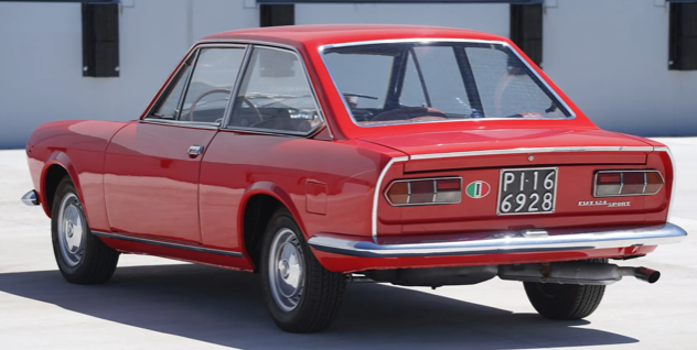
Both of today's featured cars are Fiat 124s of the same generation.  Both are sporty.  But they were designed by different men and their bodies were built by separate firms.  The convertible Sport Spider (pronounced "speeder" in Italy) was designed by Tom Tjaarda and built by Pininfarina.  The Sport Coupé was designed by Felice Mario Boano at Centro Stile Fiat, bodies were built by Fiat.  Both initial versions can be considered 1967 model year cars.

I previous wrote about these sporty Fiats here.  Background on the Spider is here, and for the Coupé here.  In my post I mentioned that I was (finally!!) in the market for a sports car in 1971 and test-drove a 124 Sport Coupé.  I liked the styling of the Sport Spider much better, but its price was a bit higher than I wanted to spend.  As for the Sport Coupé, I hated the driving position -- steering wheel too far from me and the floor pedals too near for comfort.  So I bought an entry-level Porsche 914 -- having a removable solid top more appropriate for Upstate New York driving than the Sport Coupé's ragtop's would have been.

The main non-styling structural difference between the two models was their wheelbases.  The Sport Spider's was 89.75 inches (2280 mm) and that of the Coupé was 95.3 inches (2420 mm) -- fairly significant.  The additional length was needed because the Coupé featured a small bench seat behind the driver's seat, something lacking in the Spider.  Of course, that and the fixed top affected the package Boano had to deal with.

In the Gallery below a Spider and a Coupé are compared.  The blue car is a 1971 Fiat 124 Sport Spider, the red car is a 1969 Fiat 124 Sport Coupé.  All photos are from Bring a Trailer Auctions.

Gallery

Headlight assemblies are slightly sunken, and the grille opening is sculpted to conform the that feature.  Overall, an appropriate composition.

An even simpler front end, though the turn indicator lights are somewhat arbitrarily wedged in.

This shows the headlight assembly area more clearly.  Subtly flowing fenderline.

The windshield appears to be carried over from the Fiat 124 sedan, though it is raked more steeply.


Wheel openings are similar.  The extra length of the Coupé is hard to establish given the two differently shaped bodies.  But note the Coupé's rear seatback lies above the car's axle line -- not a comfortable location when on bumpy roads.

Same Spider as in the other images, but auctioned again two years later.

Boano's  rear design is more spartan than Tjaarda's.  The aft panel here is similar to those found on Fiat 124 sedans (berlinas).

Interesting wedge effect on the fender interior sculpting.


Instrumentation is the same, but differently laid out.  Forward part of the central console seem the same.