Monday, April 29, 2024

1931 Daimler Double-Six 50 Drophead Coupe by Corsica

This post, "Very Long Hoods," is one of the most popular on this blog.  Among the cars pictured is the unique 1931 Daimler Double-Six 50 Drophead Coupe, body by Corsica -- the subject of today's post.

Corsica Coachworks (Wikipedia entry here) is interesting because it had no formal in-house design staff.  Instead, clients presented their wishes, and these were either refined by Corsica staff or else formalized by outside consultants.  I have found no claim regarding who actually designed today's featured car.

Some background can be found here, including: "Apart from its glorious body and impressive engine, this Daimler sits on one of the few chassis modified at Thompson & Taylor by Reed Railton to achieve an underslung chassis of the lowest possible height.  So much so, the fenders which surround the oversize 23 inch wheels nearly reach above the hood line."

Also: "The Double Six is named after a taxable RAC rating of 50 hp, but the modern rating is somewhere between 130-150 bhp.  Less then 10 cars were ordered with the Double Six 50 engine."

Its long wheelbase might be 142.5 inches (3620 mm), according to this confusing link (What cars are they actually discussing?).

Regardless, that V-12 convertible coupe was an astonishing design, vastly different from a common perception of Daimlers being tall, awkward limousines owned by members of the Royal Family.

Images of the subject car on the Internet are repeated in so many sites that I find it difficult to cite original sources.

Gallery

An earlier photo of the car.  Other photos on the Web show the color as a sort of pale yellow-tan with light brown fenders.  In any case, it wasn't painted black in its youth.  The registration plate looks like it was Photoshopped -- but might not be.

As seen at the 2006 Concours d'Élégance at Pebble Beach where it was named "Best of Show."

Its hood covers more area than its motor takes up.  Those two vertically oriented handles on the hood's side are near the edges of a folding engine-access panel, indicating the space the engine takes.  Also note the small air intake atop the hood about at the middle of the motor -- probably for carburation.

Note the almost-cycle fenders and abbreviated running board.

No bumpers fore or aft, making for a cleaner, but less-practical design.

I think this photo showing the raised top is by Pavel Novitski.

The hood takes up about half the body length abaft of the grille.  Note the tidy top.

Frontal view showing those large wheels/tires and high fenders compared to the height of the hood.

Thursday, April 25, 2024

Facel Vega Coupé Evolution

French Facel Vega automobiles powered by Chrysler Corporation V-8 motors were produced 1954-1964, as this Wikipedia entry mentions.  (A later, Facillia line had inline four-cylinder engines.)  The company made bodies for other firms along with its own cars.

Most Facel Vegas were expensive, sporty hardtop coupés and some cabriolets.  There was also the Excellence, a sedan line.  Enough coupés were imported to America that I can remember seeing some when they were new.

Styling of the coupés fell into three main versions: the original FV1 (1954-1955); FV2/FVS/HK500 (1955-1952); and the Facel II (1962-1964).  These cars might appear similar to a casual viewer because front end styling, fenderlines and rear ends were indeed similar.  The significant difference was the passenger compartment greenhouse.

Gallery

1954 Facel Vega FV1 Coupé - publicity photo
The Facel Vega frontal theme was established from the start.  The elements: a central, vertical grille opening flanked by smaller horizontal openings, all with the same grille bar pattern; a fairly simple bumper mounted below; and front fenders terminating in vertical headlight-related assemblies.  Here we find single headlights plus smaller auxiliary lights.  Also note the "art-nouveau" chrome treatment above the windshield and merging to above the side window.

1958 Facel Vega FVS Coupé - RM Sotheby's photo
The second generation grilles had more, smaller bar patterns and horizontal chrome strips dividing the two auxiliary openings.  I'm not sure regarding what appear to be quad headlights.  The lower lights have a central nub and need to function as turn indicators, there not being a dedicated light for that.

1963 Facel Vega II Coupé - Gallery Aaldering photo
Grille side openings are larger here.  Headlights are true quads.  Small turn indicator plus auxiliary lights are found between the headlights.

1955 Facel Vega FV1 Coupé - photo via Classic Car Garage
The passenger greenhouse is quite rounded.  Side window framing is strongly curved above the nearly horizontal beltline/fenderline.

1958 Facel Vega FVS Coupé - RM Sotheby's
Beginning 1955-56 windshields became wraparound/panoramic.  The A-pillar leans forward much like those on 1954-56 Oldsmobiles.  The roof's profile is less curved than on the FV1s.  Framing above the door window is straight, horizontal, while the curved section is over the secondary window to its aft.

1963 Facel Vega II Coupé - Gallery Aaldering
In line with American styling trends, the windshield has reverted from panoramic to backward-leaning A-pillar framing.  It's large and the glass curves vertically as well as horizontally.  The backlight window's size and shape seems almost the same as that of the windshield.  Side window framing is linear: no curves, and the roof is thinner with a straight profile line.  I find all this to be harsh, unattractive.  The front fender profile curves downward more than on previous cars.

1955 Facel Vega FV1 Coupé - unknown photo source
The rounded theme of the greenhouse is repeated on the trunk lid.  The tail light assembly theme continues with varioutions over all generations.

1958 Facel Vega FVS Coupé - RM Sotheby's
Minimal differences from this viewpoint.

1963 Facel Vega II Coupé - Gallery Aaldering
The trunk lid cutlines have changed.

Monday, April 22, 2024

Futuristic 1954 Oldsmobiles, Buicks and Their Chrysler Corporation Competitors

American automobile model year 1955 saw the greatest sales volume in history to that date.  Much of what sparked that sales surge was the announcement of redesigned (Chrysler Corporation, General Motors' Chevrolet and Pontiac) or massively facelifted (Ford, Mercury, Nash, Packard, Studebaker) cars, all featuring various kinds of panoramic (wraparound) windshields.

It was GM that launched wraparounds in what proved to be, not the wave of the future, but a fad or fashion whose welcome was passing by 1960.  That launch was for 1954 when Oldsmobiles, Buicks and Cadillacs got new bodies.

Those new GM cars seemed sensationally futuristic at the time.  Besides the panoramic windshields that had been previewed by "dream cars," those new designs featured low hoods, long trunks and proportionally higher passenger compartment greenhouses on those overall lower (than 1953) cars.  Of course, those new designs were popular.  Compared to the 1953 calendar year, calendar year 1954 sales for Oldsmobile, Buick and Cadillac respectively increased 36, 10, and 20 percent, while most other brands showed declines.  Overall 1954 American car sales fell 10 percent from 1953.  Ford and Chevrolet sales were fairly constant over the two years.

Suffering the most were the "independent" (non- Big Three) brands.  But Big Three member Chrysler Corporation's brands also experienced serious sales declines.  An important reason was their seemingly out-of-date styling.  I wrote about their '54 facelifts here.

Decline percentages for Chrysler brands were: 40 for entry-level Plymouth, the firm's highest-production line; 48 for Dodge, another normally high-volume car; 46 percent for DeSoto; and 37 percent for Chrysler.

In the Gallery below 1954 Oldsmobile and Buick four-door sedans are compared to Chrysler Corporation models with similar list prices.  This is an attempt to show the designs the typical buyer faced if considering sedans in those price categories.  Clearly, the GM cars sold well and Chrysler's didn't.  But were those GM designs actually better than those of competing Chrysler products?  From the perspective of 70 years later, the matter is not so clear.

Gallery

1954 Oldsmobile 88 - car-for-sale photo
The best-looking GM designs were on sporty hardtop coupes, but as mentioned above, sedans were generally the go-to models in those days.  (Buick was a 1954 exception where its hardtops often outsold 4-door models.)

1954 Buick Special - car-for-sale photo
GM Styling supremo Harley Earl usually favored high hoodlines suggestive of a powerful motor underneath.  But his 1954-1955 redesigned cars had high fenderlines and hoods not raised far above them.  As mentioned in the text, the key styling feature was the wraparound windshield.

1954 Dodge Coronet - unknown photo source
The competing Chrysler Corporation car.  Slightly smaller than the new GM B-body competition.  More rounded sides.  But there's that old-fashioned windshield.

1954 Oldsmobile Super 88 - RM Sotheby's photo
GM's more upscale B-body cars were almost identical to the entry-level ones so far as exteriors are concerned.

1954 Buick Century - Hessney Auctions photo
Buick's Century was basically a Special with a more powerful engine.

1954 Chrysler Windsor - car-for-sale photo
However, prices were high enough to yield their competition from Dodge to the Chrysler's lower-price Windsor line that had a different basic body.

1954 Buick Super - Saratoga Motorcar Auctions photo
Buick Supers and Roadmaster had GM's new C-bodies.  A-pillars are vertical, unlike the slanted B-body ones.  Hoods here are more raised and fenderlines slightly lower.

1954 DeSoto Firedome - car-for-sale photo
The competing Chrysler Corporation body is similar to GM's 1948-vintage C-bodies and 1949-1954 A-bodies mostly found on Chevrolets and Pontiacs.  The main similarity being the separate rear fender, a feature also seen on 1954 Packards.  The DeSoto's hood is high: Harley Earl would have been pleased.  These and some other style elements had been found on the road for several years, making DeSotos and Chryslers seem dated compared to the new GM cars.

1954 Buick Roadmaster - unknown photo source
Top-of-the-line Buick.

1954 Chrysler New Yorker - unknown photo source
Top of the standard Chrysler line (Chrysler Imperials were the firm's luxury line and priced much higher than the Buick).

Back in 1954, the Oldsmobiles and Buicks pictured here indeed seemed like glimpses into the future, and the Chrysler Corporation cars looked out of date.  Yet now those GM sedans strike me as looking more awkward than the Chrysler cars.  Why?  I think it has to do with the panoramic windshields.  They are bulky.  Their vertical and forward-slanting A-pillars interrupt the front-to rear design flow.  For that reason, Chrysler Corporation's redesigned 1955 cars with back-slanting A-pillars have aged better than competing models with GM-style wraparounds.

Thursday, April 18, 2024

Towards the Last Chrysler Airflows: Rear Body Design

As is well-known to automobile history buffs, the Chrysler Airflow was an engineering innovation success, yet also a styling and marketing failure.

Once Chrysler Corporation management realized that sales were far below expectations, a crash-project was started to make Chrysler and DeSoto Airflows appear more conventional.  This included redesigned grilles (I wrote about DeSoto Airflow grille evolution here).  Today's post deals with aft end treatments -- specifically the addition of integral trunks.

Gallery

1934 Chrysler CU Airflow Sedan - RM Sotheby's auction photos
Establishment photo of the best-selling 1934 Airflow model.
Trunk access was via the interior, there being no exterior lid.  Also, trunk capacity was limited.  That was typical of the times: for added space, exterior trunks were optional on a number of current, non-streamlined designs.

1935 Chrysler CZ Airstream Sedan - Hyman Ltd. photo
By the mid-1930s integral trunks became an optional body variation such as seen on this Chrysler Airstream.

1936 Chrysler Airstream Sedan - car-for-sale photo
The Airstream's next restyling resulted in a trunk further integrated into the basic body.

1937 Chrysler Royal Sedan - car-for-sale photo
The 1937 non-Airflow version.

1936 Chrysler C9 Airflow Sedan - car-for-sale photo
Airflows for 1935 retained the 1934 rear design.  But for 1936, integral trunks were added, the design being essentially that used on Airstreams.  The styling goal seems to have been to make Airflows as similar to mainline Chryslers as possible.

1937 Chrysler C17 Airflow Sedan - car-for-sale photo
The final-year Airflow aft end was unchanged from 1936.

Side-view comparison: the 1934 CU Airflow shown earlier.

1936 Chrysler C10 Imperial Airflow Sedan - RM Sotheby's Auctions photo
This car has a slightly longer wheelbase than the CU in the previous photo, but that affects an aft body design profile comparison only a little.

Monday, April 15, 2024

Datsun 240Z Walkaround

Back in 2015 I posted about the Datsun 240Z and stated:

"It was the sensation of late-1969. The Nissan S30 model, known as the Datsun 240Z in the the USA, triggered an intense "I gotta have one" reaction for those of us in a sports car frame of mind.  Sadly for me, 240Zs were priced a bit higher than I felt I could afford, so I settled on a Porsche 914 in 1971.  But I really, really wanted a Z."

Besides what I wrote in that post, here is more background on the car.

Now that there are more and more comprehensive photo sets about cars listed for sale on the Internet, it's a good time for a walkaround post dealing with the Z.  Photos below of a 1970 Datsun 240Z are from Bring a Trailer Auctions.

Gallery

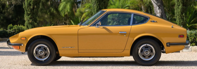
The grille is a simple extension of the hood.

No flabby lines.

Nice, long hood.  The driver's seat is close to the rear axle line.  Flowing fenderline with a straight character line crease below it: interesting contrast that helps transition to the lower body edge.

The rear panel area is functional.  Its details are not related to the nearby design.  Given the strong shape/color contrast to the surroundings, that doesn't matter as much as it otherwise might.

A hatchback, not a trunk lid.

Again, note the character fold on the side.

No kiddie seat behind the driver, so that fastback curve begins right behind his head.  This adds to the crisp design appearance.

A good design with no memorable features.  It requires being taken as a whole.

Dashboard with sunken instruments.

Thursday, April 11, 2024

1941 Cadillac Sixty Special Walkaround

When writing about a design I usually focus on the model year of first appearance.  That's because stylists usually believe that is when the design is its most pure form, before facelifts to "freshen" appearance for model year marketing purposes usually add clutter or apply trim that's less in keeping with the basic design.

This is no longer much of an issue because annual model year facelifts ended in the USA many years ago.  But it matters when dealing with cars built during annual facelift times.  (Of course, designs are still occasionally facelifted partway into an extensive multi-year production run, so my policy usually continues for some recent designs.)

Today's post features the 1941 Cadillac Sixty Special sedan, its basic body having been launched for the 1938 model year -- 1938-1941 Sixty Special's  Wikipedia segment here.  As noted, the '38 Sixty Special was styled by William L. (Bill) Mitchell (1917-1988), Wikipedia entry here, early in his career at General Motors.  He eventually became head of GM styling.

The 1941 design is of interest because it included features of '41 Cadillacs using bodies new for 1940 and 1941 while being based on the fourth model year of the original Sixty Special design.  In addition, it featured front fenders that extended onto the front doors, something GM introduced across nearly all of its product line for 1942.

Finally, I need to note that the 1941 Sixty Special was, on balance, more attractive than the original 1938 version.  That's because '41 Cadillacs had an outstanding grille design.

The photo of the 1938 Sixty Special is via Worldwide Auctioneers.  The 1941 Sixty Special photos are via Mecum Auctions.

Gallery

A 1938 Cadillac Sixty Special.  Its signature feature is the shaping of the side windows and their chrome trim.  The smoothly integrated trunk was an advanced feature at the time.  The grille is bold, but not especially distinctive.  Those detached headlight pods were old-fashion for 1938.

1940 Sixty Specials were little changed from 1938 aside from a reshaped grille.  The 1941 facelift was entirely new forward of the cowling and A-pillar.  The very front is the same as that found on the new B-body Cadillac model 63.  The Sixty Special has a longer hood, though its side air vent has similar detailing to that of the 63.

While the '38 car's front fenders are of the "suitcase" type, the '41 fender is moreso.  Seen from the side, the front third of the car strikes me as being a little too heavy looking, due mostly to the fender shape.

As mentioned, the after part of the design is nearly that of the 1938 original.

This rear view makes the car seem old fashioned compared to newer American designs: too tall, too narrow looking.


Upper front door hinging is the same as on the 1938 car.

Frontal heaviness is apparent here too.  I think it's the high after part of the fender.

Ah, but the front.  It has the classic 1941 Cadillac grille.