Thursday, February 29, 2024

Austin-Healey Sprite Mark I Walkaround


Austin-Healey Sprites (Wikipedia entry here) entered production in 1958, a run that lasted into 1971.  The best-known Sprite design (shown above) was what's now called the Mark I (of 1958-1961).  I posted about it here.

Today's post is a walkaround that offers more detail and evaluation than my previous effort.

The Sprite was an entry-level sports car where development and production costs were minimized perhaps more strongly than normal.  Maybe the best-known instance is the "Bug Eye"or "Frog Eye" headlight assemblies.

As I noted in my previous post: "... it was originally intended that the Sprite's headlights would be hidden when not in use.  They would pivot upwards when turned on in the manner of cars such as the Porsche 914.  However, this feature was rejected for reasons of cost.  Another solution would have been to place headlights on the front fenders, and this was done on the second-series Sprites."

With the passage of time, those headlights seem lovable for some folks.  But not me.  Yes, they made Sprites distinctive from a marketing standpoint, yet styling-wise, I consider them a negative.

Photos of the 1961 late-production Mark I Austin-Hearly Sprite featured below are via England's Historics Auctioneers.

Gallery

The face of the car has those prominent "eyes" and a grille in the form of a smiling mouth.  I don't know if that effect was intentional, but it might well have been.

The body has flat sides and rounded ends.  No sheet metal sculpting, no chrome trim on the sides.

Wheelwell openings are rounded, a simple and appropriate solution.

No trunk lid -- that didn't appear until the Mark IIs came along.  Note the attachment seams atop the fenderline above the tail lights.  Mark IIs were given new fenders similar to those later found on MGBs.

Rear bumper protection is skimpy.

Note the hood cutlines.  The entire body front pivoted upwards from hinges on the firewall -- a massive hood.  This too was changed on the Mark IIs.  Aside from the headlights, the side profile is simple.  But not totally so, as there is subtle curving of the fenderline/beltline.

The cockpit with its simple, Spartan dashboard.

The Mark I Sprite's design is basically pretty good, considering its intended price-point.  It would have been better if: (1) headlights were retractable as originally planned; (2) a different grille shape was used, perhaps a rectangular theme as found on the Mark IIs; and (3) there was a trunk lid for practical, not aesthetic reasons.

Monday, February 26, 2024

1935-1936 General Motors A & B & C Body 4-Door Sedan Comparison

According to Michael Lamm and David Holls (here, page 97) General Motors' shift to multi-brand body platforms began in 1931 from an analysis of current production bodies by Vince Kaptur.  This took a while to implement, but was in force by the 1936 model year for all GM cars, perhaps aside from luxury vehicles.

Factors that brought this into play were the Great Depression that resulted in fewer sales and lesser income as well as the shift to all-steel bodies that required more expensive production tooling.

Platforms were designated by letter.  The link above states:

"Harley Earl showed Kaptur's conclusions to Fished Body and suggested that all GM cars share four basic body shells.  He designeted these A-B-C-D.  The A-body would be used by Chevrolet, standard Pontiac and small Oldsmobile.  The large Pontiac, mid-size Oldsmobile and small Buick would use the B shell.  The C-body accommodated the big Olds, big Buick, LaSalle and small Cadillac.  And all Cadillac and Buick limousines used the D body."

That was the concept, but details varied over time.

Wikipedia has entries dealing with the bodies dealt with in this post: A platform here; B platform here; C platform here.  At this time I drafted this (February 2024), some details did not agree with Lamm and Holls, who I am more inclined to trust.

The problem is, aside from Chevrolets, the bodies of other GM cars look essentially the same regarding profiles, door and window shapes and such.  That is, they seem to share most body tooling and sheet metal stamping.  Therefore, body type is difficult to clearly identify, the information in the quote above not being helpful.  I lack charts of body dimensions, so the analysis below is simply based on study of photos.  More precise information is greatly appreciated.

Photos below are of cars listed for sale on the Internet.

Gallery

1935 Chevrolet Master DeLuxe
This is the new A-body Chevy.  1934 Chevrolet Standards carried over 1934 bodies.

1936 Chevrolet Master DeLuxe
The main change for 1936 was replacing the forward "suicide" door with one hinged on the A-pillar.  Note that the back of the passenger compartment drops nearly vertically.

1936 Pontiac Master Six
About the same wheelbase as the Chevrolet Master DeLuxe, but with a different aft profile.  Might this be a B-body?  Wikipedia says this is an A body.

1935 Oldsmobile F-35 Six
Another example of a possible 1935 B-body 4-door sedan, though Wikipedia has this as an A.  Front doors hinge on the B-pillar, sharing the shape seen on the 1935 Chevy in the top image.  The new "Turret Top" (without a fabric insert) had its shape dictated by body engineers more than stylists who echoed the roof curvature in the window shapes.

1936 Oldsmobile L-36
The larger Olds Eight, with what seems to a C-body -- or B, according to Wikipedia.  Quite similar to the Olds in the previous image, but note the top hinge on the C-pillar is mounted higher.

1936 Buick Century
Buicks did not get the new bodies until the 1936 model year.  This seemingly is like the above Olds Eight -- a B, Wikipedia says.  The hood is long to accommodate an inline eight cylinder motor.

1936 LaSalle 50
According to the quote above, this LaSalle should be sporting a B-body, if Wikipedia is correct.  That should confirm my guesses regarding the two cars shown above.  But...

1936 Cadillac 70
Wikipedia has this as a C-body.  Yet it looks like the LaSalle -- which brand Wikipedia ignored in the links above.

Yes, plenty of guesswork here.  Aside from Chevrolet, there's so much similarity that I wonder if 1935-36 B and C bodies were worth different labels.

Thursday, February 22, 2024

1953 Lincoln XL-500 Concept

The Lincoln XL-500 was one of Ford Motor Company's earliest concept cars, a near-contemporary of Ford's X-100 revealed as a full-scale model in 1952 and as a functioning car in 1953.

Unlike the X-100, the XL-500 was what has been called a "pushmobile," lacking any motor and related running gear.  In fact, even its doors were shallow cutlines on the body sides.  Entry was via side widows that lacked glass.

Nevertheless, its design is worth some study, as its styling was closer to future production than the X-100's.

Images below are via Ford.

Gallery

As seen at a car show.

Hood and fender height are similar to that of the 1952 Lincoln.  Hooded headlight assemblies similar to the X-500's appeared on 1956 Lincolns.  The bold bumpers with "Dagmar" guards are in line with early-1950s American styling fashion, though the unprotected prow was not.  (My 1965 VW Karmann-Ghia was similarly vulnerable to denting.)

The wide, B-pillar (potentially a roll-bar) saw production on 1955 Ford Fairlane Crown Victorias.  The fenderline hump above the rear wheel is clearly non-functional with respect to spring jounce.  Also note that the bulge is not centered above the rear axle line.  Perhaps the shape was selected before the wheelbase was finalized.  Or else it was though that it related better to the C-pillar than if it were aligned with the rear axle line.

The feeling (not the precise detailing) of the tail light assemblies appeared on 1955-56 Mercurys.

View of the interior through the transparent roof.  Automatic transmission gear selection buttons are seen on the steering wheel hub.

Overhead view at a car show.  Hood humps appeared on Ford Motor Company cars starting with the 1952 model year.

Monday, February 19, 2024

2019-Vintage Comparison: Toyota Camry, Toyota Avalon and Lexus Es

Different automobile brands or models sharing the same basic body structure is nothing new.   General Motors was doing that by the 1930s.  I find it interesting from both brand-identification and styling standpoints.  What it boils down to is the efforts of styling staffs to be creative, given technical and marketing restrictions.

For this post, I've chosen to feature a fairly recent Toyota Motor Corporation platform used for some of its most important brands sold in North America.  Those cars are the Toyota Camry, Toyota Avalon, and the Lexus ES.

More specifically, the Camry is the model introduced for the 2018 model year, the Avalon is the 1919 model (the final one, as Avalons were discontinued after 2022), and the 2019 Lexus ES.  The links each note that these cars share the same platform.

Toyota has the financial punch to invest in tooling for a comparatively large number of detail variations on the basic form, which makes today's presentation even more interesting because the designs are superficially quite different.

The Avalon and Lexus have a 113.0 inch (2870 mm) wheelbase, whereas the Camry's wheelbase is 111.2 inches (2820 mm).  I need to note that the Avalon was the Toyota brand's upscale North American model while the Camry is Toyota's best-selling sedan in that market.

Gallery

2018 Toyota Camry
First, some side-views.

2019 Lexus ES
The difference in length lies between the B- and C-pillars: note the wider rear door.  The Lexus' roofline has a different taper than the Camry's.  Door handles are in the same relative positions, but most side sheetmetal differs.

2019 Toyota Avalon
As noted, same wheelbase as the Lexus.  Roof curve is the same, but the Avalon is a six-window car, unlike the others.  The door handles and beltline seem the same as the Lexus'.  Again, differing side sheet metal.  Greenhouses forward of the B-pillar are virtually the same for all three

2018 Toyota Camry
The three cars have differing sheet metal, trunk lid cutlines, and even backlight windows.

2019 Lexus ES

2019 Toyota Avalon
Rear bumper impact areas seem the same on the cars.

2018 Toyota Camry
Note the "knock-knee'd" grille structure theme that echoes ...

2019 Lexus ES
... the Lexus brand's upside-down back-to-back Lexus "L" theme used since the mid-2010s.

2019 Toyota Avalon
All three cars feature similar shaping in the vicinity of the fender fronts, also hood profiles.  However, the Avalon's grill lacks the pinched theme seen above.

2021 Toyota Camry
Interestingly, the 2021 Camry facelift dropped the pinched look, replacing it with wide, horizontal bars Ă  la Avalon.

2018 Toyota Camry
Some frontal views for comparison.  All three have their brand symbol placed high and centered.  Hood cut lines are similar.

2019 Lexus ES
I hate this grille theme, distinctive though it is.

2019 Toyota Avalon
There is a subtle, wide "V" theme in the central grille area formed by subtle shaping of the horizontal bars.  The framing is unrealistically large.  But too-large grille elements have been on Audis for many years and are recently found on some BMW models.

Thursday, February 15, 2024

Merkur XR4Ti Walkaround

During the later 1980s Ford Motor Company created a short-lived brand for the USA called the Merkur.  It was sold at selected Lincoln-Mercury dealerships.  The two-doors-plus-hatchback Merkur was an Americanized version of a European Ford Sierra model.  Some Merkur background is here.

Merkurs did not sell well, only 42,464 were built during five model years (1985-89) -- an average of 8,493 units per year.  The Wikipedia link above, as of late October 2023, claims low sales resulted from fluctuating exchange rates for U.S. and German currencies (Merkurs were imported from Germany).  Resulting prices were high, limiting consumer demand.

My reaction in 1985 when the sporty Merkur XR4Ti was introduced had to do with its styling.  The design struck me as being unnecessarily complicated.  I suspect many potential buyers had a similar reaction.

Now that nearly 40 years have passed, we might as well take a second look at the XR4Ti.  Photos below are via Bring a Trailer Auctions.

Gallery

The Merkur logotype badge was not stylish.  Note the broad license plate zone below the bumper -- a carryover needed for those wide European plates.

Frontal styling is disrupted by that license plate zone.  Elements above the bumper do not relate well to those below.

The fussiest aspect of the design is abaft of the B-pillar above the beltline.  I notice a D-pillar behind the C-pillar.  Too many windows for a coupĂ©.

Then there are the dual spoilers on the hatch door, one partly blocking driver vision to the rear.  Perhaps there were aerodynamic reasons for this, but the resulting clutter degraded appearance.

Otherwise, rear end design was undistinguished.

That after side window really bothers me.

Part of its problem is the C-pillar.  It probably needed to be wide for structural reasons.  It could have been less visible by having thin brightwork outlining the entire window set and perhaps painting the C-pillar black or a dark gray.  This might better separate the passenger compartment greenhouse from the lower body.  As things stand, the comparative lack of separation makes the design seem heavier.

Too bad the hood could not have been lowered a little.

Monday, February 12, 2024

Pontiac's Mid-1950s Facelift Pattern

Nowadays car designs often are unchanged for a few years after a redesign, and even for an entire multi-year production cycle.  If a facelift does occur, it would often be sometime near the middle of that cycle.

But in America from the 1930s into the 1960s and even beyond, facelifts happened each model year following the new design's introduction.

The idea of facelifting was to make the next year's model different enough from the existing one that potential buyers would be pleased to be seen driving a car that was truly "new."  And drivers of previous-years cars might be made to feel that their car was "old," and so be tempted to replace it with a "new" one.

That was what stylists referred to when they said that the first design on a multi-year production run was the most "pure" -- the often arbitrary facelifting degrading that purity.

Another purpose for facelifting was to preview some styling features that were set to appear on the next complete redesign.

So what often happened for three or four year production cycles would be as follows.  The first model year would feature the supposedly "pure" design.  Intermediate years would find arbitrary detail changes.  The final-year styling would include a few "preview" details.  An example is Pontiac for model years 1955-1957, the subject of today's post.

Gallery

1954 Pontiac Star Chief Catalina - Mecum Auctions photo
The last year of a two-year cycle (1953-1954).  The general body shape is similar to the previous 1949-1952 series, so we might instead think in terms of a 1949-1954 cycle.  What's interesting in the context of the discussion above is that there was virtually no thematic carryover from this design to the totally redesigned 1955 Pontiacs.  One subtle preview is the stretched oval in the grille bar -- it harkens to the overall grille opening shape on '55s as seen in the image below.

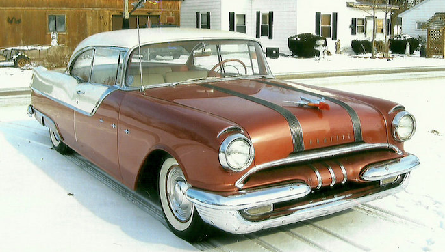
1955 Pontiac Star Chief Catalina - Mecum
Instead of traditional Silver Streaks running down the center of the hood, we find two, separated, sets of streaks.

1956 Pontiac Chieftain Catalina Coupe - Mecum
The mid-1955-1957 cycle facelift retained the dual Silver Streaks.  The grille and side trim are new.

1957 Pontiac Star Chief Catalina Coupe - Mecum
Pontiac and Chevrolet shared the same basic body that was given a major facelift for 1957.  The cowling and hood were lowered and the trim theme completely changed.  The new grille design harkens to the 1935-1956 Silver Streaks, but there are no true streaks remaining.

1958 Pontiac Star Chief 4-door sedan - car-for-sale photo
The redesigned 1958 Pontiac.  The side trim theme is retained with detail changes, as is the wide grille.

1954 Pontiac Star Chief Catalina - Mecum
THe 1954 Pontiac as seen from the rear quarter.

1955 Pontiac Star Chief 4-door sedan - car-for-sale photo
Carried over are round tail lights.  The Silver streaks are off the trunk lid and on the small tailfins.

1956 Pontiac Chieftain Catalina Coupe - Mecum
Few changes here, though there's some new rear fender sculpting forward of the tail lights.

1957 Pontiac Star Chief Catalina Coupe - Mecum
Entirely new theme here containing elements previewing 1958.

1958 Pontiac Star Chief 4-door sedan - car-for-sale photo
Both the '57 and '58 have rear fenderline extensions.  Tail light assemblies have oval shapes in both designs.  Trunk lid trim is about the same.  But the tail lights are round again.