Monday, July 31, 2023

1949-Vintage Nash Body Types

Nash cars usually were styled close to current design fashion though the 1948 model year.  Then things changed, as I described here in my post "Nash Airflyte: 1940 Car of the Future Made Real in 1949."

By the late 1930s and early 1940s it was widely assumed that future automobiles would have highly streamlined, rather teardrop-shaped bodies where wheel openings were essentially eliminated to provide smooth sides.


An example is this 1941 rendering by Gil Spear for Chrysler.

As it happened, by the end of World War 2 when American car production resumed, the consensus had shifted.  Most carmaker's postwar redesigns were lower, longer versions of 1942 forms with bustle backs and flow-though fenderlines.

Only the redesigned 1949 Nashes followed the pre-war thinking.  It was a marketing mistake that was corrected when the boxy 1952 Nash line appeared.

An important problem with the 1949 Nash design was that the cars looked heavy, not lithe.  And their rounded shape led many observers, including the young me, to refer to them as "upside-down bathtubs."

Nashes came in two model lines, the 112-inch (2856 mm) 600 / Statesman, and the 121-inch (3073 mm) Ambassador.  There were 4-door sedans and 2-door cars that were given a variety of names (Brougham, Coupe, Club Coupe) even though they looked the same.

1949 and 1950 standard Nashes were essentially identical in appearance.  One detail difference was found on front bumper guards.  Therefore, the images below are an assortment from both model years.

Gallery

1950 Nash Ambassador 4-door sedan - RM Sotheby's photo
General view of the design.

1950 Nash Ambassador 4-door sedan - for sale car
Side view of an Ambassadot 4-door.

1950 Nash Statesman 4-door sedan - Ben Piff photo
The Statesman version is the same abaft of the cowling, the Ambassador having a longer front end forward of the A-pillar door cut line.

1950 Nash Ambassador 2-door - Mecum Auctions photo
Two-door models had the same roof profile.  Front doors were wider and the B-pillar leans forward.  Aft side windows could be rolled down at least partially on sedans (and possibly on coupes as well).

1949 Nash 600 2-door - for sale
The 600 (1949) / Statesman (1950) model seems closer to the 1940-vintage streamlined concept than the Ambassadors due to the shorter hood.

Thursday, July 27, 2023

Some Mercedes "Autobahnkurier" Examples

Streamlining - both aerodynamic and sylistic - was The Next Big Thing in automobile body design around the mid-1930s.  Mostly, cars were given a marginally aerodynamic treatment in the form of rounded rear ends, while front ends retained the usual pre-streamlining features.  In other words, little aerodynamic efficiency was gained.

This was happening in Germany as well as the other main car-producing countries in those days - USA, England, France and Italy.  The German firm Adler even made some cars that were aerodynamically more efficient, as did Hanomag and Horch.  Mercedes-Benz also made at least one aerodynamic passenger car, but mostly opted for the rounded rear option on a few cars called Autobahnkurier.

The term Autobahnkurier was applied to some Mercedes W29 Typ 500K and 540K coupés (the W denotes Werknummer - "Works Number" - a more precise designation than the Typ "Type" number that can and has been applied to more than one Werknummer over the years).  Wikipedia entries for the 500K and 540K are here and here.

Besides those coupés, some Mercedes Stromlinien Limousine - streamlined sedans - have been referred to as Autobahkuriers, though perhaps not by Mercedes.   (My personal library and the Internet are lacking regarding official Mercedes-Benz designations.)  Regardless, today's post presents some examples of both coupés and four-door sedans wuth traditional front ends and rounded rears.

As best I can tell based on Internet searches, some steamlined sedans were W18 Typ 290 based, and others were of W142 Typ 320.

Sources disagree regarding the number of true Autobahnkuriers built, also the number of survivors.  Some say ten were made, others claim 12.  As for survivors, for certain, one 500K exists, as does one 540K.

Autobahnkurier bodies were desined by Friedrich Geiger (1907-1996), who later was in charge of Mercedes styling.

Photo sources for the surviving 540K are extremely varied, and mostly defy citation, as the car has appeared in a number of shows and apparently lacks an official set of images.  Also, given the similarity of the streamlined sedans, the type designations found on the Internet might not be accurate.

Gallery

1934 Mercedes W29 500K Autobahnkurier
One of my sources claims that this was the original Autobahnkurier displayed at the February 1934 Berlin automobile show.  It's a very attractive design in line with the emerging "streamlining" styling details of the day.

Those details include teardrop-profile fenders, smooth downward passenger compartment greenhouse profile, V'd two-piece windshield, and the boat-tail aft planview of the greenhouse.  Note the high, tiny, impractical backlight window.  Compare the overall design to the 1933 Cadillac Aero Coupe.

500K Autobahnkurier owned by the Shah of Persia - photo via Wikipedia
This photo was taken at a Teheran car museum.  The hood is shorter than seen in other coupé photos.  Might the photos above actually be of a 540K?  Or perhaps the car in those photos was given a version of the longer 129.5-inch (3290 mm) wheelbase instead of the 117.3-inch (2980 mm) wheelbase chassis probably used for the car shown here.

540K Autobahnkurier - unknown photo source
From this perspective, the passenger compartment seems quite short, though the car's proportions are similar to the much-admired 500K and 540K roadsters.

1935 Mercedes W18 Typ 290 Stromlinien Limousine - factory images
The design shown here is on a W18 platform according to the Internet photo source, and it looks the same as that shown below as W142s.  Therefore, I cannot guarantee that the Werknummeren jibes with the images.  That said, the streamlining details are not as strong as on the Autobahnkurier design shown above.  For example, two-segment windshield is not as strongly V'd as the coupé's.

The greenhouse profile has a slight ogive curve.  The rear fender is not quite teardrop in profile, though it is spatted, like the coupé's.  Doors are hinged on the B-pillar, but that pillar is thin above the beltline.

The backlight window is two-piece, divided by that central fin or windsplit running down over the spare tire lid.

1938c Mercedes W132 Typ 290 Stromlinien Limousine - unidentified photo sources
As mentioned, the body design is the same as the one just pictured.

This photo might be via Daimler Benz's museum.  Tail lights appear here, but not on the W18 images.

The three-pointed star at the bottom of the fin/windsplit is a cute detail.

Note the contrast between the traditional front and "streamlined" rear.

Monday, July 24, 2023

Aston Martin Lagonda Series 2: Low and Angular

Nearly ten years ago I wrote about the Aston Martin Lagonda Series 2 design.  Since then, more images of  those cars have appeared on the Internet, so now I can present a walkaround sequence showing the styling in much greater detail.

There were four production series: Series 1 (1974-75), Series 2 (1979-85), Series 3 (1986-87) and Series 4 (1987-90) with 645 built, all told.  The first series amounted to fewer than ten cars, as the second link above mentions.  It also states that its cars were based on Aston Martin components, whereas Series 2 and later cars had a unique platform.  A prototype was displayed in 1976, but production cars were not marketed until 1979.

In my earlier Aston Martin Lagonda post, I noted: "[I]n my judgment the design suffers because of the dimensions of the 'package.'  The car is simply too long and too low; its proportions would make almost any styling seem wrong."

Keep in mind that a long-term design trend was to increasingly low car bodies.  By the early 1970s this yielded some sports cars and show cars whose height had reached levels essentially impractical for everyday use: for example, the 1966-73 Lamborghini Miura and 1968-78 Lamborghini Espada.  At the same time, the current styling fashion was for cars to be angular-looking: razor-edge all-over.  Both factors dominated the Aston Martin Lagonda design created by William Towns.

Here are Series 2 dimensions as reported in the Wikipedia link: wheelbase, 114.8 inches (2916 mm); length, 208 inches (5282 mm) and height, 51.3 inches (1302 mm).  Clearly, overhang was enormous.

Gallery

Circa 1966 Volvo 144
An example of angular styling on a car with practical passenger packaging dimensions.

1984 Lagonda Series 2 Saloon - Gallery Aaldering photo
And here is an Aston Martin Series 2 Lagonda.

1980 Lagonda Series 2 Saloon - Bonhams auction photos
Now for the walkaround.  Plenty of razor-edge angularity.

Yet the styling is professional, with few errors aside from the overall proportions.

Long hood, short, all-overhung trunk.  Note the chin spoiler at the front.

The full-length rub-bar transitions to the upper edge of the rear bumper.  I'm not sure of the purpose of the panel on the C-pillars; seems set too low for a potential knock-out opera window.  Perhaps one is a fuel filler cover.

Tail light and reflector assemblies are geometrical.  But other lines are subtly curved, as on Greek temple columns.

Sigh: If only the car were slightly taller, all might have been well.

The steeply raked windshield helps aerodynamic efficiency.

Consistency: the rub strip meets the top of the front bumper, as it does the rear bumper.  The body flares outwards near its lower edge.

The cockpit is quite angular in spirit with high-tech details.  The steering wheel's single spoke recalls that of the Citroën DS.

Thursday, July 20, 2023

Giugiaro's Alfa Romeo Giulia GT by Bertone

One of famed designer Giogetto Giugiaro's best designs when he worked for carrozzezia Bertone was the Alfa Romeo Giulia GT Coupé, the subject of this post.

Although a 1960s effort, it was still in the tradition of classic late 1940s and 1950s Italian coachbuilding.  Moreover, its styling language derived from earlier Alfa Romeo coupés by Bertone such as mid-1950s Giulietta Sprints designed by Franco Scaglione.

Giugiaro's design was so good that it remained in production from 1963 to 1977 with minor changes, according to the link.

Gallery

1967 Alfa Romeo Giulia Sprint GTV - Bring a Trailer auction photos
The passenger compartment greenhouse was tall and airy.

Note the large backlight window.

1967 Alfa Romeo Giulia Sprint - Bring a Trailer auction photos
Earlier Giulia Sprints had an air vent opening along the front edge of the hood.

Wheels were simple by today's standards.

1971 Alfa Romeo Giulia Sprint - Gallery Aaldering photos
This later model lacks the hood air intake, cleaning the design a bit.  Post-Giugiaro, however.

The quad headlights are unfortunate, but at least have differing diameters to provide some visual variety.

GT Sprints were short, having a wheelbase of 92.5 inches (2350 mm).  But the design was crafted so that the car seemed longer and more graceful than its actual size should have permitted.

Rear end details in the bloc where the license place and tail lights are found are only slightly linked to side sculpting.  This might have been necessary to maintain the subtle side profile effect mentioned above.

Raised fender tops add interest and sculpting to the rear of the car.

Aside from bumpers, the only brightwork abaft of the grille is for window framing.

Wheel well openings are large, but the aft ones have flattened upper profiles so as to relate better to the strong side sculpting and busyness in the area of the C-pillar.  A round profile would place too much visual activity in that area.

Grilles retained the Alfa Romeo shield shape, but details changed over the years.  Raised front fender tops echo those at the rear, providing continuity.

Monday, July 17, 2023

1949 Buick Four-Door Sedan Mixed-Walkaround

The design of the 1949 senior Buicks has always interested me because it exemplified General Motors' styling chief Harley Earl's post- World War 2 theme preferences.   I wrote a post titled "Cascading Curves: 1949 Buick" dealing with that.

Since that 2014 post, more images of '49 Buick Supers and Roadmasters have appeared, allowing me to present more detail regarding styling of four-door sedans.  Unfortunately, I still haven't found a "walkaround" photo set for a single automobile.  So rather than waiting and waiting for something that might never happen, today's post is a walkaround built from photos of several cars.  Some are line-leader Roadmasters, others are mid-range Supers.

Unless noted, images are of for-sale cars.

Gallery

1949 Buick Roadmaster
Harley Earl really liked large-radius curves, and there are plenty of them on '49 Super and Roadmaster sedans.  As mentioned in my previous post on the subject, curves are positioned so as to appear "cascading" downwards.  That is apparent in this rear-quarter view.

1949 Buick Roadmaster - Mecum Auctions photo
A partial side view showing fairly standard (for GM at the time) bustleback  roof and trunk lid curves.  Those are functional.  But the rear fender curves associated with the tail light assembly are decorative, echoing those functional curves.

1949 Buick Super - Mecum
Now for the walkaround.  Bold, vertical grille bars were a strong Buick theme for model years 1942-1954 and occasionally after.  The shape of the grille frame and related hood sculpting are carryovers of themes dating from the 1920s.

1949 Buick Super - Mecum
Supers had shorter wheelbases than Roadmasters, and had only three instead four "portholes" on front fenders.  Otherwise, Supers and Roadmasters looked the same.

1949 Buick Super
The fender design appeared across most of the GM line in 1949.

1949 Buick Roadmaster
The lighting for this photo shoot creates highlights that somewhat obscure the shape of the body.

1949 Buick Roadmaster
A massive bumper, but otherwise a pretty clean rear design.  Note the curves descending from the roof and trunk centerline.

1949 Buick Super
Basically an attractive design, though slightly fussier than 1948 Oldsmobile 98s that shared the General Motors C-body.

1949 Buick Super - Mecum
Curves everywhere -- the windshield, hood, grille bars and more.

Thursday, July 13, 2023

Generation 6 vs. Generation 5 Chevrolet Camaro

A reader wrote me to ask my opinion on the 6th (2016) generation Chevrolet Camaro styling versus that of the 5th (2010) generation Camaro.  Truth is, I hadn't paid much attention to the 6th generation design because it is superficially similar to that of the 5th generation.  And, especially, since I'm not in the market for a Camaro, I was only vaguely aware that there even was a 6th generation.  Mea culpa.

The Camaro Wikipedia entry discusses the various generations is here.  I wrote about the evolution of Camaro styling through the 5th generation here.

According to Wikipedia, the 5th generation cars were based on General Motors' Zeta platform of 2006-2017.  Given that 2017 phase-out, Chevrolet needed a new platform for its Camaro line.  So the 6th generation was based on GM's available 2012 Alfa platform used for smaller Cadillacs.  This platform is to be phased out, which is one reason why current speculation holds that future Camaro-type cars will be on electric platforms.

This Zeta-to-Alpha platform change meant that Camaros had to be redesigned for the 2016 model year or thereabouts.   Apparently, folks at GM thought 5th generation styling was so appropriate that the 6th generation cars should look pretty much the same in general, though differing in details.

As for these recent Camaros, wheelbases are: 2010 = 112.3 inches (2852 m); 2016 = 110.7 (2812 mm). Lengths are: 2010 = 190 inches (4826 mm); 2016 = 188.3 inches (4783 mm).  No important differences here.

All images below are via Chevrolet.

Gallery

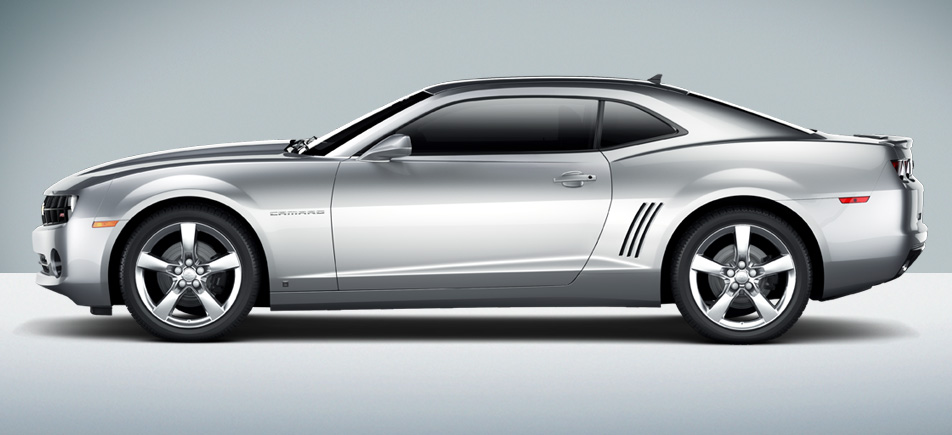
2010 Chevrolet Camaro Coupe

2016 Chevrolet Camaro Coupe
Windshields look alike, hood bulges are similar.  Front impact area is more thin on the Gen-6 and the air intake zone taller, though widths are about the same.  Headlight-to-headlight sweep is much less tall, but the '10 character remains.


The '16 passenger compartment greenhouse seems a trifle shorter and its profile is more curved.  Door shapes are similar, but not the same, further implying the new structure.  The large, sculpted wheel openings help retain the '10's character.  Side sculpting differs, the Gen-6's lacking the Gen-5's mid-body carry-through crease.  The roughly similar window profile helps carry the Gen-5 theme.


The most noticeable change here is the shape of the tail light assemblies, though all the sculpting has been changed for 2016.  Given the small amount of carryover (mainly the backlight window and C-pillar area), the design still says "Camaro."