Thursday, June 29, 2023

Saoutchik's Streamlined Dalahaye and Talbot Compared

Early in 2022 I wrote about coachbuilder Saoutchik's Delahaye 175 Coupe de Ville of 1949.  It was fairly typical of the wild designs Saoutchik was making in those days.  That said, it had a passenger compartment with an uncluttered fastback that was in the same spirit as 1940s General Motors fastbacks.  I regard it as one of Saoutchik's better post- World War 2 designs

Recently, I came across a Saoutchik design that was similar, yet much better.  It was for a 1950 Talbot Lago T26 Record Grand Sport CoupĂ©.  As was the case for the Delahaye, I don't know how many such bodies were built.  Based on photos found on Internet searches, there seem to have been at least two survivors, and possibly more were made.

The Dalahaye is longer, having a 116.1-inch (2950 mm) wheelbase, whereas that of the Talbot is 104.3 iinches (2650 mm), as the Wikipedia links above state.

Images of the Delahaye are from Barrett-Jackson auctioneers, and most or all of the Talbot are via RM Sotheby's.

Gallery

Frontal design of the Delahaye 175 is largely standard Delahaye, aside from the flamboyant fender work by Saoutchik.

The upper grille frame outline is Talbot, but the rest of the design is by Saoutchik.

Interesting side styling.  The chrome strip extending from the side of the hood to below he beltline to the top of the rear fender does all this in one sweep.  This ties the otherwise somewhat fragmented design together.  The rear fender bulge and the fadeaway front fender reduce visual bulk on what otherwise would have been a slab-sided 1949 design.  That front fender side sculpting and its different paint color assist in this.

Note the narrower door and shorter passenger compartment.  The fenderline is more "modern" than that of the Delahaye.  It's higher, but has subtle shaping below the beltline.

The rear styling is clean and well-shaped aside from the heavy fender chrome.

This Talbot is remarkably brightwork-free for a Saoutchik design, though note the strip tailing abaft of the door, extending along the trunk lid.  At least it's narrow.

Now for two additional Talbot images.  This is a well-styled design in the context of 1950 and in the context of Saoutchik's normal flamboyance.  

This example looks good in part because it lacks bumpers.  What effect might they have?

Here's a photo of another Saoutchik Talbot, this via Bonhams.  It has bumpers, but they don't degrade the design much.

Monday, June 26, 2023

1960s Styling Renderings of Exaggerated Cars

Stylists' sketches and renderings often exaggerate their design's appearance by using various kinds of distortion.  But often enough, such distortion is minimal, and it is the shape of the designed car that's extreme -- at odds with everyday usage practicality.  In other words, such designs would almost never see production as-is.

From the late 1950s into the 1960s a good many such presentation drawings featured cars that were too long to be practical.  Some sort of stylist fashion that I find hard to explain.

A large proportion of the renderings shown below are of Cadillacs, and three of them are by Wayne Kady, who at one point was head of Cadillac's advanced design studio.  So perhaps other Cadillac stylists were influenced by him.  Of course, Cadillac's status as a large, luxury automobile gave some permission for exaggeratedly long shapes.

Not all the images below are of Cadillacs, so the fashion seems to have been general in the American auto industry in those times.

Gallery

Oldsmobile design by Peter Wozena - 1958
A late-'50s example.  The exaggeration is the long trunk / rear fender area abaft of the passenger compartment.

By A.D. Tony Miller - 1960
The wheelbase is too short (note the rear wheel's relationship to the passenger compartment), and front and rear overhangs are extremely long.

By Syd Mead - early 1960s
A hugely long future limousine.  Also, impractically low.

Cadillac, by unidentified - c.1961
Basically an instance of "styling jazz."  The car has four doors, but the after doors lead to a windowless compartment.

Cadillac, by unidentified - c.1962
Not as jazzy as in the previous image, and more Cadillac-like to boot.  Overhang is vast.

Cadillac by Wayne Kady - 1963
Either the passenger compartment is too small or the car is huge.  Consider the size of the exposed tire, then the apparent space for the driver and passengers: one or the other has the wrong size.  As usual, extreme overhang.  One interesting detail is the fully-spatted rear wheel well, a feature that was pretty retro by the early '60s.

Cadillac by Wayne Kady - 1964
I think this design goes beyond styling jazz to the point of being ridiculous.  Must have been inspired by slingshot dragsters (not Cadillac things, those dragsters).

Cadillac by Wayne Kady - 1966
More miles of overhang.  The sides appear bulged out too far.  Note the car seat tops do not follow perspective rules.

Pontiac? by Wayne Kady - 1966
Another too-short passenger compartment.

Cadillac by John Perkins - 1966
The car is too low for human occupancy: Try to visualize where the driver might actually fit.

By Robert Ackerman - 1966
Jazz.

By Syd Mead - mid-1960s?
Even the great Syd Mead made designs with no room for people, or even a motor.

Thursday, June 22, 2023

1941 Packard LeBaron Sport Brougham

Although Packard entered the mid-price market in 1935 in order to survive the Great Depression, it kept trying to maintain its reputation as a builder of luxury automobiles.  One luxury-class example for the1941 model year was the Custom Super Eight One-Eighty Sport Brougham.  It was built by coachbuilder LeBaron, then a subsidiary of Briggs, supplier of bodies to several auto makers.

List price was $3,545 -- a Packard One-Sixty four-door sedan with the same 138-inch (3505 mm) wheelbase was listed for $2,054, and Cadillac's sporty Sixty Special was $2,195.  So the Sport Broughams were seriously expensive.

I've read that 99 were built, with perhaps 20 percent of them surviving.

Below are two well-restored examples along with a view of one with fender-mounted spare tires.  Images below are probably via RM Sotheby's, unless noted.

Gallery

This Brougham was formerly owned by the late, greatly lamented Harrah’s Automobile Collection, as RM Sotheby's mentions here.

Packard One-Sixty four-door sedan, 138-inch wheelbase - car listed for sale.  Compare to the Sport Brougham below.

The front end is basically stock.  The rear fender seems a little longer than stock.  Rear door hinges are not visible, so side sheet metal is not the same as the car above.  The passenger compartment greenhouse is different.

At least one source I read stated that the trunk was that of Packard coupes.  They are similar, but not quite the same.

Another Sport Brougham, this with a two-tone paint scheme.  Even though the front end is old-fashioned by '41 standards, the rest of the car is essentially current with the styling fashions of the time.

Rear quarter view.

Left side view.  Compare to the car below.

Based on Web-surfing of Sport Brougham images, it seems that not many were fitted with fender-mounted spare tires such as seen here.  An impressive combination of the old and (for 1941) new.

Monday, June 19, 2023

Jaguar Mark 1 and S-Type Compared

The 1955-1959 Jaguar 2.4 and 3.4-Litre cars retroactively called Mark 1 Jaguars boasted one of William Lyon's very best designs.  Well, that's my opinion: loved them from the first time I saw one.

More than 40 years later while Ford owned Jaguar, the 1999-2008 S-Type was created.  Although in the year-2000 design mode, it was given Retro features evoking the successful Mark 1 design and its strong historical Jaguar image.

I really liked it too, even though it was criticized by some who thought it should have been pathbreaking rather than Retro.  Since then, all that traditional Jaguar styling language has been abandoned, possibly to the brand's detriment.  But that's a story for another occasion.

Today's post compares the two designs so as to show how much classic styling was retained, and how much was generic year-2000 practice. 

In the comparison below, the Mark 1 car was listed for sale on the Internet.  The S-Type photos are via England's Car and Classic Auctions.

Gallery

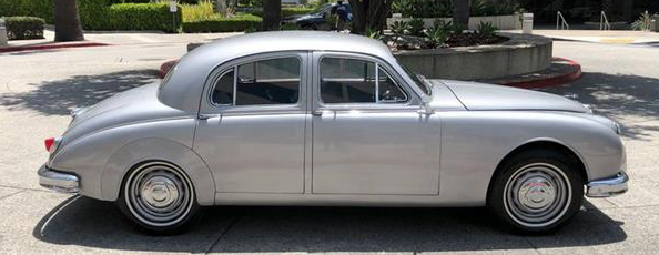
The Mark 1.  Characteristics include a V-plan hood, vertical rounded-off grille, headlights mounted inboard of the fenders and settings for fog lights closer to the grille than the headlights are.

The S-Type. The main Retro carryovers can be seen here.  Grille has a similar shape, but not as tall -- a chin air intake makes up for that.  Four frontal lights, the larger ones placed close-to, but not at the fender edges.  The plan-view V shape on the hood is subtly sculpted, and the hood itself is essentially car-width.


The Mark 1 body sculpting abaft of the headlight assemblies is echoed here, but related to the inner lamps.
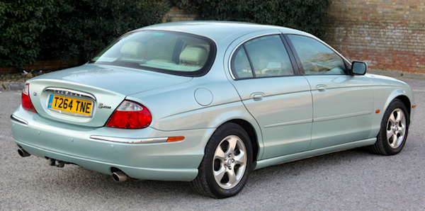

The S-type's wheelbase is 114.5 inches (2908 mm), that of the Mark 1 is 107.5 inches (2730 mm).  Respective lengths are 193.4 inches (4913 mm) and 181 inches (4597 mm).  The tuck at the after edge of the rear side window is echoed here.  Not the same profile, yet the Mark 1 spirit is evoked.


Almost no carryover at the rear due to packaging and aerodynamic considerations.


The S-Type's backlight window is more rounded than angular, so that's sort of a similarity to the Mark 1's.

Note the classic Jaguar tucked-down passenger compartment's aft end and the greenhouse's comparatively short length.  The car and its seating details are taller than on the S-Type.

Like most 2000-vintage cars, the S-Type's shape resulted from some wind tunnel testing in reaction to government fuel economy regulations.  So its side view contains no Retro items worth noting aside from that mentioned earlier.


Conclusion: The Retro part of the design is almost entirely found on the S-Type's from end.  And largely due to the grille and lights.

Thursday, June 15, 2023

Riley RMF - Last of the "Real Rileys"

As mentioned here, the Riley car manufacturing firm lost its independence in 1938, having been purchased by the Nuffield Organisation (i.e. Morris).

Perhaps due to wartime diversions for Britain's automobile industry, Riley was not fully integrated into Morris at war's end.  In fact, very shortly after the war, the first of Riley's RM series appeard, but carried over pre-Morris features.  Morris-based Rileys did not appear until the Gerald Palmer-designed Pathfinders arrived in 1953, as I posted here.

Today's post deals with the RMF of 1952-1953, the final 2.5-liter RM model.

Although its styling features were pre- World War 2, RMF proportions and shaping were attractive.  One of my reference books A Nostalgic Look at Riley Cars mentions (page 27) that the styling was by Eric Holmes and Eric Carter.

Below are some images for your viewing pleasure.

Gallery

1953 Riley RMF 2.5 saloon - for-sale car

1953 Riley RMF 2.5 saloon - for-sale car
This image and the next show a car with silver matte paint.  Not original paint, but this finish lacks highlights, allowing us to better understand the body sculpting.

Top coverings were standard on RM saloons.

1953 Riley RMF 2.5 saloon - images via Hemmings
Now for a few casual views of two other RMFs.

This car has tan-color top cover -- black was most common.

1953 Riley RMF 2.5 saloon - Historics Auctioneers photos

RMFs had substantial rear bumpers formed to frame the license plate.