Monday, April 24, 2023

1955 Pontiac Strato-Star and Oldsmobile 88 Delta: Similar Concepts

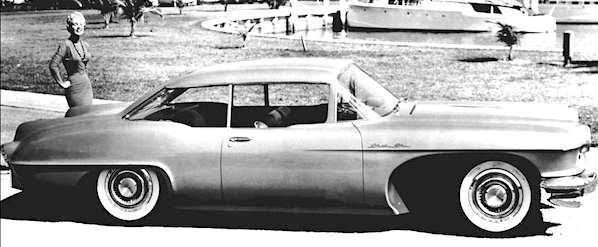
The 1955 General Motors Motorama featured two concept cars that strike me as being variations on the same basic body concept -- a body that might well have been considered for future production.  Otherwise, what was the point of this exercise when distinctly different styling exercises exploring a wider variety of ideas could have been presented.

As it happened, the basic design shared by the two concept cars never entered production, though a few features did.

One concept car was the Pontiac Strato-Star (some background information here).  The other was the Oldsmobile 88 Delta that I wrote about here.

I cannot prove my hypothesis, given available information on the Internet and in my reference library, so the best I can do is offer evidence via the GM-sourced images below.

Gallery

Pontiac Strato-Star.

Oldsmobile 88 Delta.

Showing the car with the passenger door closed.

Features to compare are: (1) front wheel opening; (2) fender lines and beltlines; (3) door cutlines; (4) rear end basic shaping.

The 88 Delta's passenger compartment greenhouse seems lower than the Strato-Star's, the the C-pillar / backlight window areas differ considerably.  The wide front wheel openings are impractical for daily use in non-desert climates.

The 88 Delta has a 120 inch (3048 mm) wheelbase, but I cannot find that of the Strato-Star, but it seems to be shorter.

Doors seem to be the same width, but the 88 Delta's greater length is found between the rear door cutline and rear wheel.  Note the similarity of the fender lines and especially the rear fender shapes.

Strato-Star rear view.

88 Delta rear view.  Both cars have similar rounded shapes.  Ditto exhaust ports.

Monday, April 17, 2023

Doing It Better: 1940 Redesigns for American Mid-Range Cars

The 1930s decade saw a major transition in automobile styling.  At its start, sedans were rather boxy, with separate fenders, spare tires, headlamps and such.  By 1940, American designs were becoming largely integrated, most details aside from fenders merged into the main body.  And those main bodies were of all-steel construction rather than being metal-clad panels attached to wooden frames.

I usually place the endpoint of this evolution in terms of the 1949 Ford, an attractive design where all elements were essentially integrated into the car body.

As for the 1940 model year, the redesigned cars from General Motors and Chrysler Corporation were smooth, not awkward like earlier designs produced during the evolution.  Today's post presents some sedan designs along with a few examples from 1939, the previous model year, to illustrate this step in the styling transition.

I previously posted on this subject here and here regarding 1940 General Motors designs.

Unless noted, images below are of cars listed for sale on the Internet.

Gallery

1939 Dodge 2-door sedan - unknown photo source
Chrysler's 1939 line was given major facelifts, mostly from the windshield forward, an expensive means of transitioning to the redesigned 1940 cars.

1940 Dodge
This basic body was used from 1940 to partway into the 1949 model year, aside from wartime years when production was curtailed.

1940 DeSoto - unknown source
Brand distinction was mostly from the cowling forwards.  Here is the DeSoto version.

1939 Chrysler Royal - factory image
The heavily facelifted '39 Chrysler Royal, the entry-level Chrysler brand model.

1940 Chrysler Royal - factory image
The 1939 Royal looks awkward compared to this tidier, smoother design.  By the 1940 model year, Detroit stylists and body engineers had finally learned how to use 1930s glass and metal-forming technology advances to create pleasing designs.

1939 Pontiac De Luxe Eight
This was a new design for that model year, but still somewhat awkward.  The front fenders are not well blended into the main body, and the headlight assemblies are not integrated at all.

1940 Pontiac Torpedo
General Motors' C-body for 1940 marks the culmination of 1930s lessons-learned.

1940 Oldsmobile
A nicely integrated design aside from the fussy grille and not-quite-integrated headlight assemblies (that transition would be completed for 1941).

1940 Buick Super
Now for a few views of Buick's Super, its entry-level C-body.  Again, the grille and headlamps are still needing refinement.

Otherwise, window profiles relate well to the roofline and beltline.  Fenders are distinct, while also merging into the main body.

The after part of the passenger compartment greenhouse and trunk area relate to each other well: no tacked-on look as in previous designs.

Monday, April 10, 2023

Hotchkiss Anjou Walkaround

Thanks in part to French government policy (the infamous "Plan Pons") that discriminated against makers of low-production mid-to-upper scale cars, the Hotchkiss firm was nearing its last automobile-building legs when it introduced its Anjou model for 1950.  Production of Anjous ended in 1954 and Hotchkiss left the car business the following year.

Anjous were expensive, selling for around two million French francs.  That was about twice the price of a Ford Vedette or a Peugeot 203.  On the other hand, a Delage with a custom body would go for 2.3 to 2.8 million francs.  Little wonder that only 5,500 or so Anjous were made.

Anjou styling was conservative in the 1950 American context, but not for France.  But by 1954 it was becoming dated even by European standards.  The French Wikipedia entry (as of 22 November 2022) suggests that the coachbuilder firm Henri Chapron did some bodywork.  I wonder if Chapron had anything to do with the design, but have no reference regarding that.

All things considered, the Hotchkiss Anjou was an attractive car, though not really exciting to look at.

Walkaround images below are via the Artcurial auction site, with one exception.

Gallery

The 1930s-traditional Hotchkiss grille was retained.  Those crossed-cannons on the badge reflect Hotchkiss' history as an arms maker.

This view reveals the Anjou as being in line with contemporary Jaguar design practice.

This left-side view of a 1951 Anjou is from an unknown (to me) source.  Because Anjous had right-hand steering, a driver's natural approach would be to the right side, which most side views favored, including Artcurial, which didn't have a left side view.

The rear is rather bland, but that was the case for most 1950-vintage designs.


Front fenders extend over the front doors, a common 1940s American style.  That made for difficult hinging on the A-pillar, so the Anjou's front doors were the "suicide" type, hinged on B-pillars.


French luxury cars up to World War 2 often had right-side steering, and the postwar Anjou continued that odd feature.  In France, cars drove on the right side of roads, so left-side steering was safer, more practical.  The Anjou dashboard seems Spartan, even for 1950.

Monday, April 3, 2023

Two-Passenger Thunderbirds: 1955-56 Versus 1957

What was the best-looking Ford Thunderbird?

Not any of the four-passenger models, in my opinion, though the third-generation (1961-1963) design was pretty nice.

As for two-passenger Thunderbirds, they were all attractive.  I rank the final-generation (2002-2005) model in second place, it being a more consistent design than the 1955-1956 first generation T-birds despite some quirky details.

The best of the lot?  It's the 1957 facelifted first-generation design.  This is a fairly rare instance of a facelift being better than the original styling.  A styling rule-of-thumb is that the first version is more pure than the facelifts.  That's because facelifts often consist of changes in trim that are simply meant to be noticeably new, and not necessarily consistent with the basic body design.

In the Gallery below I compare the 1955-1956 design with the 1957 version.

Gallery

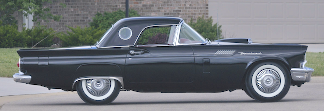
First, a 1957 Thunderbird, Barrett-Jackson auction photo.  Thunderbirds were basically convertibles with retractable soft tops.  Detachable hard tops were an option that was popular -- the cars shown below all sport that feature.

This is a 1955 Thunderbird, Mecum auction photo.  Compare its grille-bumper ensemble with the 1957 car below.

Another Mecum image.  The grille is deeper, and is partly framed by the re-shaped bumper.  Protection is diminished, but the appearance seems more organic compared to the tacked-on bumper seen above.

The side-view differences are in the rear fender area.  That porthole on the top is not a standard 1955 feature: it became so for the '56 model year.  However, the car itself is indeed a 1955 model.

For 1957, a canted tail fin was added.

The earlier rear end design is fussier than the '57 replacement.  Note the clutter below the trunk lid's aft fold, an indented panel with those twin exhausts.  The finned rear fender shaping combined with the items just mentioned creates a slightly "pinched" feeling that's more obvious when viewed in person as opposed to seeing a photo such as this.

The '57's aft is much cleaner looking because the shaping is simplified and the exhaust outlets have been moved to below the tail lights.  That placement, plus the outward-canted tail fins, make the rear design seem wider, eliminating the pinched appearance noted above.  Image is of a for-sale car.

Now for some views of a 1957 Thunderbird, more images via Mecum.


The car's color is not original, but it serves a useful purpose here because it enhances the body sculpting.

This is a very nicely styled car.