Thursday, March 31, 2022

The 1939 Hudson 112's Different Face

I wrote here about Ford's 1938-1940 practice of passing the basic grille design for its De Luxe series down to its entry-level Standard series the following model year.

It seems that Hudson was doing something similar for model year 1939. (My post dealing with Hudson facelifts is here.)

Hudson's 1939 facelift included a new grille and front fenders that housed the headlights.  But the company's low-priced 112 model didn't get those integrated headlights.  Instead, separate streamlined headlight assemblies atop the fenders were carried over from 1938 Hudsons.

Images below are factory sourced or are of unknown (to me) origin.

Gallery

1938 Hudson Six
Headlights are nested on the catwalk area on senior '38 Hudsons.

1938 Hudson 112 Standard Brougham
But the 112's headlights are mounted by the grille.

1939 Hudson Pacemaker Six
This shows that new front fender with its headlights.

1939 Hudson 112 Touring Sedan
The 1939 Hudson 112 retained the 1938 headlight mounting.

1939 Hudson 112
Seen from another viewpoint.  The grille is that same as those on other Hudson models.

Monday, March 28, 2022

1933 LaSalle Walkaround

The LaSalle brand (model years 1927-1940) was a lower-priced companion brand to General Motors' line-topper Cadillac.

To my mind, there were three standout model years for the marque in terms of styling.  The introductory 1927 model was styled by Harley Earl (1893-1969) in a project to evaluate Earl's capabilities and the market's reaction to a professonally styled design.  It turned out well becasue the car sold well and Earl became head of GM styling for the next 31 years.

The next noteworthy LaSalle design was the 1934 model styled by Julio Andrade.   It featured a clean, somewhat rounded "streamlined" look that saved the brand from extinction.

Then there was the 1940 swan-song LaSalle, another fine design.  It and the others are pictured below.

But the main subject of this post is a LaSalle sedan from the model year before Andrade's creation.  It is a nice design that appeared just as the American automobile industry was staring to launch its design evolution to integral body shapes.  The car is a LaSalle 345 C photographed for Mecum Auctions.

Gallery

1927 La Salle, Harley Earl at the wheel, his mentor Larry Fisher standing - via General Motors

1934 LaSalle Coupe, unknown photo source

1940 LaSalle Touring Sedan, car listed for sale

1933 LaSalle 345 C - Mecum
Dramatic overhead view.

Modern features for 1933 include the skirts on the front fenders and slightly V'd grille.

Plus, the windshield is ever-so-slightly raked back.

This was at a time when trunks were add-on items or (here) absent.

The large windows give the car an airy appearance.  V12 and V16 engine Cadillacs had similar bodies, but longer, more elegant hoods.

Thursday, March 24, 2022

Pinin Farina' 1947 Delahaye 135 MS Coupé -- and an Alfa 6C 2500 SS

A few years ago in this post I noted that Pinin Farina used a nearly identical design for both a Delahaye 135MS Coupé and an Alfa Romeo 6C 2500 Belinetta Speciale.  Today's post presents more images of those cars.

Alfa Romeos are probably known to to most readers of this blog, but perhaps Delahayes are less familiar.   So here is some background on the company's 135 model.  As for the 135MS Coupé, here is information via Bonham's acution page.  I don't have similar information regarding the Alfa.

Images below are via Bonhams and otherwise perhaps from Pinin Farina.

Gallery

Delahaye 135 MS Coupé

Alfa Romeo 6C 2500 SS
Front ends feature grille designs and other features appropriate to each brand.

Delahaye 135 MS Coupé
The Delahaye's window profile is very slightly more curved than that of the Alfa.  And the distance from the door's cut line to the wheel opening is slightly greater here.

Alfa Romeo 6C 2500 SS
The Alfa has greater front overhang and perhaps a trifle less at the rear.

Delahaye 135 MS Coupé
The car's restoration eliminated the wand-type turn indicator abaft of the door.

Alfa Romeo 6C 2500 SS
Tail lights differ and the Alfa's rear bumper wraps a bit more.

Given that Farina's immediate post- World War 2's clientele was probably mostly Italian, my guess is that the Alfa body was created first, while the Belgian who bought the Delahaye decided he wanted one like it.

Monday, March 21, 2022

The Messy Roots of the 1968 Dodge Charger

There's the old saw about it not being a good idea to watch sausage being made.  Maybe the same sort of mix of messiness and ugly ingredients could be applied to designing automobiles.  In addition to the expected tensions between stylists and engineering staffs, there is the matter of personality clashes between strong-minded styling staff members.

Such seems to have been the case for the now-renowned 1968 Dodge Charger.  Regarding that, consider this detailed background by Dodge stylist Diran Yazejian that can be found here (and here if the first link fails).

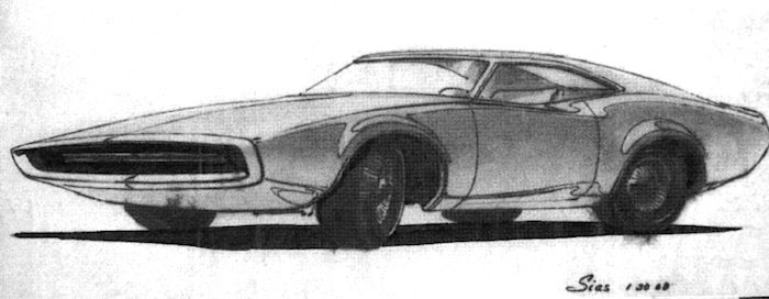
It has to do with Richard Sias and his bosses Bob Brownlie and Charles Mitchell.  It seems that when Brownlie went to Europe for two weeks he had ordered Sias and others not to work on Sias' Charger design while he was away.  But they did.  And senior styling executives loved the design.  The end result, even though the new Charger design was a sales success, Sias was in Brownlie's doghouse.  So he quit Chrysler and later worked in Walter Dorwin Teague's team devoted to designing Boeing airliner interiors.

The Charger design stemmed from Sias' Double-Diamond overhead profile concept.  As Yazejian put it, "They created a true icon: a design that wasn't copied from anything, and has been copied by no one since."

Gallery

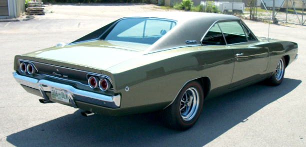
1968 Charger, Mecum Auction  photo.  This shows the long, flowing rear fenderline and passenger compartment sail panels flanking the flat back window,

Same car, side view.  Note how the front fenderline fades out near the door midpoint and the rear fenderline begins by the cowling.

Front quarter view, Bring a Trailer photo.  Extremely simple grille: maybe too simple.  It was improved for 1969.

Overhead view, factory photo.  Note the zone where the fenders overlap.  This has to do with the Double Diamond concept.

Sias drawing of a Double Diamond example.

Another Double Diamond Sias image.

Sias sketch of non-Double-Diamond Charger possibility.  It is dated after the 1968 model had been in production.

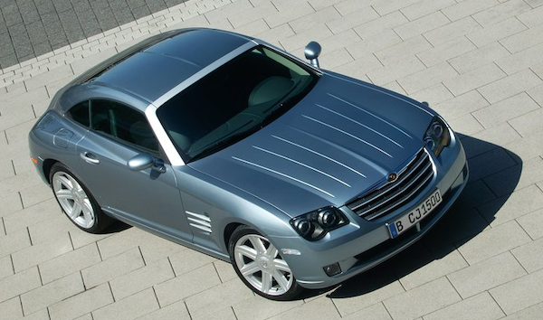
I'm not sure Diran Yazejian's statement that the Double-Diamond concept was "copied by no one since" actually holds true.  Consider the 2004 Chrysler Crossfire pictured above.

Thursday, March 17, 2022

The 2022 (Jeep) Wagoneer

The Jeep brand has been highly successful, so marketers and product planners have had to resist the temptation to fall into the brand extension trap.  A worldwide example is the many varieties of Coca Cola.   An American example is Cheerios breakfast cerials.  So far as I can tell, these brands remain strong, though the risk is that extensions pushed too far from the core will muddle the brand's image in the minds of potential customers, helping to allow them to drift to competing brands.

For model years 1963-1991, Jeep made a station wagon variant called the Wagoneer, a four-door body-on-frane vehicle on a 110-inch (2794 mm) wheelbase.  Some background is here.

Then for 30 model years there was no true successor.  Finally, for the 2022 model year the Wagoneer was resurrected, though minus the Jeep name (Wikipedia entry here).  Presumably, not having the word Jeep on the vehicle was a means of counteracting any brand extension effect, because the new Wagoneer was much larger than other Jeeps (123-inch, 3124 mm wheelbase) and based on a Ram truck, unlike the rest of the line.

That said, the Wagoneer's grille features seven vertical slots in true Jeep fashion. And it is usually referred to as a "Jeep Wagoneer" in the automotive press.

I should note that as today Wagoneer sales have not been good: large dealer inventories.   High prices might be a factor.  Or stiff competition.   Or any number of other things.

Gallery


A 1963 Jeep Wagoneer styled by industrial designer Brooks Stevens.

Rear quarter view of a two-door variant, same year.

1993 - the last of the original Wagoneers.

Factory photo of a 2022 Wagoneer.  Very large and un-Jeeplike.


This is a Grand Wagoneer, the top-of-the-line model.  Note the heavy, vertically-oriented pillars.  The rear door window and the window abaft of it have rounded-off bottoms, while the upper corners are sharp.  Vertical pillars are a carryover from original Wagoners, but are more robust for rollover safety.  Those sharp upper corners also hark back to the angular earlier Wagoneers.

Now a comparison to the current (as of early 2022) corporate stablemate, the Dodge Durango, its present design dating from 2011. It has a 119.9-inch (3045 mm) wheelbase.  The rear quarter window has a soft feeling that reminds me of the rounded lower profiles of the Wagoneer's windows.

Monday, March 14, 2022

1961 Dodge Flitewing Concept Car

For some reason Chrysler Corporation concept cars became increasingly strange looking over the years (c.1953-1961) Virgil Exner (1909-1973) was in charge of styling.  Perhaps his 1956 heart attack that limited his input to Chrysler designs for a while might have been a factor.  Or maybe Exner, like General Motors' Harley Earl, finally ran out of good ideas, losing any sense of styling direction he might have had.

Regardless, let's consider the 1961 Dodge Flitewing, one of the last concept cars that appeared during Exner's tenure.

According to this book about 1940-1970 Chrysler concept cars, the Flitewing incorporated several ideas Exner had in mind for future production.  One was having side window glass merging as closely as possible with adjoining sheet metal.  Other was increasing front overhang while reducing the then extensive rear overhang.  These features did appear on future American cars.

Below are most of the photos of the Flitewing available on the internet along with my commentary.

Gallery

The Flitewing was designed in Detroit and built by Ghia in Italy on a Dodge chassis with a souped-up V8 motor.  The most absurd detail is the huge grille with its too-large chromed frame -- though Audis from around 2005 also had ridiculously large grille areas.

Those roof-mounted window panels were an experiment dealing with improving passenger access to really low cars.  They were not a new idea; for example, the 1956 Mercury XM- Turnpike Cruiser concept car had them.  The electrical work was very complicated in those days before integrated circuitry.  And the system never worked well.

The side profile is nice aside from the fixed triangular windows by the A-pillar.  This detail is a logical, yet too-cute combination of an aft-leaning A-pillar and a pseudo-extension hinting at the General Motors type 1954 B-Body wraparound windshield.

Side view with window panel raised.

I think the Flitewing looks best from the side.  But the car is fairly attractive from the rear quarter view, though the fake spare tire lid should be eliminated and the sail-panel-cum-tailfins detailing made more crisp.

A poor quality image.  Perhaps taken by Ghia in Italy or maybe by Chrysler when the car arrived.  Or, since it was known to have been driven by Chrysler executives including Elwood Engel, this might have been the car made slightly more street-legal.  All that said, the main differences from the other photos are the missing medallion at the grille's center and the hubcaps.

Thursday, March 10, 2022

Some General Motors SUV Brand Variations

Back in the days when General Motors ruled the automobile world and was rolling cash, there still was need to economize.  For example, from the early 1940s into the mid-1950s GM made use of three basic bodies for its five brands (1940s Cadillac Model 75 limousines were a minor exception).  Which meant that each body was shared by more than one brand.

Each GM brand was given its own set of styling cues -- grilles especially, plus lesser decorative items -- and these would be provided to the various bodies for brand identification purposes.  For example, around 1950, Chevrolets and Pontiacs used only GM's A Body, whereas 1951 Oldsmobiles used bodies A, B and C.

Those bodies were sedans and derivatives such as convertibles and station wagons.  Nowadays, a brand's models are spread across several distinct body types, perhaps along with more than one body within a given type.

Currently, General Motors has several SUV bodies in production, each used by more than one of its four current brands (Chevrolet, Buick, GMC and Cadillac).  The present post deals with brand variation on a current intermediate-size SUV platform and its immediate predecessor.

Models discussed are the Chevrolet Traverse, GMC Acadia and the Buick Enclave.

Gallery

2009 Chevrolet Traverse
General Motors was drifting towards bankruptcy when this body was under development.

2008 Buick Enclave
Even so, the Buick version received slightly different sheet metal on the lower body.  Also note small differences on the rear door windows.

2007 GMC Acadia
Yet the Acadia received different bodywork aft of the middle of the rear side door.  My guess is that since GMC was once General Motors' truck brand, the car was given a larger-capacity cargo carrying zone in the form of a higher roof and more vertical rear, in line with GMC's industrial image (that is much less strong today).

2018 Chevrolet Traverse
The 2007-09 SUV bodies were replaced for the 2018 model year.  By that time, GM was in better financial shape and could afford to fund more visual variation.  The Traverse is the largest seller of the group, so consider it the baseline for our discussion.

2018 GMC Acadia
The Acadia again received the most expensive differentiation.  Its wheelbase is 112.5 inches (2857 mm) compared to 120.9 inches (3071 mm) on the Traverse and  Enclave.  The difference is most visible in the profile of the aft quarter window and the aft cutline of the rear side door.

2018 Buick Escalade
The Escalade's bodywork abaft of the cowling is different from and racier-looking than that of the Traverse.  Note the chrome strip extending across the upper edges of the windows and on to the rear.   This enhances the "racy" appearance (compared to many competing SUVs). 

2018 Chevrolet Traverse
The Traverse grille theme is similar to that of some other Chevrolet models.  That horizontal sweep from headlight to headlight is a variation on an industry-wide styling cliché, though the overall frontal design is comparatively simple and pleasing.

2018 GMC Acadia
That across-the-front sweep cliché is mercifully absent on the Acadia.  Instead, there is a strong, truck-like grille befitting the GMC legacy.

2018 Buick Enclave
Enclave's design feel is softer than that of the others.  More obvious curved areas and little angularity and tight-radius folds.  Its front end is fairly simple in today's context.  The sweep cliché is absent, and the grille is less bold than the GMC's.  All-in-all a likable design, though not an outstanding one.

Rear-quarter view showing more of the generally rounded body-shaping theme.