Thursday, December 30, 2021

1953 Plymouth and Dodge Hardtop Coupes

Chrysler Corporation's Plymouth and Dodge brands were redesigned for model year 1953, whereas DeSoto and Chrysler were given massive facelifts.  Chrysler line sales were good in 1953, but dropped drastically the following year.

Today's post presents 1953 Plymouth and Dodge hardtop coupes, high-end models and a popular body type in those years and beyond.  Previous Plymouth and Dodge bodies dating from 1949 were boxy-looking, and the redesign included softening the lines.

According to some observers, a factor in the 1954 sales decline was the reduced lengths of '53 Plymouths and Dodges compared to 1952 counterparts and competing 1953-54 brands.  But wheelbases for 1953 Plymouth and Dodge hardtops were almost the same as competing Ford and Chevrolet models, though Pontiacs were considerably longer.

Unless noted, images below are of cars listed for sale.

Gallery

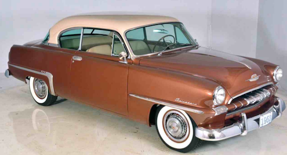
1953 Plymouth Cranbrook Belvedere
The Plymouth hardtop was a tidy design.  The rounded-down hood prow gave it a stumpier-than-needed appearance.  Also, the grille design was odd, but distinctive.

1952 Plymouth Cranbrook Belvedere - factory photo
The previous Plymouth hardtop coupe.

Side view, showing that the hood and trunk are short, the passenger compartment greenhouse is long -- dominating the car's profile.

The car seems to look best from the rear, where the short front end is hard to see.

Two high-perspective views of the same car.


1953 Chevrolet Bel Air
A competing hardtop coupe with a longer, more purposeful seeming hood.

1953 Dodge Cranbrook Diplomat
I found almost no images of 1953 Dodge hardtops on Internet searches.  This front quarter view is not very revealing.

1952 Dodge Cranbrook Diplomat
The Previous year's version.

Another low-quality image.  Perhaps few '53 Dodge hardtops have survived.

1953 Dodge Cranbrook Diplomat - brochure illustration
The people in this illustration are too small, but the car seems little-distorted.

1953 Pontiac Catalina
A major Dodge competitor.  It looks like a lot more car for the money.

Monday, December 27, 2021

The Mysterious, Elusive 1961 Pontiac Astra Concept Car

Below are two photos of a 1961 Pontiac design probably under consideration for the 1963 model year.  Before late September 2021, I had neither heard of it nor had seen pictures of it.  Search engines have turned up essentially nothing other than the images.  My personal reference library is unfortunately sketchy regarding Pontiac, so that was no help.

Part of the Internet confusion might be because Pontiac did market a model called the Astre, and that might confuse search engines.

That said, let's look at those photos.

Gallery

This is a four-door hardtop sedan (no B-pillar above the belt line).  Rear doors are supposedly hinged at the rear, same as Ford's new 1961 Continental.  But there are no actual cut lines, so there are no actual doors on the right side of this styling model.  A vestige of Pontiac's Silver Streaks can be seen forward of the front wheel opening.  Windshield framing is unusual because the upper corners are sharp and the lower ones are rounded.  Body sides are puffed out to help accommodate the brand's new Wide Track axle width stance.  The dramatic sculpting around the headlight assemblies harkens to Pontiac's recently developed paired grille theme (note images of production car grilles below).

The Astra's rear is also somewhat quirky -- namely the central copped-down fin on the trunk lid.  From this photo, it's hard to tell where the tail lights are.  Maybe in the interior folds of the fenders.  The "people" in the model are actually mannequins, something quite rare on full-scale models.  That is, in the top image the woman in the front seat is gesturing.  She also is gesturing in the above photo that was probably taken a little later than the first one because the turntable was rotated 180 or so degrees (compare shadows and backgrounds).

All things considered, the Astra is an interesting design that might have been produced if its details were less exaggerated and it had more practical bumpers and such.

A 1963 Pontiac Bonneville Vista Sedan, the kind of production car being investigated by Astra and other Pontiac designs in 1960 or even early 1961.  The rear fenders, backlight window and C-pillar are not much different from those items on the Astra.

The front of a 1959 Pontiac Catalina showing the two-piece grille design that first appeard on Pontiacs that model year.

Rounded-frame two-piece grilles did not reappear until the 1961 compact Pontiac Tempest was launched.  Other Pontiacs in the 1960-61 time frame had grille designs more removed from the Asta's theme.

Thursday, December 23, 2021

Ford Mustang Grille Evolution

A subject I write about fairly often is automobile brand image continuity, and I mostly deal with grilles as the subject.  I usually cite Rolls-Royce, Packard, and sometimes brands such as BMW as examples of grille design theme consistency.  And I also sometimes present examples of car brands whose grille design themes are inconsistent -- Ford is one example.

However, one Ford product has conformed somewhat.  It's the Ford Mustang model, marketed starting in the spring of 1964.  Besides grille design, Mustang has had other styling continuity items including body side sculpting and tail light design. I dealt with some of that here.

Today's post presents examples of Mustang grilles over the six design generation cited in the Wikipedia entry above.  It seems that some high-performance Mustang sub-models were given special grilles and other detailing.  But the images below present basic grille designs at the start of each generation with the exception of the grille design at the end of what Wikipedia considers the first generation.  Unless noted, those images are of cars for sale or, for 2015, a factory image.

Gallery

1965 Ford Mustang
This is the original design.  It is mounted high and features a side view of a galloping mustang pony.

1973 Ford Mustang - BaT Auctions photo
This grille at the end of the first generation is lower because the hood has been reshaped.  The pony remains.

1974 Ford Mustang II
The controversial Mustang II had a grille reminiscent of the original, though the pony is not framed.

1979 Ford Mustang Ghia
As I mentioned in the post cited above, the third-generation Mustang was the least Mustang-like of all.  Retained is the theme of the grille opening being framed by headlight.  However, the pony has been moved to a small hood medallion.

1993 Ford Mustang SVT
As aerodynamic testing became common, primary air intakes moved closer to the ground.  The result here is a small opening between the headlights with a tiny pony centered.  Wikipedia considers 1993 the last of the 1979 generation.

1994 Ford Mustang Cobra
The same can be said for the '94 design, though the opening is better related to hood sculpting.

2005 Ford Mustang
Now the major air intake has been raised, better recalling early Mustangs.

2015 Ford Mustang GT
The most recent design features the horizontal chrome strips of the original car as well as framing for the pony.

Monday, December 20, 2021

General Motor's One-Year Body: 1958 Chevrolet and Pontiac

In this post dealing with 1958 Pontiacs, I stated:

"General Motors was rich during the 1950s because it dominated the American automobile market.  So when it made a marketing mistake it was able to throw money at the problem to correct it.

"A case in point was the body type used by 1958 Chevrolets and Pontiacs.  This was during the last years of Harley Earl's reign as GM's styling supremo.  Normally adept at leading styling trends, by the mid-1950s Earl began losing his touch, running out of new ideas.  In part this was because the design evolution of the 1930s and 1940s had run its course, so it wasn't clear to those who had lived through that era what might be done next. In Earl's case, he reverted to the rounded (large radius curves) kind of shapes that he usually preferred.  Unfortunately for him and GM, Chrysler Corporation's new slim 1957 line proved hugely popular while making GM car seem bloated and stodgy.  So GM launched a crash program to redesign all its cars in a somewhat Chrysler-like manner for the 1959 model year."

I wrote about General Motors' 1959 redesigned line here, here and here.

And I discussed exterior trim variations on 1958 Chevrolets here.

The present post presents 1958 Chevrolets and Pontiacs in the context of their previous 1955 redesign and, briefly, their 1959 replacement.  I focus on entry-level two-door sedan models because their basic shapes were less cluttered by ornamentation than upscale lines.  Unless noted, images are of for-sale cars.

Gallery

1955 Chevrolet One-Fifty Utility Sedan - Mecum auction photo
This car is about as basic as possible, but disregard the non-stock bent-up front bumper.  No chrome side trim.  No chrome covering the windshield and backlight window rubber strips.

1955 Pontiac Chieftain
In those days, major brand identification features were on the front and rear.  Though side trim also was used for that purpose, as can be seen here.  Since Pontiac was one step above Chevrolet in GM's brand hierarchy, this introductory two-door sedan has chrome trim around the windows.  The fenderline dip by the rear side window is retained, but wheel openings differ and a small hump to the fender's rear was added.

1958 Chevrolet Delray - Mecum
Here is an entry-level '58 Chevy.  Most had some chrome side trim, as can be seen in a photo farther down.

1958 Pontaic Chieftain Catalina
I couldn't find a decent side view of a '58 Chieftain two-door sedan, so this two-door hardtop coupe image will have to do.  The main difference is that the 2-door sedan's C-pillar lacks the horizontal-band chrome element seen here: instead it has paint there.

1959 Chevrolet Biscayne - Mecum
As was described here, General Motors produced the following body types that were shared by most brands: two-door sedan, four-door sedan, two-door hardtop, four-door hardtop, two-door convertible, and station wagon.  One exception was Cadillac, which did not use sedan or station wagon bodies.  However, all GM bodies featured the double-wrapped (horizontally and vertically) windshields.

1959 Pontiac Catalina
This two-door entry-level Pontiac shares the passenger compartment greenhouse with the Chevrolet above, as well as wheel opening profiles.  Other sheet metal sculpting is Pontiac-only.

1955 Chevrolet One-Fifty - unknown source
Front quarter view of a '55 Chevy Utility Sedan.  These basic bodies were used by Chevy and Pontiac through the 1957 model year.  Very simple body stampings.  Bear in mind that stamping technology in those days was primitive compared to what we have today.

1955 Chevrolet One-Fifty Utility Sedan - Mecum
Rear quarter view.  Again, note the simplicity of the basic '55 GM A-Body compared to the 1958 cars below..

1958 Chevrolet Delray - Mecum
Most '58 Delrays had side chrome trim such as is seen here.

1958 Chevrolet Delray - Mecum
Also, there was considerably more metal sculpting than found in 1955.

1958 Pontiac Chieftain - unknown source
The wheels and tires are not stock.  This photo shows the C-pillar paint scheme discussed above.

1958 Pontaic Chieftain
The basic body is the same as the '58 Chevy's, but GM could afford tooling for different sculpting.

Thursday, December 16, 2021

Postwar Studebaker Sedans

Post- World War 2, 1947 model year Studebakers were senationally futuristic when they first appeared.  Other American carmakers, aside from the new Kaiser-Frazer company, marketed facelifted versions of their prewar 1942 designs.

I suspect that most of the (probably few) people who recall 1947-49 Studebaker styling think of the Starlight Coupes with their wraparound back windows.  Or maybe the racy Business Coupes.  But not so much Studebaker two-door and four-door sedans, the subject of today's post.

Unfortunately, I cannot locate production data on various Studebaker body types, which means I have no way of judging popularity of sedans as opposed to the more exotic Studebaker models of that era.  Most likely, sedans out-sold the others.  But Starlights seemed to have survived better, if searches of Google and Bing images are representative of current reality.

Photos below are of cars listed for sale unless otherwise noted.

Gallery

1948 Studebaker Champion Regal Deluxe 4-door sedan
Here is a Champion sedan, Champion being the entry-level Studebaker.

1948 Studebaker Commander Starlight Coupe - Barrett-Jackson auction photo
As noted, the Starlight Coupe is the best-known postwar Studebaker design.  The Commander line was more upscale, and Land Cruisers were top-of-the-line.

1947 Studebaker Champion Business Coupe - Mecum Auction photo
The other distinctive Studebaker variant.  Now to the sedans as seen in side-view....

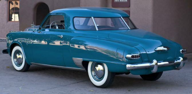
1949 Studebaker Champion 2-door sedan
The wide doors are the same as on Starlight Coupes and Business Coupes.

1948 Studebaker Commander 4-door sedan
Four-door cars had narrower front doors and a vertical B-pillar.  The after part of the rear door's window profile is that of the two-door sedan.  Ditto the C-pillars.

1948 Studebaker Land Cruiser 4-door sedan
Land Cruisers received a wider rear door, but the C-pillar configuration is retained.

1949 Studebaker Champion 4-door sedan
Now for a more careful examination of four-door sedans.  Champions had 112-inch (2845 mm) wheelbases, Commanders were 119 inches (3023 mm) and Land Cruiser wheelbases were 123 inches (3124 mm).

1948 Studebaker Commander 4-door sedan
Champion hoods were short.  The Commander's added length was just forward of the cowling.  Note the relationship of the forward vertical cut lines to the front wheel openings shown in this photo and the previous one.

1948 Studebaker Land Cruiser 4-door sedan - Barrett-Jackson
The additional length of Land Cruisers was in the passenger compartment as can be seen regarding the wider rear door.  I wonder if this added tooling expense in the passenger compartment area paid off in terms of sales.

Monday, December 13, 2021

Cars of Ford's Jack Telnack Era

Jack Telnack (b. 1937) was Vice President of Design for Ford 1980-1997.  His brief Wikipedia entry is here.

Telnack was deeply involved with Ford's use of wind tunnel testing of production body shapes in response to government mandated fuel economy standards.  As best I can tell, all the designs initiated while he was in charge were more rounded than previous Ford designs that were angular, "three box" affairs.

Images below are either factory-sourced or are of cars listed for sale.  The same bodies were used by more than one brand, but only two such examples are shown below.

Gallery

1983 Thunderbird
This is the first American aerodynamic production design by Telnack's team.  For some odd reason I perhaps unfairly likened it to a Dutch wooden shoe when it first appeared.

1984 Ford Tempo
This design seemed too soft when most other cars were angular, though it appears conventional by today's standards.  I always thought it needed more angular window framing to provide some relief from the softness.

C.1984 Lincoln Mark VII
The Lincoln version of the Thunderbird body.

1986 Ford Taurus
This design might have saved the Ford Motor Company which was in serious financial trouble when it was announced.  Like the Tempo, it seemed strange to many eyes, but it had enough appeal to sell well.  A few years later, most American cars received aerodynamic shaping and the Taurus had become conventional.

1988 Lincoln Continental
Now Telnack's style is becoming more clear.  Note the sloped hood profile.  Also comparatively (for the times) large-radius sheep metal curves.

1990 Lincoln Town Car
This new Lincoln design was rather boxy, but featured enough rounding to hint at aerodynamics.

1993 Lincoln Mark VIII
Here we find a low hoodlike creating a wedge appearance with most of the rounding towards the rear.

1997 Ford Contour
Introduced to America for the 1995 model year, called the Mondeo in Europe, this was a Ford attempt to design and market a "world car" -- well, a car for both the European and North American markets.  While Mondeos sold well in Europe, Contours didn't sell well in America.  At the time, I thought the styling was soft and uninteresting.  The weak point might be the design abaft of the B-pillar.
1995 Lincoln Continental
Ford's luxury model.  Again, the low hoodline, this time with a compatible grille design with little relationship to more traditional Lincoln grilles as seen on the Town Car above.  And of course plenty of rounded surfaces.

1996 Ford Taurus
This design fared comparatively poorly in the marketplace.  I rather liked it, especially the sculpting on the hood and front end.  The oval backlight window design was a poor choice.  The instrument panel was another problem area, its main defect being an oval-framed cluster of switches at the center of the dashboard.

1996 Mercury Grand Marquis
The Mercury using the same basic body as the Lincoln Continental shown above.  Another example of the mature Telnack-look.