Thursday, October 28, 2021

Ford Taunus 1957-1960 M 17 P2 and Its USA Ford Details

I have a pretty good automobile reference library, but only one book dealing with Ford's German cars.  Not mentioned with regard to the 1957-1960 Taunus 17 M is whether American stylists were at work in Cologne when the car was designed.  (This Taunus is more conveniently known as the P2 since there were other 17 M models, as is noted here.)

The reason I mention this is because the P2 features several design elements from American Ford Motor Company cars of the mid-1950s when the P2 was styled.  These are noted below.  Images are factory-sourced or are from cars actually or apparently listed for sale.

Gallery

1957 Taunus P2 Standard
The entry-level P2 has a two-element grille used only for that model year.

1957 Taunus P2 De Luxe
This fancier De Luxe Taunus has a different grille

Overead view of a P2 Standard

Side view, 1960 Taunus P2 De Luxe
Compare the passenger compartment greenhouse to that of the 1952-54 Ford Tudor shown below.

1954 Ford Customline Tudor
American Fords were larger than German Taunus's, so the greenhouse designs are not identical.  That said, they are clearly similar.

A four-door P2 Standard sedan
The zig-zag side chrome strip was used as two-tone paint delimiter.

1956 Mercury Custom Two-Door Sedan
It seems to have been inspired by the zig-zag feature of 1956 Mercurys.

Rear quarter view of a P2 De Luxe featuring the tail light assembly
Aside from vestigial tail fins, the tail light assemblies also reflect mid-1950s American Ford practice.

1956 Ford Mainline Tudor
This tail light assembly design first appeared on 1955 Fords and Ford Thunderbirds.

Ford imported Taunus P2s to the USA in 1960, so these stylistic similarities might have been useful from a marketing standpoint.  However, I am skeptical that the features discussed in this post were included with export in mind.  That is because the large-scale import boom led by Volkswagen was not underway when the P2 was styled, so there was little motivation to borrow American Ford styling for export sales purposes.

Monday, October 25, 2021

"Top Three" Redesigns for 1940-41

I wrote about Chevrolet, Ford and Plymouth redesigns for the 1937 model year here.  Those brands were the best-selling ones in America for decades beginning in the 1930s.

Today's post presents their next redesigns.  Chevrolet and Plymouth got new bodies for the 1940 model year, and Fords were redesigned for 1941.  That period marked the point where much of the 1930-1949 styling evolution was already completed.  Items such as headlight and trunks were largely integrated into car bodies, and all that remained was blending in fenders more fully.

All three redesigns included longer wheelbases from the previous 112 inches (2845 mm).  Plymouth's lengthening was largest, to 117.5 inches (2985 mm), Chevy next at 116 inches (2946 mm), while Fords went only to 114 inches (2896 mm).  The result was that Fords seemed stubby compared to its competitors.

The cars shown below are all four-door sedans for better camparative evaluation.  Unless noted, images are of cars listed for sale.

Gallery

1940 Chevrolet Special Deluxe - RM Sotheby's auction photo
General Motors was one model year away from blending headlights into front fenders.  The 1941 facelift transformed the '40 model into a classic Chevy design.

1941 Ford DeLuxe
1938-1940 Fords sedans featured highly rounded fastback styling, retained here.  Ford Motor Company redesigns in this period featured larger (taller) windows.  The 1941 grille was a nondescript blend of horizontal and vertical features ... a transition to the more fashionable horizontal layout.

1940 Plymouth Deluxe
Plymouths shared bodies with other Chrysler Corporation brands that usually had longer hoods.  Frontal design here features a prow-shaped hood-grille ensemble where the horizontal grille is combined with the vertical prow element.  Headlights are in the fenders, and the fenders remain distinct.

1940 Chevrolet
Four-door Chevy sedans, like the Fords and Plymouths, were six-window affairs.  The slight notchback looks awkward due to the short trunk lid.  A fastback design would have improved the profile.  Front fenders are rounded in the 1930s manner unlike the fashionable "suitcase" fenders on '40 Plymouths and '41 Fords.  This was adjusted slightly for 1941.

1941 Ford DeLuxe
This wide-angle photo distorts the Ford's profile, making it seem more stubby than it actually was.  Nevertheless, it was a stubby-looking car due to its highly rounded fastback.

1940 Plymouth
Although Plymouth had the longest wheelbase, it also looks rather short in profile.  That's because its long passenger compartment was shared with more upscale Chrysler Corporation brands, and the wheelbase meant that the hood had to be short.

1940 Chevrolet
Seen from the rear quarter, the long window ensemble is not as objectionable as it was in profile.  The car looks massive here, probably intentionally to set it apart from the competition.  Buyers would think they were getting more car for their money with Chevrolet.  Aside from the passenger compartment, the styling is of the usual highly professional General Motors variety.

1941 Ford DeLuxe
The highly rounded rear seems bloated, not stylish.  Some sort of horizontal ornamentation there would have helped to break up that effect.

1940 Plymouth
Plymouth's rear profile has a more flowing curve than Ford's while lacking the too-small notchback on the Chevy.

Thursday, October 21, 2021

American Dashboards - 1955

This is the last of a four-part series of posts presenting American dashboard designs.  Previous intallments are for 1936 here, 1941 here, and 1949 here.

I selected 1955 because most American brands were either redesigned or highly facelifted that model year.   Also, it represented the strongest sales volume year to date.   Beginning in the late 1950s, carmakers began producing more than one body platform for most of their brands, so dashboard comparisons would lead to long, complicated posts if all platforms were dealt with in single post.

Images below are from unknown sources or cars listed for sale unless noted.  Brands are grouped by manufacturer and in ascending luxury order where possible.

Gallery

1955 Chevrolet Bel Air
Chevys featured matching pizza slice items, the one on the left containing the speedometer and gauges.

1955 Pontiac
Pontiac's speedometer was a half-circle affair, but without attached gauges.  Again, a fairly simple dashboard design.

1955 Oldsmobile
Olds' dash was a lot flashier and busier.

1955 Buick Roadmaster - Mecum Auction photo
But Buick's line-topping Roadmaster dashboard was fairly plain.  The hard-to-accurately-read speedometer had a narrow red line rather than a dial (the line was actually on a drum that rotated to expose the almost-correct length).

1955 Cadillac
Cadillac's dashboard retains the sort of horizontal theme common in 1941.  Unlike Buick, the thin, horizontal speedometer uses a needle pointer.  The overall effect is dignified, as one would expect for a luxury car.

1955 Ford Fairlane - RM Sotheby's auction photo
Not all gauges are in the driver's line of sight.  The large knobs and dials provide a "spotty," not well integrated aspect.

1955 Mercury
Another pizza-slice design along with some clashing rectangular elements.

1956 Lincoln Primiere - Barrett-Jackson auction photo
Lincoln was redesigned for 1956, so that dashboard is displayed here rather than the 1955 version.  Like Cadillac, it recalls earlier dashboard themes.

1955 Plymouth Belvedere
A symmetrical layout.  I'm not sure what the small, round items on the right are ... not important gauges, I hope.  The 1955 Chrysler Corporation line featured dash-mounted automatic transmission selectors.  It's that short spike just to the right of the speedometer.  Its spear-like aspect raised safety concerns, so for 1956 the Corporation's line went to pushbutton selectors.

1955 Dodge
The spread-out instrument display is segregated from the glove compartment by some sculpting -- an interesting touch for 1955.

1955 Desoto Firedome - Barrett-Jackson
DeSoto's dashboard also had sculpting to isolate and emphasize functional zones.  An attractive design, I think.  But I'm biased because my dad bought a 1956 DeSoto with essentially the same dashboard.

1955 Chrysler
Instruments are in front of the driver, switches are above the radio controls.

1955 Studebaker President
A thin dashboard where the instruments are on what looks to be a tacked-on chromed panel.

1955 Packard Patrician
Symmetrical, dark, sculpted framing.  Instrument placement is okay, but the right-hand part of the dashboard is spotty, inconsistent.  Not the best look for a luxury car.

1955 Nash Statesman
Another early 1940s theme carryover.  The instruments are not well-positioned for driver's visibility.

1955 Hudson Hornet
Real Hudsons disappeared after 1954; for 1955-57 they were based on Nash bodies.  For 1955, the instrument cluster is a direct carryover from 1954.

1954 Kaiser
Kaiser abandoned the American market after the 1954 model year, but I thought I might as well present its final dashboard.  Considerable padding.  The instrument cluster wraps over part of the steering wheel mounting cover.

Monday, October 18, 2021

More 1954 Ford FX-Atmos Concept Car Images


I last wrote about the Ford FX-Atmos concept car here.  In that post I mentioned:

"When I first saw pictures of it, I thought the Atmos was sensational.  This was during the time that American "dream cars" and even production models had details and even larger elements inspired by jet fighter planes."

I still think it was one of the most attractive designs of that genre.  Since it had no motor -- or even the space for one -- it was impractical from that standpoint.  Its canted tail fins and sharp spikes extending forward of bullet-shaped front bumpers (?) made it questionably roadworthy even in 1954.  And its strip-headlights were illegal then.  Not to speak of the restricted turning radius determined by the lack of a large front wheel opening.  All that said, the car's design produced a hearty "Wow!!" factor.

More images of the Atmos have appeared on the Internet since 2015, and some of those are present below for your viewing enjoyment.  All photos were by Ford Motor Company or its publicity agents.

Gallery


Several recent additions to the Atmos photo collection are in color.  This "establishment shot" shows the setup where those pictures were taken.


A black-and-white (decolorized?) image from the same photo session.  Another is at the top of this post.

Wikipedia (link above) states this is a rare color image of the Atmos.

Thursday, October 14, 2021

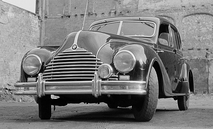
East German BMW / EMW 340

Following Germany's 1945 World War 2 surrender, the country's boundaries were redrawn and the resulting area was subdivided into occupation zones. The Russian zone became the Deutsche Demokratische Republik (DDR) or East Germany, as it was often called, in 1949.

BMW (Bayerische Motoren Werke) automobile production facilities in Eisenach, DDR, were separated from the parent company, becoming a separate firm.  In 1952, following legal proceedings, it was named Eisenacher Motorenwerk and built cars with the EMW label for a few years before further name changes were made.  A brief Wikipedia entry in English is here, and from there one can link to a more detailed entry in German.

The first new East German BMW was the 340, marketed 1949-1955.   As the link mentions, mechinically it was a development of the prewar BMW 326.  The body design was new, however.

The BMW 340 became the EMW 340 in 1952.  Images from unidentified sources and model years follow.

Gallery

I don't know if the Eisenach crew was thinking in the late 1940s that they would have to abandon the BMW name.  But for that reason or for marketing purposes, the traditional BMW "nostril" grille theme was abandoned for the 340.

Another view of the grille.

The new body design strikes me as being a prewar-postwar hybrid, the postwar part being the front end.

The attractive, long hood housed an inline six cylinder motor -- rather fancy for a socialist country, I think.

From the rear, the 340 reveals late-1930s styling features.  That said, the overall design is attractive aside from the uninspired grille.

Monday, October 11, 2021

Cars of General Motors' Irv Rybicki Era

Irv Rybicki (1921-2001) -- brief Wikipedia entry here -- was Vice President of General Motors Design (1977-1986).  During that time GM experienced a drastic loss of market share.  Some of that has been attributed to styling under Ribicki's direction.

Other factors were in play, described in Chapter 13 of the Michael Lamm and Dave Holls classic book A Century of Automotive Style: 100 Years of American Car Design.

It seems that Rybicki unexpectedly replaced Bill Mitchell, long-time (1958-77) GM Design VP.  Most GM folks assumed Chuck Jordan would be appointed, but his aggressive personality was too much for some GM leaders who were already tired of Mitchell's aggressive personality (Jordan later got the job when Rybicki retired).  Rybicki was not a firebrand.  He tended to avoid conflict and was much more willing than Mitchell to accede to the wishes of others in the corporation.  That is, he didn't fight nearly as hard for his staff's designs.

At the same time, GM underwent a restructuring whereby its former powerful divisions were placed under new, multi-division units -- another layer of bureaucracy.  There were engineering problems created by the addition of new, relatively inexperienced staff.  And falling market share gave the "beancounters" greater clout in the form of demands for production cost reductions.  More uniformity of sheet metal use across brands was demanded, and Rybicki went along with that to a great extent.  Read Lamm and Holls for whole, complex story.

Below is a gallery of designs from the Rybicki era.  It is not comprehensive because it focuses on the dominant design style for GM's lineup when he was in charge: some exceptions are ignored.  Unless noted, images are via General Motors.  Cars are listed by model year of first appearance of the design shown.

Gallery

1982 Chevrolet Cavalier
This "compact" Chevy has design features that were carried over to other models in the Rybicki years.  The Cavalier is a "three box" design with a distinct hood and trunk bracketing a passenger compartment greenhouse featuring large areas of glass.  All side windows are mounted in door frames on this sedan, so it can be classed as a four-window, not a six-window style.

1982 Oldsmobile Cutlass Ciera Brougham
A larger car launched the same model year.  Not identical to the Cavalier, yet not very different, either.

1982 Buick Century
Rear quarter view of a two-door Buick with the same body as the Ciera.  Most Rybicki-era designs can be characterized as angular -- fashionable across the industry at the time.

1985 Buick Electra Park Avenue
A large, semi-luxury car.  Lots of glass area plus a sloped hood.  The general design language is the same as seen in the previous images.

1985 Oldsmobile 98 Regency Brougham
Rear quarter view of an Oldsmobile with the same body.

1986 Oldsmobile Delta 88 Royale
The following model year this smaller design appeared, again sporting the same themes.

1986 Cadillac Eldorado
Cadillac's sporty coupé.  It descends from a larger, beloved, classic 1967 version, and was a disappointment to Cadillac fans.  Again, large windows and a sloping hood.

1986 Cadillac Eldorado Biarritz - for-sale photo
Rear quarter view.  At least it is more restrained than what can be seen on today's cars.