Wednesday, September 29, 2021

Postwar East German Horch Designs

Germany's luxury Horch brand, Wikipedia entry here, was based in Zwickau, Saxony.  At the end of World War 2 Zwickau was part of the Russian occupation zone that in 1949 became the DDR (Deutsche Demokratische Republik), commonly called East Germany.

I posted about some magnificent prewar Horch's here and here.  Marxist ideology required "equality," so Communist bloc countries built very few luxury cars, and only for top leadership use.  Therefore, Horch ceased to be a luxury brand, being reduced to something like lower-midlevel Western makes.

This present post presents the Horch (later Sachsenring) P240 produced during the second half of the 1950s.  Also shown is the prototype of a luxury model that never saw production.

Gallery

1938 Horch 930 Limousine
An example of a prewar luxury Horch.

Horch P240 - photo via Autobilder
The Horch P240 was launched in 1955.  This is an early model with vertical grille bars.  (By the way, Autobilder translates as "car pictures.")

Horch P240 - photo via Autobilder
Styling was slightly awkward, but in line with similar size Western European cars.  Included was a curved windshield and wraparound backlight, both probably imported from West Germany.  The two-tone paint scheme was in line with current USA fashion.  Note the side chrome trim, as something similar will be seen below.

1958c Horch-Sachsenring P240
The design lookes better in monochrome.  The restyled grille design seems to have been inspired by ...

1952 Delahaye MS Coupé by Henri Chapron - Bonhams photo
Delahaye was a French luxury brand in its last legs in the early 1950s.

1954 Opel Kapitän
A roughly equivalent West German car was General Motors' Opel Kapitän.  This appeared while the P240 was under development.

1956 Opel Kapitän
Here is the Kapitän's 1956 facelift that appeared the model year after the P240 was launched, but perhaps its design was frozen in the spring of 1955 when the P240 was first displayed.  Its side chrome trim is not identical to that of the Horch, but quite similar in concept.

1950c Horch 920S prototype
An evolution of the prewar Horch 930S Stromlinie design.

1950c Horch 920S prototype
The tall windows and low hood reduce what otherwise would be considerable visual bulk related to the slab sides.

Monday, September 27, 2021

American Dashboards - 1941

This is second in a series dealing with dashboards on American cars.  The first post featured 1936 model year dashboards.  Today's deals with 1941 models.

In most cases on my Internet search, the original sources of images were not possible to find.  I note them below, where known.  Cars are arranged by parent company and in ascending luxury rank where appropriate.

Gallery


1941 Chevrolet Special Deluxe - Mecum auction photo
The large dial on the left is the speedometer.  To its left are four gauges.  The circular dial at the right is the clock.

1941 Pontiac
Here too, speedometer left, clock right.  Supplemental gauges are in the rectangular panels by the speedometer.  The large central unit is the radio and speaker.  Keep in mind that this was pre-transistor, and the radio had to have vacuum tubes (thermionic valves), so it was large.

1941 Oldsmobile
Similar instrument layout to the Pontiac.  Plenty of chrome, which might have created glare if the sun was at the proper angle.

1941 Buick Century - Mecum
Instruments are clean and well-located provided the steering wheel hub didn't block their view for a short driver.  Huge radio.

1941 Cadillac - Mecum
The instrument layout is similar to that of 1936 (see previous dashboard post) aside from the large radio in the center.

1941 Ford DeLuxe
Ford opted for a slit-like instrument panel as part of the thin, horizontal dashboard theme.

1941 Mercury
Mercury's arrangement was similar to Ford's.

1941 Lincoln - Barrett-Jackson auction photo
But Lincoln retained the circular instrument cluster used since the Zephyr model was introduced.  One change is the the instruments are not at the center of the dashboard.

1941 Plymouth
Plymouth's dashboard features a rectangular theme.

1941 Dodge
Dodge also is angular.  Note the horizontal instrument strip at the left -- something of a fad.

1941 DeSoto
Again, angularity, but no gauge strip.

1941 Chrysler Windsor
Chrysler instruments are housed in that rectangular panel.

1941 Studebaker President
Another strip arrangement, this extending across the width of the dashboard.

1941 Packard Clipper - Mecum
Yet another instance of rectangular gauges positioned to the left of a circular speedometer.

1941 Nash Ambassador
More rectangles and a large, though almost too-clean radio design.

1941 Hudson
Instrument strips were indeed a styling fad in those days -- here's another that extends across the dashboard.  An interesting touch is the concave radio speaker grille.

Thursday, September 23, 2021

The Rounded 1988 Chrysler Concorde and Dodge Intrepid

One of the pendulum swings in automobile styling is from angular to rounded.  Some of this had to do with fashions that were exciting when new, but replaced by something contrary when potential purchasers became bored with the style.

In recent decades, government-dictated fuel economy standards forced carmakers to resort to wind-tunnel testing of body shapes to lessen wind resistance that motors would have to overcome.  The stylistic result was car designs that tended to be more rounded than angular.

Apparently there is at least a little wiggle room regarding the required amount of roundedness.   In this post dealing with Chrysler's angular-rounded pendulum swings, the final design mentioned was the 2005 Chrylser 300C that looked pretty anglar even though its shape was probably tested.

The present post deals with the body design that preceded the 300C -- that of the 1998-2004 second-generation Chrysler Condorde and Dodge Intrepid.  Their bodies were quite rounded.

Images below are either factory-sourced or are of for-sale cars.

Gallery

1998 Chrysler Concorde
Both first- and second-generation LH Platform cars were "cab forward" designs where the leading edge of the passenger compartment was closer than usual to the front end.

1998 Dodge Intrepid
The result was a somewhat wedged shape due to the trunk being higher than the hood.

1993 Chrysler Concorde
Now for comparison with the first-generation LH design.  The earlier passenger compartment greenhouse stands taller, the hood is higher and the trunk seems lower.

1993 Dodge Intrepid
The Intrepid got a different front end, plus a higher side rub strip.

1993 Dodge Intrepid
Side view.  Compare to the 1998 model below.

1998 Dodge Intrepid
Not quite a pure side profile, but it makes clear the differences.  To me, the '98 is a cleaner, better-integrated design.  But a little too soft for my taste: I'd prefer some visual tension here and there.

1998 Chrysler Concorde
The front end seems fish-like.  This is in keeping with the rounded theme, but the overall effect seems too soft.

1998 Chrysler Concorde
The rear also seems soft.  Aligning the tail light housing with a downward-extended trunk lid cut line would have provided some relief from the softness.

1998 Dodge Intrepid
The grille is a stylized variation of the traditional Dodge gunsight design.  And not as "fishy" as the Chrysler's.

1998 Dodge Intrepid
Crisp sculpting at the rear provides some welcome visual stiffening not seen in the side view..

Monday, September 20, 2021

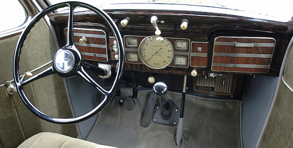
American Dashboards - 1936

This blog normally deals with automobile exterior styling, but occasionally treats interiors.  Today's post is one of those exceptions.

Drivers necessarily interact with dials, switches, buttons and other items on a car's dashboard.  Probably far more attention is paid there than standing back and admiring the vehicle's design.  Therefore, a series about dashboards.

The present post presents dashboards of significant production level American cars for the 1936 model year.  Later installments will deal with dashboards for 1941, 1949 and 1955.

For the most part, image sources are unknown to me, but are indicated where possible.  Brands are arranged by corporation or company, and by ascending order of luxury, where appropriate.  To set the scene, a few late-1920s dashboard photos are included.

Gallery

1928 Ford Model A
In the days before car makers had styling organizations, details such as instrument panels were probably created by engineering staff.  This was almost certainly the case for Ford.  The shape was intended by somebody to be "artistic."

1927 Dodge Brothers
Dodges were more upscale than Fords.  But the instrumentation is also minimal, and its setting is simpler.

1927 Chrysler 70
This Chrysler model is mid-range, with more dials.  The artistic touch is a theme of ovals.

1927 Packard - Bonhams auction photo
Even though Packards were upscale cars, this instrument panel is basic.

1936 Chevrolet Standard
By the mid-1930s all American carmakers made use of stylists. The instrument cluster is now in front of the driver, a glove box is placed before the front-seat passenger.

1936 Pontiac
Pontiac and Chevrolet shared the same basic bodies, and their dashboards were similar -- note the two large circular items.  However, functions were reversed: Pontiac's speedometer is on the left and other instruments are on the right, unlike the Chevy.  This Pontiac has a clock mounted on the glove compartment door.

1936 Oldsmobile
Oldsmobile's dashboard featured two large circles, the one on the left with the speedometer with other gauges clustered on either side.  The wire cluster behind the steering wheel seems to be a fan added by an owner.

1936 Buick Century
Buick's dashboard is more cleanly styled than Oldsmobile's.  Note the horizontal chrome "speedline" strips, a Moderne touch.

1936 Cadillac
For some reason Cadillac's instrument cluster is somewhat centered, not fully in front of the driver.  That said, the large dial on the right is a clock, not something vital for operating the car.  And there is a rectangular cluster of gauges at the left side of the panel.  The overall effect is what one might expect on a 1936 luxury car.

1936 Ford Tudor DeLuxe - Hyman photo
Ford went along with the times, having abandoned the Model A's clustered instrumentation.

1936 Lincoln-Zephyr
The newly launched Zephyr was Moderne and streamlined inside and out.  Instruments are grouped in the large circular mounting atop a centralized pedestal.  The other round-faced dial is the clock.

1936 Plymouth - Mecum
Chrysler Corporation's entry-level Plymouth brand's dashboard features fake wood trim, something seen on American cars from time to time in the future.  That's a heater mounted below the glove box.

1936 Dodge
Dodge also had a centrally-located instrument cluster and fake wood.

1936 DeSoto
I don't know if this DeSoto is an Airflow or an Airstream.  Instruments are centered, but the theme is rectangular, not circular.

1936 Chrysler Airstream
The arrangement is similar to the DeSoto's, but overall appearance seems rather stark.

1936 Studebaker Dictator
Studebaker's theme seems rather Art Deco.

1936 Packard Eight Phaeton
Yet another centralized group -- with export markets in mind?  That's surely real wood.  To me, the discordant note is the squeezed shape at the center of the cluster that features the Packard crest.

1936 Nash
A simple design with some vertical trim.

1936 Terraplane Convertible, by Hudson
The non-vertical placement of the instrument cluster makes me wonder just how visible those instrument are to the driver.  A too-affected design, I think.