Thursday, January 28, 2021

Mercedes 300 SL -- from W194 to W198

Daimer-Benz has built many outstanding cars over the years.  One of the most famous in the post- World War 2 era was the W198 300 SL Coupé.  It was a follow-on of the successful W194 racing car.  Its most distinctive feature was its "gull-wing" doors.

Details of the evolution front W194 to W198 are in the image captions below.  Unless noted, images originated at Daimler-Benz.

Gallery

Spaceframe chassis
I don't know if the item pictured here is for a W194 or W198, though it's possible that those for late-W194s were the same as for W198 coupés.  These frames were extremely light-weight, helping to reduce the weight of W194 rennwagen (race cars).

Early W194 road-tested
Interestingly, the front license plate frame sports the name "300 SL" ( SL =  super leicht, super-light) so Mercedes was thinking of that moniker early in the game.

Front quarter view of early W194
Another view of apparently the same car.  At least 11 W194s were made, and this is an early one because it lacks the famous 300 SL gull-wing doors.  Entry here required stepping over the fender while having  a gull-wing partial door raised.

Side view of early W194
The basic body shape was carried over to production 300 SLs, though the fenders were narrowed and otherwise reshaped slightly.

Rear quarter view of early W194
This shows the initial puffed-out fenders.  The next evolutionary step was provision of a gull-wing door on the driver's side only.

W194 with doors raised
This later W194 features a full set of gull-wing doors.  The plaid cloth seat trim was replaced by leather on 300 SLs.

1953 W194 chassis #11, front quarter view
This was probably the ultimate W194, perhaps serving as a kind of prototype of the 300 SL.  The air vent on the front fender was carried over into production in modified form, but not the front styling or the rear fender vent.

1953 W194 chassis #11, rear quarter view

Rear view of 1953 W194 chassis #11
Note the large gasoline tank filler cap in the rear window.  This is a racing car feature.  The trunk lid sports the legend "300 SL."  That and the Mercedes star imply a production car.  The large letter D probably stands for Deutschland.

1954 300 SL (W198) with doors raised
The "eyebrow" over the front wheel opening was to reduce window splash while driving in rain at high speed, according to Mercedes.  The other one is decoration.

Front quarter view of 1955 300 SL, Mecum auction photo
My web search of auction sites indicates that an excellent-condition 300 SL coupé can be had for more than one million dollars.

Front quarter view of 1955 300 SL with doors raised, Mecum photo
Gull-wing doors became something of a fad, as I mentioned here.  That said, they aren't very practical, though the spaceframe chassis required something like it.

Rear quarter view of 1955 300 SL, Mecum photo
The passenger compartment greenhouse is almost the same as that of W194 chassis #11.  Missing is the racing fuel cap on the backlight window,

1958 300 SL Roadster
Model year 1957 saw Coupés being phased out and Roadsters phased in.  Note the conventional door.  This change required reworking the spaceframe.  I wonder if that affected body flexing for the worse.

Monday, January 25, 2021

Peerless -- Towards the End

Peerless automobiles (1900-1931) were recognized as one of America's "Three-Ps" luxury brands -- along with Packard and Pierce-Arrow -- during the early decades of the 20th century.  The company's Wikipedia entry is here, and there isn't much else a little Google searching turned up.   My personal reference library has little regarding Peerless because my focus is on cars from around 1930 onwards, the era of professional automobile styling.

What this means is that I won't very informative in this post.

I previously wrote about Peerless here, dealing with its 16 cylinder prototype styled by Frank Hershey.

What I find puzzling is that the cars in images of late-1920s Peerlesses I found on the Internet didn't strike me as being luxury cars.  Admittedly, this was a very small sample, but cars with impressively long hoods were virtually absent.  Moreover, many of those Peerless cars had six-cylinder motors: eight cylinders and more would be expected for an expensive car in those days.

That said, below are some images of Peerless automobiles made during the last few years the company built cars.

Gallery

1927c Peerless Six-90 Sedan photographed for a San Francisco newspaper.  Six-cylinder versions had stubby hoods.

1928 Peerless Victoria Opera Coupe, auction promotion photo.  This too seems to be a six.

1929 Peerless Six-81 Sedan - for sale photo.  Yet another visually unimpressive car with typical late 1920s body design.

1929 Peerless Six-61 Roadster - Owls Head auction photo.

Same car, side view.  Sporty, yet otherwise undistinguished appearance.


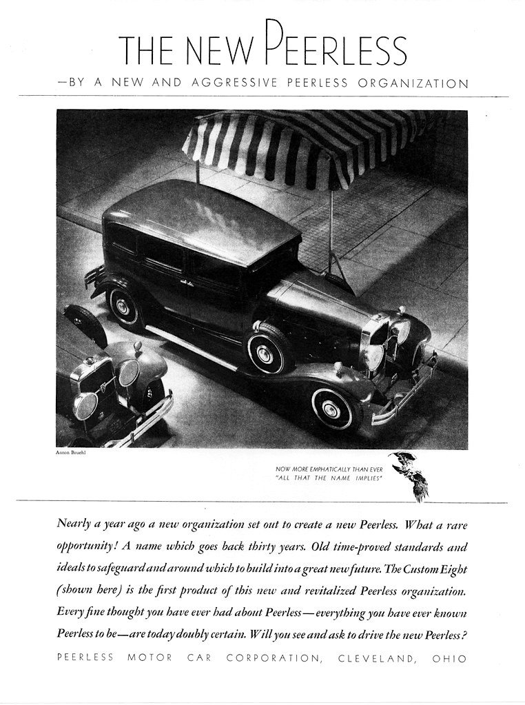
These two 1930 model year advertisements announce a new direction for Peerless.  Perhaps the V-16 prototype was one result of this failed initiative.  In any case, the cars pictured here seem like actual luxury models.  The car shown in the first ad appears to have a metal top, not the normal canvas insert  covering typical of the times.  Yet all-metal tops did not become common until later in the 1930s, so I wonder what sort of top the pictured car had.

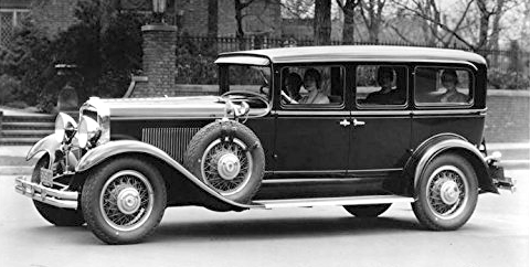
An eight-cylinder 1930 Peerless sedan.  More impressive than the Sixes shown above, but still of the 1920s pre-styling age body design practice.

1931 Peerless Master Eight DeLuxe Sedan.  I can believe this was a luxury car by its proportions.

Wikimedia Commons image of a 1931 Peerless.

Thursday, January 21, 2021

Pontiac's 1960 Facelift

General Motors dominated the American car market in the late 1950s and was rolling in cash.  So the corporation acted quickly in the context of lead-times when stylists discovered the flashy 1957 Chrysler Corporation designs that outclassed what GM had in its design pipeline.  The result was the 1959 line where bodies were shared across all GM divisions: I wrote about that here.

Those new bodies were in production for only two model years instead of the three or four years common in those days.  And for most brands the facelifts for 1960 were significant, all aside from Cadillac losing their modest tail fins.  New grilles and other details also appeared.  The present post features Pontiac and its 1959 and 1960 styling.

Gallery

Overhead view of a 1959 Pontiac Catalina hardtop coupe.  This clearly shows the V-shaped tail fins that expand their width as they approach the car's rear.  The next series of images are of for-sale Pontiac Bonneville Vista Sedans (four-door hardtops), alternating for 1959 and 1960.

1959 Bonneville.  This is the first appearance of Pontiac's signature two-segment grille used 1961-2010.

The 1960 facelift.  The medallions on the single-segment grille are not original equipment.  As mentioned, the two-segment grille returned for the 1961 model year.

Rear quarter view showing the tail fins.

GM's 1960 facelifts tended to result in a horizontal motif replacing the fins.  In '59 the tail lights / brake lights were on the lower part of the trunk lid: for '60 they are found in round lenses at the upper part of the lid.

1959 side view.

For 1960 the fins were shaved, the four side ornaments eliminated and more side sculpting added.  The cover over the rear wheel opening is an accessory, not a standard feature.

This factory image gives a better view of the revised sides.  The tail fins are replaced by a rounded element the terminates at the tail lights.  A similar shape is added about midway on the front door, extending to the front of the car.  Other, more subtle, side sculptural elements and character lines are present, replacing the largely slab side of 1959 models.

Monday, January 18, 2021

Amilcar Compound

Amilcar, a secondary level pre- World War 2 French manufacturer, launched an advanced (from an engineering standpoint) car called "Compound" for the 1938 model year (Wikipedia entry here).   For some background on the company itself and its precarious financial position and various buyers, link here.

Engineering was by the famed Jean-Albert Grégoire who was responsible for many innovative French cars that were seldom marketplace successes.  The same can be said for the Compound.  I've seen at least three different producton totals, but it seems clear that its true total was probably less than 1000 over its brief prewar run.

I do not know who was responsible for its body design.  It was fairly advanced for its time in the French context, being similar to American practice for 1936 or 1937 when it was designed.  But apparently no effort was made to anticipate what styling trends might lead to at the end of the 1930s when it was due to be marketed.

The images below that are from publication page scans are fairly large files and can be enlarged by clicking on them.

Gallery

An early production 1938 Amilcar Compound.  The hood is long, the passenger compartment short, with its typically French beltline that drops slightly at the rear.  The front fender - headlight - grille ensemble seems very 1936 American, though on a smaller scale.

Side view.  A trim design with no serious flaws, given the car's stubby proportions.  But not striking.

Here is a 1939 Compound up for auction.  Some were made in England and featured right-hand steering, as seen here.  The English version was badged as a Hotchkiss on its grille.

Auction photo of the roadster version.  This car lacks bumpers and other details.  Its chromed headlight ensembles are a telltale that it's a 1939 model.

The 1938 Amilcar Compound in the Tampa Bay Automobile Museum collection -- museum photo.


From Automobilia Hors-Serie No. 6, Toutes les voitures Françaises 1938, Salon 1937 - pages 9 and 10.  The photos atop this page show the Salon display car whose grille differs from the production version.  The previous page includes a view of the chassis and front-wheel drive layout that was a Grégoire specialty.

From Automobilia Hors-Serie No. 11, Toutes les voitures Françaises 1939, Salon 1938 - pages 9-11.  Featured here are 1939 models.

This page deals with the roadster.

And this features the Coach Découvrable, the model found in the Tampa Bay museum.

Thursday, January 14, 2021

Lincoln 1953-58 Syling: Size Seemed to Matter

Ford Motor Company's Lincoln brand has had its ups and downs.  On very few occasions near the end of the 1990s did Lincoln sales top those of Cadillac, its main domestic luxury car rival.  And for much of its existence, Lincoln was a distinct also-ran to Cadillac in sales terms.

I haven't time here to explore the entire history of the marque, instead focusing a period of exceptional interest from a styling standpoint, the middle part of the 1950s decade.  To set the scene, Lincoln's first post- World War 2 restyling yielded 1949 models based on two basic bodies.  One body was shared with the 1949 Mercury.  The other, larger body was for the Lincoln Cosmopolitan and unique to the brand.  1952 marked the next complete restyling.  The large Lincoln was abandoned and bodies were shared with Mercury, resulting in a comparatively small car at a time when top-of-the-line cars were expected to be larger than average.

Gallery

1953
This is a mild face-lift of the 1952s.  It is an attractive design that was quite modern at the time, especially the low hood feature. Also stylish was the fake airscoop on the rear part of the side.  It was a decorative element intended to break up otherwise potentially plain, tall sides.  Ford and Mercury also sported fake side airscoops.

1954
The next model year found the fake airscoop reduced to a bulge, the chrome strip defining the location of the notional air entry point being replaced by horizontal chrome strips intended to make the car seem longer.

1955
To my eyes, the 1955 Lincoln was the best looking of its cars based on the 1952 body.  The side bulge has been reshaped in a racier manner.  Headlight bezels are now extended ahead of the headlamp faces, slightly physically lengthening the car (the term for this at the time was "Frenching").  Further lengthening was due to redesigning the tail-light assembly as part of a rear fender extension.

1956
Cadillac came up with a (for the time) futuristic new body design for the 1954 model year.  Cadillacs were more squared-off (less voluptuous) than for 1953, but the big styling innovation was the wraparound windshield.  It took Lincoln two model years to catch up with this total re-design.  The 1956 Lincoln was much larger than in 1955, yet was a clean, attractive design.

1957
Sales of nearly all 1956 model year cars were disappointing compared to record-setting 1955 sales.  Lincoln management fought back with a major face-lift even though its restyled 1956s outsold its aging 1955s.  I always thought the 1957 facelift was an aesthetic disaster, but the cars sold better than in 1956.

1958
For 1958, Lincolns were totally restyled again, this time being based on a huge, heavy unitized body.  The result was aesthetically better than for 1957, but not as nice as the 1955s and 1956s.  Sales were down, however.

This post is an adaptation of an Art Contrarian post from 2012.

Monday, January 11, 2021

Second Generation Chevrolet Lumina Sedan

When the 1995 second-generation Chevrolet Lumina sedan first appeared, I found the most interesting detail was the aft cut line of the rear door.

Otherwise, the design was generic 1990s General Motors: pleasing, nicely executed -- but not exciting.

I suppose those cars conformed to Bob Lutz's contention that overly "clinic'd" designs were necessarily bland because they reflected the average response of design clinic attendees.  Maybe that's why that cut line attracted my attention.  It was unusual, not a bland, average detail.

Let's take a look.

Gallery

Front quarter view of a 1995 generation Lumina.  Rounded front, tall passenger compartment greenhouse.  But strong horizontal character lines along the sides to complement the curves, adding some visual stiffness.

Rear quarter view.  Note the rear door cut line on the C-pillar.  Rather than continuing forwards paralleling the window curve, it instead bends toward the upper edge of the backlight window.

Side view.

High rear quarter view.  Here the rear door frame gap is narrower than usually seen on production cars, making it hard to see.  But it shows that the door's roof cut line blends with the side edge of the backlight.  A nice example of GM styling detailing.

Photo of a car for sale.  Here the cut line gap is broad, but it does a good job of showing the details mentioned in previous image captions.

Another factory-sourced photo showing the Lumina's single distinctive detail.