Thursday, May 28, 2020

1998 Lincoln Town Car and Kin

Many Lincoln Town Cars of the 1998-2011 generation are still on the road as I write this.  I've never driven one, but occasionally have ridden in some that are used as airport limousines.  They have luxurious interiors and the back seats are nice and comfortable.  And I've read that they are reliable and can easily attain high mileages -- that is why many limousine operators were unhappy when Ford stopped production, meaning that possibly inferior replacements would eventually be needed.

Wikipedia entries for the Town Car and its Ford Panther platform siblings, the Mercury Grand Marquis and Ford Crown Victoria, are respectively here, here, and here (scroll down to the 1998 generation in each case).

Besides cruising around cities and towns, these cars cruised well on the USA's Interstate system of freeways.  Police forces used the Ford version in beefed up form.

I had trouble finding suitable factory-sourced images for this post, so what you see below will have to do, I'm afraid.

Gallery

1998 Lincoln Town Car
This is an example of a large sedan whose shape was greatly influenced by wind tunnel testing.  Ornamentation is restrained even by 1998 standards: the busiest part is the grille that evokes in a flattened manner Lincoln grilles of the 1930s.

Rear treatment is also restrained.  The chrome license plate area surround includes a tiny red detail borrowed from the grille ensemble.

1998 Mercury Grand Marquis
Mercurys were not as upscale as Lincolns.  Nevertheless, frontal styling remains restrained despite having more elements such as the rectangular-detailed chin grille.  The main grille features vertical bars, a sometime Mercury brand cue.

The Grand Marquis' rear is also more elaborate than the Town Car's.  I don't think the reflector panels on either side of the license plate area work well with the tail light design.

1998 Ford Crown Victoria
The Ford's frontal styling is more simple than that of the Lincoln.  Simple in a clever way that suggests that the Crown Victoria is not in the same league as the Grand Marquis or the Town Car.

Rear styling is similar to the Mercury's, but with different (and better) chrome trim placement.

Monday, May 25, 2020

A Few Ballot Automobiles

Originally a maker of engines, Ballot made cars under its own name from 1919 to 1932, the latter date not long after it was acquired by Hispano-Suiza.  Its Wikipedia entry is here, and information regarding some of its models is here.

Ballot built racing cars, so it isn't surprising that its passenger cars had high performance and were costly.

Below are some examples of its passenger lines.  These automobiles pre-date the modern styling era, having bodies mostly or entirely by coachbuilders.

Gallery

Ballot 2LS by Lagache et Glaszman from about 1922.  This body style was later called "Torpedo Sport" (TS).  The "2L" refers to "two liter."

Ballot 2TLS by Vanvooren. undated.

1928 Ballot 2LT I photographed in the Museo Automovilistico y de la Moda in Málaga, Spain


Three views of a 1929 eight-cylinder Ballot with Weymann body up for auction.  The fender-mounted spare tires were not original equipment on this car.

This seems to be a similar car with spare tires mounted behind the trunk.

Advertisement featuring  2LTS.

Another ad, this illustrated by René Vincent, a prominent illustrator.

Thursday, May 21, 2020

Early Postwar Chevrolet Cadet Project

This is a short post because I could find only three images of the proposed General Motors postwar small-car vehicle concept.  Nevertheless, I find it quite interesting because it shows what Harley Earl's styling staff was thinking back in 1945-47.   Some background on the Cadet project is here.

Below are those images plus a view of a 1949 Chevrolet, GM's post- World War 2 A-Body redesign.

Gallery

It's hard to tell if this is an airbrush styling rendering or a heavily retouched photo of a Cadet mockup.  My guess is that it's the latter because a mockup existed, and in those days General Motors staff produced many retouched images.  I further suspect that the grille design was a provisional placeholder for a different production design, though this design would have been satisfactory.  Interesting that the grille of the 1953 Studebaker line also has a V'd segment splitter and a single central horizontal bar.

Here is a 1949 Chevrolet four-door notchback sedan.  Note that the passenger compartment appears to be almost the same as that of the Cadet -- the Cadet's windshield is one-piece and slightly taller and the beltline falls off more towards the rear.  This makes economic sense, as GM could then use most of the same body structure on both cars.  The main differences are the nose and rear clips.

Side view of a mockup.  During the very late 1930 and early 1940s American styling fashion for cars of the future assumed slab fender sides and covered wheel openings, the latter for aerodynamic (as opposed to practical) considerations.

Power train and suspension layout with seating sketched in.  Here the roofline is less flat than that of the production Chevy shown above, though this might have been modified had a production go-ahead happened.

Monday, May 18, 2020

The First Lotus Elite Design

I last wrote about Lotus five years ago in this post dealing with the Lotus Elan. But to me and many others, the classic Lotus was the original Lotus Elite produced 1957-1963.

Its design has been credited to Peter Kirwan-Taylor (1930-2014) (reference here), but some attribute major input to Ron Hickman (who also contributed to the Elan). The Revs Institute in Naples, Florida has a second-series 1962 Lotus in its collection and its Web page gives credit largely to Kirwan-Taylor while acknowledging contributions by Hickman.

Regardless of its styling pedigree, the original Elite was an outstanding design, as can be seen in the images below.

Gallery

A 1959 Lotus Elite, Coys Auction photo.

Many Elites were painted cream color as in the first image.  Buy here is a 1963 Lotus in not-quite British Racing Green: Hyman auctions photo.

This and the following images of a 1962 Lotus Elite are Bonhams auction photos.  The design is simple, logical, and essentially ornamentation-free.  By "logical," note the aft cut line of the door as it extends from the door sill up into the greenhouse in one straight line.  The back window is large and curved, so there is no real need for quarter windows in the greenhouse.  The car's rear is chopped, with some radius work to soften the transition.

In profile, the Elite has a classically long hood line, the driver's head being well aft of the car's center.  The slope of the windshield is greater than seen on contemporary American cars.  A subtle point has to do with the wheel openings.  The forward opening is nearly round, but slightly flattened at the top -- this having to do with the shape of the fender relative to the fenderline profile.  The rear opening is essentially squared-off.  Were it shaped like the front opening, a visually "busy" zone would have been created due to the proximity with the windows and aft quarter pillar.  Another subtlety is the slight rise in the fenderline above the rear axle that gives that line a whiff of variety.

Frontal view showing the curved, one-piece windshield.  The grille opening is just that: an opening.  Bumpers are flimsy and not well mated to the grille, perhaps the design's weakest point, albeit a trivial one.

Rear quarter view.  Nothing to criticize here.

Thursday, May 14, 2020

1953 DeSoto Adventurer Concept: a Virgil Exner Favorite

The 1953 DeSoto Adventurer show car was one of those attractive Ghia-built Chrysler Corporation show cars of the early 1950s.

It was designed by Virgil Exner, who later became head of Chrysler styling.  During the early 1950s he was greatly interested in the styling of sports and sport-touring cars by Italian coach builders such as Ghia, Pinin Farina, Vignale, Touring and Zagato.  He felt that Italian designs were closer to what automobiles should be than the jet fighter and spaceship design features that were starting to appear on American cars and that were evident in some dream car designs, especially those from Ford.

The Adventurer's design was a favorite car of Exner's, who drove the car for a few years following its car show duties.  It was based on a shortened DeSoto chassis and powered by the DeSoto Firedome V-8 motor.

Exner was at the top of his game in those days, so who am I to gainsay his belief that the Adventurer was a very fine example of the stylist's art.  However, even though I really like the design, a few quibbles are offered in the captions below.

Gallery

Front quarter view featuring a nicely shaped grill that combines classical verticality with practical 1950s horizontal elements.  Also practical for a show car is the massive bumper -- often show car bumpers are sculptural features with little ability to protect a car from damage.  Fenders are blended into the body, yet retain a hint of pre-1950 separateness.  That is, there is no flow-through side fender design as might be expected of an American car of this vintage.

New we begin a walkaround.  The exhaust/muffler system is about the only show car jazz item I can detect.  It provides a sporty feeling, but detracts from the overall design and when heated by exhaust gasses might give burns to people bumping a leg against it.  Also, I wonder how effective that sleeve heat-guard is.

This side view reveals a nice, long hood.  Almost too long, as the driver sits slightly abaft of the car's center.  The single side window makes for a clean passenger compartment exterior design, but backseat passengers' outside vision is restricted by the wide pillar.

The rear quarter view is also pleasing.  Again, a massive bumper.  It's probably needed here thanks to the delicate tuned-under aft end of the body.  Another impractical item is the lack of a trunk lid.  The only opening seems to be for access to the spare tire.

Here is the Adventurer with a lighter paint scheme.  White-painted cars reduce the visual effect of body sculpting because highlights are camouflaged.  Note how the fenders nearly disappear here.

Rear quarter view showing an open door and some interior features.

The Adventurer in a show-setting publicity photo.

Monday, May 11, 2020

The 1956 Rambler's Curious Styling

The Nash Rambler, launched during the 1950 model year was the most successful American postwar "compact" car.  Not so successful were the early 1950s Henry J from Kaiser, the Aero Willys and the Hudson Jet.

Eventually, a redesign was called for, resulting in the 1956 Rambler from American Motors Corporation (AMC, created by a merger of Nash and Hudson in the spring of 1954).  Ramblers for the 1955-56 model years were badged as either Nash Rambler or Hudson Rambler.  Beginning in 1957, Rambler became a distinct brand.

Given the lead-time required for the creation and production of a new design, it seems likely that styling of the 1956 Rambler line was started before AMC was created.  Edmund Anderson, a veteran of General Motors, joined Nash in 1950 and was responsible for Nash and AMC styling until his departure in 1961.

The previous link suggests that Anderson might have been more an administrator than designer, but was good at hiring talented stylists.  Whatever the design situation was at Nash and AMC in roughly 1952-55, the resulting Rambler was an odd-looking car both in the context of its times and even today.

Unless noted, the images below are either factory-derived photos or are pictures of cars listed for sale.

Gallery

Setting the scene -- a four-door 1955 Rambler sedan.

And a 1955 Rambler station wagon.  Its roofline theme was carried over to the 1956 redesign.

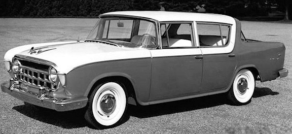
1956 Rambler 4-door hardtop.  This design was significantly longer than previous Nash Ramblers.  Its windshield is panoramic/wraparound in line with mid-1950s American styling fashion.  The three-color paint scheme (usually black, white and an accent color) was also fashionable.

Front view.  Headlights were set inside the grille frame, a feature found on 1955 and 1956 Nash full-size cars.  I find this ensemble awkward, even incoherent.  Perhaps a better solution using the same elements would place the vertical bars in the upper two levels, leaving the lower level blank.

Quasi-side view.  The panoramic windshield design seems cramped, ungraceful.  The dominant feature is the heavy C-pillar that is over-emphasized by having two colors pass over it.  This paint scheme does relate somewhat to body elements, but mostly serves to disguise  them.  I suspect that the general form of the passenger compartment "greenhouse" was strongly influenced by engineering, rather than styling, considerations.

This isn't the best possible view of the rear end, but it was the best I could find at the time.  It is a four-door sedan -- note the full-height B-pillar.  The various details work together poorly for the most part.

Alternative three-color side trim for "Sedan Custom" model.  Apparently the wrap-over-the-C-pillar paint scheme was criticized by potential buyers, so this revised pattern was offered.  It is an improvement, and the wrap-over was only offered for 1956 Ramblers.

Rambler "Super" with its simplified two-color paint scheme.  It too has that wrap-over, but provides us a better feeling for the body design.  Besides the awkward grille design mentioned above, an improvement would have been to eliminate the panoramic windshield, replacing it with a conventional A-pillar (though that might have been risky from a marketing standpoint at the time).

1956 Rambler Cross Country station wagon, hardtop (pillarless) version.  The stepped aft roofline is a carryover from the previous Rambler design: compare to the second image from the top.

Barrett-Jackson auction photo showing the station wagon's rear.

The 1956 Rambler's design is something of a mystery to me.  Anderson and his staff were competent, yet the cars were not attractive: Why?  I suggested above that engineering considerations and styling fashions might have been factors.  Another possible factor was the need (as seen by Nash president George Mason) for Ramblers to be distinct from normal American styling and design practice.  This was true of his original compact Nash Rambler that was first offered as a well-equipped convertible rather than a stripped-down compact sedan.  The first Ramblers were reasonably successful in the marketplace, and so was the design discussed here.  Apparently beauty isn't always everything.

Thursday, May 7, 2020

1956 Chrysler Dart Concept

As I discussed here, the 1956 model year Chrysler Corporation line had small tail fins tacked onto the restyled 1955 bodies for the model year facelift.  Then for 1957 the line was redesigned again, this time with the incorporation of such fins as a major part of its styling theme.

During the lead-ups to the 1956 and '57 model introductions, Chrysler publicized the idea that tail fins were the way things were going in some advanced, high-performance machines other than automobiles.

Examples included delta-wing (and tail) jet fighters such as the Convair F-102A Delta Dagger, shown here in a Air Force museum photo.

Another example was Gold Cup hydroplane racers such as the famous world speed record setting Slo-mo-shun IV seen here on Seattle's Lake Washington in the early 1950s in a photo whose origin I do not know.  It too has a delta-shaped tail fin.

To further publicize the tail fin theme, Chrysler commissioned the Delta Dart show car from Gia in Italy, the subject of this post.  Some background information is here.

The link mentions that the body shape was tested in a European wind tunnel, which raises the question of whether the design was by Chrysler stylists or by Ghia designers working on a Chrysler-specified theme.  However, it should be mentioned that the 1955 Ghia-designed Gilda was an aerodynamic exercise with features carried over to the Delta Dart.  I am away from some of my reference material as I draft his post, and will add more detail on this matter if I find it.

Gallery

The windshield resembles that used on Imperials starting in 1957.

The grille-bumper design is logical considering the overall design theme.  However, it would not be practical (or even legal in the USA) for a production version.

An interesting feature is the chromed bar/bumper element that encircles the car.  The design is fastback, which, due to contrasting heights, serves to emphasize the tail fins even further.

But that fastback top was retractible, an interesting touch not strictly related to the finned, aerodynamic theme.

Profile view.  Pretty much in keeping with the F-102 and Slo-mo-shun shown above.  Later production Chrysler Corporation car with tail fins were less conceptually pure than this show car.

Monday, May 4, 2020

2018 Chevrolet Equinox: Professional, but Not Exciting

Crossover Sport-Utility (SUV) vehicles are very popular here in America and that popularity seems to be growing in Europe and elsewhere.  That class of vehicles has been marketed long enough that many manufacturers are now producing third or even fourth (or more) generation SUVs.  As time passes and experience grows, car makers are getting better at packaging and other aspects of SUV design.

Styling remains something of a problem thanks to boxy configurations of what amounts to a tall, often short station wagon body.   Aerodynamic considerations add to styling constraints.

The subject of this post is the Chevrolet Equinox, the latest version introduced for 2018.

Its styling is what I'd call professional: pleasing with no glaring flaws.  Better yet, it isn't as over-decorated as many Japanese models are.  On the other hand, its styling isn't distinctive -- perhaps a result of having been passed through the sort of design clinic process that Bob Lutz famously criticized.  (I do not know if the Equinox design was ever given such an evaluation, so what I just mentioned is speculation.)

Gallery

Front quarter view.  The grille is hexagonal, a current fad, but shaped into a "smile" expression.  The headlights and their connecting shape are also current fashion and therefore not distinctive.

Side sculpting is fairly elaborate, but the creases and resulting curves and planes are not strongly emphasized, creating effects that are more subtle than striking.  One tiny detail that I like is the sculpting by the aft top of the C-pillar.  It's hard to see in the images here, but the side bevel of the metal roof "lid" atop the aft quarter windows extends forwards as it meets the top of the pillar.

Rear quarter view.  Shaping here might be termed "subtly fussy."  The lower edge of the aft window ensemble echoes the grille's "smile."