Thursday, January 30, 2020

Jeeps with Non-Jeep Grilles

Peter DeLorenzo, an automobile industry observer whose father was a General Motors executive and whose nearby neighbor was GM Design Vice President Bill Mitchell, hosts the must-read AutoExtremist web site.  About once a year DeLorenzo presents his evaluation of the branding strength of many makes of cars.  A consistent standout is Jeep.

From my perspective, one strong factor in Jeep's brand identity is its grille design that dates back to its World War 2 origins as a light military vehicle.  Almost all Jeeps since then have featured variations on that design.  This is akin to the famous long-lasting grille design themes of Rolls-Royce and Packard.

However, there was one exception to this strong Jeep theme.  That was found on Jeep's Wagoneer station wagon line produced from 1963 into 1991.   Early Wagoneers carried a stylized version of the traditional grille, but in 1970 that was abandoned for the rest of the model's production life.  (The Wagoneer model is being revived as an SUV in the near future, and it is likely its grille will be traditional Jeep.)

Why was the grille theme changed?  I suppose there might be an answer someplace on the Internet, and since this happened 50 years ago it's possible that some former American Motors employees are still around who can provide an explanation.  For now, here is my conjecture: Marketers decided that Wagoneer station wagons were the firm's most civilized, non-offroad Jeep-like vehicles.  Therefore, to distinguish them form "real" Jeeps, they needed a non-Jeep grille.

Unless noted, images below are either for-sale photos or photo supplied by factory publicists.

Gallery

A 1944 Willys MB Jeep, Bonhams photo.  The original stamped (simple and cheap to make) grille had nine vertical slots.  Over the years, non-military Jeep grilles tended to have seven slots, a more manageable number for stylists to work with.

2019 Jeep Cherokee featuring the latest SUV version of the grille theme.

Wagoneer for 1963, its first model year.  The grille retains vertical slots, but an even number of them in a V'd format.  Nevertheless, this design proclaims the vehicle brand is Jeep.

Going into the late 1960s the grille shape changed from somewhat vertical to broadly horizontal.  Now there were many vertical, Jeep-like slots.

As mentioned above, Jeep slots were abandoned in 1970.  Here is a mid-1970s Wagoneer whose grille has an egg-crate pattern.

By the early 1980s, this was the Wagoneer grille.  The egg-crate is gone, and now there are thin, horizontal bars -- almost the exact opposite of Jeep vertical slots.

A 1991 Wagoneer.  Fewer horizontal bars, still no vertical slots.  Thus ended the original Wagoneer line.

Monday, January 27, 2020

More Thoughts Regarding the 2016 Nissan Maxima

A few years ago I wrote about the restyled 2016 Nissan Maxima.  I mostly complained about the fussy ornamentation.  Observing one in a parking lot the other day provoked new thoughts regarding its design.

For some time now, the Maxima has been an upscaled variant of Nissan's mainline Altima brand.  Styling-wise, Maximas are Altimas with different sheet metal here and there to provide a distinctive appearance.  (Though Altimas have had a somewhat similar "feel" over the time since they were enlarged in the early 2000s, Maximas don't strike me as having any design continuity beyond their Altima base.)

To set the scene, the 2016 Altima had a height of 57.9 inches (1,471 mm), according to Wikipedia.  The height of the '16 Maxima from the same general source was 56.5 inches (1,435 mm).  It's possible that the Maxima's roof sheet metal is a bit flatter than the Altima's.  It's also possible that Maxima bodies sit a little closer to the ground.   Perhaps both possibilities were in play.

Gallery

2016 Altima, left side

2016 Maxima, left side
Both cars have the same wheelbase.  Obvious styling differences are in the side sculpting, the fore and aft door cutlines, the aft side window profile and the rear quarter shaping of the passenger compartment.

2016 Altima, rear quarter

2016 Maxima, rear quarter
From this angle it does appear that the Maxima's roof is indeed slightly lower than the Altima's -- compare the front window upper profiles.  This lower height is further enhanced visually by the high front fender curve, the rear fender curve and the wedge shaped sheet metal segment above it.  These details, in combination, visually "nest" the passenger compartment, making it appear ever lower than it might have been otherwise.  Clever.

Thursday, January 23, 2020

Recent Design Language: Volvo S90, S60 and XC40

The Swedish automobile company Volvo is no longer Swedish, having been taken over by Geely of China about ten years ago.  As best I can tell, styling and other product development remains in Sweden.

For many years Volvo stressed safety features and retained rather boxy, plain styling, though cars became less-boxy as time passed.  This post looks at three recent models' styling.

Volvo models dealt with here are the top-of-the-line 2017 S90 sedan, the smaller 2019 S60 sedan, and the Toyota RAV4-class crossover SUV 2018 XC40

Gallery

2017 Volvo S90

The Chinese-built S90 received good styling reviews when introduced.  Dominating the front is a variation of the traditional Volvo grille.  Below it are some of the usual clutter items found on most current cars.

Its profile is typical of sedan forms subjected to wind tunnel testing: graceful, with a hint of a fastback.  Side sculpting is restrained compared to extremes taken by some Japanese brands in particular.

Rear styling is more fussy.  The dominant features are the lazy-U shaped tail light assemblies that carry on Volvo's wraparound theme from previous years.

2019 Volvo S60

The new S60 line is assembled in the USA.  The frontal design follows current styling clichés, though the grille opening profile and the interior Volvo symbolism counteract that to some degree.

In profile, the shorter S60 is similar to the S90, as might be expected given aerodynamic requirements.  Side window profiles are similar, especially by the C-pillar.  Side sculpting is stronger, more in line with current fashions.  The result is a reduction in distinctiveness.

The S90 tail light theme is continued on the S60.  Otherwise rear styling is elaborate and its elements are not well coordinated.

2018 Volvo XC40

Winds tunnels and interior packaging requirements give most mid-size crossover SUVs largely the same exterior profiles, and the XC40 is no exception.  Sculpting is more angular than on the sedans just discussed, following styling cues of other brands.  The black top paint job is yet another cliché, though its dividing line on the C-pillar ties the window frame and rear spoiler better than seen on other SUVs.

Tail light assemblies are a variation of those found on previous Volvo SUVs and station wagons.  The rear design here is uncluttered and, aside from those tail lights, coherent.

The front is strongly Volvo, though an interesting variation is the mini-shouvelnose grille.  The upper side character line visually carries through from front to rear while actually being in three segments with varying sculpting.  I haven't make up my mind as to whether this is something that adds appropriate interest or is simply yet another instance of over-elaboration.

Monday, January 20, 2020

More About the 1942 DeSoto

I last featured the 1942 DeSoto here. In that post I stated:

"Automobiles are perceived to have faces, the headlights serving as eyes. DeSotos, therefore, had a curious, eyeless look because their headlights were hidden behind sliding doors when they were not turned on. Cord 810 and 812 models from 1936-37 also had hidden headlights, but these pivoted open when switched on. Door-based hidden headlights were planned for 1949 Lincolns, but instead they were left sunken and doorless. Starting around the mid-1960s, several American makes began hiding headlights, a fad that lingered here and there for decades."

Those DeSotos have always fascinated me.  Perhaps they fascinate you too.  Or maybe simply interest you.  For all '42 DeSoto fans, below are images of examples of that design.

One featured car and information about the 1942 DeSoto line can be found in this link to Hemmings. That car is owned by Nicola Bulgari: more on him and his love for American cars of a certain vintage is here.

Images below are of cars listed for sale unless otherwise noted.

Gallery

Old snapshot of a 1942 DeSoto, source not identified.

'42 DeSoto as seen in the movie "The Postman Always Rings Twice" via imcdb.

View of front end of DeSoto up for auction.

All open, including the headlight doors.  The 1942 Washington license plate's letter A stands for King County (Seattle), the most populous in the state then and now.  (That numbering system was phased out decades ago.)

Side view.  The green paint on the lower part of the car strikes me as being too bright.

Front quarter view of a highly distinctive frontal design.

Dashboard, instrumentation on the Bulgari 1942 DeSoto.  The grille over the central radio speaker echoes the vertical bar front grille.  The design theme here is rectangular from overall layout down to the gauges.

Rear quarter view of Bulgari's DeSoto.  The paint colors here match the originals.

Side view.  This car seems to be an early '42 model, because cars built towards the February 1942 end of production due to wartime had little chrome trim.

Low front quarter view.  This car's headlight doors blend smoothly with the fenders, unlike many of the cars shown above.

Thursday, January 16, 2020

"Shovelnose" Grilles

1932 Packard 900 Light Eight - RM Sotheby's photo

The Packard 900 Light Eight models from around 1932 (Packards were not given model year numbers in those days) featured a grille design distinct from mainline Packards.  The popular name (perhaps given retroactively) was "shovelnose," referring the the scoop shape of the lower part, as clearly shown in the photo above.  Some background on the Light Eight is here.

I quite like the grille's design.  At its top, it retains the traditional Packard features, and the curved lower part hints at the coming transition from boxy to curved body designs.  Although I consider it the best of such early 1930s grille forms, it was not the only example, as I explain in the captions below.  Unless noted, images are factory publicity photos or of cars listed for sale.

Gallery

1931 Auburn
Styling by Alan H. Leamy.  Superficially, this is a shovelnose grille appearing a year before the Packard design.  A close look reveals that the lower, curved part is simply a grooved extension plate with no grille openings for air intake.  Nevertheless, it might be classed as the first of the American shovelnose theme breed.

1932 Graham (a '33 in this image, almost identical in design to '32s)
The car is posed in from of the home of its stylist, Amos Northup (photo via Historic Vehicle Association).  Contemporaneous with the Light Eight, and also the work of a famous stylist, the Graham Blue Streak's grille curves slightly at the bottom.

1932 Essex Terraplane (Hudson)
Also from the 1932 model year, we find a similar treatment on this Terraplane.

1933 Studebaker President
More shovelnose examples appeared for 1933, such as on this Studebaker.  Here, like the Packard, the top of the curved area is about one-fourth of the way up from the grille's bottom, though the curvature is less pronounced.

1933 Hupmobile - my photo
Hupps had grille curves barely visible at the bottom.

1933 Oldsmobile
This car seems to be slightly lowered, perhaps hot-rodded, but is a rare example of a '33 Olds.  The shovelnose feature is visible.

1933 Dodge
The Dodge shovelnose for '33 was fairly distinct, unlike the others introduced for that year.

Monday, January 13, 2020

Pontiac's Silver Streak Echoes

For nearly 20 model years Pontiacs were easily identifiable by their Silver Streaks -- the marketing name for a strip of chromed, raised, parallel ridges running along their hoods' centerlines and in some cases down the centerlines of their trunks.

They first appeared for 1935 and continued through 1956, absent the three models years cancelled due to World War 2.  This strong brand-identification feature was scrapped for 1959 by new Pontaic general manager Semon E. "Bunkie" Knudsen.  I wrote about changing Silver Streak designs here.

Yet those streaks lived on, in a way.  On a few occasions bands of not-always-chromed parallel ridges reappeared on Pontiacs.  Not on hood or trunk centerlines, but elsewhere on the cars.  Was this decorative product identifier's resurrection intentional?  I do not know.  Perhaps a reader with solid information can write a comment with the facts.  Absent that, I strongly suspect that there was indeed intent, given that many stylists and styling managers have a good sense of automotive history.

Unless noted, images below are of cars advertised for sale.

Gallery

1935 Pontiac DeLuxe Business coupe
The original Silver Streaks.

1941 Pontiac Streamliner Sedan Coupe
A few years later streaks became fewer, yet individually bolder.  Also note the parallel linear indentations on the fenders: these will reappear years later.

1950 Pontiac Chieftain
Their band would become wider or narrower to "freshen" the concept as model years changed.

1955 Pontiac Star Chief Catalina, Mecum Auctions photo
The final two years of Silver Streaks had two narrow hood bands with tiny ridges.

1957 Pontiac Star Chief Four-Door Catalina
For 1957 the hood streaks were gone.  Yet the center section of the grille featured a multitude of parallel ridges wrapped around a notional central grill bar in a very streak-like manner.

1963 Pontiac Bonneville Coupe
A few model years later streaks reappeared on the Pontiac Bonneville line.  Here is one set running along the car's side.

1963 Pontiac Bonneville Coupe
And there was another set running across the trunk lid from tail light assembly to tail light assembly.

1999 Pontiac Grand Am, factory image
Late 1990s Pontiac Grand Ams sported swaths of parallel ridges.  The most extreme example is shown here.  The 1941-1947 Pontiacs had sets of parallel grooves/ridges on their front and rear fenders, echoing the streaks on their hods and trunks.  For some reason I doubt that many buyers made the connection to Silver Streaks that were last seen on new cars 40-some years before.

Thursday, January 9, 2020

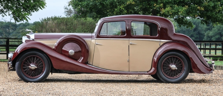
Jaguar's Tucked-in Aft Roof Line

Thanks to the keen design eye of William Lyons, Jaguar cars from the mid-1930s until around 1960 were attractive and interesting to look at.  Even during the shift from classical, discrete-component design language extant in England in the '30s to postwar integrated bodies, Lyons was able to maintain visual brand identity for Jaguar sedans (saloons).  To some degree this was due to partial continuity in radiator grill design.  More important was the after part of the roofs that had a strong tucked-in appearance that is the subject of this post.

(I wrote about Jaguar Mark VII styling here, dealing with Lyons' transition to postwar shapes.)

The images below cover the period 1935 to the late 1950s.  During that period Jaguars carried several model names, some indicating redesigned bodies, others having more to do with less obvious changes.  References are as follows: Prewar SS Jaguar 1.5, 2.5, 3.5 lire models as well as the postwar "Mark IV," a retrospective designation, (roughly 1935-1949) are treated here.  The Mark V, produced 1948-1951, can be linked here.  Information on Marks VII (produced 1950-1956) and VIII (produced 1956-1958) can be found here and here, respectively.  There also was a Mark X produced 1958-1961 using the same body as the Mark VIII, but it is not treated here due to that similarity.

Unless noted otherwise, images below are of cars listed for sale.

Gallery

1937 SS Jaguar 2.5 Litre Saloon
The feature under discussion is the profile of the after part of the roof.  Its form is that of a large-radius curve that transitions to the vertical and slightly beyond where the roof joins the lower car body at the trunk (boot).

Rear quarter view showing the back window ("backlight" in the jargon of car stylists).  Its rounded sides are retained for all the designs shown below -- another key brand identification feature.

1948 Jaguar Mark IV Sports Saloon
Here and below is a 1.5 lire model having a shorter hood than the 2.5 and 3.5 variants.  But the body abaft of the cowling is the same.  The design is a carryover from prewar SS Jaguars such as the one shown in the top images.


1950 Jaguar Mark V 3.5 Saloon
The first Jaguar postwar saloon design.  The front door cut and some other details look about the same as on the prewar models.  The passenger compartment "greenhouse" (another styling term) is new, yet its aft "tuck" is as before.


1955 Jaguar Mark VII M Saloon
The Mark VII Jaguar has an integral, postwar type body, though the greenhouse greatly resembles that of the Mark V.

The backlight is slightly taller than before.


1958 Jaguar Mark VIII - photo via RM Sotheby's
Mark VIIIs and Xs are essentially facelifted Mark VIIs.


Finally, Lyons saw to it that postwar Jaguar XK120 Fixed Head Coupé sports cars had roofs with the same characteristics found on the saloons.  Photo via RM Sotheby's.