Thursday, June 27, 2019

Chevrolet's Ill-Fated Second-Series Corvair

From around the end of the Great War until 1960 the American automobile industry built cars to the engineering convention having the following characteristics: Water cooled motor at the front of the car connected by a drive shaft to a rear-mounted differential.

There were almost no exceptions.  One was the Franklin whose engine was air-cooled, but the rest of its drive-train conventional.  Cords and Ruxtons had front-wheel drive, but their motors were water-cooled.  The brands mentioned here had an almost invisible share of the American market.

But during the late 1950s sales of Volkswagen Beetles with rear-mounted air-cooled motors were surging to the point that the Detroit Big Three carmakers decided that they had to react in order to preserve or even recover market share.  Ford and Chrysler introduced "compact" (smaller than U.S. standard size) cars for the 1960 model year.

General Motors also introduced a compact car, the Chevrolet Corvair.  The Corvair defied the existing convention by following VW, its motor being rear-mounted, air-cooled and with a flat (six opposed cylinders) layout.  The Corvair was praised in the automotive press for finally! showing some innovation.  And the cars sold reasonably well at first.

But cars with rear-mounted motors have a potentially serious flaw: At speed and due to icy roads or driver-induced maneuvering, the heavier rear will tend to rotate the car so as to lead in the direction of the car's trajectory.  That is, the car will do a half-spin so as to travel rear-end forwards.

Rear-engine VWs would do that, even a mid-engine car such as a Porsche 914 would -- I know about both through personal experience.  Over much time, Porsche engineers have been able to minimize this tendency, though they cannot easily overcome basic physics.

The link above tells of the crusade by lawyer Ralph Nader against the Corvair, calling it unsafe due to the rear-mounted motor and characteristics of the rear suspension system.  This accusation drove sales drastically downwards, the car affected being the second-generation Corvair introduced for 1965.

In this post, I deal with styling of the 1965 Corvair.

Gallery

I'll mostly focus on the coupé version of the Corvair.  To start setting the scene, above is a 1960 Corvair Monza Coupe (Mecum Auctions photo).  It has a short passenger compartment with a cramped rear seat (as I also know from experience).  The area abaft of the greenhouse is long in order to house the motor and related components.

A smaller, but analogous car is the 1961 VW Karmann-Ghia 34.  Its proportions are similar to the '60 Corvair's.

Proportions of the redesigned 1965 Corvair coupe shown in this "for sale" photo are again similar.  Note the aft point of the greenhouses in relation to the rear wheels.  Clearly, engineering considerations dominated the body "packages" and the resulting styling.  Even so, the '65 Corvair had a proportionally shorter aft zone, and so is a better balanced design.


Two Hyman Ltd. photos of a 1965 Corvair Corsa Coupe.  Styling is consistent with General Motors practice at that time during the Bill Mitchell design supremo era.  Pleasant looking with no obvious major flaws.  Impressive, actually, considering the need to deal with a rear-engine layout.

There were convertible 1965 Corvairs, this one listed for sale.

And there were four-door hardtop Corvairs as seen in this and the following "for sale" images.  Here GM engineers and stylists were able to achieve proportions not far from those of conventional, front-engine designs.

Note how subtly the air-cooling intakes are blended with the backlight.  The near-microscopic C-pillar sail panel helps to achieve a conventional, for 1965, appearance.

Here is a 1960 Corvair sedan seen from a similar angle.  Its design was established about the time Harley Earl was retiring as GM design vice-president.  It probably didn't have much Earl influence, as features such as the wraparound backlight reflect standard 1959 GM sedan designs created in reaction to preliminary work incorporating Earl's ideas.

Monday, June 24, 2019

Ford Forty-Nine Concept Was Not a '49 Ford

One of Ford's 2001 concept cars was called the Forty-Nine, recalling the company's post- World War 2, post- Henry Ford I redesign.  I consider the '49 Ford as emblematic of the conclusion of the style evolution that began in the early 1930s whereby designs gradually changed from boxes with distinct fenders, headlights, etc. to smooth, integrated designs such as that Ford.  You can read all about it in my book noted at the right (best seen on a large iPad or a Kindle computer reader).

That said, the Forty-Nine doesn't strike me as being particularly Retro, as I'll discuss in the image captions below.

Some background on the Forty-Nine can be found here and here.   The latter mentions that Ford brought in Chip Foose as a consultant.  Foose was trained in Transportation Design at the Art Center, and produces hot-rod themed custom cars (I wrote about one example here).

Gallery

1949 Ford Tudor, the first one off the production line, seen here by the Henry Ford Museum.

The Forty-Nine's frontal design.  The grille area sports a large horizontal bar, echoing the grille bar on the actual '49 Ford.  Missing is the round centerpiece which is the strongest identifier of that design. Big mistake.

The sides of the concept are clean, as was the production car's.  But the ornamentation differs.  It really needs some taillight assembly side sculpting something like that of the original.  Another mistake.

Tail lights are oriented horizontally, a very feeble echo of the 1949 Ford rear design.  Mistake number three.

The Forty-Nine captures a hint of the '49 thanks to the bowed-out sides.

Another carryover is the wheel well openings -- full at the front and two-thirds at the rear.

Two Forty-Nines were made: this is the convertible version.

So car as I am concerned, the Forty-Nine was mis-named because it has so little of the design flavor of the original car.  Other than that, it's a pleasant-looking design.

Thursday, June 20, 2019

How Four-Door Sedans Got Their Trunks

I borrowed this post's title from a Rudyard Kipling Just So story title dealing with elephants, in case you might be curious.

For some reason hard to fathom 90 years and more later, American automobiles did not have storage areas worthy of the name.


For example, even this late-1920s Checker taxi in New York City has no roof rack or other obvious place to store luggage and other large objects.  I suppose these were placed between the passengers' knees and the driver's seat.

Trunks became an industry-wide feature during the 1930s, the decade when car design evolution was at tis strongest.  The focus here is on four-door sedans because coupés and some two-door sedans, due to their shorter passenger compartments, got integrated trunks sooner than their four-door siblings.

Examples of trunks from that era are shown below.  Unless noted, images are of cars listed for sale on the internet.

Gallery

1929 Auburn 8-90
This Auburn is typical of its time, having no trunk.

1929 Hudson Club Sedan by Biddle & Smart - RM Sotheby's photo
However, some larger upscale cars did have trunks.  This Hudson's trunk is conventional, being a separate item placed aft of the main body of the car.

1930 Stutz Monte Carlo, Weymann body - RM Sotheby's
This Stutz appears to have two trunks, a separate unit at the extreme rear as well as a trunk abaft of the passenger compartment accessible from outside.  This was extremely rare in 1930 for four-door sedans.

1931 Marmon Sixteen Close-Coupled Sedan by LeBaron - Hyman Auctions photo
Marmon V-16 cars were among the those at the top of the price/prestige ladder, and this one has a trunk attached to the car's body.  It is a separate element, not integrated like the Stutz's trunk in the previous image.

1933 Cadillac Town Sedan
By 1933 trunks like this were becoming common on larger cars.

1934 Studebaker Land Cruiser - my photo
Here is an example of an integral trunk several years ahead of its time.  The design of this car was derived from the 1933 Pierce-Arrow Silver Arrow.

1935 Buick 41 Club Sedan
More typical is the trunk on this Buick.  It remains visually distinct, yet its edges are smoothed into the main body -- a step towards complete integration.

1936 Cord 810 Beverly - Hyman
Standard Cord 810 Westchester sedans had a fastback design incorporating a lidded trunk.  Beverly models had fancier interiors and some were given the tacked-on trunk lid seen here to provide some extra storage space.

1936 Lincoln Zephyr - factory photo
Aerodynamically-influenced Zephyrs has integral trunks.

1938 Studebaker Commander
Less radical is the trunk on this Studebaker.  In some respects it's similar to that on the 1935 Buick above, but its blending into the body is more complete.

1938 Graham
Now we see an early version of the "bustle back" style common after the war.

1939 Mercury Eight
A "fastback" design like the Zephyr, but this Mercury's trunk is wider and more practical.

1941 Pontiac Torpedo Sedan
By the early 1940s integral trunks were the industry standard.

Monday, June 17, 2019

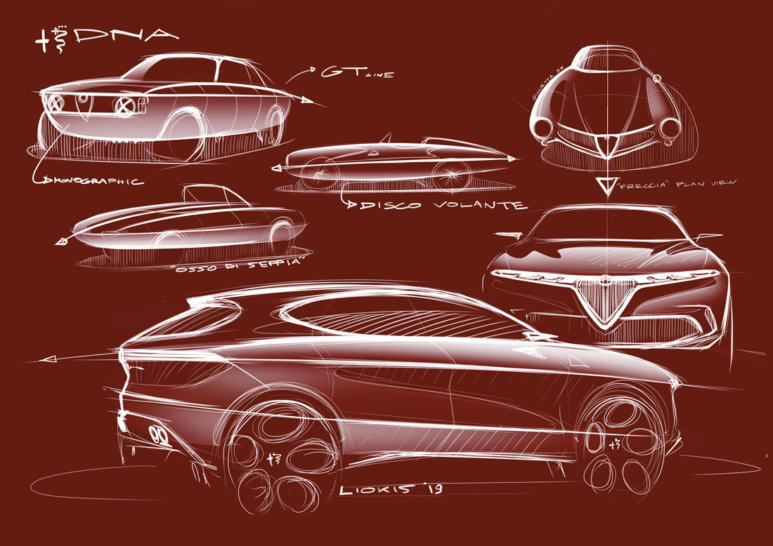
Alfa Rome Tonale Concept: Design Heritage

Alfa Romeo's Tonale concept SUV was presented at the 2019 Geneva auto show in March.  A similar-appearing production version is expected.  Some background on the Tonale can be found here and here.

Compared to some Japanese styling excesses (I'm thinking of you, Lexis, Toyota and Honda!), Tonale's design is clean and attractive.  Well, I'm not sure that frowning look given by the headlight ensembles was the best solution, but I'll let that pass for now.

What I think might interest readers is Alf Romeo's contention that the Tonale's design was influenced by the styling of various Alfa automobiles going back as far as the late 1930s.

This was a theme stressed in a May/June 2019 Auto&Design magazine supplement, Auto&Design being an Italian-based, bilingual publication featuring background information (especially styling illustrations) on the design gestation of newly-announced  automobiles.

Below are photos of the car along with drawings from Centro Stile Alfa Romeo indicating sources of inspiration.  For some reason, I very slightly suspect that some of this is post-design retroactive justification for various features.  Let's assume I'm wrong, because it's usually nice to see design language continuity.  Click on images to enlarge.

Gallery


Photos of the Tonale.  Design "DNA" sketches are below.


Thursday, June 13, 2019

A Wehrmacht 1938 Opel Super 6 Cabriolet

The Opel Super 6 was in production 1937 and 1938, 46,453 being assembled.  A brief Wikipedia entry in English is here, but from there you can link to a longer entry in German.

World War 2 started on 1 September 1939, after production of Super 6s was completed.  Since the German military needed automobiles for use by staff (as did all other war participants), some cars had been purchased before the war and others were requisitioned after it began.

Paul Allen, the late co-founder of Microsoft, established what is now called the Flying Heritage & Combat Armor Museum, located at Paine Field in Everett, Washington, the site of the Boeing factory that builds 747, 777, and 787 aircraft.

That collection includes an Opel Super 6 staff car.  The museum's web site's page dealing with the car states:

"This machine, a 1938 Super 6 two-door cabriolet, was used to transport high-ranking officials near combat areas. Its license plate, with WH for Wehrmacht Heer, marks it as a staff car used by the German army.

"Staff cars were enticing targets for Allied fighter bomber pilots, who knew those riding inside could be of high importance in the German military command structure. As a result, the car’s civilian glossy paint scheme and chrome trim were painted over with drab colors to make them less visible from the air. At night, the cars operated with blackout headlights, designed to cast a diffused horizontal beam of light onto the roadway."

Below are images of Opel Super 6 cars along with photos I took of the one at the museum.

Gallery

The grille resembles that of the 1936 Chevrolet, also a General Motors car.

Another view.


Publicity images of an Opel Super 6 Cabriolet.

A Cabriolet seen from on high.

Wartime photo of a Cabriolet in military service.  Its license plate appears to be civilian, but the left fender has WH (Wehrmacht Heer) painted on it, designating it as an army car.  Its grille and bumpers are the same as those shown a few images above.

The museum's Opel Super 6 has a different grille and different front bumper than seen in the photos of civilian Super 6s.  It is possible that these items were customized after the military took possession.  An alternative possibility is that a limited number of Super 6s were purchased by the army in 1937 or 1938 and were provided these non-standard features by the factory because the army requested them.

That's a British tank in the background.

Note the landau irons on the canvas top.  The car has considerable ground clearance, but so do the civilian Super 6 Cabriolets shown above.

In the background are (left to right) a U.S. army ambulance, a navy Corsair fighter, and a German army half-track personnel carrier.

Monday, June 10, 2019

Cord 810, America's Greatest Design

I normally find it difficult to claim this or that is my favorite in response to questions such as "What is your favorite thing in Paris?"  Maybe I spent too much time in grad school or perhaps it's simply the way I've been for many years, but I nearly always need to qualify my answer.  Or not have an answer at all.  I cannot say what my favorite Paris thing is, for example.

But when it comes to American automobile designs, I actually do have a favorite, and I've had that favorite for decades.  It's the 1936-37 Cord 810-812.  As early as age 13 or so, photos of Cords fascinated me.  And once, around that time, I saw a pale yellow Cord sedan rolling along the street, the driver going about his business (never saw that again, by the way).  I was thrilled.

Just in case, here is some background on those Cords.

The images below are of 1936 Cord 810 Westchester sedans, Gordon Buehrig's core design: click on them to enlarge.

Gallery


Front and rear quarter views of Cords auctioned by Hyman, Ltd.

Side view via RM Auctions.

Cord patent drawings.  The positions of the retractable headlights are those found on the prototype car.

Overhead view of the prototype.  I think that the key to the the design is the area forward of the passenger compartment -- specifically the shapes of the hood, fenders, catwalks and those cooling-related slats.  Any variation of those details would have ruined the effect Buehrig created.

These final images are photos I took a few years ago in Reno.  First, there is the visual tension between the rounded fenders and the more angular hood.  Then there is the placement of those fenders and the sheet metal between them (covering part of the front-wheel-drive mechanism) that's well forward of the front of the hood.  Again, a contrast creating a kind of visual tension.  The grille/vent slat design is far different from mid-1930s American styling fashions.  Very simple, while enhancing the relatively angular theme of the hood.  Besides that, there is the subtlety of the front of the hood assembly -- it isn't vertical, but leans sightly forward.  This makes it seem vertical, analogous to the slightly bulged columns of the Parthenon.

As can be seen in the overhead view of the prototype, the fenders are separated from the body by a narrow catwalk.  This separation is another subtle yet essential detail so far as Buehrig's theme is concerned.  Merging the fenders and the body would have destroyed the contrast theme.  Helping this is the lack of running boards.  The 1934 LaSalle had similar fenders and a catwalk, but the aft part of the fenders were connected to running boards, thus reducing their visual separation from the rest of the car.