Monday, April 29, 2019

General Motors' Headlight Evolution 1932-1942

Automobile headlights were becoming nested in car body parts in America as early as the 1934 model year.  But it wasn't until around 1941 that General Motors got around to doing it.  This was despite that GM designs under the direction of Harley Earl were considered style leaders in those days.

Why was this the case?  It happened that GM engineers, in particular "Boss" Kettering, thought that headlamps embedded in fenders would be subject to being put out of alignment if the fender was damaged by a collision.  This is true.  Whether this was truly a major problem or just a comparative rarity is probably debatable in any absence of insurance data.

Actually, GM headlight styling was aligned with most of the rest of the industry until about 1939.  Perhaps accepting Earl's dominance, or perhaps due to tooling cost considerations, many other firms retained separate headlamp housings through 1938.  Nevertheless, Earl had wanted integral headlights long before, and could cite 1936 Lincoln Zephyrs and 1937 Fords as competitors leading the way he wanted to go.  Finally he got what he wanted.

General Motors' mid-range Oldsmobile is used as the example shown below.

Gallery

1932 Oldsmobile
Nearly all American cars looked something like this in 1932.

1933 Pierce-Arrow - Bonhams photo
For many years Pierce Arrows had headlights perched atop front fenders as a visual trademark.  For 1933, they were partially embedded.

1933 Oldsmobile Eight
Oldsmobiles got new bodies for 1933 when streamlined appearance was starting to become a style fashion.  Headlamps were placed in aerodynamic-seeming housings that sat on posts.

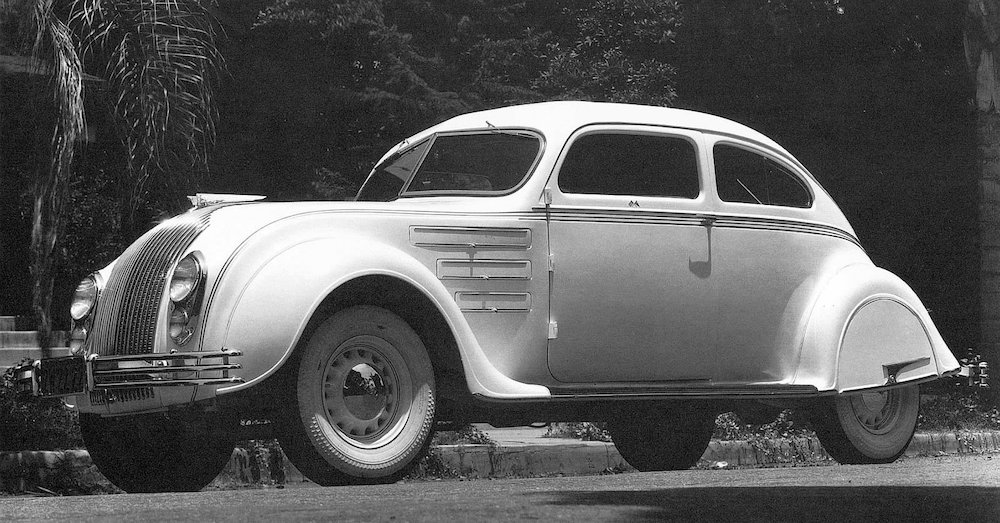
1934 Chrysler Airflow
Airflow design was wind tunnel tested.  Headlights are embedded in the car body.  Other Chrysler Corporation models followed General Motors practice until 1939.

1934 Hupmobile
Hupps were less-streamlined, but headlights also were faired into the body.

1934 Oldsmobile
For '34, Olds headlamp housings were more teardrop-shaped.

1935 Oldsmobile Six
Headlight housing attachments moved from posts to the sides of the body.  The background in the photo is San Francisco's Golden Gate Bridge under construction.

1936 Oldsmobile Six
No real change for 1936.

1937 Ford
Headlights are nested in the catwalk area.  This is similar to 1936 Lincoln Zephyr practice.  At this point, General Motors frontal designs began to look dated.

1937 Oldsmobile Six
Meanwhile, Olds headlights were still free-standing, attached to the hood area.

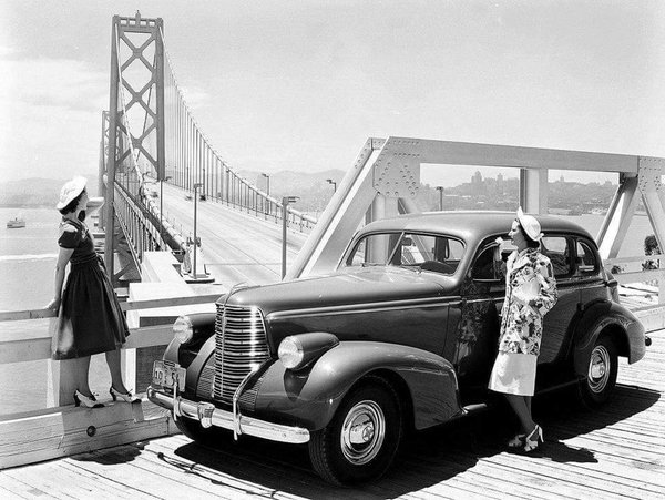
1938 Oldsmobile Eight
Now headlight housings are on the catwalk area, but remain separate elements even though they are very slightly integrated at their bottoms.  In the background is the new San Francisco Bay Bridge.

1939 Oldsmobile Six
Housings are moved ever-so-slightly down into the catwalks.  Meanwhile, many non-GM brands including Nash, Studebaker and the entire Chrysler Corporation line have headlights buried in front fenders.

1940 Oldsmobile 90
Headlight housings became more deeply buried for 1940, but only about halfway so.

1941 Oldsmobile
Finally GM headlights are fully integrated into the body shape.

1942 Oldsmobile B-44
Some GM brands had headlights placed near the fender edges for 1942, but Oldsmobile stylists held off until the 98 series was redesigned for 1948.

Thursday, April 25, 2019

Toyota's Yamaha-Built 2000GT Sports Car

Only 351 Toyota 2000GT sports cars were made 1967-1970, 62 of which were provided left-hand drive for sale in North America.

The Wikipedia entry outlines its fairly complicated background.   Apparently the original concept was by Yamaha, who failed to convince Nissan to produce the car.   But it appealed to Toyota.  What is not perfectly clear to me is how much body styling had been completed at that point.  Regardless, Wikipedia credits Toyota's Satoru Nozaki (English name-order) as being responsible for styling.

Confusingly, this RM Sothebys auction commentary mentions Raymond Loewy's name, but fails to pin down a direct connection to the car and does not mention Nozaki.

Then there is Mecum's commentary:

"Toyota began work on an automobile designed to compete with the new crop of premium European GTs, specifically the Jaguar E-type, as well as the Porsche 901 (soon called 911), Alfa Romeo 2600 and others. Project 280A was spearheaded by Toyota’s racing manager Jiro Kawano and his small team of around a half-dozen people, one of whom was stylist Satoru Nozaki.

"At the same time, Yamaha was attempting to expand its horizons as a sort of low-volume specialist subcontractor and had a four-cylinder sports car project called A550X ongoing with Nissan. Nissan had worked with Yamaha before but in this instance, altered its course and cancelled the A550X.

"As Yamaha had substantial money and commitment invested in the A550X, the company shopped it to Nissan’s arch-rival: Toyota. Since Yamaha would be assembling the limited-production sports cars, Toyota must surely have been pleased to avoid hand-building the engines and bodies. After that, a 2000GT prototype was swiftly completed for the 1965 Tokyo Motor Show in Harumi, where it stunned the world....

"Satoru Nozaki’s body was turned directly from his scale clay model into body bucks, and as no one in Japan had a production line capable of producing the 2000GT’s complex, compound curves, the semi-monocoque steel body was hand built, with all detachable panels and trim being numbered specific to each car. The impossibly low ride height of 3 feet 9 inches is made possible by a central beam, spine-frame with Ys at each end. This also created a front-mid engine position and gave the car its famously perfect balance."

A source I no longer can locate mentioned that Nozaki was inspired by the design of the Jaguar E-Type.  I placed some comparative photos in the Gallery section below.

The 2000GT is a superior design in my opinion, better than what Touring and Pininfarina were starting tp produce by the mid-1960s.  The majority of the 2000GTs ever built still exist, and from time to time you might have the chance to buy one at auction for someplace in the range of $600,000 to $1.2 million.

Photos below are of cars listed for sale or auction.

Gallery

Front 3/4 view.  The front features large, low-set lights that seem like headlights but might not be.

That's because the main headlights pivot upward when switched on.  Those lower lights are positioned fog-light height, so maybe that is what they are.

Side view.  Front wheel jounce range seems limited, but apparently there is no problem there.

Jaguar E-Type side view.  The similarity to the 2000GT seems superficial.  Shared characteristics are a long hood, a fastback/hatchback and the forward part of the rear fenderline.


Rear 3/4 view of the Jaguar and 2000GT.  The latter clearly has different shaping and detailing though the long hood - aft-set passenger compartment theme is the same.

Monday, April 22, 2019

1932 Fiat 508 Balilla / 1937 Fiat 1100

A popular 1930s Fiat line was called the "Balilla," or model number 508.  Somewhat retroactively there were the 508 A (1932-1934), 508 B (1934-1937) and 508 C (1937-1953), though the latter quickly became the first version of the Fiat 1100 and lost the Balilla name.  This post deals with he styling of Balillas from 1932 to 1939.  The Wikipedia entry for 508 A and B is here, and that for the C/1100 is here.

Balilla styling was never innovative, unlike a number of 1930s creations by Italian carrozzeria.  For that reason, I choose to compare some Balillas with contemporary cars that had similar details.  Most of the images below seem to be factory-generated publicity photos.

Gallery

This is a 1932 Ford V8 Deluxe Tudor, the only major American redesign for that model year.

And here is a 1932 Fiat 508 Balilla, also new for that year.  The Balilla carried a number of details that were old-fashioned compared to the Ford.  Its grille is flat, rather than slightly V'd.  There is a fixed exterior sunshade atop the windshield, a feature common in the 1920s.  And its general feeling is also that of a rather angular 1920s car.

A 1935 508 B in a "for sale" photo.  Its facelifted styling is behind the times compared to the 1935 USA norm.  Here the windshield is raked back slightly and the sunshade is gone.  The grille also tilts back and is more sculpted than the '32 version.   Front fenders are reshaped, carrying side skirts and extending farther downwards at the front.  Rear fenders have a touch of skirting.

1937 508 C Balilla, a complete redesign.  Note the detailing on the aft part of the passenger compartment greenhouse.

And compare it to this 1935 Ford Tudor.  It's possible the Ford inspired whoever styled the Balilla.

On the other hand, the Citroën 7 A appeared in the Spring of 1934, also having the same sort of sculpting in the area of the C-pillar.  Actually, that could be found on 1933 Ford two-door sedans, though on a more vertical greenhouse aft end, so it's difficult to determined who originated and who copied..

Another 1937 508 C.  Here we focus on the front end, its sloped hood-grille ensemble specifically.

The Balilla design might well have been inspired by the hood/grille of the 1936 Peugeot 302, shorn here.

The Peugeot 302 had a comparatively long hood, but the 1938 Peugeot 202 was a smaller car, more in line with the Fiat 1100's proportions.

Fiat 508 C / 1100 cars got a facelift for 1939, as can be seen in tis image from Fiat's Centro Storico (Historical Center).  As usual, the styling lags a few years, the grille being similar to what American cars were wearing around 1937.  It did change the character of the design, which was what must have been intended.

Thursday, April 18, 2019

American Hoods Got Visually Lower, 1952-1961

It was probably inevitable that when car bodies became envelope-type, with "pontoon" fenders and integrated exterior functional details, fenders would become taller and hoods less prominent.

This change took place during the 1950s, especially 1952-1955 as redesigned models got lower and lower bodies.  Harley Earl, General Motors' styling vice president, had favored high hoods because they suggested powerful motors lucking under them.  But even he, adept at trend-reversing, had his team lowering hoods by the 1954 model year.

What follows in the images below is not a fully-researched design history.  It's simply suggestive of what was happening styling-wise in the USA at that time.  Images are either factory photos or photos of cars listed for sale via the Internet.

Gallery

1942 Buick Century
A pre- World War 2 General Motors design featuring low, distinct fenders and a prominent hood.

C.1947 Cisitalia
Pinin Farina styled this iconic car.  Most of the hood is lower than the front fenders.  The highest part of the hood area is at the cowling, and about the same height as the fender peaks.  This configuration was never quite duplicated in American designs aside from Chevrolet Corvettes, first-generation Ford Thunderbirds and perhaps a few other sporty cars.

1949 Chevrolet DeLuxe
By the late 1940s and early 1950s, style-leader General Motors cars retained prominent hoods.

1949 Ford
I have considered this car as exemplifying the end of the styling evolutionary period that began in the early 1930s.  This Ford's hood is above the fender line, but proportionately much lower than that on the contemporary Chevy in the previous photo.

1952 Ford Mainline Tudor
The Ford Motor Company line was redesigned for 1952.  Fender lines were higher and hoods were not much above.

1952 Nash Ambassador Custom
Nashes were also redesigned that year with a small amount of input by Pinin Farina.  In this photo the hood appears to be nested between the fenders.  To some degree it was, though the highest parts of the hood along the centerline crest are actually slightly higher that the tops of the fenders.

1954 Nash Metropolitan
If it weren't for the air intake- styled bulge atop the hood, the hood would be nested between the fenders aside from close to the cowling.  This marks the most extreme 1950s USA example of this relationship.  By the mid-1960s, in many cases hoods and fenders became blended shapes.

1954 Oldsmobile Super 88
GM B and C bodies were redesigned for 1954. C bodies tended to have higher hoods, but B-body cars such as this Olds had hoods little higher than the front fenders.

1955 Pontiac Star Chief
The following model year GM A-bodies were redesigned.  Like the Oldsmobile, this Pontiac's hood is close to fender level.

1957 Oldsmobile 88 Holiday
This year marked another redesign.  Again, hoods are low, but not nested.

1960 Ford Galaxie
The redesigned '60 Fords featured a return the aft-slanting A-pillars.  The hood and fenders are nearly blended.

1961 Lincoln Continental
Another iconic design,  The central area of the hood is slightly higher than the fenders, but the fenders themselves are high.  As a result, the side edges of the hood are very slightly nested by the tops of the fenders.  Nevertheless, this configuration is a far cry from that of the Cisitalia due to differences in packaging the motor and other front-end engineering components.

Monday, April 15, 2019

2019 Toyota RAV4 Update

I wrote about the restyled, fifth-generation Toyota RAV4 crossover SUV here.  My review was somewhat mixed.  That was because Toyota stylists created a drastic personality makeover for the RAV, changing its visual character completely.

That has to do with marketing strategy.  The previous two RAV generations, in production for 12 model years, had created an image that eventually resulted in very strong sales in the USA.  To wipe out that image was a gutsy move that runs the risk of failure: check back in a year or two to evaluate sales data.

However, I need to mention that the third and fourth generation RAVs represented a break from previous RAVs.  Go here to Wikipedia and scroll down to view all RAV4 generations.

The new styling theme is a rugged, outdoorsy, truck-like appearance for a vehicle mostly used to drive to the shopping mall instead of up a dry creek bed.  In the images below, compare the frontal styling to that of the new Toyota Tacoma pickup.

2019 Toyota RAV4

2019 Toyota Tacoma
Note the thematic similarity.

In my previous RAV4 post I mentioned: "Now that the 2019s are here, I'm not at all sure I want to buy a new RAV4. That's because of the styling.... To me, the silliest, most unnecessary detail is that black strip which continues the backlight roof overhang to side window outline, running almost arbitrarily across the C-pillar. How did this detail ever get approved? This little joke is a design-killer, so far as I'm concerned. I'll go shopping for a Honda CR-V even though I'll admit that the new RAV4 looks better in the showroom than it does in these photos."

And that's what I recently did.  I test-drove a Honda CR-V and was not pleased.

My main gripe was outside visibility.  The windshield was comparatively narrow, perhaps the result of wind-tunnel testing, so the A-pillars intruded too much for my liking.  Due to that, to a slight degree my forward's vision was through the side windows.  Compounding this was the the limited visibility out the back window.  From the outside, the backlight seems nice and wide.  But a large amount of that is blanked out by sheet metal, resulting in a sort of tunnel view to the rear.  One actually has to sit in a CR-V driver's seat to understand this, but below are a few images that might provide a sense of the problem.

This marketing image shows that the windshield is indeed somewhat narrow and that its setting appears to be sculpted via wind tunnel tests.  Compare to the RAV4 image above.

Another marketing image, this of the instrument panel.  The windshield is largely cropped, but you can see that the A-pillar's base is atop the left side of the instrument panel.

I took this photo of a CR-V in a parking garage.  Note how small the rear window opening is compared to its potential.

The new RAV4 has a nice, panoramic views both fore and aft, as I discovered when test-driving one.  So I bought the car.

And as for that silly black stripe that bothered me so much, I was able to camouflage that by buying a black car.  I know, black shows road grime more than dark gray does, but for fussy me it was worth the bother.  Comparative images are below.

Gallery

Side publicity view of a 2019 RAV4.  Note the black stripe on the C-pillar.

Photo of my car, side view.  That stripe is barely visible.

Rear quarter view the same RAV with a light, bright paint scheme.

Rear quarter view of my car

* * * * *  FOOTNOTE   * * * * *


Shortly before I scheduled this post I spied an SUV with the same kind of C-pallar stipe as the '19 RAV4. It's the Hyundai Kona, first revealed in 2017 as a 2018 model.  Given its timing, I have little doubt that Toyota stylists were aware of this detail when they were designing the RAV.  Shame on them!