Monday, December 24, 2018

Chrysler's Awkward 1956 4-Door Hardtop Windows

The American "hardtop convertible" (alias "hardtop") was a style whose course ran from 1949 through the 1970s when safety regulations related to roll-overs snuffed it.  A hardtop had a B-pillar truncated at the belt line, so when windows were rolled down the car would appear pillarless between the A-pillar and the C-pillar.  Very sporty, very popular.

The first hardtops were coupés.  General Motors introduced the 4-door hardtop for the 1955 model year, a style that persisted as late as 1978 for some brands.  American Motors, Ford Motor Company and Chrysler Corporation reacted quickly, marketing 4-door hardtops on some of their brands for 1956.

I should mention that hardtops, especially the 4-door variety, were not very practical when their windows were down.  At all but very low speeds, back-seat passengers received a highly uncomfortable blast of air.  Therefore, when moving, most such cars had their windows raised.  A 4-door hardtop was at its most elegant when parked.

Some were aesthetically successful, but the 1956 Chrysler Corporation set had an awkward detail that is illustrated below.  Unless noted, the images are from factory publicity or for cars up for sale.

Gallery

1955 Oldsmobile 88 Holiday 4-door.  Note the aft side window is a one-piece affair.

Even though Fords would get new bodies for 1957, 4-door hardtops were added for 1956.  Aft side windows were also one-piece.  Mercurys and Lincolns did not have 4-door hardtops for '56.

1956 Nash Rambler Custom.  This was a new body design, but the hardtop shown here was probably a 4-door sedan quickly modified for 1956 availability.  The aft quarter-window is fixed other than being capable of pivoting.

1956 DeSoto Fireflite Sportsman 4-door hardtop shown with retracted windows.

1956 DeSoto Firedome Seville 4-door hardtop with windows raised.  Note the aft quarter window in this Mecum auction photo.

Here is a DeSoto Firedome 4-door sedan from which the hardtop was derived.  It has an aft quarter window that pivots.  The shapes of these quarter windows differ.

A somewhat worse-for-wear Firedome Seville.  This photo shows how 1956 Chrysler Corporation 4-door hardtop windows retracted.  On DeSotos and Chryslers, the rear doors extended over the wheel wells and were shaped so that fully-retractable windows had to be narrower than belt line door width.  This can be seen in this photo and the previous one.  In order to achieve a pillarless look, main rear windows and quarter windows both had to retract into the limited available door space.  The result was not as clean as GM and Ford were able to achieve, hence my claim of awkwardness for Chrysler's solution.  Chrysler Corporation cars got new bodies for 1957 and 4-door hardtops got cleanly designed side windows.

1956 Chrysler New Yorker 4-door hardtop with windows raised.

1956 Dodge Royal Lancer 4-door hardtop.  Dodges and Plymouths had different bodies than the more expensive DeSotos and Chryslers, but the side/quarter window retraction scheme was the same.

1956 Dodge Custom Royal 4-door sedan.  Its rear door has a different shape than the hardtop's.  The latter is wider below the C-pillar to accommodate quarter window retraction.  The sedan's quarter window only pivots.

I don't have a photo of a Plymouth 4-door hardtop with rolled-up windows, so this publicity photo of a Belvedere Sport Sedan with retracted windows will have to do.

Thursday, December 20, 2018

More About Infiniti's Window Design Theme

Infiniti is one of those brands I pay little attention to.   Their cars cost more than I'm willing to spend on transportation.  I also don't want to spend a similar amount for a Mercedes, BMW, Lexus, Audi, Cadillac or other expensive cars.  But the latter for a variety of historical reasons have earned greater mind-share space then Infiniti.  Infiniti simply doesn't strike me as having much of a distinctive history even though the brand is nearly 30 years old.

I wrote about Infiniti's developing C-pillar brand identification theme here.  But for the reason suggested in the first paragraph, I didn't pursue the matter until I finally noticed the aft styling of an Infiniti SUV that passed me as I was driving over one of Seattle's Lake Washington floating (on concrete pontoons) bridges.  Then I realized what drove the seemingly odd design.  Better late than never, as they say.

Details in the captions below.

Gallery

2014 Infiniti Q50 sedan
The structural C-pillar is actually a normal dog-leg reversal such as can be seen on BMWs.  It's the chrome strip that features the extra kink that comprises the brand identification theme.  It's decorative and a bit fussy seen on this sedan body.

2017 Infiniti Q60
On this coupé body, the kink can be found on the C-pillar, though the chrome strip exaggerates it.  Again, it doesn't really fit in with the rest of the greenhouse.

2014 Infiniti QX60
Here we find a hint as to the logic of the kink.

2017 Infiniti QX30
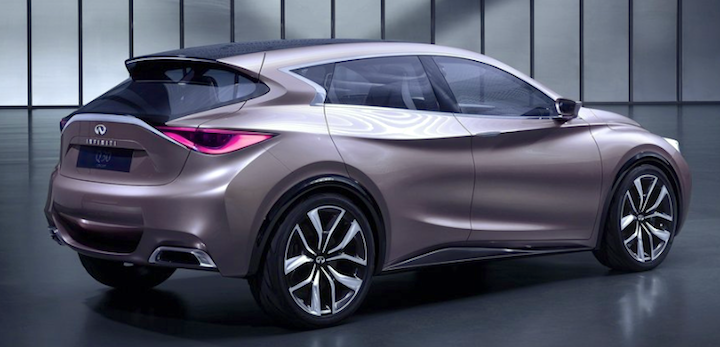
But the logic is more evident here, on the sort of car I noticed driving over the floating bridge.  If you click to enlarge the image you will see the following details better.  First, note that the structural back window -- the non- blacked out part of the glass area -- is not nearly as wide as the window implied by the glass and its side-trim.  The trim flanking the backlight converges to a rounded point.  That point is echoed by the kinked trim on the C-pillar (that has no structural kink).  It's all a matter of decoration, but the relationship just mentioned "justifies" the pillar kink that has no such justification on the sedan and coupé shown above.

2013 Infiniti Q30 Concept
This theme was previewed on the concept car shown here, a thinly disguised QX30.  Had I been more aware of this concept car and paid greater attention to production Infinitis, I would have understood the logic of the kink sooner.

2013 Infiniti Q30 Concept
Another view.  It seems that many brand identification decorations don't remain on production cars for very many models years.  A new styling director or senior manager might wish to impose a new theme that suits them.  Might this happen for Infinity?

2018 Infiniti Q Inspiration Concept
This is a recent concept car revealed at the Detroit show in January.  Probably a pushmobile, as it might be fully electrically powered or else have hybrid characteristics of some sort.  Note the absence of a C-pillar kink.

2018 Infiniti Q Inspiration Concept
A more normal perspective of the Inspiration's rear quarter design.  Some background can be found here and, especially, here.

Monday, December 17, 2018

Mercedes 230 SL with "Pagoda" Roof

The Mercedes-Benz W113 (230 SL, 250 SL, 280 SL) series of sporty cars was in production 1963-1971 (Wikipedia entry here).

When it first appeared, it seemed odd-looking to some observers (me, anyway) due to its detachable roof.  Non- soft-top automobile roofs before the 230 SL had shapes ranging from flat in the early days to various degrees of convex.  The same can be said regarding post-W113 cars roofs.  Given all this context, the 230 SL's concave, dished-in roofline didn't seem quite right.

This Web page by Mercedes offers the following items regarding 230SL design: "Under the direction of the designer Friedrich Geiger, a modern vehicle was designed which had clear and distinctive lines" and cites "Béla Barényi’s knowledge of passive safety in vehicle bodies".  The Coupé roof, was designed by Paul Bracq.  "The characteristic form of the removable Coupé roof with its inwardly pointing curvature additionally improves passive safety: the concave form ensures greater stability at a lesser weight."

I am not sure what is meant by "passive safety."  One guess is that, since the roof attachments might fail, positive aerodynamic pressure might help hold it in place.  This assumes convex shaping would create an airfoil effect of lessened pressure that would tend to generate lift, and an opposite shape would not.  Whether or not this conjecture is valid would depend upon wind tunnel testing.  For what little it's worth, I cannot think of any other potential major reason for the "passive safety" claim.  The "greater stability" claim might also be aerodynamics-related.

The Wikipedia entry states that 230 SLs began rolling off production lines in 1963, some 55 years ago.  Perhaps time, the presence of some 49,000 W113s on the world's streets and highways, and all the other sometimes odd designs appearing since then, have served to make the "Pagoda" roof (as it's often called) less jarring.

Gallery

Factory photo of a 230 SL, probably from 1963.

Barrett-Jackson auction photo of a 1964 230 SL.  This clearly shows the concave roof.

Rear view of a "for sale"230 SL, this illustrating the thin, concave lateral roof profile.

1967 230 SL rear quarter view: RM Sotheby's auction photo.  This roof features chrome strips at the edges of the concave section.

Another 1964 car, this with European headlights: compare to the car in the second image.

A nice general portrait of a 1966 for-sale 230 SL.

Thursday, December 13, 2018

Early 1950s German Lloyd Cars

Say you want to mass-produce automobiles.  But your county's factories are mostly bombed to rubble and overrun by enemy armies.  It takes years to even party recover from this disaster.  So how to you start?  What kind of car can you build?

Norddeutsche Automobil und Motoren GmbH, later Lloyd Motoren Werke GmbH (Wikipedia entry here), originally a subsidiary of the North German Lloyd steamship company but under the control of Carl Borgward, launched a very basic product.   The entry states "The very first cars (the Lloyd 300) were wood and fabric bodied. Thin, rolled steel gradually replaced the original fabric shell between 1953 and 1954 (Lloyd 400), however wood framing was still used within the doors and elsewhere."  Lloyd 300 and 400 models had two-cylinder, two-stoke motors that could propel the cars to a maximum of 75 KPH (47 MPH).  The 600 series motors remained two-cylinder, but were given four-stroke ignition resulting in a top speed of 100 KPH (62 MPH).

Postwar Lloyds were produced 1950-1961 and a few thereafter, later models being marketed by Borgward, which essentially failed in 1961 but reappeared as a Mexican concern.

Lloyd being an obscure brand, there is not a lot about its cars on the Internet.  Worse, labels for images of various Lloyd models are inconsistent, so the identification of the cars in the images below should be taken with a little skepticism.

Gallery

Publicity photo of a Lloyd LP 300.  Lack of metal bodywork is evident: the car was probably polished as best it could be for the photo shoot.

Rear quarter view of a Lloyd LP 300, Wikipedia photo.  These cars were quite small, having a wheelbase of 2 meters (79 inches).  The body designers tried to make them as modern looking as possible, given the structural limitations (especially featuring pontoon fenders).


Two views of a Lloyd LP 400 for sale.  The styling theme of the 300 remains, but is better executed thanks to the metal paneling.  Note the curved back window.  Doors remain rear-hinged.

I'm pretty sure this is a Lloyd 600, but some Internet versions of this image have it as a 400.  Here we see a two-tone paint job and more extensive chrome trim.  The design is functional: plain but not ugly.  Tiny cars such as these are difficult to style.  Keep in mind that metal and glass forming technology was far below today's standards in the early 1950s when these cars were designed.  Also recall that Germany was only beginning to recover industrially at this point after the war.

Another view of a LP 600.

A for sale LP 600 from around 1956 with revised tail lights and turn indicator lights.

Finally, a circa-1958 Lloyd Alexander 600, the LP body type designation having been dropped.  Here we find two-tone paint, a side chrome strip and a revised grille.  All-in-all, hardly a design classic -- but it could have been a lot worse.

Monday, December 10, 2018

Ford's Redesigned 1972 Torino

Ford redesigned its Torino "mid-size" models for 1972.  In the fall of 1973 the Yom Kippur War triggered a gasoline crisis that resulted in the next generation of most Detroit cars to be downsized.  The 1972 models also were among the last not affected by U.S. government regulations regarding bumper impact resistance capability.  So to some degree, those Torinos represent the last of an American automobile breed.

As the link above mentions, the Torino name first appeared for 1968 and styling was revised for 1970.  It terms the '72 Torinos as "third generation."

The name "Torino" is Italian for the city English speakers would recognize as Turin.  It is home to Fiat and Lancia  cars and, historically, Cisitalia and Siata.  Presumably Ford marketers  were thinking of the aura of the sportier brands and not of Fiat 500 Topolinos.

1972 Torinos came in two levels -- a basic Torino and the more upscale Gran Torino. Body types were a station wagon (not shown here), a four-door sedan and two varieties of hardtop coupes.  Even though Torinos were considered "intermediate" or "mid-size," they were fairly large.  Their styling for that model year was generally attractive.

Gallery

Ford Gran Torino 4-Door Pillared Hardtop.  That's what this model was called: "Pillared Hardtop" actually means that this was a sedan with a fixed B-pillar and not a pillarless car as the term "hardtop" normally meant in those days.  Ah, those marketers!

Gran Torino 2-door hardtop coupe.  The vinyl top covering was a fad at the time.  The sides of the car extend outwards to a horizontal crease that provides relief to potentially massive fender appearance as well as unifying the front and rear.  The rear fender kickup and sculpting add interest and also help reduce visible bulk.  This car has a long hood and a comparatively small bustle back.

Gran Torino SportRoof -- the fastback version of the car in the previous image.  The fastback quarter envelopes what had been the rear fender line, but the carry-over sculpting helps reduce the added bulkiness.

Rear quarter view of the bustle back version.  A detail on the image of the similar car, but more visible here: a thin chrome strip along most of the horizontal crease.  Rear end styling is simple and attractive, unlike what can be seen on many current cars.  Car shown was for sale.

The most distinctive feature on '72 Gran Torinos is the grille, seen on this "for sale" car.  Its outline is rounded-hexagonal with a rectangular grid pattern interior.  Aggressive-looking, but logical.  The dual-headlight housings follow the same outline theme.

All that changed on this 1974 Torino.  Federal regulations called for more massive bumpers, so frontal styling had to be reworked to accomplish this.  The resulting rectangular theme changed the character of the design, mostly for the worse.  The only plus, so far as I'm concerned, is the elimination of those dual headlights.  Again, a "for sale" image.

Thursday, December 6, 2018

Shared Features: Ford Futura and Ford Thunderbird

One car-buying lesson I've learned is to test-drive a car at freeway speed.  That might not be as important as it was decades ago, but it's a wise task nevertheless.

How did I learn this?  By renting a Ford Fairmont Futura coupé at some point in the early 1980s.  The 1970s and early '80s marked a low point for American cars, and this seemed true for that Futura.  The problem was that its front "floated" at highway speed -- around 60 mph (100 kph).  Why did it do this?  My hypothesis is that the car was engineered for a V-8 motor, but the one I drove had a lighter straight-6 engine, so there was less weight up front.  Needless to say, I was not a fan of that car.

Setting that aside, let's consider its styling.

The Futura was a sporty version of Ford's Fairmont line of compact cars, introduced later in the 1978 model year.  What is interesting is that, unlike other Fairmonts, several styling features were borrowed from the 1977 Ford Thunderbird.  A web source I unfortunately didn't bookmark stated that a compact version of the Thunderbird was considered during the '77's development, and that it became the basis for the Futura and its Mercury equivalent Zephyr Z7.  An image below deals with this.

Gallery

Factory photo of a 1978 Ford Fairmont Futura.  Its signature styling feature is the broad B-pillar.

That thick B-pillar was probably inspired by the 1947 Studebaker Starlight Coupe, here in its Champion version.

Another view.

This version seems to have vinyl swaths on the roof separated by sheetmetal and resulting in the appearance of a Porsche-like "Targa" bar.

Rear-quarter view of a car for sale to be compared to the image below of a 1977 Thunderbird.

The passenger "greenhouse" designs are  quite similar, even to the L-shaped character lines running down the B-pillars and then extending aft a short distance below the fender line.  The Thunderbird is a wider car than the Futura -- about 7.5 inches (190.5 mm) more.  There is no "shoulder" or "catwalk" along the fender line of either car, so it seems that the greenhouses are not identical, though they might share some side stamping in the B-pillar area.  Photo of a car for sale.

An image of full-size model of what seems to be the small Thunderbird mentioned above.  It has a Thunderbird "bird" emblem on the B-pillar.  The body is clearly Fairmont-based, though front overhang is longer than production Futuras.  The louvres abaft of the front wheel opening are similar to those on Thunderbirds.  The Zephyr Z7 also has louvres, but of a different design, and Futuras lack them.  The photo was taken on 3 March 1976 which was about a year and a half before 1977 Thunderbirds were announced.  By that point, the actual Thunderbirds probably would have committed to production, so this photo might have been taken of a model built a few months earlier before final Thunderbird decisions were made.  However, Ford management liked the smaller design enough to commit it to production as Futuras and X7s around the time the photo was taken.

Side view of a "for sale" Futura.  It conforms closely to the 1976 mockup in the previous image.  Even the character lines on the B-pillar and front and rear fenders are the same.  Ditto the quarter window and the angle of the backlight.  Compare these latter two details to the Thunderbird's below.

Side view of a "for sale" 1977 Thunderbird.  Its door and B-pillar are wider than the Futura's and the latter includes an opera window.  Its quarter windows are longer and the slope of the backlight is greater than on the Futura.

Sunday, December 2, 2018

Oldsmobile Six and Eight Grille Variations 1933-1938

During the 1930s some American brands featured grille designs that varied by model.  An early example was the 1932 Packard Light Eight, which had a "shovel" shaped lower grille, unlike more expensive Packards.  Towards the end of the decade Ford Standard and Ford De Luxe models had distinctly different grille designs, with one year's De Luxe features passed down to the following year's Standards.

Oldsmobile marketed both six and eight cylinder cars, and from the 1933 model year through 1938 gave each distinguishing grille features.  Differences were minor in the early years, but totally different grilles were used for 1937 and 1938.

In more recent times grille design variations can be found, but usually where a brand's models differ by body platform.

Oldsmobile grille designs for 1933-1939 are shown below.  For a better view of minor grille details, click on the images to enlarge.

Gallery

An Oldsmobile Eight is on the left, a Six to the right.  The Eight's grille features slender bars angled downwards in a V motif.  The Six has small, vertical bars overlaid by fewer, thicker horizontal ones.  This image cannot be enlarged.

1934 Oldsmobile Six, for sale image.  The horizontal grille bars have simple forms.

Here is a '34 Oldsmobile Eight Convertible Coupe, RM Sotheby's photo.  The main difference from the Six's grille design is that the horizontal bars are wider with a black groove down their middle.

1935 Oldsmobile Six Business Coupe.

1935 Oldsmobile Eight Business Coupe.  Here again, the models are distinguished by the same grille bar features as in 1934.

This Owls Head auction photo is of a 1936 Oldsmobile Six Touring Sedan.

Another '36 Touring sedan, this an Eight that was for sale.  Yet again, the distinguishing grille differences have to do with horizontal bars.

Then for the 1937 model year Six and Eight grilles became strongly different, as shown in this publicity material.

1938 again saw major design differences.

Then for the 1939 model year Oldsmobile dropped the Six and Eight labels along with grille differences, switching to Series Sixty, Series Seventy and Series Eighty that evolved post - World War 2 into model names such as Super 88 and Ninety-Eight.