Thursday, September 28, 2017

Early 1940s Willys Cars

I wrote about how Willys (American pronunciation is Will-iss) dealt with the onset of the great 1930s Depression here and its line of late 1930s cars in the 25 September 2017 post.

This post brings the Willys story into the 1940s to the point where American car production was halted by government order early in 1942 due to entry into World War 2.

Willys cars for the 1941 and 1942 had model numbers 441 and 442, but were advertised as the Americar (some background is here).  As can be seen in the images below, 1940s Willys's were a continuation of previous models, with a major 1940 facelift.  Changes after 1940 were minor.

Gallery

Setting the stage, here is a 1939 Willys Overland design that was given a major facelift for the 1940 model year.

A 1940 Willys 440.  Running boards are gone.  Front fenders are slightly reshaped so that headlights could be smoothly blended in.  The hood prow is less aggressive and the grille ensemble has been moved forward and redesigned.

This basic '40 coupe has less chromework on the front of the hood than the sedan in the previous image.

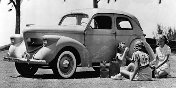
Here is a 1941 Americar 4-door sedan that is essentially the same as the year before.  The 1940 facelift included a modest bustle-back and a six-window passenger compartment.  As the plight of the model shows, the back seating area is cramped on a car of this comparatively small (for the USA) size.

1941 Americar Coupe.  This model year Willys can be identified by its grille lacking a large center bar.

Americars for 1942 were little changed.  The grille got a new center bar (compare to 1940) and running boards reappeared.

The Americar Coupe for 1942.

Willys cars were on the way out, being replaced by Jeep production.  Shown here at Fort Holabird, Maryland is a 1941 Americar next to an early version of the Jeep.

Monday, September 25, 2017

Late 1930s Willys Cars

The Willys (English pronunciation: Will-iss) survived the Great Depression of the 1930s by going small, as I wrote here.

Model 77 had some advanced styling features when it was introduced in 1933, but its basic body was somewhat old-fashioned looking to begin with, and it aged rapidly as competitors launched rounded, streamline-suggestive designs.  So Willys fought back for the 1937 model year with its restyled model 37 on a still-short 100.5-inch (2553 mm) wheelbase.

Its styling was in keeping with the times, but compromises from standard-size American car fashion were required due to the car's small size.

Gallery

This is a 1937 Model 37 coupe.  Its rounded prow can be justified because a conventional (at the time) vertical or slightly backwards-leaning front would have made the car seem stubby indeed.

Advertisement image of a 1938 four-door sedan.

A Model 38 two-door sedan.  The rain gutter on this and the car in the previous image creates an awkward distraction from the aft window profile and fastback that are otherwise in harmony.  My guess is that the shape was needed on the four-door model because, had it followed the rear door cut, rain water might have poured into the back seat area when the door was opened.  Even so, a better gutter trace could have been found.

Just for fun, here is a publicity photo.

The Model 38 was retained for the 1939 model year, but the Overland line was added.  Its wheelbase was 102 inches (2591 mm), the small difference added forward of the cowling.

The prow became less rounded, more assertive.  The grille opening was lowered in tune with styling fashion.  Headlights and their housings have a mean, aggressive look.  Note how the headlight housing shapes echo the prow and grille basic forms.

Another publicity photo, this of an Overland posed next to the Henry Dreyfuss styled Broadway Limited locomotive.

The 1938 Graham "shark-nose" design.  It appeared a year later than the Willys 37, but its frontal styling might have influenced that of '39 Overlands.  (Shannons Melbourne Auction photo.)

Thursday, September 21, 2017

Chrysler's German Engineered, American Styled Crossfire

During the DaimlerChrysler AG era there were efforts made -- some strong, others not -- to share parts and engineering design between the German and American components of the organization.  An example of a Chrysler model with a great deal of German roots is the Crossfire, offered model years 2004-2008.

As the link mentions, it was essentially a Mercedes-Benz sports car with a body designed by Chrysler stylists and built by Karmann in Osnabrück.

Sales amounted to about 76,000, of which 61,000 were during its first two years in the market.  The first year, the Crossfire was offered in coupé form, and a cabriolet (marketed as "Roadster") was added for 2005.

Its styling theme might in part be classified as a 21st century take on the feeling of 1930s German industrial design.  Here I'm thinking of its fastback profile and the inverse ribbing on the hood.  Certainly not as 1930s Germany as the original Audi TT, however.  But the most striking feature was the tapering effects on the sides.

Gallery

From the license plate, it's likely that this photo and the following one were taken in or near Karmann's Osnabrück facility.  The unusual side sculpting is more clear when viewed in person, but here is what is happening.  The rear fender is wide, but its side panel extension tapers inward going forward across the door and approaching the air outlet abaft of the front wheel opening.  The upper part of the front fender extends across the door, also tapering inwards to blend into the C-pillar zone.  That is, the are two inwards tapers, but in opposite directions, hence "crossfire."

The tapering as seen from the rear on the same car.  I find the concept fascinating.  Note the "dead zone" towards the forward edge of the door where the tapers converge and briefly disappear.

A side view where the convergence area is clearly shown.  There is no convergence in the lower side panel, as the fore-to-aft taper is at the top of the fender only.  All we find here is the aft-to-fore taper just above the cut line at the bottom of the door.

Looking down on a Crossfire with a Bremen license plate.  This shows more clearly how the upper part of the front fender tapers aft to blend with the fastback.

The Roadster model that appeared for the 2005 model year.

Rear view of the Roadster.  No fastback, of course, but the part of the trunk lid immediately above the license plate indentation includes the the same brand symbolism.

Monday, September 18, 2017

Inside a 1935 Tatra T77a

Streamlined Czech Tatras of the 1930s fascinate, seeming more pure than their post- World War 2 successors.  I wrote about the first and last streamline models here.

The first production Tatra streamliner was the T77, only 249 T77 and T77a models being built over 1934-38.

Despite the small production count, a few T77s survive. I saw a 1935 T77a in May at the Tampa Bay Automobile Museum and took a few few photos of it in a state of preliminary restoration.

Gallery

Tatra T77 from about 1934.

Tatra T77a.  The main exterior differences are the placement of the headlights on the fenders and the addition of a central light.  The museum's 1935 Tatra T77a is in the images below.  Click on them to enlarge.

The car is in sad shape, but these views provide a sense as to its construction.

It has a steel "turret top," but the doors are wood-framed.

Czech cars drove on the left sides of roads until the 1939 German occupation when German right-side practice was dictated.

Hub caps differ from those in the period photos.

Thursday, September 14, 2017

Failing Brands, Shared Body: Graham and Reo

What do you do if your automobile manufacturing company is at the lower end of the sales rank hierarchy while the country is in a Great Depression and overall car sales are about half of what they were in prosperous times.  One possibility is to reduce costs by sharing car body designs with a car maker in similar straits.  There are several cases of this happening in America and Europe, and the one featured here involved Graham-Paige and Reo for model years 1935 and 1936.

Information on Graham is here and that on Reo here.   As it happened, Graham-Paige ceased production in 1940 while Reo exited car business in 1936 to concentrate on trucks.

Like some other low-production car makers in those days, Graham and Reo sub-contracted many components of their cars to specialists, including bodies.   Staring in 1935 they each bought the same basic body from Hayes, with certain trim details customized for the sake of brand identity.

Gallery

One such "something about a Graham" was the body it shared with Reo.

Side view of a 1935 Graham.  Chrysler Airflow seating positioning hadn't trickled down to Hayes; note that the rear seat is above the rear axle as was the norm pre-Airflow.  The windshield is only slightly sloped back.  Perhaps the most advanced styling feature is the cautious fastback profile. This photo and the following one are from Lucky Collector Car Auctions.

Rear 3/4 view of the same car.  1935 was the model year that Pontiac introduced its famous Silver Streaks on its hood and grille.  Here the '35 Graham happens to have two sets of chromed streaks on its trunk lid.

This is an illustration of a 1935 Reo, so a few artistic liberties were probably taken to enhance appearance.  It does show that even fenders were shared with Graham.

Both brands had similar grille profiles and somewhat V'd front bumpers.  Differences include grille details, hood side vent designs and headlight mountings (on fenders for Graham, the sides of the radiator grille assembly for Reo).  Photo from the IMCDb web site, which explains the fuzzy quality of the image.

Graham for 1936.  The grille is a variation on the fashionable "fencer's mask" convex style.  Fenders were redesigned into more of a teardrop form, so the headlight attachments were moved to the car body.  An inexpensive cosmetic change was the detailing of the hood's side vents.

Same car from the rear.  Fastback slope was increased, so the aft side windows are much smaller than in 1935.  The trunk lid "streaks" are gone.  Photos from Niwot Auctions.

1936 Reos differ from Grahams mostly due lack of a fencer's mask grille.  Gone is the V'd front bumper.

Front of a for-sale '36 Reo showing its new pattern of grille bars, the vertical ones extending beyond the upper frame.

Rear of another for-sale Reo.  This has a bulged trunk that increases storage capacity, a common option in those days.  Chromed "steaks" that vanished from Grahams now appear here in simplified form.  This car has a divided back window like the '35 Graham shown above.  The 1936 Graham's backlight is not divided, but the window outlines are the same.

I include this Mecum Auctions photo of a 1937 Graham for completeness, as it represents the last version of that Hayes body.  The grille pattern has been simplified and the side hood vents restyled.  More costly changes are some fender reshaping and, especially, a new, V'd windshield.

Monday, September 11, 2017

The Svelte 1994 Dodge Ram Pickup

I seldom write about trucks here, only doing so when something really interests me. Such is the case with the redesign of the Dodge pickup truck line for the 1994 model year.

The 1981 first-generation Dodge Ram design was typical of pickup styling in those days -- a squared-off body sporting a bold grille.  The Wikipedia entry on "Ram Pickups" notes how the redesign for 1994 came to be.

What Chrysler stylists did was create a more rounded, more graceful shape.  One might expect that this "feminized" effect would run counter to expectations of trucks having rough 'n' tough "masculine" personalities.  What made the design truck-like was the bold, Dodge "gunsight" grille that served to counteract the curves.  The result was a huge sale success, an increase of about six times between 1993 and 1996.

General Motors and Ford eventually redesigned their pickup lines and Ram sales levels retreated.  Future Ram styling moved in a more powerful, less graceful direction.  That evolution does not detract from the 1994 Dodge Ram's important place in transportation design history.

Gallery

Front view of the newly designed for 1981 Dodge Power Ram Royal SE W150.  Note the rectangular headlights and the strong, rectangular theme of the frontal styling.

The same truck as seen from the side in this public relations photo.  Very rectangular and very pre-aerodynamic.

The 1994 Dodge Ram 1500.  More rounded with a suggestion that the design might have had some wind-tunnel testing.  Headlights are similarly rectangular.  But though the frontal theme remains basically rectangular, this has been softened.

What struck me when the '94 Rams appeared was the fadeaway front fender crossing over onto the door.  It reminds me of front fenderlines on 1946-48 Dodges, DeSotos and Chryslers.  There is a slight fenderline echo in the sheet metal above the rear wheel opening.

Thursday, September 7, 2017

Market Hierarchy-Based Trim Variations: 1950s USA

I touched on the matter here, and am now expanding on it.  Many automobile models have variations in price and prestige.  For example, my own model comes in three trim varieties, mostly having to do with the interior.  From the outside, these varieties are distinguished by the type of wheels and a few letters attached to the trunk lid.

At the other extreme, back in 1950s America during the fashion of elaborate two and even three color paint schemes and variations in chrome trim, the top and bottom of a brand's line were often easy to distinguish.  Despite my academic degree field, I'll do my best to avoid committing an act of sociology (being an apostate) to explain this.  From a strict automobile styling standpoint, the 50s was a time shortly after a strong, evolutionary trend had ended and styling staffs were groping (and failing to find) another evolutionary path.  See my book "Automobile Styling" for more detail.

This business of creating distinctions of price/prestige is a tricky one for manufacturers.  On the one hand, many buyers of top-of-the-line models enjoy being able to show off that they bought the best of the lot.  On the other, buyers of lesser models might feel a little unhappy that that other people can notice that their car isn't top-drawer for the brand.  So a certain amount of care needs to be taken to avoid loss of sales at either end of the continuum.  Of course, many buyers are not snobbish in this way; some are utilitarian in outlook and buy the model that best fits their budget and practical needs.

In today's automobile world, models of differing design within brands are what serve as price/prestige indicators.  Examples are letter-series Mercedes and number-series BMWs.

Returning to 1950s America, here are some examples of strong differences between models (though I must note that many brands' trim differences were more modest than what is shown below).

Gallery

1950 Chevrolet Styline Special Sport Coupe (for-sale photo).  Bottom of the line.  Exposed rubber windshield moldings and rubber rock guards on the rear fenders.  The chrome strip running along the top of the rear fender hid a cut-line, the fender panel being detachable on 1949 and 1950 Chevys.

The top of Chevrolet's 1950 line, the Bel Air hardtop (Barrett-Jackson photo).  Much more chrome trim can be seen here, though it isn't very gaudy.

1952 Ford Mainline Tudor.  Bits of rubber here and there like the Chevy shown above.  The only chrome trim on the sides is along the belt line.

The Customline Fordor.  Not much chrome, but enough to distinguish it from the almost totally-plain Mainline series.

1951 Hudson Pacemaker (for sale photo).  A thin chrome strip low on the body is the main bright side decoration.

The '51 Hudson Hornet in this for-sale photo features a chrome strip echoing the pressed character line along with a wide swath of chrome along the lower edge of the body.

1955 Chrysler Windsor DeLuxe Nassau hardtop, Mecum Auctions photo.  We are now well into the era of elaborate paint jobs set off by chrome trim.  But this entry-level hardtop lacks all of that.

Top of the line '55 Chrysler New Yorker DeLuxe St. Regis hardtop.  Aesthetically a few notches down from the Windsor, though it follows the function of proclaiming what it is.  Interestingly, the first Chrysler 300, introduced partway into the model year, had a clean side like that of the Windsor in the previous photo.

1955 Chevrolet One-Fifty Utility Sedan (for sale).  During the era of 1950s excess, we find this almost totally plain automobile.

1955 Chevrolet Bel Air hardtop at the other end of the line (Auctions America photo).

1956 Nash Rambler Super.  It isn't nearly as plain as the Chevy One-Fifty, having a swoopy two-tone paint scheme.  But it isn't nearly as elaborate as...

... the three-tone paint job on the line-leading Rambler Custom 4-door hardtop.

Finally, a 1958 Chevrolet Delray coupe.  Two-tone paint schemes were possible due to the chrome strip running along much of the side, though this car has only one color.  The color break at the front was via a small chrome piece linking the side strip with the top of the wheel opening.  This car lacks it, being monochrome.

This Bel Air sedan shares the side body stampings with the Delray, but uses a different trim design to proclaim its higher status.  It has the forward color divider above the wheel opening.