Monday, May 29, 2017

Comparing 1939 Mercurys and Fords

Ford Motor Company's mid-range Mercury brand spent most of its 72 model-years life sharing basic bodies with Ford and, at times, Lincoln.  This is well known.  Not so well-known, yet no secret, is that the original Mercurys had their own bodies.  The problem being that those bodies looked very similar to those used by contemporary Fords.  Perhaps that, plus the need to keep production costs reasonable, led Ford management to use Ford bodies as the basis for 1941 Mercurys.

The Wikipedia entry on Mercury is here, and Joe Sherlock's thoughts on the brand as it lay dying are here.

The original Mercurys were larger than Fords, as the Wikipedia entry mentions.  So if a 1939 Mercury were seen next to a 1939 Ford De Luxe, this would be obvious.  Normally, it was fairly rare that people saw such juxtapositions.

I don't have photos of the cars side-by-side, but perhaps the images below will illustrate their similarities and differences.

Gallery

Publicity photo of a 1939 Mercury 4-Door Sedan.

A 1939 Ford De Luxe Fordor on display in Salt Lake City.  Similarities: headlights, grille shape, hood shape and cut lines, chrome trim along the belt line, windshield and side window shapes, door openings, door hinging and general fastback shape.  Differences: position of windshield wipers, fender profiles, rear door hinging, and the degree the bodies overlap the running boards.

A two-door '39 Mercury.

A Ford De Luxe Tudor.  Again, side widow shapes are essentially the same, though the Mercury's aft window is longer thanks to its larger body.  The length difference in this zone of the car is between the door and rear fender, the Mercury having a longer wheelbase.

Publicity shot of a convertible.  Note the Moderne trim on the building in the background, perhaps to hint that the Mercury is in tune with the future.

Grist for another comparison, the Mercury here...

... and a Ford here, albeit a Tudor (for-sale photo).  This offers a better view of fender differences, slight though they are.

Rear three-quarter view of a '39 Mercury 4-door sedan in another for-sale photo.

1939 Ford De Luxe Fordor, Barrett-Jackson photo.  Back windows are about the same, as is the trunk and its cut lines.  The Mercury's rear fender is fatter than the Ford's.

Thursday, May 25, 2017

The Cleanly-Styled Yet Flawed Chevrolet Vega

Chevrolet's first fling at producing a compact car for the American market was the ill-fated Corvair, marketed 1960-69.  The second attempt was the Vega in model years 1971-77.  It sold well, more than two million being produced.  This comparative success came despite Vegas having earned a reputation for many defects.  Wikipedia has a detailed entry on the Vega that mentions its problems.

Here we focus on styling.  In that regard, the Vega comes off somewhat better.  Its design was uncluttered, its basic shape being a carefully scaled-down version of what a standard size American car could have looked like in those pre- aerodynamic efficiency days.

That virtue might also be considered a defect, because it might have looked even better -- or more appropriate -- had it not followed the general appearance of larger cars.

Gallery

A 1971 Vega hatchback, the most popular model.  Its "face" (especially the grille, bumper and headlight housings) strongly resembles that of the 1970 Chevrolet Camaro pictured below.

1970 Chevrolet Camaro Z/28 - Barrett-Jackson auction photo.

Near-side view of a 1971 Vega hatchback.  A pleasant design.

1971 Vega hatchback seen from behind.  Again, an uncluttered appearance.

Rear 3/4 view of a 1971 Vega Sedan.  There never were four-door Vegas.  This model featured a notch-back and conventional trunk.

Front 3/4 view of a 1971 Vega sedan.  Its profile is less attractive than the hatchback's.

The third Vega body type was the "Kammback" station wagon.  A low-production variation of this was a panel truck where the rear side windows were replaced by sheet metal panels.

Monday, May 22, 2017

The Pre-War Opel Admiral: An Interesting Mélange

General Motors took over the German automobile builder Opel around 1930.  In 1937, GM established a design studio at Opel, part of the staff (Strother MacMinn, John Coleman and George Jergenson, led by Franklin Q. Hershey) coming from Harley Earl's Detroit Art & Colour group.  Their first effort was the 1939 Opel Kapitän.
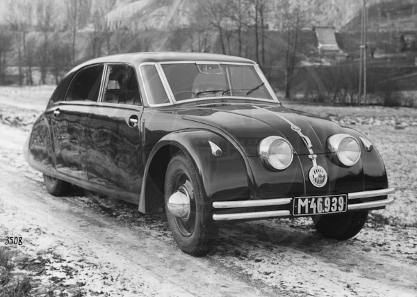
The Opel Admiral, subject of this post, was announced for 1937.  According to its Wikipedia entry, only a few were built that year: the main production run was in 1938 and 1939.

Since development of the Admiral took place before Hershey's team arrived, it is difficult for me to associate its design to a stylist.  However, it seems highly likely that Hans Mersheimer was involved.

The Admiral's styling interests me because of its odd collection of borrowings.  The images below are mostly from the time the cars were in production, and their quality is mediocre.

Gallery

Here is a factory photo of the Opel Admiral.  The front end ensemble might have been inspired by some cars pictured farther down.  An advanced feature is the almost-hidden running board.

Two-piece, V'd windshields had been around for a few years, but the Admiral's has some of the feeling of 1940 American versions.  That is mostly due to its relationship to the comparatively flat (for its time) all-steel top.

The S-curve where the passenger compartment profile transitions to the trunk area strikes me as being unusual for a four-door sedan of its era.  Contemporary American cars with similar shaping were usually two-door coupes.  Perhaps a sharp-eyed reader can remind us of any late-1930s four-door cars with a similar treatment.

This is a post- World War 2 photo showing the Admiral's rear design.

This seems to be a photo of either a prototype Admiral or perhaps a very early production car.  The bumper lacks guards and the hood side venting trim differs from cars in the previous images.  Note that the Opel lettering on the hubcaps have been carefully aligned to the horizontal for what seems to be a publicity shot.

1935-38 Volvo PV36 "Carioca"
The 1937-vintage Admiral's frontal design looks like it might have been inspired by this Volvo that must have been known to Opel body designers such as Mersheimer.

1935 Chrysler Airflow
The initial facelift of the 1934 Chrysler Airflow featuring a more prominent grille.  The Volvo PV36 was probably inspired by the '34 Airflow.

1934 Hupmobile
The headlight treatment (blending the lights into the hood) is similar to the Admiral's, and it is likely that its designers were aware of Hupp styling.

Thursday, May 18, 2017

AMC Cavalier: Symmetrical Concept Car

Ultra-luxury cars aside, the automobile industry lives in a cost-control environment.  Pennies, Euro-cents and single-digit Yen are pinched on virtually all the parts that comprise a car.  A relatively drastic cost-control tactic that is used occasionally is to have body stampings perform dual duties.  Most often, this takes the form of symmetrical doors where, say, the right front and left rear doors are  the same (save, perhaps, for a cut-out for the rear wheel opening).

Today's post deals with the interesting case of a concept car intended to demonstrate even more extensive panel-sharing.  It is the 1966 American Motors Cavalier (Wikipedia entry here).  Besides the below-the-beltline parts of the doors, the front and rear side / fender panels could be used on both sides of the car.  Also the bumpers, front and rear.  The link above claims that hood and trunk panels could be interchanged, but that isn't evident to me from the photos.

The resulting design is fairly clean and attractive, though diminished by having a static feeling that was probably inevitable, given the quest for symmetry.

Gallery

The front is simple and attractive, though not particularly distinctive.

The doors are hinged at the A and C pillars.  The slopes of the A-pillar and the leading edge of the C-pillar differ in order to help relieve potential static effects (window framing apparently had separate stampings from the remainder of the doors). Note the identical cut-outs for the tail light and grille wrap at the fenders' extremities.

Compare the wheel cut-outs in this photo to what can be seen in the previous photo.  They seem to "lean" in opposite directions.  Is this an optical illusion?  A side view of the Cavalier would resolve this, but I could not find such a photo.

As for the hood and trunk lid, it's possible that the horizontal parts would use the same stamping, but as I mentioned, I can't be sure, and tend to think they differ from what I see in the various photos.

Monday, May 15, 2017

Fiat's Aerodynamic 1500 of 1935

I don't know much about the subject of this post, the Fiat 1500 version built 1935-1939.  The English Wikipedia entry for it is here, and it, in turn, has links to entries in others languages that might have additional information.

The claim to fame for the 1500 introduced 9 November 1935 at the Salone dell'automobile di Milano is that its shape was wind tunnel tested, apparently the first for a European sedan.  The first comparable American car was the 1934 Airflow from Chrysler Corporation.

Mid-1930s streamlining was half-hearted in that separate fenders, running boards and other non-aerodynamically efficient details were usually retained.

Gallery

This image puzzles me.  The caption associated with it on the Internet has this as a 1936 Fiat 1500 Berlina Speciale.  However, this car has details not found on Web images of other Fiat 1500s from that era.  Example items include the lack of ventipanes in the forward side window assemblies, presence of rear wheel covers, differently shaped headlight assemblies, the C-pillar position of the turn indicator wand, exposed door hinges, and the horizontal alignment of the door handles.  Might this have been a prototype rather than a production model?

This is said to be a Fiat 1500 B from 1938 or 1939.  Compare it to the car shown in the previous image.

Frontal view of a Fiat 1500.  The shape of the grille is essentially the same as that of the aerodynamic Peugeot 402 introduced for 1936 on 13 October 1935 at the Paris salon -- interesting case of simultaneous development, though I have seen no reference of wind tunnel testing for the 402.  This is a wartime photo: note the blackout headlight covers.  I'm not sure if this was taken in liberated or occupied Italy.  That's because of the man's uniform.  The general cut of his jacket (the lower pockets, especially) is Italian, but the collar and details around the upper chest seem German.

This is a 1937 Peugeot 402 Éclipse, a car with a retractible metal top.   Compare its grille to the Fiat 1500's.  (1936 402s had the same grille design, so this camparison of 1935-36 vintage grilles is legitimate.)

A Fiat 1500 competing in the 1937 Bartolomeo hill-climb.  This photo has a better view of the headlight assemblies.  Note that the bumper is in one piece.  Apparently only 1936 1500s had divided front bumpers.

Comments from sharp-eyed readers are welcome regarding both the car in the top image and the uniform seen in the wartime photo.

Thursday, May 11, 2017

What Were They Thinking?: 1968 Olds Toronado Facelift

I wrote about the iconic 1966 Oldsmobile Toronado here and redesigned Toronados here.  This post deals with a facelifted version of the original design.  As I mentioned in the first link, the design was slightly compromised in 1967 thanks to a minimally revised grille.  It got worse for the 1968 model year, the focus of this post.  (For some background on Toronados, go to the Wikipedia entry.)

I titled this post "What Were They Thinking?" for two reasons.  First, there was a pretty obvious rationale for the revised grille that I'll suggest below.  Secondly, that and other changes completed the destruction of the purity of the 1966 design, and "What Were They Thinking?" expresses my horror.

Gallery

An advertisement for a 1968 Oldsmobile Ninety-Eight (the top of the sedan line).  The '68 model year was when Oldsmobile introduced two-segment split grilles, a feature that continued for years thereafter (see my book "How Cars Faced the Market" for more about split grilles).

My conjecture is that Olds management wanted Toronados to conform to this new theme.  The resulting Pontiac-like grille and hood design is shown in this ad.

The rest of the car also received some unfortunate restyling.  This Mecum Auctions photo shows a Toronado Holiday Coupe.  The vinyl covering on the roof is a phony feature in the first place.  Worse, it extends down over the C-pillar zone destroying the original blending of the greenhouse and lower side in the area of the rear wheel opening.  The striping near the fender line of the car shown here further degrades the original concept.

Here is a publicity photo of a 1966 Toronado for comparison.

Monday, May 8, 2017

Return of the Three-Piece Windshield

Wraparound or panoramic windshields (both terms refer to the same thing) reached mass-production in the USA in the form of 1954 Oldsmobiles, Buicks and Cadillacs.  (However, a few expensive, low-production Oldsmobile and Cadillac convertibles with such windshields were marketed during the 1953 model year.)  Such windshields became practical once glass-forming technology reduced breakage rates to an acceptably low level.

But such windshields turned out to be a fad.  By the 1961 model year, wraparounds where the A-pillar was either vertical or leaned forwards were gone.  Some European brands followed the same pattern, but lagged slightly behind the Americans.

Before those 1954 one-piece wraparounds appeared, a few companies marketed cars with what amounted to three pieces of glass grouped in a panoramic manner.  Large center sections used flat glass and were flanked by small glass panels that were within the state of glass forming art.  In one case, the flanking panels had flat glass, and in the other, the glass was curved.

What I find interesting is that a car was recently introduced with what amounts to a three-piece windshield in the spirit of 1930s forebears.

Gallery

1934 Hupmobile
Hupps had three-piece windshields only for the 1934 model year.  All the panels had flat glass.

Tatra 77 from 1934 or 1935.  Only the center panel is flat.

1937 Panhard Dynamic - sales photo
Panhard introduced three-piece windshields on its 1935 line and continued the practice on its redesigned 1937s.

2015 Fiat 500L
The concept returned on the Fiat 500L, perhaps due to packaging considerations (note how close the front door forward cut line is to the wheel opening and how far forward the windshield extends).

Thursday, May 4, 2017

The Exciting 1962 Corvair Monza GT Concept Car

The Corvair was a "compact" (USA terminology) car marketed by Chevrolet for model years 1960-69.  Unusual features (again, for the USA) included an air-cooled motor with six cylinders in "boxer" format.  In addition, the engine was mounted at the rear, VW Beetle fashion.  During Corvair's first year in the market a sporty version of its coupé was added: the Monza.

Monzas proved so popular that General Motors used the name for a Corvair-based concept car in 1962.  Unlike production Monzas, the Monza GT show car had the motor mounted ahead of the rear axle, making it a mid-engine vehicle.

The Wikipedia entry for the Monza GT is here.   A General Motors Web page devoted to the car is here.  Wikipedia claims the GT was displayed at the New York Auto Show in 1963, but the GM page says it was 1962.   I mention this because I was able to see the Monza GT at a New York Auto Show since I was stationed in the army within striking distance of New York City both years. What I don't remember is which year I saw the car.

Credit for styling the Monza GT is given to Tony Lapine and Larry Shinoda.

When I viewed it, I was excited by the sculpting of its front end and fenders as well as the fastback roof line.  I still like the design even though I'm more amused by the way it combines some practical engineering with plenty of jazzy show-car features.  In theory, it could have become a production car.  But making it street-legal and ergonomically practical would have neutered many of its design features, destroying its looks.

Gallery

I don't have a source for this photo taken GM's Technical Center.  I include it because it's one of the few images found on the Internet that show the car about as it would look to someone standing nearby -- most photos are taken from unrealistic angles.  The plaque in front of the GT includes the word "Spyder," which seems incorrect.  That refers to the Corvair Monza SS concept car convertible.

Flashy image of the Monza GT that emphasizes the sculpting.

Showing the rear aspect.

Side view.  At the auto show the GT was placed on a raised platform, perhaps with a turntable.  So this low-angle shot is close to what I saw.  It certainly dramatizes what's already a dramatic design.  The various air intake vents clutter the design, but were necessary for cooling the motor.

Poor-quality front view showing the clamshell headlight openings.  Totally impractical for street use.  Ditto the absence of a front bumper.

Passenger compartment opening.  Also impractical if used on stormy days.  An instance of show-car jazz.

This shows how the engined was accessed.  A whiff of show-car jazz, but more practical than the passenger access.

Monday, May 1, 2017

Deutsche Pony: 1969 Capri


The market success in the USA of the Ford Mustang and competing brands' "pony cars" (a real mustang is a wild horse) led to a European version developed by Ford's German branch.  It was called Capri.  Capris were even exported to America as Mercury Capris -- Mercury being Ford's mid-range brand at the time.

Several versions of the Ford Capri appeared in Europe over 1969-1986.  The first, retroactively called the Mk I, was produced 1969-1974.  It is the subject of this post.

Background on the European Capri is here, and about the Mercury Capri here.

Gallery

Like the Mustang, the Capri featured a long hood.  The bold character line on the sides is unusually strong and is also unusual in how it partly frames the rear wheel opening, thereby creating a different, smooth character to the aft side.  Distinctive, but not visually satisfying, it was eliminated on Mk II Capris.  What look like air intakes aft of the door are (probably) non-functional: entry level Capris had only sheet metal there.

Rear three-quarter view of a Capri for the UK market.  What looked like a semi-fastback in side view was achieved via sail panels.  The rear license plate / tail light ensemble is tidy.  Note the vinyl covered top, a styling fad in those days.

Another UK Capri.  The grille design a very simple.  Headlight housings are pretty well designed, given the shape of the headlights used.  The turn indicator segment divider does not align with the hood cut line -- a minor flaw.

Another publicity photo.  This sporty version has its hood, rocker panels and other bits painted black so as to provide even more sporting credibility to potential buyers.

This Capri has quad headlights.  Another feature besides the aft part of the character line that bothers me is the rounded window outline.  It's too symmetrical and thereby too static for a supposed performance car.  This too was changed on the redesigned Mk IIs.