Monday, August 31, 2015

First-Generation Honda and Toyota Hybrid Cars

Hybrid cars have been sold in the American market for around 15 years now.  Many such cars are difficult to detect because, aside from a small badge, they look the same as equivalent conventionally-powered models.

The first hybrids were different-looking, something like the current crop of electrically powered cars.  And the two earliest hybrid entries in the USA -- the Toyota Prius and Honda Insight -- are still being sold and still have their own styling themes.  One change is that the initial Prius and Insight models have been replaced by new designs.

In this post, I present the initial Priuses and Insights along with the usual commentary.  For background on the first Prius, click here, and for the Insight, go here.

Gallery

Australian market version Prius shown here.  It has small wheels on a short (100.4 in, 2550 mm) wheelbase along with a short, stubby nose.  From the cowling back, the design is in line with small sedan styling conventions of the the mid-1990s.  The Prius redesign used a longer (106.3 in, 2700 mm) wheelbase and a body derived from extensive wind tunnel testing.

For me, the problem with the initial Prius design is that the front and the rest of the car are poorly integrated.  The main culprit is the curved character line above the front wheel opening: it shouldn't be curved.  I would have extended it forward to touch the headlamp ensemble, splitting the latter so that the part above the contact point would be an amber color turn signal.  Something like this would have related the front to the rest of the car.

The Prius rear is bland, but not ugly.  The car cries out for larger wheels, but engineers probably insisted on small ones as a weight-saving measure.

The first Honda Insight had a very short wheelbase (94 in, 2400 mm) and held only the driver and a passenger.  The design was clearly influenced by wind tunnel testing -- note the covered rear wheels, among other details.  Like the Prius, wheels are aesthetically too small.

The Insight had a much better-integrated design, though the area in the vicinity of the top of the front wheel opening is a bit confusing.  Fortunately the curves, folds and cut lines are subtle, thereby limiting the damage.

Both the Insight and Prius (to a lesser extent) designs have strong folds on the sides towards the rear.  In both cases the objective was to have a usefully wide axle line while having the upper part of the aft body taper slightly inwards for aerodynamic reasons.

Thursday, August 27, 2015

First and Last: Tatra Streamliners

Czechoslovakia between the World Wars had an automobile industry that featured low production and high creativity.  Probably the best known firm from that era was Tatra, which built lines of cars with motors at the rear draped in streamlined bodies.   These features were considered in the 1930s to be the wave of the automobile design future.  Today, streamlining is a very important consideration in automobile design, whereas the rear-engine concept is considered a false path.

This post contrasts the first and last Tatra models with that combination of features.  Prague and Belin auto shows early in 1934 saw the introduction of the Tatra 77, the first of the breed.  Other models with similar styling followed, including the post-war Tatraplan.

By the early 1950s, Communist planners decided that Tatra would concentrate on building trucks and that Tatra cars would be assembled by Škoda.  Also around that time it was further decided that Tatras needed a complete restyling that would continue the engine placement and streamlining features.  Thus was born the Tatra 603 line.

Tatra 603s were reserved for Czech government and Party officials -- the general public had to make do with Škodas (though there might have been a few exceptions).  On the other hand, some 603s were exported as part of an effort to bring in foreign currency.

Allowing for the state of sheet steel shaping and glass curving technologies in the 1930s, I consider the 77 line to be logical and fairly attractive.  The 603s, on the other hand, look more modern, but are garish, awkward designs.  So the commissars got what they deserved.

Gallery


1933 Tatra 77 prototype or early 1934 production car
I think this is a prototype because it has air scoops towards the rear of the roof and lacks a rear bumper.  The front is necessarily stubby, but the rest of the car has nice lines.

Tatra 603 - ca. 1957
This is the initial version, produced 1956-1962.  Odd features include the three headlights, the tacky airscoop on the "hood," the awkwardly-placed turn indicator lights at the front of the fender and the Cadillac-inspired "Dagmar" bumper guards -- just to mention a few.

Tatra 2-603 - 1963
The main styling change for the 1962-1968 2-603 model is the replacement of the three-headlight arrangement with quad headlamps.  Unfortunately, the assembly is ugly even though it is somewhat dictated by the rounded nose shaping.

Tatra 3-603 - 1968
The final 603 series (1968-1975) got a better looking quad headlight assembly and lost the airscoop and Dagmars.  The chromed side trim was also cleaned up.  Nevertheless, it was impossible to eliminate all the awkward features, so the next Tatra redesign kept the rear motor but abandoned streamlining.

Monday, August 24, 2015

James W. Williamson's Charming Ford Model A Ads


The Ford Model A advertisement shown above was illustrated by James W. Williamson (1899-1978), a self-taught artist with a degree from Yale.

Ford had been building its famed Model T for many years, but by the mid-1920s its market share was being eroded by more modern competing cars.   Eventually, even the stubborn Henry Ford had to concede that the T had to be replaced, as this Wikipedia entry indicates.

The new Ford required a new marketing approach, so in 1927 the famous N.W. Ayer & Son advertising agency from Philadelphia was hired to create advertising for the forthcoming Model A.  In those days, most car ads did not use photography, so an artist needed to be selected.  Henry's son Edsel was impressed by Williamson's work and had him hired as the advertising artist.

Williamson had a successful career stretching from the 1920s to the 1950s, though it was at its peak during the 20s and 30s.  I could find little regarding him on the Internet aside from this biographical note.  He was inducted into the Society of Illustrators Hall of Fame in 1984, but their Web site contains no biography of him.

One thing that interests me regarding Ford Model A advertisements is that, although it was a low-priced car, the artwork usually showed Model A's in upper-class settings (note the floatplane in the image above).  Moreover, many of the ads were placed in women's-interest magazines.

As for Williamson, he used a clean style and included charming, sometimes humorous details in his illustrations.  And 85 years later, they provide a window into the life of a different, and possibly better, time.

Gallery


* * * * * Cross-posted at Art Contrarian * * * * *

Thursday, August 20, 2015

Badge Engineering: Chrysler Cirrus and Its Siblings

Chrysler Corporation, being the smallest of America's "Big Three" automobile manufacturers, usually tried to spread a single basic car body across all of its brands.  I dealt with one instance of that in this post.

A more recent case is Chrysler's JA platform.  JAs were marketed in the 1995-2000 model years as the Chrysler Cirrus and Dodge Stratus.   The low-priced Plymouth Breeze was produced for the 1996-2000 model years.

So far as exteriors are concerned, all three versions were essentially identical aside from grilles and a few minor trim details.  The basic body was attractive when introduced.  I recall seeing what was a pre-production or pre-release Cirrus when visiting Chrysler marketing staff and being pleased to notice the old Chrysler medal insignia on the grille instead of the vapid Pentastar from previous years.

I'm not quite so smitten with the JA design as I was at first.  Something to do with the aft end, I think.  The trunk is high, a practical detail.  But the stylists somehow failed to reduce the visual bulk.  Were I part of their team, as a start to the fix I wouldn't have wrapped the tail lights around to the side in their present form and perhaps not at all.  Then I would have experimented with a stronger rear fender line fold than the shallow roll seen on production JAs.

In the images below, I deal mostly with the grille differences Chrysler stylists used for brand identification.

Gallery


From the C-pillar forward the Cirrus strongly resembles contemporaneous full-size LH Chryslers, but with perhaps a little less front overhang.

The Cirrus grille.  Compare it to the Dodge and Plymouth alternatives below.

The lower-price Dodge Stratus features Dodge's trademark "gunsight" grille bar pattern.  Note that it shares the low-mounted running lights with the Cirrus, a money-saving feature.

The Plymouth Breeze was the lowest-price JA.  Not seen in this photo are cheap-looking plastic-like identifiers mounted at the rear, though one with the word Plymouth in script can be seen on the front door.  The running lights seem about the same as those on the Cirrus and Stratus, but they are behind the lower grille.  The bumper lacks the inserts found on the other cars, so the Breeze did get a bit of unique tooling here.

Monday, August 17, 2015

Chevrolet Corsica and Beretta: Disguised Siblings

I use the word "disguise" in this post's title because, although Chevrolet's Corsica sedan and Beretta coupe (1987-1996) were built on the same platform, their appearances differed more than might be expected for four-door and two-door versions of essentially the same car.  That distinction was intentional because Chevrolet product planners and marketers took care to give the models different names as well as letting stylists give the cars different detailing.

Given that General Motors was in its Roger Smith era downwards slide, I question the wisdom of spending the money to make the Beretta look more different from the Corsica than necessary.  In further hindsight, as this Wikipedia entry mentions, Beretta sales declined from year to year following its launch.  For more about the Corsica, click here.

Below are paired images juxtaposing the designs, Corsicas above, Berettas below.

Gallery


The main shared exterior elements seen in these photos include the windshield, cowling and bumper.  Front fender panels have the same basis, but different detailing; the Corsica has a simple wheel opening and character line crease whereas the Beretta lacks the crease and has a curved flange around the opening.  The hoods are nearly identical, with a slight difference discussed in the following pairing.


Corsica's interface with its grille - headlamp assembly is a straight, horizontal line, whereas the Beretta's features a slight kink.  The Beretta's grille has more vertical bars than the Corsica's.


Astern of a point located at the Corsica's B-pillar, the cars are completely different even though they have the same wheelbase (ignore that the Corsica shown here is a sedan and the Beretta is a coupe).  It's hard to tell from these photos, but it's possible that the cars share some structure near the top of the backlight.

Thursday, August 13, 2015

Peugeot Quartz Concept

So there I was back in July, innocently strolling down Paris' Champs-Élysées with my wife, when I came across the Peugeot showroom.  Inside the showroom, prominently displayed, was Peugeot's Quartz concept car, first shown the previous fall at the Paris auto show.  Of course I went in and took some photos, some of which are presented below.

Peugeot's web site has this blurb dealing with the Quartz. One short paragraph that caught my attention stated: "The strong, powerful, sporty style of the PEUGEOT Quartz is clear from the outset. Its shapely design combines the body of an SUV with the cabin of a sedan."

They can't be serious.

The Quartz's body clearly is that of a sedan -- there is essentially nothing about it that is SUV.  If the Quartz had a rear opening of some kind, it might be classed as a hatchback.  But I have yet to locate an internet image showing any kind of opening at the rear; how stuff gets placed behind the rear seats is a mystery to me.

Besides, there is hardly any storage space at all behind the rear seat, further proof that the car is not any kind of SUV.  To me, a salient characteristic of a SUV is that its body and interior spaces are variations of the station wagon (or break) theme.  The Quartz is no station wagon.

An independent take on the Quartz is here.  Images are below.

Gallery

Publicity image
The Quartz's overall shape is that of a blunt object.  Some of this is due to the high hoodline mandated in Europe.  Peugeot stylists added a few curved or soft elements rear the top of what might be considered the fenderline.  But they combined all this with sharp, faceted surfaces and straight-edged openings to contrast the curves, generally a wise move.

Auto show image showing open doors
The doors are dramatic, but don't seem very practical: call this auto show eyewash.  The rear door seems poised to cause injury to back-seat passengers entering or leaving.

Front
Dramatic, aggressive.  The three or four (It's hard to tell) kinds of grille decor on the various openings makes the front a bit busier than perhaps it should be.  This photo and those that follow were taken by me in the Paris showroom.

Side views, different lighting
Too-large wheels, and note that the Quartz has high clearance -- perhaps the one thing SUV about it.  The faceted area along the lower body is an exaggeration of a current styling fashion.  Interesting that the car has minimal front and rear overhang; it's really stubby.  Maybe that's why all the jazzy details were added, to disguise the basic shape.  The slit-like windows keep the weight from glass down, but otherwise are yet another dysfunctional detail.

Rear 3/4 view
Rear door cut lines doubling as color separators continue over the top to define the upper edge of the backlight.  Intersecting this line are upper and lower side window edge extensions, creating a busy zone that's made even busier by the protrusions above the backlight.  The angular openings at the car's lower corners echo the theme of similar openings at the front.  They also seem to interfere with the effectiveness of the rear strike (bumper) zone.  Otherwise, the composition of rear elements is interesting, especially considering the lack of overhang.

There are some interesting ideas crammed into the potato-like body of the Quartz, but they are on motor show steroids.  What I see is detail-drama that will surely be tamed if anything like this car (not a SUV, remember) ever reaches production.

Monday, August 10, 2015

Styling Crime: Škoda 440-445

In the early 1950s Škoda was tucked behind the Iron Curtain, largely hidden from the prying eyes of automotive journalists here in the United States.  Those journalists probably didn't give Škoda much attention anyway because its cars were not imported to the USA and therefore weren't newsworthy.  Whatever the reasons were, I never knew whether or not the firm had a styling department.  Yet someone or some group was responsible for the appearance of Škoda cars in those days.

So who is to blame for those ugly 440-445 models produced 1955-59?  Some unknown (to me) stylist or stylists?  The company's engineering department?  Management?  Well, management, for sure, because somebody had to agree to release the design for production.  Blame might also be placed on budgetary constraints and the level of metal-shaping technology available to the firm when the 440 was under development.

For some background on the Škoda 440 series try this link.  It's in Czech, so you might have to use a web browser translation feature if one is available.

Images of 440s and 445s are below.  Date citations are approximate.

Gallery

1955 Škoda 440 side view.  One-piece, curved windshield and backlight aside, the passenger compartment greenhouse and trunk ensemble has an awkward, late-1940s look.  The pontoon fender line would have been improved if it was slightly more curved with a modest kickup near the rear wheel opening.  What was needed was the aft part of the fender to be closer and roughly parallel to the fold just below the lower edge of the window.  As it is, it allows the especially awkward area around the C-pillar unneeded emphasis.  Then there is that odd bulge atop the front fender opening; I find it inexplicable.  Finally, note the protruding, chromed headlight housings that have a cheap, tacked-on appearance.

From the rear, this 440 seems very tall, an impression created in part by the bland, curved trunk and the low, bulged fender.  More of a bustle-back for the trunk and higher, less bulged fenders might have improved matters.

I suspect engineers had a large hand in the styling defects mentioned thus far.  But perhaps a stylist or an engineer with artistic inclinations was responsible for the grille design that is busy-looking and unrelated to the rest of the car.  On second thought, maybe a ne'er-do-well nephew of a commissar was responsible.

Škoda 445 from 1957 or so.  The visible changes are the 50s-fashionable two-tome paint job and upper-grille ornamentation that harmonizes better with the dominant bars on the lower grille.

A publicity photo of a 445.  The car is ugly.  The girl isn't, thank heaven.

Thursday, August 6, 2015

Harrah Collection in September 1972

Long gone, Bill Harrah's huge automobile collection was dispersed after his death with only a portion remaining here.

I was fortunate to visit it once, in September of 1972, while on my way from the Bay Area back to upstate New York where I worked.  The collection was housed in the city of Sparks, Nevada which is just east of Reno.  If I remember correctly, it was in a warehouse or industrial district and occupied three or four one-story warehouse-type buildings.

One building was devoted to cars deemed deserving of better display.  The others simply had cars jammed together.  Some of the collection was systematic.  For example, there was at least one Packard from each of the years Packards were built.  And I thing the same was largely true for Fords up through 1949 or thereabouts.

Not long ago I scanned many of the 35 mm slides I took with my Nikon F cameras.  The Harrah collection photos were taken under poor conditions for the film I was using.  The cars were mostly indoors under fluorescent lighting, so the colors I was getting tended into the blue range.  Worse, most images were blurred either slightly or strongly.  I used my iMac's image software to partly clean up the photos presented below, but the quality is still pretty bad.

Nevertheless, give them a look to get a slight sense of what Harrah had gathered at a point six years before he died.

Gallery

Outdoors.  That's one of those convertible tour busses used in the 1920s and 30s to show tourists around Yellowstone and Glacier national parks (among others).

A row of cars perhaps awaiting restoration along with a P-38 fighter plane in the background.  The nearest car is a 1955 Studebaker.  Behind it is a 1938-vintage Graham.  Farther back is what seems to be a late-1930s Packard.

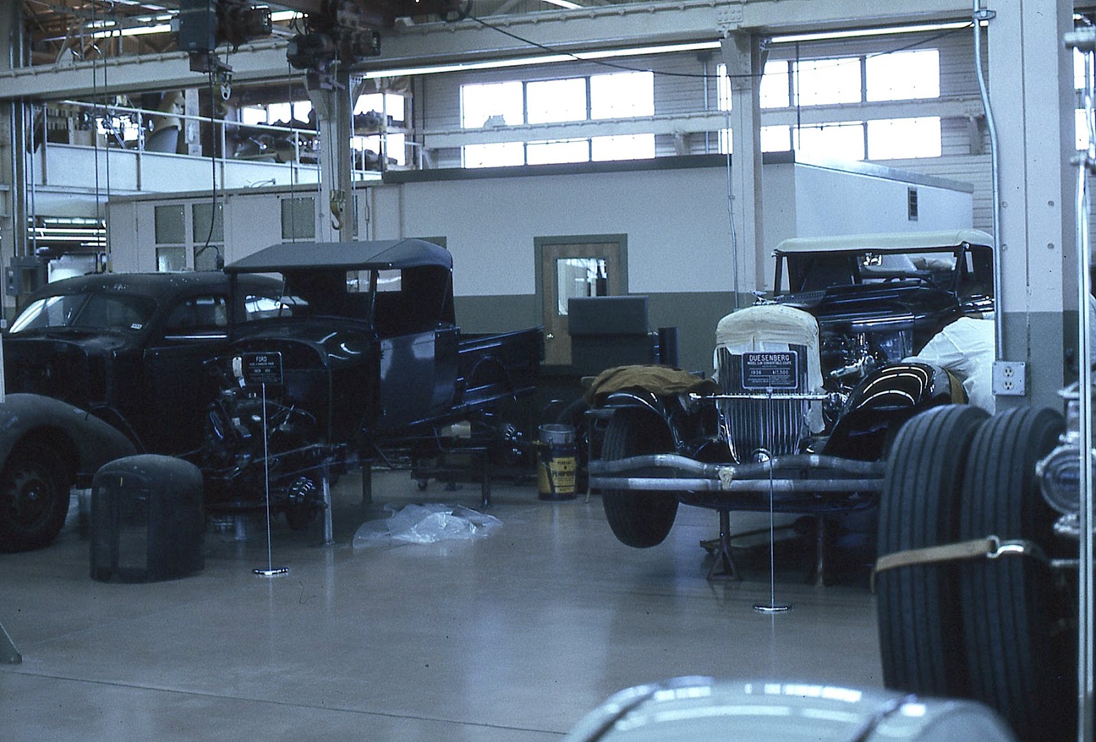
Views of restoration areas.  That's a 1932 Marmon 16 convertible coupe in the lower image.  A Duesenberg is at the right in the upper photo.

A hall jammed with sports cars.

The red car is a 1935 Auburn 851 boat-tail Speedster.

A 1954 Hudson Italia, one of only 26 that were built.

1918 Crane Simplex.

A row of Duesenbergs.  So if your collection has a bunch of Duesies on the show floor, not to mention the one under restoration, you might as well have ...

a Bugatti Royale.