Monday, June 29, 2015

Lincoln Town Car: First Series

The first generation Lincoln Town Car (model years 1981-1989) was a large, squared-off vehicle with surprisingly little room for the driver.  Or at least that was the impression I received the only time I drove one, a rental car when I was in Los Angeles on a consulting project.  Even though I hated driving it, Town Cars were fairly popular in their day because they looked impressive and had a trunk large enough to hold golf bags.

More background information can be found here.  The Wikipedia entry in the link notes that the 1981 Town Car was smaller and lighter than the largest Lincolns of 1980.  Even so, it was still comparatively large.  Its extreme "three-box" hard-edge, rectangular styling provided a crisp appearance, and the passenger compartment greenhouse accounted for a good share of the car's height, providing visual lightness.  Nevertheless, there were defects, as I indicate below.

Gallery

1982 Lincoln Town Car advertisement.  The Town Car had a distinctly rectilinear theme beginning with its "three-box" body style.  This frontal view shows its rectangular grille framed by rectangular quad headlights.  Ford Motor Company began its switch to aerodynamic designs with its 1983 Thunderbird and Lincoln Continental Mark VII and the 1984 Ford Tempo.

Rear three-quarter view of a 1981 Town Car.  Like the car in the first photo, it has vinyl covering over the rear part of its top.  The body was shared with Ford the Ford LTD Crown Victoria  and Mercury Grand Marquis, all of which featured the small slit of a trailing side window.  The rectangular theme was relieved by the round wheel openings, a nice touch.

Another rear 3/4 image, this of a Town Car Coupe.  This offers a better view of how the near-relentless rectangular theme played out on the rear of the car.

I find the Town Car's proportions awkward, the most objectionable aspect being the long front overhang that is emphasized by the positioning of the front wheels fairly close to the cowl and leading edge of he front door.  Rear overhang was also large, giving the car a less-than-solid visual stance despite its 117.3-inch (2979 mm) wheelbase.  The length was 219.2 inches (5568 mm), meaning that total overhang was about 46.5 percent of the overall length of the car.

Thursday, June 25, 2015

Non-GM First-Generation Hardtop Convertibles

The American "hardtop convertible" style (ca. 1949-1978) was originally based on convertible bodies upon which fixed steel roofs were added.  Because such cars lacked B-pillars, when windows were rolled down the result was a sporty, airy appearance that had great appeal to car buyers.

I wrote about the original "hardtop" design from General Motors here and GM's second-generation hardtops here.  As the first linked post mentions, I liked the first-generation GM hardtop design very much.

The present post deals with the first round of hardtop convertibles marketed by other American car makers in response to GM's successful venture.

Gallery

1949 Buick Roadmaster Riviera - auction photo
I include this first-generation GM hardtop as reference for the designs shown below.

1950 Chrysler Windsor Newport advertisement
Chrysler actually beat General Motors by introducing a hardtop convertible in its 1946 Town and Country line.  It lacked a panoramic backlight window and very few were built, so I credit GM with introducing the design concept to mass production.  Chrysler's first serious hardtops appeared for the 1950 model year (the corporate line had been redesigned for 1949) and appeared on 1950 Dodges and DeSotos as well as Chryslers.  The design was very similar to GM's, but wasn't as effective due to the blocky nature of the basic Chrysler Corporation body produced 1949-52.

1950 Dodge Coronet
A photo of a rather beat-up Dodge hardtop.  The Chrysler shown in the previous image was lowered and stretched by an illustrator to make the car seem more attractive than it actually was.

1951 Plymouth Belvedere
Chrysler's Plymouth brand didn't get a hardtop convertible until 1951.  This photo that I found on the Internet features yet another well-used car, but I include it because it shows that Plymouth hardtops got rounded lower corners on their backlights, unlike the other Chrysler Corporation makes.

1951 Ford Victoria - Barrett-Jackson auction photo
Redesigned Fords were coming for 1952, but a hardtop was introduced for 1951.  Its design is identical or nearly so to that of the tops on restyled 1952 Ford hardtops as well as 1952 Mercurys.  It's not as graceful as the 1949 Buick's design, but at least does a presentable job of including a good deal of glass area, the goal of General Motors stylists in their 1950 second-generation hardtop designs for Buick, Cadillac and Oldsmobile (see the second link above).

1951 Hudson Hornet Hollywood - sales photo
Post- World War 2 Hudsons (introduced for 1948) had a long, semi-fastback roofline.  This convertible-based hardtop is more in the bustle-back spirit.  The design of the windows is awkward, unfortunately.  A dog-leg style C-pillar and backlight combination such as Nash used (see below) might have worked better.  But the real problem was that the convertible-dictated aft edge of the top resulted in the top being too stubby to accommodate a graceful profile and a satisfactory window treatment.

1951 Packard 300 Mayfair
Packards were completely redesigned for 1951 and hardtops were included in the product mix.  The design shown here is similar the the GM style, the main difference being that profile of the upper edge of the rear window is slightly curved rather than straight.  Nevertheless, it looks good.

1952 Lincoln Capri advertisement
The entire Ford Motor Company product line was restyled for 1952.  Hardtop convertibles were given greenhouse designs that were very similar to the one previewed on 1951 Fords (see above).

1952 Studebaker Commander Starliner - via Wikipedia
Studebaker's initial hardtop design was produced only for the 1952 model year, being replaced for 1953 by the classic Loewy Starliners.  Given the high degree of talent in Loewy's Studebaker styling shop, it's little wonder that the 1952 Starliner greenhouse looks good.

1952 Nash Ambassador Country Club

1952 Nash Rambler Country Club
Nash added hardtop convertibles for the 1952 model year.  1949-1951 Nashes had a bulbous, aerodynamic design that did not lend itself to either convertibles or hardtops.  The restyled full-size Nash line did not include convertibles, but a hardtop was introduced.  Nash Ramblers first appeared for 1950 and did have a convertible model (but with fixed side window framing), but no hardtop till 1952.  Nash's hardtops featured a dog-leg C-pillar arrangement similar to that used on 1953-54 Chevrolets and Pontiacs (see second link above).  This is a sensible hardtop convertible window style, though the proportions of 1952 Nashes and Ramblers were not helpful to the greenhouse designs shown here.

1953 Willys Aero Eagle
Willys returned to automobile manufacture for the 1952 model year and added a hardtop line for 1953.  There were no convertibles.  The hardtop design was pleasant, though not striking, and aside from the lack of a B-pillar, is the same as that of other two-door Willys'.

Monday, June 22, 2015

Second Generation General Motors Hardtops

I wrote in this Design Classics post about General Motors' first-generation "hardtop convertible" styling.  Hardtop convertible being the term used in America when that type of car was most popular.  To summarize, a "hardtop" (another common name for it) was essentially a convertible coupe fitted with a fixed steel top.  That resulted in a sporty look because all the windows could be rolled down and there was no B-pillar to block views or help support the roof -- a safety defect that eventually killed off hardtops.

GM's hardtops first appeared on 1949 model year Oldsmobiles, Buicks and Cadillacs, then on 1950 Chevrolets and Pontiacs.  As noted in the link above, I am very pleased with the design GM stylists used for those tops.  But Oldsmobiles, Buicks and Cadillacs got a complete restyling for 1950, and that created an opportunity to create a different hardtop look.  What the stylists did was design a lighter appearance by reducing the size of the C-pillar, as can be seen below.

As for Chevrolet and Pontiac, their next redesign came for 1953 models.  Here a thinner but still substantial C-pillar was used.  These pillars were given a backwards slant that nowadays seems to be associated with BMW styling.  One human-factors consequence was improved viewing by back seat passengers, as was a result of the 1950s restyle of GM's senior lines.

Nevertheless, to my taste, the first-generation GM hardtops looked better than their successors.

Gallery

This auction photo of a 1949 Buick Roadmaster Riviera from the post linked above sets the scene for the second-generation restyles shown below.

Rear 3/4 view of a 1950 Buick Roadmaster Riviera hardtop.  The backlight continues as a three-piece affair.  Rear side windows are longer and the downward curves the their tops and the top of the backlight cross, yielding small, somewhat triangular zones on the C-pillars.

Side view of a 1950 Cadillac 62 hardtop, Barrett-Jackson auction photo.  Same roof design as on the Buick shown above, aside from differences in chromed trim.  The wire wheels on this car were not found on production 1950 Cadillacs.

1953 Pontiac Catalina, sales photo.  This illustrates the C-pillar "kink."

A&E photo showing rear 3/4 view of a 1953 Pontiac Catalina.  Auto glass moulding technology had improved to the point that backlights were one-piece.

Thursday, June 18, 2015

Design Classic: GMs Original Hardtops

Nowadays, the term "hardtop convertible" might refer to convertibles with retractable metal tops.  But from the late 1940s until the mid-1970s, the reference in the USA was to a car body with a fixed, metal roof where there was no B-pillar.  When windows were rolled down, there was nothing but open space between the the A and C pillars.  The style was very popular, and every American automobile firm had them in their lineup at one time or another during those years.

Cars with that configuration appeared long before General Motors' 1949 model year introduction of the style.  But it was GM's market dominance that made hardtop convertibles common.  The term was coined because convertible coupes lacked center posts, and the new design basically was a coupe lacking center posts, thereby evoking the look of convertibles with their cloth tops raised.  "Four-door hardtops" appeared on some GM brands in 1955, and by the following year they were available for all GM and Chrysler marques.

One reason for the sudden popularity of hardtop convertible coupes was that those initial GM designs were very attractive, as we shall see below.  They first appeared on 1949 Oldsmobiles, Buicks and Cadillacs, but those lines were restyled for 1950 and the original top design was abandoned.  Chevrolet and Pontiac got the redesigned GM A-body in 1949, but didn't have hardtop convertible versions until 1950.  However, the hardtop design they finally got was that used by GM's senior brands for 1949: they continued its use through the 1952 model year.

Gallery

1949 Oldsmobile Futuramic 98 Holiday Coupe - Barrett-Jackson auction photo
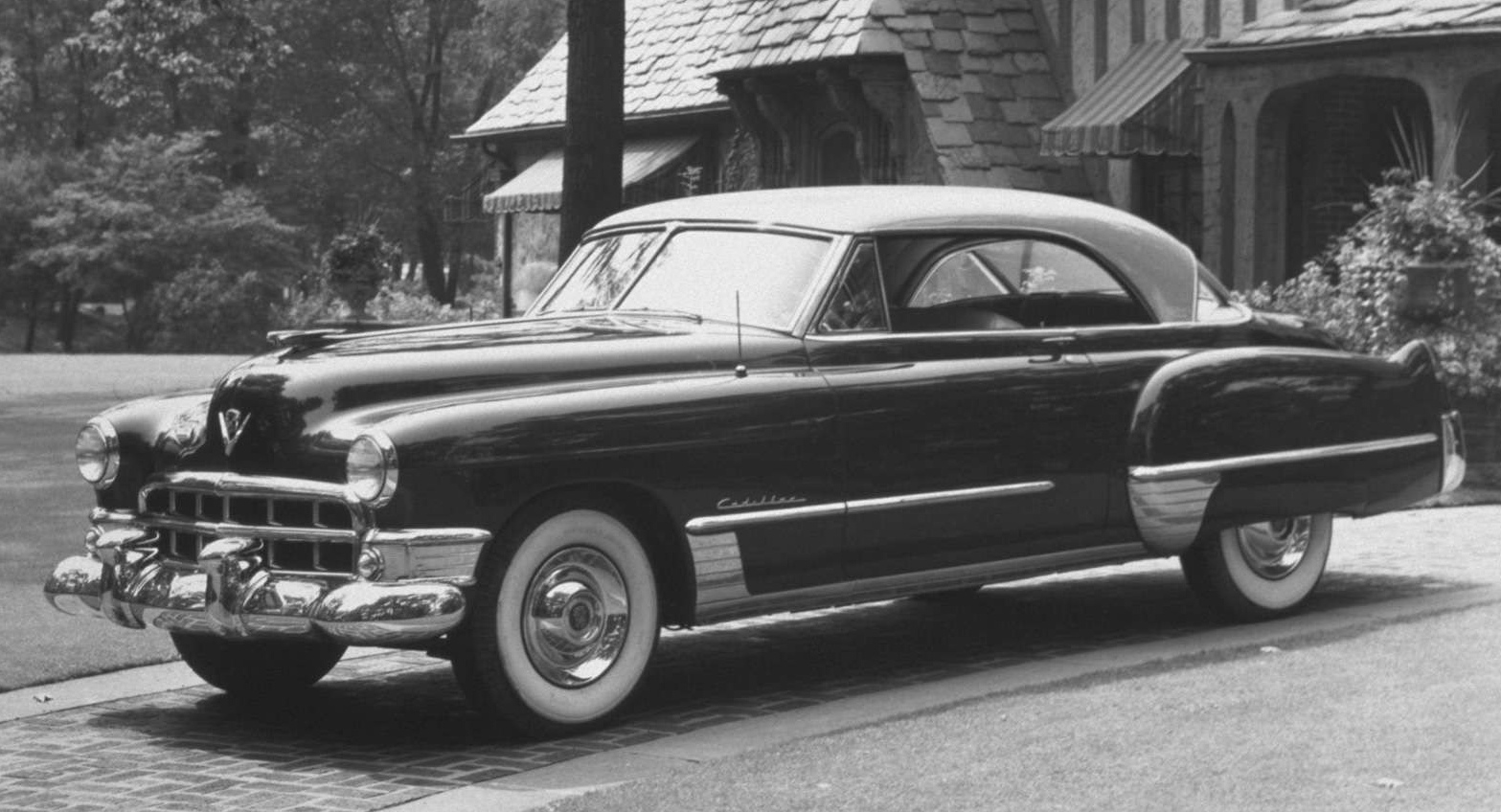
GM's "C" body was restyled for the 1948 model year, but hardtop convertible coupes weren't added until 1949.  This side view shows rolled-down windows and the convertible-look they provide.  To me, what sells the top as a Design Classic is the interplay of positive and negative shapes created by the curves of the roof profile and side window cutouts balanced by the sharper cut of the three-piece backlight (rear window) ensemble.

1949 Buick Roadmaster Riviera - auction photo
Yes, it's a prime example of styling boss Harley Earl's taste for rounded shapes, but I've always liked the design of 1949 Buicks, especially the way the rounded shapes cascade towards the rear.  This photo shows the backlight ensemble more clearly.  Auto glass makers were still struggling to mass-produce satisfactory extreme-curve window glass, so GM had to use three segments to fill the space dictated by the backlight opening.  Single-unit curved backlights became available on 1952 Oldsmobile 98s and on all GM lines for 1953.

1949 Cadillac Coupe de Ville
Front three-quarter view, this of a Cadillac.  From this angle, the top echoes what a Cadillac convertible with raised top looked like.

1949 Pontiac Catalina prototype
As mentioned, the production Catalina didn't appear until the 1950 model year.  But Pontiac kept the same basic body 1949-52, so this 1949 Pontiac differed from the production model only by way of the facelifted chromed trim for 1950.  Due to its less-massive 1949 grille, the prototype is slightly better looking than the production version.

1950 Chevrolet Bel Air Hardtop - Barret-Jackson auction photo
Side view of the Chevrolet hardtop convertible.  From the cowling back, it closely resembles the profiled 1949 Olds in the top photo.  But the Chevy is shorter from the cowling forward, changing the proportions and making the top seem heavier looking.

1950 Chevrolet Bel Air Hardtop - Mecum auction photo
This rear view reveals the least attractive aspect of GM's initial hardtop styling.  That is, the backlight looks rather short and the top massive.  From even a slightly different angle (see the 1949 Buick, above), the design becomes much more appealing.

1951 Pontiac Catalina
I tossed in this image because I like 1951 Pontiac styling.  My father bought a new '51 Pontiac sedan and, sadly, not a glamorous Catalina such as the one here.

Monday, June 15, 2015

GAZ M-20 Pobeda: First True Soviet Car

The GAZ M-20 Pobeda ("Victory") was the first Soviet car not based on existing Western automobiles, as this Wikipedia entry indicates.  The entry is worth reading because it provides plenty of details that are probably unfamiliar to non- Soviet Bloc area readers.

It seems that planning for the car began in 1943 as the tide of war in Europe was turning toward the Allies.  Styling is credited to Veniamin Samoilov who seems to have been aware of American and other Western design trends prior to Hitler's invasion of Russia in June of 1941.

Styling the Pobeda was easier than producing it.  As the link above indicates, a few were built as early as 1946, but it wasn't until 1949 that mass-production was achieved.  Production in Russia ended in 1958.

Gallery

Styling mockup of the M-20 in a photo apparently taken in 1944.  The basic design elements are the same as those found on many clay models made in the wartime years by Ford and Chrysler, among others.  These included a fastback roof shape and flow-through or pontoon fenders.

A side view I found on the Web, seemingly a scan from a magazine article.  It had a fairly large blind spot aft of the rear door, so ideally should have had a six-window passenger cabin.

Photo of a running Pobeda.  This, and the image above show how high the body rides above the ground -- probably necessary given the nature of Russian roads in the 1950s.  Awkward details include the abrupt transition of the headlight housings to the fender tops and the exposed hinges at the bottoms of the doors.  Charitable explanations for these are (1) the headlamps used were not planned for inclusion earlier in the design process, and (2) Russians were far less experienced designing cars than their Western counterparts.  (Who, even so, were using exposed hinges as late as cars styled during the 1930s and marketed during the early postwar years.)  Otherwise, Pobeda styling is unobjectionable given its era.

Thursday, June 11, 2015

Jaguar Mark VII: Modernizing Classical Styling

Jaguar introduced its first postwar sedan (saloon), the Mark V, in 1948 and it continued in production into 1951.  Its styling was essentially prewar, however.  The true postwar sedan from Jaguar was its Mark VII, produced 1950-1956.  Background on it can be found here.

Mark VII styling was an interesting mix of themes from the Mark V and borrowings from elsewhere.  Given William Lyons' fine taste in design, the result was pleasing, very British, and a tad behind what American and Italian stylists were doing at the time.

Gallery

Jaguar Mark V - 1949 - Bonhams auction photo
The grille and headlight treatment is slightly heavy, but prewar in spirit.  The rest of the car is light and airy aside from the wheel covers on the rear fenders.

Jaguar Mark V - 1951 - auction photo
This side view shows the interesting tuck-under profile at the rear of the greenhouse, a feature also found on Jaguar XK120 coupés introduced in 1951.

Jaguar Mark VII side view
Compare this publicity paste-up or retouch with that of the Mark V above.  Similarities include the rear fender spats, the shape of the greenhouse (including that tuck-under profile) and the window design.  The teardrop profile of the rear fender, the lower, longer trunk (boot) and the falling away of the shoulder line aft of the A-pillar give the Mark VII a racier appearance than its predecessor.

Jaguar Mark VII advertisement

Jaguar Mark VII - 1954 - Auctions America photo
The actual Mark VII looks heavier than what is depicted in the advertisement drawing above.  In part, that's because it was indeed a fairly large car.  It would have seemed even more bulky if it were styled in full pontoon-fender mode.  Fortunately, the flow-through front fender profile drops down towards the rear before intersecting the separate rear fender, this lightening the appearance.  The grille and headlamp arrangement strongly hints of prewar design, but also proclaims the Mark VII's English heritage.

Jaguar Mark VII - 1955 - Barrett-Jackson auction photo
The tuck-under top profile helps to give the car a lighter appearance than a conventional profile would have yielded.  This 3/4 view presents the Mark VII in its most interesting, attractive aspect.

Monday, June 8, 2015

Buick's First Set of Skylarks

General Motors' Buick Division has used the name Skylark for several different models over the last 60-some years.  A complete listing can be found here.  The present post deals with the earliest Skylarks which, to my mind, are the most interesting (but not the best) from a styling point of view.

GM was planning a major restyling of its B and C bodies -- used by Oldsmobile, Buick and Cadillac -- for the 1954 model year.  This new styling included what then was considered a futuristic feature, the panoramic or wraparound windshield.  Such windshields had appeared on show cars such as the LeSabre and Buick XP-300 in 1951 and for 1953 they were grafted onto two production models in anticipation of the '54s.  Those models were the top-of-the-lines Cadillac Eldorado and Oldsmobile Fiesta, both convertibles featuring a dropped, flowing door and shoulder line.  Buick also was given an expensive convertible with the same flowing line.  But unlike the Eldorado and Fiesta, the Buick Skylark had a conventional windshield.

The Skylark name was continued for 1954 as a convertible based on the new styling.  A strong effort was made to give the Skylark a distinctive appearance, but the effort was flawed.  In any case, the dramatic new 1954 standard convertibles were exciting enough and cost less, so the Skylark was not continued for 1955.

Gallery

1953 Buick Skylark
Compare this to the 1953 Buick Super convertible below.  Differences include the cut-down door line, a slightly shorter windshield, a cleaner rear fender and a reshaped "Sweepspear" on the side.

1953 Buick Super convertible
This was the best comparison photo that I was able to find on the Internet.

1954 Buick Skylark
For 1954 the Skylark featured larger, reshaped wheel openings and a distinctive rear end.

1954 Buick Skylark - rear 3/4 view
This is a Barrett-Jackson auction publicity photo showing the rear, where most of the changes were made.  Compare to the photo below of a standard '54 Buick convertible.  The trunk was both lowered and rounded-off, thereby reducing storage capacity.  To prevent this area from looking too "soft," those odd chromed tail light assemblies were added.

1954 Buick Super convertible
This also is a Barrett-Jackson auction publicity photo from a similar point of view to the image above.

Thursday, June 4, 2015

Sorting Out the Mercedes SLR McLaren

Not many Mercedes-Benz SLR McLarens were built, so they are seldom seen.  However, I am drafting this post (for later publication) in the Palm Springs area of California and earlier today found myself behind a car just like the one pictured above while driving through the posh town of Indian Wells.

The SLR McLaren looked impressive, but when it was first announced in 2003, I didn't like what I saw in photos.  So now it seems to be time to sort out my impressions.

Gallery

This illustrates the SLR's heritage.  In the background is a 1955 vintage 300 SLR that served as styling inspiration for the 1999 Vision SLR concept cars shown in the foreground that preview the 2003 production SLR McLarens.  The dominant similarities are the long hood and the air outlets aft of the front wheel openings.

The original SLRs featured gull-wing doors that became a design fad for a number of later sports cars by other makers.

The SLR's pivoting door arrangement.  Not gull-wing, but not conventional practice either.

Profile view showing that the hood / nose takes up about two-fifths of the car's length.

Front three-quarter view showing the awkwardness of the detailing due to the inclusion of too many elements.  Actually, an effort seems to have been made to tie things together.  Note that the splitter bar in the upper grille opening aligns with the hood cut line on the front fender.  The fold-line of the front bumper aligns with the lower horizontal splitter that runs across the side louvers. The crease above the rear wheel opening touches the V of the tail light assembly.  The curve at the front of the heat exhaust zone on the front fender is echoed by the aft door cut line.

Despite these efforts, there are problems such as the curve above the front wheel opening that relates poorly to nearby detailing.  The side window aft of the door is awkwardly shaped.  The splitters over the main air intake echo the shapes at the edges of the intake, but do not relate to the rest of the front ensemble.  Also note the detail confusion in the image of the car's rear in the photo at the top of this post: the theme is curves, but they clash as much as they relate.

Front view.  The snout containing the Mercedes star looks tacked on, gratuitous.  There seem to be too many circular and oval elements: I count 15.

As noted above, the SLR McLaren was impressive when seen in person.  That probably had to do with its size and length of the hood.  Nevertheless, a hard look at styling details suggests that the car could have been improved through reducing visual clutter.  Not stripping away all ornamentation, mind you -- just dealing with it more judiciously.

Monday, June 1, 2015

BMW 501: First Postwar BMW Sedan Design

As this Wikipedia entry mentions, it took a while for BMW to straighten out its post- World War 2 affairs.  These were complicated by the fact that its Eisenach production facilities were in the Russian occupation zone and needed to be legally divested.  Eventually things fell into place and the firm began planning a postwar line of cars, the 501 model and its derivatives.

The 501 was introduced at the 1951 Frankfurt auto show and produced 1952-1962.  During the planning stage, an in-house design was prepared by Peter Schimanowski.   But management was unsure of its worth, so Italian stylist Pininfarina was commissioned to create an alternative design.  However, according to the link above, it was rejected because it was thought to be too similar to an Alfa Romeo design.

As we shall see below, the production 501 was conservatively styled in the general manner of some postwar English cars.  It seems to have been given the ambivalent nickname Barockengel (Baroque angel) by some of the motoring public.

Less than 23,000 500-series cars were built over a ten-year span, so BMW remained financially precarious until late in that period when the Quandt family put money into the firm and the 1500 model was introduced.

Gallery


Above are two views of the 1950 Pininfarina version of the 501.  The air intakes on either side of the traditional BMW grille are indeed similar to Alfa Romeo styling details that emerged in the late 1940s.  The smaller lights next to the headlamps are placed too close to the snout containing the main grille, helping (along with the cramped Alfa-like intakes) to create a cluttered, awkward front ensemble.  The rest of the car is cleanly styled and in line with design fashions of the time.  The passenger compartment "greenhouse" has a windshield that looks the same as that of the production 501.  The doors are hinged at the front and the lower edges of the windows look misaligned.  But that is an optical illusion caused by the fact that the fender line seems to be bowed slightly upward towards the B-pillar.

A 1957 501.  The "greenhouse" is airier than that of Pininfarina's design due to thinner pillars and the six-window motif.  Otherwise, the design is a step or two behind the times, English cars excepted.  The doors are hinged front and rear.  The fenderline is not far removed from that of a 1942 Buick.  The real wheel opening relates poorly to the curve of the rear fender, and the same can be said to a lesser degree regarding the front wheel opening and its fender.

The 501 is smaller than it seems.  In this image, the attractive model provides a sense of scale to the car.  Note the disjointed profiles of the main grille and air intake below the headlamp.

The front is cleaner than that of Pininfarina's version even though the auxiliary air intakes are poorly shaped in reference to the other elements and placed too close to the headlights.

A rear view of a 501 licensed in Switzerland.  The trunk is strongly bulged, which isn't very attractive, but has the virtue of practicality  The lip tying the rear fenders together is a styling oddity that at least distinguishes BMW 501s from other cars.