Thursday, May 28, 2015

What Were They Thinking?: Subaru SVX

The "What Were They Thinking?" series of posts does not necessarily deal with bad designs; "Styling Crimes" is reserved exclusively for those.  In "What Were They Thinking?" I often deal with designs that are questionable from a marketing standpoint or feature a styling quirk that is odd, but not necessarily fatally bad design.

Such is the case of the Subaru SVX coupe, built 1991-1996.  According to the link, the car was an early Subaru attempt to move up-market.  The idea was to produce a sporty coupe with good performance, and they hired one of the best styling consulting firms in the business to provide the design.

This leads to the "What Were They Thinking?" factor.  That's because the design firm was that of ace stylist Giorgetto Giugiaro.  What was Giugiaro thinking when he either drew the design or signed off on it?  And what were Subaru executives thinking when they approved Giugiaro's proposal?

The problem has to do with the design of the doors and side windows.  The window frames are set high on the passenger cabin and the main window glass is strongly curved to blend the sides of the cabin with the top -- especially on the rear quarters.  This results in an airy effect and plenty of fenestration for passengers to view the passing scene, though a greenhouse effect would also likely be enhanced.

But such large, strongly curved windows could not be retracted into the doors, yet there was a need for the driver and passengers to open windows for various purposes including handing over money to a toll taker.  Giugiaro's solution was to have smaller, supplemental, roll-down windows placed within the confines of the overall side window ensemble.

The design result was an odd appearance and roll-down windows that seemed inconveniently small to many potential buyers.  A more serious result so far as Subaru was concerned was that the SVX was a sales flop.  The top Wikipedia link above states (as of May 2015):

"Total sales of the SVX numbered 14,257 in the United States and a total of 24,379 worldwide.  2,478 SVXs were sold in Europe (with 854 headed directly to Germany and 60 to France). Roughly 7,000 of all SVXs sold were right-hand drive models. Included in this number were the 249 vehicles sold in Australia, at a cost between approx. A$73,000 to A$83,000. 5,884 units remained in Japan.

"As an investment, Subaru actually lost $3,000 on every Subaru SVX sold, for a total loss of around $75,000,000 on this project."

Gallery


Monday, May 25, 2015

Dodge's Forgotten First Charger

I lack survey data to support the claim in this post's title, but I'm pretty sure that the 1966-1967 Dodge Charger is little known to most people under age 60 unless they are serious car nuts or rabid Dodge fans.

My strongest memory is of an almost-new silver-painted Charger that had caught on fire a few blocks from the Penn campus early in my grad school days there.  After the flames and dark smoke dissipated, all that remained to be seen was the rusted body shell that lingered for a few days until it could be hauled away.  Not an exact metaphor for the market fate of the model, but it never sold well, as this Wikipedia entry indicates.

That aside, it was an attractive car fated to compete with other attractive entries in the hot late-1960s American sporty car / muscle car / pony car market segment.  My guess as to why it was a comparative failure is that (1) it was too large, (2) and its styling didn't proclaim that it was a gutsy machine.  A redesigned Charger was launched for the 1968 model year.

Gallery

A year before production Chargers appeared, Chrysler displayed its Charger II concept car that was a 1966 Charger with a few extra styling touches.  Differences included the grille, hood and, as shown above, extended fender tips.  Standing beside the car is Chrysler styling boss Elwood Engel.


The views of a 1967 Charger.  A noteworthy feature was hidden headlights, something found on 1936-37 Cords and 1942 DeSotos, and reintroduced in the USA on the 1965 Buick Riviera.  But the most striking feature was the fastback roof.  A nice touch is the backlight / C-pillar ensemble that includes a concave-convex-concave backlight profile.  My main complaint is the grille, which seems a bit flat and not inset far enough -- though a different headlight area design would have been required were that done.

A 1966 brochure spread showing the Charger in profile; click to enlarge.

Thursday, May 21, 2015

The "Neue Klasse" 1500, the First Modern BMW

The Neue Klasse 1500 (and subsequent 2002 and other models) effected a turnaround in BMW's fortunes that eventually resulted in the Munich firm's becoming one of the world's most prestigious automobile makers.  The Wikipedia entry dealing with the Neue Klasse ("New Class") is here.

The 1500 itself was produced 1962-64, but variants continued to be built until 1977.  Its styling is an an extension of that of the BMW 700 (introduced 1959), an early example of the "three-box" look popular into the 1980s that was abandoned due to the need for better aerodynamic efficiency.  The look's features included a squared-off, boxy appearance that usually included a tall "greenhouse" with large windows that had the effect of making the car seem less heavy than it otherwise would have appeared.  BMW's styling director at the time was Wilhelm Hofmeister.  Consultation was provided by the prolific Italian stylist Giovanni Michelotti.

Gallery

The 1500's body was boxy indeed and there was plenty of glass.  The belt line is enhanced by a character line that, in various guises, extends all the way around the car, a feature also found on the 1960 Chevrolet Corvair that I wrote about here.  There is a secondary crease farther down the fender that, in my judgment, is poorly placed.  Note that it touches the lip around the front wheel opening, an awkward detail.

The front styling marks the debut of a theme that continues in various forms to this day.  The traditional (from the 1933 BMW 303) dual-opening "nostril" feature is now augmented by a horizontal element that admits most of the air flowing to the radiator.

The rear as portrayed in a catalog.  The lower side character line does not integrate with the tail light assembly -- presenting yet another defect.  A noteworthy feature is the "kink" or "dog leg" angle on the leading edge of the C-pillar.  This was not an BMW innovation, but when elaborated in later years, became an identification feature on BMW sedans.

All told, the 1500s styling was a great success.  The car was fairly small, and the airy greenhouse emphasized lightness.  Unlike garish, baroque styling found on late 1950s American cars, the 1500 was plain, with little ornamentation other than in the grille area.  As mentioned, the main defect was the secondary side character line that might have been necessary for sheet metal stiffness, but was poorly placed.

Monday, May 18, 2015

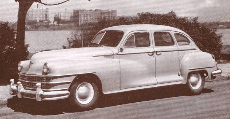
Postwar Chrysler: Four Brands, One Body

This post deals with the Chrysler Corporation brand portfolio in the years immediately after World War 2.  Prewar designs were facelifted and kept in production until the 1949 model year when the seller's market was fading and fresh styling was needed to boost sales.

It seems that the last prewar Chrysler brands shared the same set of bodies as an economy measure, and this carried over to the facelifted models and even to the redesigned 1949 line.  Product managers and stylists therefore had to find ways of creating a marketable gamut of cars ranging from low-priced to near-luxury based on bodies that were essentially the same from the cowling to the rear end.

Here is what they did.

Gallery

1946 Plymouth brochure page
Plymouth was Chrysler Corporation's entry-level brand and received the least-drastic facelift -- mainly a restyled grille.  Note that the front fenders extend almost to the front door.  Fun detail: the artist did not include the exterior hinge at the lower-right part of the rear door; that out-of-style hinge can be seen in some of he images below.

1947 Dodge advertisement
Dodge was the first step up from Plymouth in Chrysler's lineup.  Dodges had longer hoods than Plymouths, and the front fenders faded over the front doors in line with current styling fashion.

1946 DeSoto
The next notch up the price-prestige rank from Dodge was DeSoto.  It too had a long hood and fenders flowing onto the front doors.  Both Dodge and DeSoto had bold grilles, yet their overall appearance was balanced.

1947 Chrysler (postcard image)
The same cannot be said for Chrysler, the corporation's top-of-the-line near-luxury brand.  Flow-through fender extensions over the doors were like those on Dodges and DeSotos.  The difference is the even-longer hood.  That, coupled with an elaborate grille and two chrome strakes extending to the front wheel opening, created a nose-heavy, unbalanced appearance.  After all, the body aft of the hood was essentially the same as Plymouth's.

1947 Chrysler Imperial Limousine
Balance was restored for Chrysler limousines.  The passenger cabin was lengthened -- note the wider doors here compared to those on the Chrysler in the image immediately above.

Thursday, May 14, 2015

Fussy Styling: Lutz and I Agree

Loyal Readers have probably noticed that I fairly often grumble about the current fashion of baroque or rococo styling.  But it's comforting to have one's ideas reinforced by respected persons.

It seems that the latest Road & Track magazine (June 2015) features some remarks by famed Car Guy Bob Lutz on the matter.  It's on his end-of-the-book page "Go Lutz Yourself" where a Portland, Oregon reader asks "Why do so many cars seem overstyled these days?"

To which Lutz replied: "'Not a surface left untouched' seems to be a design tendency today.  I also find it deplorable.  The Lexus LF-SA concept at the Geneva auto show looked like an origami swan done by a waiter in a Japanese restaurant.  I think it's seen as visual excitement, but usually, it's just awful and superimposed on cars that are so wrong in basic proportion, the result is about as attractive as a 400-pound woman in a Mardi Gras costume."

That said, here are some examples.

Gallery

2015 Lexus LF-SA concept car
This is Lutz's bĂȘte noire.

2012 Hyundai Veloster

2011 Nissan Juke

2014 BMW i3

Note that all the examples shown above are small cars, which are indeed the worst offenders.  A large car offers a broader canvas for sculptural and ornamentation overkill, whereas a small car with the same frills content serves to concentrate and exaggerate the resulting mess.

Monday, May 11, 2015

XM Turnpike Cruiser: 1956 Mercury Concept

Once the 1950s got nicely underway American automobile makers began to produce dream car after dream car -- what are now called concept cars.  As is true now, some were far-out shapes that never would be produced.  Perhaps a few features under consideration for future models might be included to test public reaction.  And futuristic designs might have been shown with the idea that they would deliver the message that the car company was a progressive, cutting-edge firm that could and would be able to deliver fabulous products in the years ahead.  Other show cars were simply tarted-up current production cars that could be created quickly with the purpose of generating some publicity.   Then there were (and are) concept cars that include many (or even most) styling features intended for near-term production.

The 1956 Mercury XM Turnpike Cruiser concept car fell somewhere between the first and third categories just mentioned.  It was futuristic, but lent both its name and some styling elements to a forthcoming 1957 Mercury model.  Links with information about and images of the show car are here and here.

For some reason, photographs of the XM Turnpike Cruiser are hard to find on the internet.  Some of the images posted below, for example, seem to be scanned from magazines or other publications.  The links feature these and other images including some showing a specially-built display truck-trailer combination that toured the USA showing off the XM Turnpike Cruiser.  My father and I visited it when it stopped off in Seattle.

Gallery

Stylists doing dream cars were still in jet fighter - space ship inspiration mode when the XM Turnpike Cruiser was hatched.  Nevertheless, it was practical enough that it could have entered production.  The front features "frenched" headlight assemblies, bullet-shaped bumper guards and a sensible grille design.  The "panoramic" or "wraparound" windshield was like those on mid-50s production cars.

Looking down.  The wraparound backlight has the flavor of late-1940s Studebaker Starlight Coupes and forthcoming 1959-60 General Motors four-door hardtop backlights.

Side sculpting was bold, even exaggerated.  But the contrast of a convex element intruding over a concave shape is interesting,  Aside from the huge tail light assemblies that blend into the side sculpting, the rear is simple -- another useful contrast.

When the door opened, a transparent roof panel open with it, presumably making it easier to enter and exit the car.  I'm not sure how practical that would have been here in rainy Seattle.

Here is an advertising card for the 1957 production Turnpike Cruiser.  I liked the show car (still do, actually), so was disappointed in the street version.  I'll discuss it in detail in a later post.

Thursday, May 7, 2015

Mercedes-Benz 190SL: Somewhat Controversial in Its Day

Mercedes-Benz reaped prestige with its 300SL sports cars featuring gull-wing doors.  But they were expensive, so it was decided to introduce a smaller, less-potent and cheaper companion sports car, the 190SL, built 1955-63.

The 190SL sold fairly well, but its 104 horsepower motor and 2,552 pound (1,158 kg) weight resulted in 24.5 pounds per horsepower, more than double the 11.2 PPH for the 300SL.  So the 190SL gained a reputation as a boulevard sports car even though some were raced.

As for styling, let's take a look at some Barrett-Jackson Auctions photos of 1959 190SLs.

Gallery

Well, not yet.  First we need to see a 190SL prototype first revealed at the 1954 New York auto show.  In the photo above, it's between the 300SL in the foreground and the dark sedan.  Note the "eyebrows" over both wheel openings on the 300SL and that the 190SL has one only above the front wheel opening.

Some publicity material featuring a car like the one shown in New York.

Production 190SLs differed from the prototype.  The hood air scoop has been replaced by a bulge.  Guards have been added to the bumpers.  There is a chromed stone guard at the lower-front of the rear fender.  Another addition is an "eyebrow" over the real wheel opening such as was found on 300SLs.


Two views of the same auction car.  The 190SL's basic style conforms to 1950s sports car practice: long hood, flowing front fenders, distinct rear fenders.  The Mercedes differs from contemporary sports cars such as the Jaguar XK140 and Austin-Healey 100 in that it has a wider, flatter appearance.  The "eyebrow" feature probably has little functional justification, but serves to remind viewers of the far more potent 300SL.  If memory serves, 190SLs never seemed much like real sports cars; they were often seen being driven by well cared-for blondes on the way to tennis or fancy stores.

Monday, May 4, 2015

The Original Chrysler 300

The 1955 model year saw Chrysler Corporation's payoff for appointing Virgil Exner as styling leader.  His restyled corporate lineup reversed a downward sales trend while altering public perception of Chrysler as a stodgy purveyor of automobiles.

Some models were more attractive than others.  For example, I expressed pleasure at DeSoto styling here as well as that of the Imperial here.  On the other hand, I have problems with the Chrysler line.  Perhaps Exner might have too, because when the decision was made to market a high-performance Chrysler, he raided the parts bin to create the look for the new Chrysler 300.  The most important change was replacing the fussy Chrysler grille with that of the Imperial.

Gallery

Here is a top-of-the-line Chrysler New Yorker hardtop.  Its grille is complicated, the upper part being poorly related to the lower.  Also complicating the design is the two-tone paint division that has an awkward moment where it curves up to meet the C-pillar.  This was essentially what Exner had to use as his starting point for the 300.

The body elements are not entirely New Yorker; the rear quarter panels were apparently taken from the shorter Windsor line.  Deleted was the heavy windshield frame that incorporated a micro-visor.  The improvement created by incorporating the Imperial grille is apparent.  Also, the 300 lacked the fashionable two and three tone paint schemes that were fashionable at the time; buyers could only choose amongst white, black and red.

This side view shows the 300s excellent lines.

This rear 3/4 view from Hyman auctions highlights the 300s most dubious styling detail: the tail lights carried over from standard Chryslers.  To me, they seem to be an affectation at odds with the elegant styling of the rest of the car.