Monday, March 31, 2014

Buick's Shanghai Riviera

A concept car that attracted a good deal of attention in the automotive media last year was the Buick Riviera unveiled at the Shanghai Motor Show.  Besides its flashy looks, the car received attention because General Motors officials suggested that it contained future Buick styling theme features.  The design was created in a GM studio located in Shanghai.  One reason why the Buick brand was retained during GM's bankruptcy was that the brand had particular appeal in the rapidly growing Chinese automobile market.

Some car buff media reactions to the Riviera concept are here and here.   Now that some of the excitement has cooled down, let's give the styling a critique, keeping in mind that only a few details are likely to appear on production cars.

Gallery

One item that almost surely won't be found on a production Buick is the gull-wing doors, an impractical feature introduced on Mercedes-Benz 300SL racing cars more than 60 years ago that remains catnip for stylists.  The grille retains Buick's trademark vertical bars (actually apparently slats here), but they now strongly converge as they drop.  This feature might appear later, as might the intake opening shape under the bumper strike-plate, though changes would have to be made because this version seems vulnerable to impact damage.

I find the clean fender surfaces interesting because this marks a change from the fussy character line sheet metal folding that has become a styling cliché.  I like the frank sheet metal aspect of the rear fender made clear by its separation from the rear of the car; normally stylists seek to blend the sides and rear elements.  Also note the rear-end continuation of the indentation below the door.  All this is very fresh and clever.  Also impractical, because these gaps would be traps for road grime in everyday driving.

The side view reveals a front fender - rear fender ensemble evocative of 1950s sports cars.  Some of this might show up in future production Buicks.  I like the tail lights and the way the side window kink echoes the upward thrust of the rear fender.  The profile of the top is nicely taut, contrasting with the curvacious fenders.  The car looks best when seen from this angle.

Thursday, March 27, 2014

Mercedes A-Class: Regression Towards the Mean

Mercedes-Benz's original (in 1997) entry-level A-Class gained notoriety in more than one way.  At first, car buff magazines spewed much ink over its engineering design features such as its use of front-wheel drive and the placement of the motor at a low level relative to the passenger compartment.  And not long later came the news that the A-Class failed the Swedish Elk Test in an embarrassing way: the test car flipped over while performing the tight S maneuver.

Nevertheless, the handling problem was resolved and the car sold moderately well until 2004, when it was replaced by a redesigned A.  Mercedes A-Class cars were not exported to the United States, so American readers might not be familiar with them.  As it happened, I once rented one while visiting Europe and found it surprisingly pleasant to drive, given its (to me, at the time) odd proportions.

Here is a photo of the first A-Class Mercedes.  In retrospect, it might have evolved more fully into crossover-SUV form, though the concept of that platform was still in its early stages in the mid-1990s.  Given its height and short length, stylists were seriously constrained in any effort to make the car attractive.  To me, the most serious mistake had to do with the wraparound rear corner windows.

Apparently Mercedes stylist felt the same way, because the 2004 A-Class (shown above) eliminated that feature.  The Wikipedia link above indicatea that this was a new design.  However, the car is dimensionally essentially the same as the previous A, and gives a strong impression of being a facelift.  What is new is the two-door version seen in the background.

By 2012, when the current A-Class Mercedes (above) was launched, crossover SUVs had become an important market segment.  Yet Mercedes opted to transform its A-Class into a conventional sedan configuration.  Perhaps this was because a slightly longer version, the CLA, was planned for 2014 model year introduction as an entry-level car for the North American market.

Unlike earlier A-Class cars, the new version features a long hood, though the rear seems excessively truncated.  The kinked sheet metal sculpting on the sides strikes me as being too contrived, though it vaguely conforms to Mercedes' current styling themes.

Monday, March 24, 2014

Improved by Facelift: Pontiac 1955-57

In general, a new automobile design is more attractive than design alterations (facelifts) intended to freshen appearance in order to maintain market appeal.  That is, the initial design tends to be more "pure," with better-integrated details than those found on facelifts where changes are made more for the sake of change than as real improvements.  There are exceptions to this rule-of-thumb that will be discussed here from time to time.

This post deals with Pontiac for the 1955, 1956 and 1957 models years, where the brand used the same basic body.  In my opinion, the 1955 model was the least attractive, and the facelifts were successive improvements -- though none of the versions was an outstanding design.

Gallery

Here are views of the 1955 Pontiac, part of General Motors' stable of sensationally futuristic designs (how they were perceived at the time) launched in 1954 and 1955.  Oldsmobile, Buick and Cadillac got new bodies with panoramic windshields for 1954, and the GM "A" body arrived for 1955 Chevrolets and Pontiacs.

The Pontiac version was surprisingly dumpy looking compared to the rest of the GM line.  Much of this had to do with its front end.  The grille was basically a bar with a few strips of vertical, chromed trim, being integrated to a two-segment front bumper.  The headlights featured small "eyebrows," set slightly back, that were faux air intakes.  On the hood were Pontiac's at-the-time traditional Silver Streaks; but in the form of two "streaks" rather than a single streak set, as in the past.

The main changes introduced for 1956 were a revised side trim and two-tone paint pattern along with a redesigned grille.  The paint pattern seems a bit less heavy looking than the 1955 version.  The grille and front bumper ensemble is an improvement due to the bend of the bumper segments, altering what had been a rather dull, horizontal theme.

The 1957 facelift was more drastic than 1956's.  The headlight eyebrows were eliminated in favor of "frenched" (hooded) headlights.  The grille-bumper ensemble became horizontal again, but vertical grille teeth were added to create more interest than the previous designs offered.  Rear parts of the fender were redesigned, yielding an almost-tailfin look, tailfins emerging as the latest styling fad.  Also changed was the side chrome / paint divider, where the area of second-tone paint was greatly reduced -- an important improvement.  And the Silver Streaks were eliminated.  These changes resulted in a crisper, lighter appearance, especially when compared to the original 1955 design.

Thursday, March 20, 2014

Speed Lines, Then and Now

In the previous era of baroque styling, cars were jazzed up using chromed strips and multi-color paint schemes.  Nowadays, stylists resort to shaping an automobile's sheet metal giving the appearance of sculpting.  A functional reason for this is that folding and creasing a metal panel adds stiffness.  Aesthetically, if the folds and creases are essentially horizontal and placed towards the lower edge of a car's side, this will usually tend to make the car seem lower.  That's because plain sides are boring, causing the eye to wander upwards to the shape of the top and side windows.  The reverse effect occurs where the dominant character line lies high.

This matter of guiding a viewer's eye is much less important than it was in the late 1940s when sedans were taller than they later became, and often had slab sides to boot.  Current SUVs are tall, so some sculpting is usually helpful when stylists try to make a boxy shape seem more graceful.  But most sedans these days are pretty low and have nice proportions to begin with, so adding sculpting to their sheet metal is largely an exercise in decoration.

I'll characterize this sheet metal sculpting using the old term "speed lines," which refers to shapes added to the basic form of a car to make it look like it's going fast, even when at rest.  Sometimes speed lines were enhanced by chrome trim, but often enough they alone carried the visual load.  Below are a few examples of speed lines found on American automobiles from the 1930s, followed by such lines decorating some current sedans.

Gallery

1934 Auburn 850Y
Speed lines here are enhanced by a secondary paint color.  Most noteworthy are the lines along the top of the hood and the curved vent covers along the sides of the hood.

1935 Nash
The Nash shown above featured a large number of sheet metal indentations with the appearance of grooves.  One such line extends from the grille to the trunk.  Another outlines the side window zone.  And there are even grooves along the tops of the front fenders.

1938 Graham "Sharknose"
This Graham's styling theme was called "Spirit of Motion," which was essentially adding a thrusting front end onto an otherwise ordinary late-1930s body from the cowling on back.

* * * * * * *
Now for some current sedan styling...

2014 Honda Accord
Here we find the cliché creases and folds along the lower body.  Most stylists pay more attention to sculpting located towards the top of the fender line.  Here, effort is made to present a signature shape that, it is hoped, viewers will associate with the brand.

2013 Hyundai Sonata
This Hyundai features a rising character line (a speed line, really) that merges into the tail light assembly and trunk.

2013 Chevrolet Impala
Impala's sculpting is more elaborate.  In addition to folds and creases along the upper and lower areas of the fenders, GM stylists added a character line above the rear wheel opening that's suggestive of a separate rear fender.  This evokes details from previous Impala generations.

2012 Mercedes-Benz CLS 63 AMG
All that and more characterize this Mercedes.  Character (speed) lines slash, wheel openings bulge, and a fold along the top of the front bumper rises and then disappears.  All visually dynamic, mind you, but there is a lot of clutter as well.

Monday, March 17, 2014

Jeep Grilles Over Time

One of the most distinctive vehicle grilles is that of the Jeep.  Nevertheless, stylists messed with it from time to time.

One possible reason is that Jeep passed through several corporate hands over the more than 70 years of production.  The original design was by the American Bantam (formerly, American Austin) company.  But the Butler, Pennsylvania firm was judged to be too small to produce Jeeps in sufficient numbers for America's army, so production contracts went to Willys and Ford.

Postwar, Willys continued Jeep production while introducing civilian versions.  Eventually, Willys was taken over by Kaiser.  When Kaiser failed, the marque was continued by American Motors which, in turn, was absorbed by Chrysler, that is now part of Fiat.  Jeep survived all this because it was a distinctive brand selling vehicles whose use was understood.  In recent years, Jeeps have not all been off-road-capable utility vehicles.  Instead, many models are simply SUVs similar to those made by other firms.  Yet the grille design theme continues.

Gallery

Weaponized Jeep - C. 1942
This might even be a 1941 photo, from the look of the uniforms.  This particular Jeep is overloaded with a heavy machine gun and what seems to be a 37 mm cannon or anti-tank gun.  No doubt this is a publicity photo intended to extoll Jeep's potential combat versatility.

Bantam Reconnaissance Car - c. 1940
Here is one of the original American Bantam Jeeps.  The grille is simply a set of vertical bars protecting the radiator (sort of).

Willys MA - 1941
This is an early Willys Jeep.  In addition to radiator protection bars, the Willys name is stamped on the front of the hood.

Jeep at Yalta Conference - 1945
The Jeep shown here with President Roosevelt in the passenger seat has the grille configuration most commonly found in World War 2 and associated with Jeeps ever since.

Willys Jeepster - c. 1948
Willys introduced "civilianized " Jeeps not long after the war.  Vertical grille bars painted body color are overlain by chromed horizontal bars, perhaps an attempt to add sleekness to the design.

Willys Station Wagon - 1951
Here is the station wagon version.  Same grille, but the rest of a car is an ur-SUV (as Germans might put it).

Jeep Wagoneer - 1963
A new body design approaching conventional styling for the time.  The main unconventional features are the flat front and vertical grille.  That grille contains traditional Jeep vertical slots, but narrower, and in a chromed panel.

Jeep Cherokee - 1974
A decade later, this Cherokee model sports a horizontal grille containing many Jeep-style vertical slots.

Jeep Cherokee - 1985
Another decade later, we see this Cherokee with squared-off vertical slots and a pattern behind them.  Still Jeep-like in general effect, however.

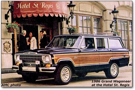
Jeep Grand Wagoneer - 1986
That's the St. Regis hotel on East Grand Boulevard in Detroit.  It's across the street from what was then the headquarters for General Motors.  GM put me up there once, back when I started consulting for them.  This Jeep's grille has a vertically oriented grid pattern behind the horizontal chromed bars.  The Jeep grille is gone, for all practical purposes.  Perhaps stylists or management thought that the boxy body was sufficient to visually identify the brand.

Jeep Liberty - c. 2002
By 1990, Jeep grilles were back to their traditional mode.  This Liberty even maintains the grille-headlamp positioning of World War 2 Jeeps such as the one pictured above at Yalta.

Jeep Cherokee - 2014
  Here is the latest Jeep grille interpretation, this on a new SUV design in line with current body sculpting fashion.  Maybe I'll change my mind, but right now I rather like this variation on the traditional Jeep grille because, while it's clearly Jeep-like, it has a contemporary flair.

Thursday, March 13, 2014

Pontiac Sunfire: Its Name in Lights

Starting around the mid-1990s, General Motors styling went through a spell of soft, aerodynamically-influenced body shapes enhanced by having minimal ornamentation.  An example is the Pontiac Sunfire, a compact car in production for the 1995-2005 model years.  Its Wikipedia entry is here.  As Wikipedia indicates, the Sunfire shared its body with Chevrolet's third-generation Cavalier.

Seen from the side, it's hard to distinguish Sunfires and Cavaliers from one another.  Even their front "faces" are not greatly different, the most apparent distinction being the shape of their headlight assemblies.

But it is at the rear where the Sunfire shined -- literally.  Rather than having the Pontiac brand name spelled out in chrome-plated letters or appearing on a plaque of some sort, the name glowed because it was illuminated through translucent red cut-outs on a black-background plastic panel.

Gallery

1995 Pontiac Sunfire sedan
The grille opening is divided in the middle, a weak evocation of Pontiac's traditional (since 1959) two-part grille theme.  The glowing (when headlights were turned on) Pontiac name can be seen on the black panel separating the tail lights.

2000 Pontiac Sunfire coupe
The Pontiac name is more visible in this rear 3.4 view of a Sunfire coupe because the car's lights were turned on for the photographer.

Yes, the illuminated brand name is a small detail, yet it was highly noticeable when seen on the streets.  I don't know how most people reacted to it, but I found it bothersome and somehow in bad taste.

This form of brand signage is extremely rare; offhand, I can't think of any other major make doing the same thing in recent decades.  Someplace in the back of my mind I have the impression that some 1930s American cars did something similar.  For example, a glance at Google Images for the 1937 Buck suggests that the Buick name on chrome letters was placed over a small, centrally located brake indicator light.  Much more subtle, and not quite than same thing as the Sunfire's bold Pontiac proclamation.

Monday, March 10, 2014

General Motors Badge-Engineers a Sports Car

The 2002 Pontiac Solstice show car drew enough interest that General Motors placed it in production, perhaps as a corporate morale-builder in the mold of the original Dodge Viper.  (Bob Lutz was on the scene in both instances.)

The Solstice entered production in 2005 as a 2006 model, as described here.  A facelifted version was placed in production as the Saturn Sky, an effort to broaden interest and increase production.  Then the Sky was used as the basis for the Opel GT roadster and Daewoo G2X. All of these were assembled at GM's Wilmington, Delaware plant.

The 2008 financial crisis struck, sending General Motors into bankruptcy.  Side-effects of this were the killing of the Pontiac and Saturn brands along with the closure of the Wilmington facility.  Total production was about 108,000 vehicles, of which around 66,000 were Solstices, 34,000 were Skys and 7,500 were Opels.  I could find no data regarding G2X sales; apparently they were essentially nil.

Another thing I do not know is whether these sports cars were profitable.  My guess is that they were a money-loser.

As for styling, it was well-done, hewing to the classical 1950s sports car themes embodied by  Austin-Healey, Corvette, and such.  The Pontiac had a rather soft front end that, while being a reasonable styling solution for incorporating the marque's traditional grille theme, was lacking in "punch" or character.  I would have preferred something stronger, yet maintaining theme continuity.  In contrast, the Sky's front was crisp, bold, and altogether more purposeful.  Also conventional, not very distinctive.  The Opel and Daewoo versions are essentially Skys with different badges on the grille bar and a few other places.

Gallery

Pontiac Solstice - 2006

Saturn Sky - 2007

Opel GT - c. 2006

Daewoo G2X - 2007

Thursday, March 6, 2014

BMW 328s Pure and Silly

In the years since around 1950, when automobile styling switched from evolution to fashion, stylists have become tempted to harken to previous themes for inspiration.  The buzz word for this is "Retro."  Sometimes Retro is found in production cars, but it might happen even more where concept cars are concerned.  A case in point is the BMW 328 series, a production sports car that sired some road racing variants around the end of the 1930s.

Gallery

Shown here are the 1937 Bügelfalte, 1939 328 Touring Coupe and 1940 328 Kamm Coupe.  They are of interest due to the use of serious streamlining (as opposed to superficial streamlining found on many passenger cars of that era).

The Touring Coupe.  It was created by the Italian coachbuilder Touring because BMW needed a closed car to better compete in road races outside Germany such as Italy's famed Mille Miglia (Thousand Mile) race through towns and countryside.  More information is here.

The Kamm Coupe.  Unlike the Touring coup, the Kamm Coupe's body was the result of wind tunnel testing by the noted aerodynamicist, Wunibald Kamm. See here for more details.

Two views of the 2006 BMW Mille Miglia Concept Coupe.  This was inspired by the streamlined racing cars pictured above.  I think it is very nicely done.  Well, I have a few quibbles such as the lack of doors, but this is a show car, after all, so details that do not affect the overall design can be excused.  The front seems to be mostly inspired by the Touring Coupe, while the rest of the design is derived from the Kamm Coupe.

A production BMW 328 roadster is pictured with the 2011 "328 Hommage" concept car in conjuction with the 2011 Villa d'Este concours.

Closer views of the 328 Hommage.  Some background regarding it can be found here.  Unlike the Mille Miglia Concept Coupe, the styling of the Hommage is a hash of unrelated or marginally related details.  The design would have held together better if doors were present, but the cut-out entries serve to break it into chunks.  Yes, there are continuation lines (the top of the fenders and the upper side character line), but these are overwhelmed by the cut-outs.  I would have honored the original 328 by having the door cut-outs terminating along that character line, rather that dropping through it.  This would have unified the design and better reflected the 1930s 328's styling.

Monday, March 3, 2014

Does Good Styling Sell?: The Oldsmobile Case

Aesthetic judgments are just that: opinions based on subjective reactions to the appearance of something.   So there is little possibility of doing research to conclusively demonstrate an objective relationship between a car model's appearance and success in the marketplace.  About the best one can do is to take a survey to come up with the average opinion regarding a car's looks.  Another possibility is to collect judgments from supposed experts.

That said, there are cases where automobiles with designs that are considered outstanding by consensus proved to sell poorly.  Examples include the 1936-37 Cord and 1953 Studebaker Starlight Coupe.  But even here, marketplace weakness can be explained by factors not related to styling (radical engineering and an underfunded company for Cord, and quality defects and sales pressure from GM and Ford for Studebaker).

Financial weakness is often the culprit, a fading company gambling on flashy new styling to save the firm.  Instances here (besides Cord) include the 1963 Studebaker Avanti and the 1951-54 Kaiser.

Now consider a counter-example, where nondescript design correlates to strong sales.  Today's exhibit is shown below:

1984 Oldsmobile Cutlass Ciera

According to this Wikipedia entry, during its long (1982-1996) run, "the Cutlass Ciera was consistently Oldsmobile's best-selling model."  Moreover, as another entry states, "Oldsmobile sales soared in the 1970s and 1980s (for an all-time high of 1,066,122 in 1985)," implying that the Cutlass Ciera was a popular car indeed.

The Cutlass Ciera design is not bad.  I might characterize it as being competently mainstream with nothing to excite an automobile fan.  It's the sort of appliance-on-wheels that a consumer advice magazine of that time might have approved of.

Let's put the Ciera design in Oldsmobile-historical context:

Gallery

1941 Oldsmobile
From the 1920s into the 1960s, General Motors marketing policy held to a continuum of car brands from low-priced to luxury.  By 1941, the sequence from low-price to high was Chevrolet, Pontiac, Oldsmobile, Buick and Cadillac.  There was price overlap between brands, but nevertheless it was a clear system whereby a satisfied buyer of, say, a Pontiac could "move up" to an Oldsmobile for his next purchase if he could afford to.  The sales result was comparative stability amongst GM's brands during those times.  The 1941 Oldsmobile shown above has fussy trim, but it sold well.

1948 Oldsmobile 98
During the late 1940s Oldsmobile styling featured less ornamentation.  The 98 pictured here was part of the top of the Oldsmobile line.  I think it is an attractive design for its time.

1954 Oldsmobile 88
Another clean design is this two-door hardtop from GM's portfolio of futuristic cars for the 1954 model year.  The excitement dissipated in 1955 and 1956 as competitors launched their own versions of panoramic windshield styling.  By the 1958 model year, Oldsmobiles featured Rococo styling in a misguided attempt to appear new and exciting.  This was quickly reversed when Bill Mitchell replaced Harley Earl as GM's styling boss.

2000 Oldsmobile Intrigue
General Motors killed the Oldsmobile brand in 2004 because its declining market share could not support six different makes (GM introduced the Saturn brand for the 1990 model year).  In the years leading up to this, GM marketers and brand managers agreed that Oldsmobile styling should be clean, with not much ornamentation.  In the late 1990s, GM styling in general featured soft shapes and reduced trim, so Oldsmobiles became amongst the blandest of the bland, as this Intrigue demonstrates.  It isn't a bad looking car, but it offers little visual excitement.

My answer to the question in this post's title must be inconclusive, so far as Oldsmobile is concerned.  A stylistically unexciting Ciera was a good seller and the bland Intrigue marks the brand's dying days.