Drivers necessarily interact with dials, switches, buttons and other items on a car's dashboard. Probably far more attention is paid there than standing back and admiring the vehicle's design. Therefore, a series about dashboards.
The present post presents dashboards of significant production level American cars for the 1936 model year. Later installments will deal with dashboards for 1941, 1949 and 1955.
For the most part, image sources are unknown to me, but are indicated where possible. Brands are arranged by corporation or company, and by ascending order of luxury, where appropriate. To set the scene, a few late-1920s dashboard photos are included.
1928 Ford Model A
In the days before car makers had styling organizations, details such as instrument panels were probably created by engineering staff. This was almost certainly the case for Ford. The shape was intended by somebody to be "artistic."
1927 Dodge Brothers
Dodges were more upscale than Fords. But the instrumentation is also minimal, and its setting is simpler.
1927 Chrysler 70
This Chrysler model is mid-range, with more dials. The artistic touch is a theme of ovals.
1927 Packard - Bonhams auction photo
Even though Packards were upscale cars, this instrument panel is basic.
1936 Chevrolet Standard
By the mid-1930s all American carmakers made use of stylists. The instrument cluster is now in front of the driver, a glove box is placed before the front-seat passenger.
1936 Pontiac
Pontiac and Chevrolet shared the same basic bodies, and their dashboards were similar -- note the two large circular items. However, functions were reversed: Pontiac's speedometer is on the left and other instruments are on the right, unlike the Chevy. This Pontiac has a clock mounted on the glove compartment door.
1936 Oldsmobile
Oldsmobile's dashboard featured two large circles, the one on the left with the speedometer with other gauges clustered on either side. The wire cluster behind the steering wheel seems to be a fan added by an owner.
1936 Buick Century
Buick's dashboard is more cleanly styled than Oldsmobile's. Note the horizontal chrome "speedline" strips, a Moderne touch.
1936 Cadillac
For some reason Cadillac's instrument cluster is somewhat centered, not fully in front of the driver. That said, the large dial on the right is a clock, not something vital for operating the car. And there is a rectangular cluster of gauges at the left side of the panel. The overall effect is what one might expect on a 1936 luxury car.
1936 Ford Tudor DeLuxe - Hyman photo
Ford went along with the times, having abandoned the Model A's clustered instrumentation.
1936 Lincoln-Zephyr
The newly launched Zephyr was Moderne and streamlined inside and out. Instruments are grouped in the large circular mounting atop a centralized pedestal. The other round-faced dial is the clock.
1936 Plymouth - Mecum
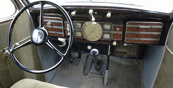
Chrysler Corporation's entry-level Plymouth brand's dashboard features fake wood trim, something seen on American cars from time to time in the future. That's a heater mounted below the glove box.
1936 Dodge
Dodge also had a centrally-located instrument cluster and fake wood.
1936 DeSoto
I don't know if this DeSoto is an Airflow or an Airstream. Instruments are centered, but the theme is rectangular, not circular.
1936 Chrysler Airstream
The arrangement is similar to the DeSoto's, but overall appearance seems rather stark.
1936 Studebaker Dictator
Studebaker's theme seems rather Art Deco.
1936 Packard Eight Phaeton
Yet another centralized group -- with export markets in mind? That's surely real wood. To me, the discordant note is the squeezed shape at the center of the cluster that features the Packard crest.
1936 Nash
A simple design with some vertical trim.
1936 Terraplane Convertible, by Hudson
The non-vertical placement of the instrument cluster makes me wonder just how visible those instrument are to the driver. A too-affected design, I think.


No comments:
Post a Comment