Thursday, January 30, 2014

Packards Everywhere

This post originally appeared in the Art Contrarian blog (15 March 2013).  I am re-posting it here because it might interest Car Style Critic readers.

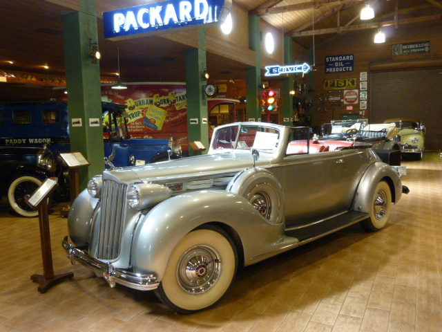
They call it the Antique Car Museum, but it's really mostly about Packards.   My wife was getting in a tennis session plus some poolside sunning, and I was at loose ends because those activities aren't for me.   A dive into the guidebook entry for Fort Lauderdale, Florida mentioned a car museum, something up my alley.   So off I went.  The museum lies a mile or so south of the city's downtown on a sidestreet so, like me, you might have to grope around a little to find it.  But the price of admission is very reasonable, and the collection is interesting.

What the museum's not is glitzy or over-curated.   No shiny black floors and spotlights like the Blackhawk museum in California.  No faux street scenes as in the ex-Harrah museum in Reno, the Petersen museum in Los Angeles or the Henry Ford museum near Detroit.  Just all kinds of stuff everywhere.  That stuff includes custom car designer renderings from the 1930s, framed car ads for many brands, cases containing shelves of hood ornaments, gasoline station and car dealer service signs, and much more potentially fascinating clutter.  There's even a small room in homage of Franklin D. Roosevelt who for some reason didn't seem to favor Packards.   Nobody's perfect.

Here are some of my photos.   The quality varies because the museum walls are pierced by many small windows that let in the intense south Florida daylight that contrasts with the otherwise fairly dark interior.

Gallery
Touring car - 1931
This is one of the more elegant Packards from the marque's heyday as America's top luxury automobile.

Runabout - 1928
The golf bag in the rumble seat is a nice touch.  Note the huge spotlight mounted aft of the front fender.  23-skidoo!

Convertible - 1939
Seen 74 years later, this Packard seems very impressive.   But at the time, its styling lagged behind its Cadillac and Lincoln competition which were featuring more streamlined shapes.

Caribbean - 1955
One of the last of the "real" Packards.  After the 1956 model year, Packards were built, but their bodies were facelifted Studebakers.  That's called dying with a whimper.

Station wagon - 1948
The greenhouse rear treatment makes it sort of a "woodie," but nearly all the body was metal.  The photo doesn't show how narrow the woodie part was; this wagon wasn't all that functional.

Convertible - 1950
This car and the wagon in the previous photo represent facelifts of the attractive 1941-47 Clipper body.   The facelift included clumsy flow-through fenders that enhanced the awkward, bulky appearance of the cars.  The convertible shown here was the top-of-the-line model and somehow seems slightly impressive nowadays.

Light Eight - 1932
Luxury car makers were hit especially hard by the Great Depression.   For 1932, Packard added the Light Eight line in an attempt to offer lower prices without tarnishing the Packard mystique.  From what I read, the Light Eight was still expensive to produce, and it did little to stanch declining sales.  The line was abandoned for the 1933 model year.

Light Eight grille
The styling feature I like best on the Light Eight is its grill, popularly called "shovel nose."  To me, it combines the traditional Packard iconography at the top with a gesture to streamlining at the bottom.

Monday, January 27, 2014

DeSoto: Was the 1955 the Best Ever?

Chrysler's DeSoto brand (1929-1961) was the corporation's weakest in terms of sales for its entire existence, as best I can tell.  (In the early decades of the 20th century, some American makes were given names of North American explorers and other historical figures: Cadillac, Marquette, Lafayette, Lincoln, DeSoto and so forth.)  Its Wikipedia entry is here.

The probable reason for continuing the DeSoto was for Chrysler Corporation to have a range of brands covering the price spectrum in imitation of General Motors.  From the mid-1930s to the mid-1980s, GM's lineup from entry level to luxury was Chevrolet, Pontiac, Oldsmobile, Buick, Cadillac.  Chrysler Corporation from the early 30s to 1961 countered with Plymouth, Dodge, DeSoto, Chrysler and, starting 1955, the Imperial brand.  DeSoto, therefore, was in the middle to upper-middle price group, Chrysler being an upper-middle to lower-upper range car, with the Imperial as a stab at the luxury market.

Even though DeSoto was squeezed by the more popular Dodge and Chrysler brands, from time to time it was given nice styling.  One of those instances was the 1955 line, the first year of the corporation's styling revival under the direction of Virgil Exner and dubbed the "Forward Look" by marketing staff.

Gallery

An American styling fad in the 1950s was having cars painted in two or even three colors.  Shown above are 1955 DeSotos with two-tone paint jobs, the most common option that model year (there were no three-tone schemes for DeSoto).  Both cars pictured here are two-door "hardtop convertible" models, a very popular, sporty body style in those days.

Some DeSotos, in particular those from early 1955 production, came either with one color or without the large color splash on the sides.  The car in the upper photo is a four-door sedan with the secondary color on the roof only.  The lower image is of another "hardtop," one with only one color.  I like this one best of all.

The basic body is gracefully styled, which somewhat disguises how large these cars actually were.  Note the ridge along the side of the front fender and how it aligns with the center of the headlamp and, at its other end, transitions into a raised curve suggestive of a rear fender -- an elegant solution for visually reducing bulk.

For some reason, I almost always enjoy encountering a design where "soft" surfaces flow over "hard" objects -- in the DeSoto's case, it's the upper edge of the grille opening flowing around the bumper guards.

So far as I'm concerned, the only serious styling flaw is the tacky air intake at the front of the hood, a chromed slash atop a "V" symbol.  Without these and the hood mascot/ornament, the design would be just about perfect for a 1955 American hardtop.

Thursday, January 23, 2014

Rover 75: Dignified Millennial

The Rover 75 (1999-2005) was an attempt to give new life to a major mid-priced British automobile brand that had been falling on hard times.  Falling to the extent that it suffered the indignity of offering the public a re-badged Honda as a Rover.

That this attempt was made at all was because Rover was owned by BMW at the time, and the Germans hoped a new Rover would make their investment pay off. The Wikipedia entry for the Rover 75 is here.  According to the Wikipedia link, both BMW and Rover management thought that conservative, dignified styling would be appropriate for the new model.

Also according to the link, the design was fairly well received, but sales were not as strong as hoped, behaps due to concerns about the company, which BMW sold in 2000.

I visited England several times when Rover 75s were in production and could seen fairly often on streets and motorways.  I thought the styling was blandly pleasing and Rover-like: just what a conservative mid-line British car should be.  My biggest quibble is the zig-zag cut line in the front fender area for the front end impact cap.  An effort should have been made to integrate it in some way with the upper character line on the fender.


A later model with a different grille and headlamp treatment.

Monday, January 20, 2014

Styling Crimes: 1957 Hudson

Here we are with another post falling under the "Styling Crimes" label.  By that I mean automobiles with really ugly styling whose design was approved even though most of those involved in the process must have known how bad it was.

This post deals with the last model year for Hudson cars, 1957.  The Wikipedia history of Hudson before the company was merged with Nash into American Motors (in 1954) is here, and the entry on American Motors is here.

Hudson was the junior partner in the merger, so the Nash people, now in charge, had to keep the Hudson brand alive for a while, probably for contractual reasons.  The Hudson bodies dating from the 1948 model year were abandoned, and Hudsons became facelifted Nashes on a basic design dating to the 1952 model year.  The 1955 Hudsons weren't very attractive, but were not awful, either.  For 1956, splashes of metal and three-color paint jobs entered the Hudson styling scene, and these characteristics were made even more definite for 1957, the last year for both Hudson and Nash.  Let's take a look at some '57 Hudson hardtop convertibles:

Gallery

Working from rear to front, we first notice small, tacked-on tail fins; fashionable, but clearly a cheap, half-hearted gesture to that currently popular feature.  The side of the car includes a swath of gray metal with sort of an arrowhead shape at the front -- an arbitrary, unnecessary piece of decoration.  But the worst of it takes place at the front of the car.  Above each headlamp is a curious, two-pronged triangular windsplit whose main function is to add clutter.  The rest of the front is a confused collection of V-shapes surrounding the grille opening.

Why all those Vs?  It's because Hudson, starting with its first 1910 models, featured a triangle as its symbol.  Those Vs on the 1957s are not triangles, but evoke them, perhaps an early example of postmodernist decay.

To put 1957 Hudson styling in context, here is a photo of a classic post-war Hudson, this a 1951 model.

Thursday, January 16, 2014

Opel Kapitän 1951 Publicity Photos

World War 2 was a disaster for Germany, but by the early 1950s things in the newly formed (in 1949) Federal Republic were rapidly improving, including automobile sales.

Opel, wholly owned by General Motors by 1931, introduced its Kapitän line in 1939, just before the war started.  (Kapitän, in German, refers to the naval rank equivalent to a colonel in the army or a ship's captain.  An army captain in Germany is called a hauptmann.  For many years Opel favored naming its lines after ranks, including Kadett, Admiral, Diplomat, Commodore, this to indicate the line's degree of assigned prestige.)  Information regarding the Kapitän line can be found here.

The postwar Kapitän was introduced for 1947, and was almost identical to the 1939 model, the visible change being that the '47 had sealed-beam headlights.  A facelift was added for 1951-1953 models.  The most noticeable difference was a new grille with large, chromed bars in the contemporary American fashion.

Below, for your viewing enjoyment are some Opel publicity photos featuring 1951-vintage Kapitäns.

Gallery

I don't recognize the setting, so comments from sharp-eyed readers are welcome.

Apparently Opel's proving ground was populated with attractive young ladies whose sole interest was tracking lap speeds.

Picnics and similar outdoor scenes have long been the subject of automobile publicity.

Girls having fun in Nice, France along the Promenade des Anglais, with the Hotel Negresco in the background.  Nowadays, the street is a lot busier.

Monday, January 13, 2014

Henry J: Cute, But Few Sold

Kaiser-Frazer's Henry J (1951-1954) was named after Henry J. Kaiser, founder of the company.  This was one of several marketing errors associated with the brand; an odd name without meaning to many people.

Another, according to this Wikipedia entry, was that conditions for getting a government loan forced the company to cut manufacturing costs to the bone, resulting in a cheap looking car.  For example, early Henry Js had no trunk opening; one had to open the side door, fold down the rear seat back and then try to maneuver a heavy, cumbersome piece of luggage into place.  For not a lot more money, a potential buyer could get a new entry-level Chevrolet, Ford or Plymouth with a trunk lid as standard equipment, more passenger room and other goodies not found on a Henry J.

Henry J styling was what I call cute, and more pleasing than that on many other small cars in the USA and elsewhere at the time.  A nice gesture was the small up-kick or micro-tailfin at the rear of the fender line.  It served as a counterpoise to the fastback roof line, giving the design some needed balance.  Unfortunately, that fastback roof line was going out of style in 1951.  Worse, it yielded an inconveniently sized trunk -- the trunk that was difficult to access due to its lack of a lid.

The grille was an oddity -- large, chromed shapes perhaps inspired by squiggly graphics and table tops that were so strangely popular around 1950.  Even so, it wasn't really bad.  Maybe that's because Kaiser-Frazer had a team of first-rate stylists for a few years, including Buzz Grissinger.

Gallery

An advertising image showing a Henry with seriously small people.

This publicity photo offers a better sense of scale, though the boy with his hand on the door is pretty small.

More probably small-ish people stuffed into an already small car.  In those days, cars of any size were often pictured with small people or people crammed into the passenger compartment to give the illusion that the car was larger than it really was.  Note how the flowing fender line adds a touch of grace to what might have become just another slab-sided design.

This was one of the few photos I found on the Internet showing a Henry J with no trunk opening.  A trunk lid was quickly added once it became clear that the original configuration was hurting sales.  The double-curve at the top of the backlight window echoes window shapes on the new, redesigned Kaisers.

Thursday, January 9, 2014

Fat Cars: AMC Pacer and Ford Edge

I can't say whether it's the way human brains are constructed or whether it's simply a matter of familiarity from repeated observations, but to me, at least, some automobile proportions seem more satisfying than others.  And "others" include cars that strike me as being too fat.  This does not mean I think fat cars have to be ugly, it's that they at best are a little less attractive than the best designs using certain other proportions.

Automobile tubbiness does not necessarily deny market success, though it is helpful for sales if many contemporaneous cars are tubby rather than svelte, that being the existing styling fashion (think early post-World War 2 cars).  In the present post, I present one market failure along with a success.  Shown below are the 1975 American Motors Pacer and the Ford Edge, introduced for the 2007 model year.

Gallery

1975 AMC Pacer
I actually think the Pacer is kind of cute (but whadda I know).  Its sales problem had to do with the fact that it was heavy for a car of its length; buyers must have expected it to be more economical to operate than it proved to be.  Once word of that got out, sales began to suffer.

2008 Ford Edge
The Edge, on the other hand, has sold well.  When I'm in the Palm Springs area of California, I see lots and lots of Edges.  The Edge is a crossover SUV based on a Mazda 6 sedan platform, and features a moderate wheelbase and little front and rear overhang, perhaps for reasons of handling.  So in order the have carrying space expected for a SUV of its price class, the body was made comparatively wide.  I know this because my wife owns a 2008 Edge and I am its driver when we travel to California.

Monday, January 6, 2014

Berliet and Licorne: Last-Ditch Body Transplants

Automobile production levels were low in Europe until the 1950s, at least when compared to the United States.  So I continually wonder how a country such as France could have supported so many car manufacturers.  (As late as model year 1938, 22 firms exhibited at the Paris Auto Show, and there were others in business that didn't exhibit.)  Part of the reason was because cars were mechanically much less elaborate than nowadays.  Also, bodies were usually composite, steel sheeting over wood framing until into the mid-1930s.  Therefore, less expensive tooling was required for body construction, though more hand-work was involved.

But industry consolidation was inevitable, and accelerated by the Great Depression of the 1930s.  During those years the French auto industry was dominated by three firms: Renault, Peugeot and Citroën -- the latter, having fallen on hard times, was taken over by Michelin, the tire maker.  Lesser firms were being squeezed out of the market and sometimes resorted to preservation strategies that might strike us today as being odd, yet were occasionally used in even the USA.

The strategy the present post deals with is where a smaller, weaker company sells cars built from components of cars from stronger makes.  Examples here are Berliet and Licorne.

Gallery

1939 Peugeot 402 BLE
1939 Berliet Dauphine
For the 1939 model year, Berliet turned to Peugeot to body its Dauphine line.  As can be seen above, from the cowling on back, the body is strictly Peugeot 402 B (the largest model in Peugeot's line at the time).  The front end borrows heavily from 1937-vintage American styling.

1938 Citroën 11
1938 Licorne Rivoli
Licorne's borrowing for 1938 was even more drastic.  Besides having a Citroën body, this Licorne model also had a Citroën motor and transmission -- necessary because the Citroën was front-wheel drive and therefore had no structural provision for a driveshaft and powered rear wheels.  This Licorne is essentially a Citroën with a different grille.

UPDATE: See Comments for a discussion of the Licorne's running gear and motors that runs counter to my speculations.

Thursday, January 2, 2014

Studebaker's Mid-1950s Sedan Facelifts

Working as a stylist for a car company whose sales were falling and money was running out probably wasn't much fun.  On the other hand, those perilous conditions must have fueled a good deal of design creativity.  How, with an extremely limited tooling budget, can the next year's models be made to look fresh and competitive?  If you were a stylist worth your salt, you had to dig deeply into to your creative resources to succeed in this task.

This problem cropped up all too often in the history of the automobile as brand after brand fell by the wayside.  We deal with it fairly often on this blog, the subject of this post being the sedan line of Studebaker, a maker of wagons and then cars for more than 100 years as the mid-1950s approached.

The company had done well for the first years following the end of World War 2, and the 1953 model year featured a complete redesign of the Studebaker line.  The highlight was the Starliner coupe, considered one of the most outstanding car designs ever.  A number of critics assert that Studebaker was mistaken when it styled its sedans using cues from the low, rakish coupe.  I might get around to dealing with that in a future post, but for now will take the 1953 sedan design as given.

What happened was, Studebaker sales had peaked in the 1950 model year and began a decline that saw few interruptions until production ceased for good.  The 1953 redesign had no real effect at all.

Given that background, let's look at the company's sedan styling from 1953 through 1958 (the 1959 facelift, where the car was drastically shortened, is another story worthy of a separate discussion).


Gallery

1953 Studebaker Champion
This is how the 1953 restyling appeared on Studebaker's low-price line.

1955 Studebaker President (early version)
1954 Studebakers were almost identical to the '53s, but a noticeable facelift was required for 1955 because most other American cars were either restyled or were given major facelifts.  Studebakers were given a garish, awkward, heavily chromed grille as the main means of freshening appearance.  The rear wheel well cover is an accessory.  But there was a problem: Almost every other make had "modern" wraparound windshields, and Studebakers didn't, at least at the time the '55s were introduced.

1955 Studebaker President (later version)
Studebakers did get a wraparound windshield later in the model year.  Its version had a back-sloping A-pillar similar to that used by Chrysler Corporation.  Other makes with wraparound windshields had either vertical or forward-sloping A-pillars.

1956 Studebaker President
1956 saw a more extensive facelift.  The rear was filled out, lengthened a little, and squared off to increase trunk room.  The front was also filled out so as to offer a more conventional appearance.  But the passenger compartment was unaltered, and therefore seems perhaps a little too soft when compared to the rest of the car.  Studebaker sedans might have sold better in 1953 had they looked more like the 1956 models.

1958 Studebaker Commander
By 1958, styling fashion called for "quad" headlamps, thin roofs and tail fins, so Studebaker went along with the crowd.  The problem with this facelift is that the quad headlights were housed so that the front fenders had to be "blistered."  This tacked-on appearance degraded what otherwise was a relatively sensible design in those extravagant, baroque times.