Monday, July 31, 2017

Cadillac's First Seville

The first-generation Cadillac Seville (1976-79) was given a clever marketing twist, as is mentioned here.  The Seville was smaller that other Cadillac sedans, but priced higher; normally the largest American luxury models had the highest prices.  General Motors' idea was to change the perception just mentioned.  This made further sense in that, partly in reaction to the 1973 oil crisis, the new trend was to smaller American cars and Cadillac needed to move in that direction.

The Wikipedia link above notes that the first Sevilles were based on the nearly-unique (to them) General Motors K platform.

My take is that first-generation Sevilles didn't look especially luxurious and expensive.  Nor did they have what might be called strong "character" -- admittedly a fuzzy, subjective assessment.  There was nothing technically wrong with the styling, but the likely intent of the designers was to produce a dignified image and this resulted in something bland, rather than distinctive.

My previous post about Sevilles dealt with the later, definitely distinctive "Razor Edge" version styled under Bill Mitchell's guidance.

Gallery

Front and rear three-quarter views of 1976 Sevilles.

Side view.  I like the long hood on this rear-wheel drive car.

Another advertising image, this showing a Seville not in a photography studio.

1978 saw the introduction of the Elegante package, a new top-of-the-line Seville featuring a two-tone paint scheme (Palm Springs area for-sale photo found on the Internet).

Thursday, July 27, 2017

Lancia Aprilia: Production Series

Aerodynamic refinement was in the mid-1930s automotive air.  The most famous such body design from that era is the Chrysler Airflow of 1934.  There also was the Tatra 77 of 1934 (wind tunnel tested), then came the Volvo PV 36 Carioca of 1935 (I'm not sure if it was wind tunnel tested), the Fiat 1500 of 1936 (tested), the 1936 Peugeot 402 (probably not tested), and the Lancia Aprilia, Wikipedia entry here.

In addition to many custom-bodied Aprilias there were two factory body versions: first series 1937-1939, second series 1939-1949.  The differences were mostly mechanical.

The Wikipedia entry as of the time this post was drafted states that the Aprilia was "...one of the first designed using wind tunnel in collaboration with Battista Farina and Politecnico di Torino, achieving a record low drag coefficient of 0.47. The berlinetta aerodinamica was first shown in 1936."

Regarding the wind tunnel testing, the Italian Wikipedia (here) mentions:

"Quanto alla carrozzeria, ricerche effettuate in collaborazione con il Politecnico di Torino portano a concludere che la forma della coda riveste una particolare importanza aerodinamica: la linea della vettura, quindi, segue alla lettera queste indicazioni al punto che, quando Vincenzo [Lancia] vede il "mascherone" in legno della carrozzeria, trova esagerato il raggio di raccordo tra tetto e fiancata, e lo fa subito ridurre.  Alla fine, il coefficiente aerodinamico risulta di appena 0,47 Cx, un record per l'epoca, se si esclude la Tatra T87 del 1936, che aveva un cx di 0.36 (e corrispondente, grosso modo, a quello di una Renault 5 o della prima Volkswagen Golf o di una Alfa Romeo Giulietta della serie degli anni ottanta).

La scocca dell'Aprilia, carrozzeria compresa, viene brevettata - come consuetudine Lancia - il 9 gennaio del 1936."

No mention is made of Farina.

"A total of 20,082 cars and 7,554 additional chassis for coach built bodies were produced in Turin along with about 700 in France," according to the English entry above. The French Wikipedia entry has it that "Les ventes entre 1937 et l'arrêt de la fabrication pour cause de guerre ont atteint les 1.620 exemplaires seulement ; 1.500 berlines et 120 châssis" for the Lancia Ardennes (the name used in France).

The French Wikipedia also notes, regarding the Aprilia main Italian competitor: "Les deux modèles, Lancia Aprilia et Fiat 1500, seront commercialisés jusqu'au printemps 1950, date à laquelle les deux marques les remplaceront par la Lancia Aurelia et la Fiat 1400. La Fiat 1500 sera produite en 47 000 exemplaires tandis que la Lancia Aprilia atteindra les 28 000." So the larger, stronger Fiat firm had somewhat more success with its early wind tunnel tested car.

Here are some images of Aprilias whose factory design remained virtually unchanged over its production run.

Gallery

A 1937 Lancia Aprilia for sale in the UK.

Dimension diagram for the 1937 Aprilia.


Two more images of the car in the first photo.  The body to the fore of the cowling doesn't seem particularly streamlined.  Apparently wind tunnel resting had the most impact abaft of that point.  The ridge running along the center of the top and across the rear windows to the license plate frame is probably a styling affectation -- but a nice touch.


Two for-sale views of a 1939 (second series) Aprilia.  The main changes from the 1937 car that I notice are the running boards and the tail light arrangement.

RM Sotheby's auction photo of a 1949 Aprilia -- the last model year.  Still the same design.

Monday, July 24, 2017

Plymouth's Fins Final Fling: 1960 Fury

Chrysler Corporation's standard size cars mostly switched from body-on-frame to unitized construction for 1960.  Retained features included wraparound windshields with back-slanting A-pillars (first appearing in 1955) and tail fins (that began to sprout for the 1956 model year).

Virgil Exner was nominally in charge of Chrysler styling when the 1960 redesign was underway.  But he had suffered a major heart attack in 1956 that required open-heart surgery and a long recovery period.  Because of this, Exner was not deeply involved with the design of cars under development during the late 1950s, nor was he always pleased with the results of the work done by others.

The subject of this post is the 1960 Plymouth Fury, a car with odd design features.  Peter Grist, in his biography of Exner, has Cliff Voss responsible for its styling.  Voss was an experienced designer who had held leadership positions for years, so I find it a bit strange that Plymouths appeared the way they did.

As it happened, Plymouth sales were not good during the 1960 model year.  The 1961 facelift cleaned up the front end design somewhat, and tail fins were eliminated.

Gallery

Hyman Ltd. photo of a 1960 Plymouth Fury hardtop coupe.  The tail fins are unnecessary, the '61 facelift doing a neat job of replacing them with a sort of horizontal blade motif.  Otherwise, the design aft of the cowling is reasonably pleasing.

The major styling defect is the mess forward of the cowling, as seen in the previous photo as well as this Mecum Auctions image.  The worst detail is the curved chrome slash that whips around the front wheel opening while serving here as a paint tone separator.  The accent color forward of the opening serves to exaggerate the awkward, somewhat static zone in a design that otherwise flows tautly from front to rear (fins aside).  Quad headlights occupy too much space.  The "eyebrow" above the grille zone is too heavy-handed.  The shallow V at the lower edge of the grille clashes with the horizontal middle section of the eyebrow.  The nearly-horizontal connector bar between bumper side elements adds yet another shape that does not relate to its neighbors.

Side view of the same car.  From this perspective, the tail fins are clearly too large, and unbalance the design.

High angle view of the rear of a Fury convertible from Barrett-Jackson.  The fake spare tire cover is an affectation found on several 1950s vintage Imperials and then appeared on Furys for 1959.   This photo helps confirm that the fins are unhelpful from a design standpoint.

Thursday, July 20, 2017

Chevrolet's Uncluttered 2003 SS Concept Car

Nowadays concept and production cars seem to be collections of planes and angles intended to somehow make wind tunnel tested body shapes distinctive for the target marque.  I think that is simply a fad -- well, I hope it is a fad.

Back around the year 2000 there was generally a lot less ornamentation and shapes were cleaner.  There also was a minor fad for so-called Retro designs, where features of cars from decades earlier were hinted at.

A somewhat obscure concept car from that era is the Chevrolet SS, first shown at the Detroit auto show early in 2003.  It displays some of the characteristics just noted.  However, its design features didn't appear on future Chevrolet sedans.

Gallery

The wheels on the SS are huge, so reducing their diameter slightly would have improved the design.  The front fenders are nicely shaped Retro element recalling sports car fenders from around 1950.

The rear is uncluttered, in part because concept cars don't require bumpers.  I can glimpse a trunk lid cut line that suggests an inconveniently small opening.  These details would have been altered for a production version.

An almost-side view showing the simple, nicely done shaping.  The problem of the too-large wheels is clearly shown here.

Here is a 2003 vintage Chevrolet SSR, an odd production pickup truck.  Beginning in the early 2000s, Chevrolet stylists began playing with a frontal theme based on a single, thick bar that was sometimes chromed, sometimes not.  Chromed versions are seen on the both the SSR and the SS concept.  The shallow V grille opening shape also is seen on both vehicles.

Monday, July 17, 2017

What Were They Thinking?: 1961 Ambassador

American Motors Corporation was doing well in terms of sales around 1960.  Nevertheless, it lacked the financial resources of the Big Three car makers of Detroit.  For that reason, it usually had to make use of basic body tooling for more model years than their richer competitors.

This was true for its senior Ambassador line.  The Ambassador name was used by Nash for its top line, and after AMC dropped the Nash brand it applied the name to a stretched (in front of the cowling) body that originally entered production as the 1956 Rambler.

AMC stylists kept fiddling with Ambassador grilles, tail fins, and other details in an effort to keep the aging basic body fresh looking long after a redesign would have been called for (if the Ambassador had been, for instance, a General Motors car).

For 1961, an odd front end facelift design was selected.  I find it hard to understand how this happened, because AMC had a talented styling staff that included Dick Teague who was hired by AMC in 1959 when the '61s were still in the development stage.   Ed Anderson was in charge of AMC styling, and I regard him as less skilled than Teague, so perhaps he okayed the design for production.  Or possibly it was someone in upper management who bears responsibility -- though a manager would have to have selected a design option originating in the styling section.

The facelifted '61 Ambassadors were asserted to have a European flair.  Maybe so, if some of the strangest French designs served as inspiration.  As for me, I see fail to see a genuine European character to Ambassador front ends, and think the European angle was public relations hogwash.

And as it happened, sales for 1961 Ambassadors dropped from 1960 levels and 1962 Ambassadors received a facelift that eradicated the '61 design.

Gallery

This is a 1956 Rambler, the first year for this basic body.

The 1961 Ambassador.  Exterior body panels differ from the '56 Rambler's, but the underlying unitized structure is largely the same below the belt line.

An AMC publicity photo featuring the front.

This is what the rear looked like.  Tail fins were rapidly falling out of vogue in America, but Ambassadors retained a fairly modest version for '61.  This and the following photo are of a restored Ambassador via Hemmings.

Closeup view of the front design.  The fender extensions are probably the worst element, and the "eyebrow" over the grille and headlights is a close second: they certainly don't work well together.  The slope between the bumper and the eyebrow in itself is not bad, but it results in fussy headlight housings required for dealing with it.  And those headlights, being of the nasty quad variety, are squeezed between the edges of the grille and the fender extensions resulting in plenty of clutter.  Single headlights on each side would have helped, but wouldn't have rescued the design.

Thursday, July 13, 2017

Albrecht Goertz Messes with the Phantom Corsair

One of the most iconic automobile designs of the 1930s was the Phantom Corsair of 1938, intended as the prototype of a hyper-expensive luxury cruiser.  Michael Lamm provides useful background here, as does this article.

The Phantom Corsair was the brainchild of Yale dropout Rust Heinz of the "57 Varieties" Heinz family.  The body was crafted by Maurice Schwartz of the famous Bohman & Schwartz coachworks in Pasadena, California. Heinz died in a car crash in 1939, ending plans to produce more Phantom Corsairs.  Today the car is part of the National Automobile Museum (The Harrah Collection) in Reno, Nevada that occasionally sends it out for display.

Lamm mentions some of the hands the Phantom Corsair passed through, but the one who interests us is Herb Shriner, a show business personality whose career peaked in the early 1950s, around the time he acquired the car.

According to Lamm, Shriner thought the Phantom Corsair was too prone to overheating, so he brought in stylist Albrecht Goertz, perhaps best known for designing the BMW 507, to design some alterations.  These alterations are little seen on the internet, and my contribution in this post is a page from a short-lived automobile magazine that deals with the car.


A nice image of the Phantom Corsair found in many places on the Internet: I don't know its origin.

Paulette Goddard and Douglas Fairbanks, Jr. posing with the Phantom Corsair that will be called the "Flying Wombat" in their movie "The Young at Heart." This shows the small air intakes for the radiator, inspiring Shriner to commission a redesign.

This is the only photo I could find of the restyled Phantom Corsair as completed.

Here is the page from the March 1954 issue of Cars magazine (a short-lived offshoot of Mechanix Illustrated).  Aside from the cosmetic two-tone paint job, Goertz's contribution was grille openings somewhat similar to those on 1953 Studebakers, along with eliminating the little louvres on the original nose.  Click on it to enlarge.

Monday, July 10, 2017

Real and Fake Cars in 20th Century American Illustration

This is a slightly modified Art Contrarian post appearing at the same time as this one.  It deals with contrasting examples of how automobiles were depicted in American magazines 1945-1975.  One famous illustrator took pains to paint accurate images, whereas cars in cover art for a major magazine were "styled" by the illustrators.

I just got my copy of David Apatoff's long-awaited book about Bernie Fuchs, who many of us consider the greatest illustrator active in the waning days of large-circulation, general-interest magazines.  Actually, Fuchs can be ranked as one of the very best American illustrators ever.

During his brief career-building phase (he rocketed to the top by the time he was in his late 20s) Fuchs spent a few years in Detroit working on advertisement and brochure illustrations for automobiles.   He mostly did backgrounds and settings, leaving rendering of the car to a specialist.   But Apatoff's book suggests that he might have illustrated cars from time to time: he definitely paid close attention to how that was done.

Because of that background, he wasn't afraid to include cars in some of his advertising and editorial assignments, and those cars were easy to identify.  That is, he didn't invent his own designs for generic cars.

This is in contrast to the depiction of automobiles on covers of the Saturday Evening Post, the leading American general-interest magazine for most of the first two-thirds of the 20th century.  I did a Google search for usable images of Post covers that included automobiles for inclusion in this blog post.   I didn't turn up every Post cover from 1945 through 1959 (my target era).  All covers can be found on the Post web site, but they are watermarked and therefore not usable here.   What I found was that most car designs were totally made up by the illustrator.   In a few cases, cars pictured were close to actuality, but partly hidden by other subject matter.

Why did this happen?  The Saturday Evening Post was a favorite "ad buy" for advertising agencies with automotive clients. Every issue could be counted on having a number of car ads.   So my guess is that the magazine's editors and art directors instructed illustrators to avoid portraying actual cars, this so that advertisers would not be offended.   ("Hey, guys, we spend tons of money on Chevrolet ads and your latest cover featured a Ford!!  Are you giving them a free plug or something?  We just might switch more of our budget to Life and Collier's.")

If anyone knows for sure why the Post featured generic cars, please let us know in Comments.

Gallery

Fuchs story illustration showing a mid-1950s Volkswagen.  Click on the Fuchs images to enlarge.

At the left is a 1960 DeSoto. Behind it, across the street, is a 1959 Plymouth.  I'm not sure why Bernie was featuring Chrysler Corporation products here.

This Fuchs view of the Brooklyn baseball stadium in the late 1940s might have been painted in the mid-1970s, judging by the style.   The blue car at the right is a 1946-48 vintage Chrysler.   Note that Fuchs has a blurred image of a man screening part of the sharply-done car.  Amazing how he combined the two styles without destroying the car's details.  He must have painted the car first and very carefully added the man and his hat.  The car behind the Chrysler is a 1946 Buick.

Here Fuchs fudged things slightly.  The car is a 1957 Imperial (yet another Chrysler product).  But he didn't paint a small point on the chrome strip above the headlights, above which was a small crest.   That is, he very thinly disguised the car.

Saturday Evening Post - 24 March 1945
This wartime illustration, when no American cars were being built, shows a 1941 Ford. A reference book of mine has a photo of what seems to be this car -- same police sign, same license plate.

Saturday Evening Post - 22 September 1951
This police car is a 1949 or 1950 Ford. However, clipping off the front and rear ends and placing the man in front of the car make it hard to identify for many people.

Saturday Evening Post - 8 September 1956
One last Post example of an identifiable car.  It is a 1954 Mercury with some distinctive side trim abaft of the door missing.  Placing all the camping stuff in front of the car also helps to disguise it.  The image's watermark is because this is a slightly cleaned-up cover by a poster-selling firm.

Saturday Evening Post - 3 October 1953
Now we show what was typical for the Post. The front of the car is somewhat like a 1950 Cadillac, but the rest is nondescript.

Saturday Evening Post - 4 August 1956
These cars look vaguely like early '50s General Motors models, but they lack brand identification ornamentation.

Saturday Evening Post - 8 December 1956
The cars pictured in this cover are totally contrived (though the side trim on the red car is similar to some 1956 Fords).

Saturday Evening Post - 15 November 1958
The wraparound windshield is similar to 1954-56 General Motors "C" body cars, but the rest of the car illustrated here is imaginary.

Saturday Evening Post - 21 May 1949
A totally imaginary design.  However, in the background is what looks like a Jeep station wagon.

Saturday Evening Post - 1 August 1959
The cars in the foreground are imaginary, but farther away I notice shapes and trim that remind me of mid-50s production cars. But their images are so tiny and partial that it doesn't matter.

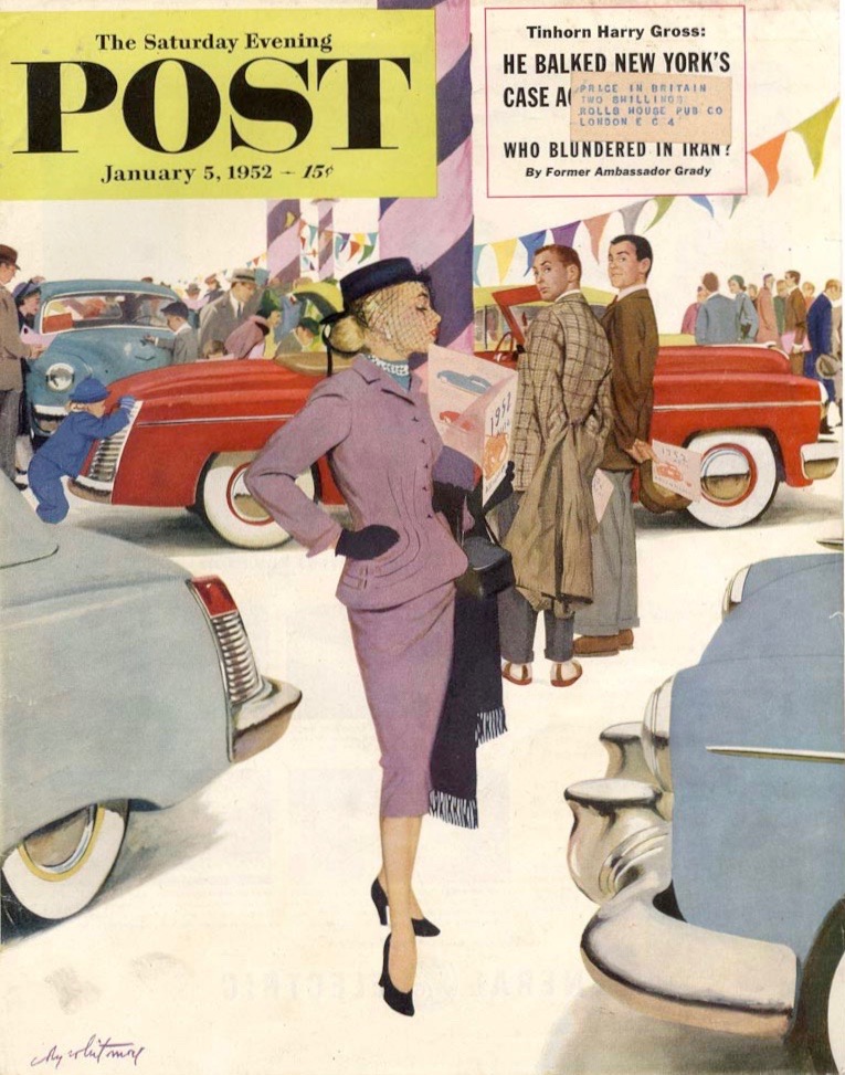
Saturday Evening Post - 5 January, 1952
I used this Coby Whitmore cover in another Art Contrarian post. Whitmore was a total car guy and knew full well what different brands looked like. But had to come up with his own designs here.

Thursday, July 6, 2017

Hispano-Suiza and the 1927 LaSalle

The father of automobile manufacturer styling departments is Harley Earl, whose work designing bodywork for the 1927 LaSalle (a new companion brand to General Motors' Cadillac marque) led to his appointment as GM's styling director and the establishment of its Art & Colour Section.

A well-known factor in LaSalle's design was Earl's admiration for the appearance of Hispano-Suiza automobiles.  Michael Lamm and David Holls in their classic book "A Century of Automobile Style" report the Hispano - LaSalle connection as follows (p.87):

"Earl took inspiration for his 1927 LaSalle design from his favorite European marque, the Hispano-Suiza, and he made no bones about it.  He'd admired Hissos during his several trips to the Paris Salon in the late teens and early 1920s, and he later told Barbara Holliday of the Detroit Free Press, 'The Hispano-Suiza was the apple of my eye.  All the chic people who appreciated cars drove Hispanos.  They were very light as against the heavier models American companies were making, and every line meant something.'... Earl, in fact, kept a Hispano-Suiza radiator in his office for many years after the LaSalle's success, and a number of his early 1930s cars--particularly Cadillac-- also borrowed the Hispano grille shape and ornamentation."

I suppose it has been done before, except that I cannot remember ever seeing a comparison of mid-1920s Hispano-Suiza design to that of 1927 LaSalles.  So why not do just that here.

Gallery

1923 Hispano-Suiza H6B Dual-Cowl Tourer - Bonhams photo.

1924 Hispano-Suiza H6B Coupé de Ville by Saoutchik - Bonhams photo.

Front end of the same car - RM Sotheby's photo.

1925 Hispano-Suiza H6B Transformable Cabriolet by Belvalette - Bonhams photo.

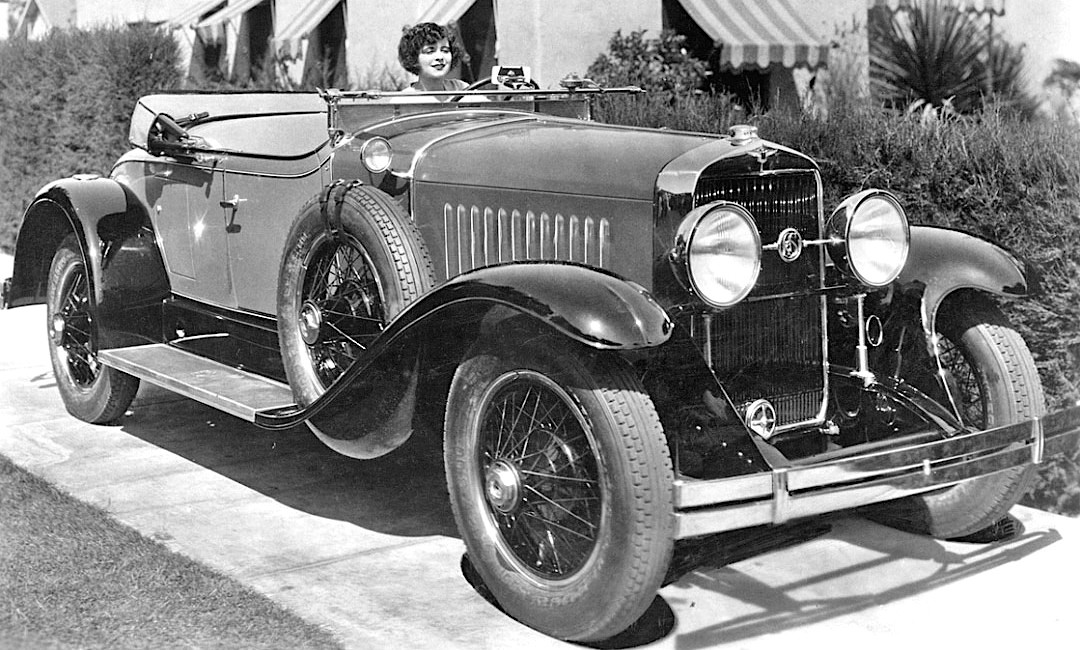
Harley Earl at the wheel with Larry Fisher and 1927 LaSalle.

Harley Earl in his personal 1928 LaSalle.

1927 LaSalle roadster - publicity photo.

Indeed, Earl copied the Hispano-Suiza grille.  Almost the same are Hispano and LaSalle radiator-grille outlines.  Ditto the width of their bright metal surrounds.  The Hispano crest had wings, so Earl's LaSalle crest also had wings.  Comparisons for the rest of the bodies is difficult because post- Great War Hispano bodies, so far as I know (and I'm not a Hispano expert) were all custom built by coachbuilding firms.  That is, aside from the grille, hood, and perhaps fenders, there was no standard Hispano-Suiza body that Earl could have used for inspiration.

Monday, July 3, 2017

Tiny Cars With Pretentious Names


There it is, posing by the Seine on the Quai de la Tournelle early on a Paris Sunday morning.  It's a 2009 Toyota iQ.

A what?!?

Well, the name strikes me as being utterly unimaginative.  That's because it was intended to compete with Daimler-Benz's Smart Fortwo.  And the name "Smart" also strikes me as being condescending.  That is, you are a half-brain-dead idiot if you fail to discern the wonderfulness of this tiny example of fatal-collision bait.  (Yes, I know Smarts were given crash tests, but I'd hate to be in one getting smashed by a camion at 130 kph on an Autoroute.)

Anyway.  Given that the Smart brand had been around since 1998, one might think that, ten years later when the iQ was introduced, Toyota marketing management would have come up with a non-aping, more creative model name.  As it stands, iQs are no longer on the new car market, production having ended March 2016.

Smarts continue in production, but have never sold well in the United States.  Their natural habitat is a large city such as Paris where street parking is hard to find for standard cars, but occasional small spots might be found that would accommodate tiny cars.

This post presents the second Smart version, produced 2007-2014, as compared to the iQ that was produced 2008-2016.  Due to their very small size, there was little for stylist to work with when designing them.

Gallery

Stylists on the Smart Fortwo project included side sculpting and headlight assemblies patterned after what is found on standard cars.

Due to its minimal length, all that décor yields little more that busyness and clutter.

I'm not sure that the rising character line should rise.  A horizontal line might make the car seem a bit less stubby.

The Fortwo, as the name implies, seats only the driver and one passenger.  But in 2004-2006 Smart also made a Forfour with four doors and, in theory, room for four people.  A Renault-based Forfour re-emerged in 2014.  Above is a 2004 version.

Now for the iQ.  It was designed to accommodate a driver and two or three others -- its small back seat was fit for an adult sitting crosswise or for two small children.  In terms of carrying capacity it's between the Smart Fortwo and Forfour, though it was basically competitive with the Fortwo.

Unlike the Smart, iQ's styling is largely decoration-free.

This rear 3/4 view of a black iQ shows the effort put into sculpting instead of visual jazz.  Its front end seems awkward, but what we see here is more pleasing.