Thursday, January 29, 2015

Mercedes-Benz 300 W186 Post-War Large Sedan

It isn't surprising that it took several years following the end of World War 2 for a restyled large Mercedes-Benz sedan to appear.  This was the 300 or W186 (Werknummer 186) that entered production in November 1951, as reported here.

The W186 styling is an interesting combination of old and contemporary features.  The oldest is the traditional vertical grille theme.  Also looking somewhat dated for a car appearing in showrooms early in 1952 was the fender treatment.  Front fenders that fade into the front doors date at least as far back as the pre-war 1941 Packard Clipper.  A somewhat similar bustleback trunk and separate rear fenders combination appeared on 1948 Oldsmobiles.  The most modern feature was the one-piece windshield that also was found on 1950 Cadillacs.

Whereas prewar Mercedes sedans were rather squared-off with fairly flat sides, the new W186s were noticeably more rounded.  This had the effect of making them look bulky, but perhaps that was thought desirable for top-of-the-line cars in those days.

All told, the W186 featured dated styling features awkwardly assembled.  Later on, styling would improve.

Gallery

1951-57 Mercedes-Benz 300 W186 - front 3/4 view

1951-57 Mercedes-Benz 300 W186 - rear 3/4 view

1951-57 Mercedes-Benz 300 W186 Cabriolet

1951-57 Mercedes-Benz 300 W186 - Hans Liska ad illustration

1951-57 Mercedes-Benz 300 W186 - Hans Liska ad illustration
As a bonus feature, I include these advertisement illustrations for the W186 by noted artist Hans Liska, who I wrote about  here.

Monday, January 26, 2015

Flawed Facelift: 1951 Mercury

The 1949 postwar Mercury design by "Bob" Gregorie was appreciated in its day.  Its calendar-year sales ranking jumped from tenth in 1948 to ninth place, and in 1950 Mercury moved to seventh before falling back to eighth the next year when the design was facelifted.

For readers not familiar with the Mercury brand, its Wikipedia entry is here. 

Once the 1949-51 Mercurys went out of production and their prices as used cars fell, they became highly popular as bases for kustom-kar hot rods.  I'm pretty sure that most of the existing Mercurys from that era are customized versions because I had a hard time finding images of stock Mercurys for this post.

A major problem facing American stylists in the late 1940s was that cars were still fairly tall, and the fashion for fenders was to the flow-through variety.  One solution was slab-sided fenders: Packard, Nash and Kaiser-Frazer took that path, and the result was a ponderous appearance.  (Hudson did the same, but its cars were low, so the problem wasn't there.)  A better solution was to have the front fender flow through over the rear doors while preserving separate rear fenders.  This reduced the slab effect, especially if the fender lines were a few inches below the window sills.  Studebaker, General Motors and Chrysler took this route.


Mercurys and small Lincolns, which shared the same body, featured another approach to making a tall, flow-through car look sleek.  Gregorie drew a low front fender that faded ever-closer to the body side as it extended towards the rear.  Then, about two-thirds of the way across the front door, the fender line took a small drop before continuing.  This is the sort of thing one can see on some pleasure boats.  Gregorie did this perhaps because he also was a boat designer.  Very clever, and his solution worked well.

Then another problem emerged for the 1951 model year.  Mercurys and small Lincolns with that unusual fender treatment began to seem old-fashioned to people at Ford and perhaps to some potential buyers as well.  Since Gregorie had now left the company and couldn't defend his design, a facelift was put in place to tide the marques over pending a total redesign for 1952.  Let's see what happened to Mercury:


Gallery

1949 Mercury
It's a large, late 40s car, yet it looks sleek.  Here you can see Gregorie's fender design as well as how the side curve of the hood continues over the front door to become the rear fender.  The dropped front fenderline breaks up the side bulk.  Another interesting touch is that the chromed grille "floats" in the radiator intake hole.  Were the opening outlined by chrome strips, the front of the car would probably have looked heavier.

1950 Mercury advertisement
Styling was virtually unchanged for 1950, so I include this because it has different perspectives of the design.

1950 Mercury Monterey - sales photo
The Monterey for 1950 had a padded, vinyl top.  The backlight or rear window was a single piece of glass that year; the '49s had a three-piece rear window.  It was the aspect of the design shown here that received the bulk of the facelift.

1951 Mercury advertisement
The 1951 facelift here, this advertisement providing multiple views.  The grille was extended forward to form more of a point than the earlier rounded version.  This might have been an improvement.  However, a horizontal chromed strip was at the lower front edge of the hood, presumably to jazz things up and match what competing cars had.  The rear window was considerably enlarged.  Its new profile might not have worked well with the 1949-50 rear end.  But the other important change was the extension of the rear fenders to give Mercurys a longer, more squared-off look, perhaps to help ready the public for the boxy-looking oncoming 1952s.

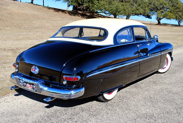
1951 Mercury Monterey - Mecum auction photo
The higher, longer, more squared-off rear fender adds bulk to Gregorie's graceful design.

1951 Mercury Monterey - Mecum auction photo
The rear looks awkward in comparison to the earlier models.  A one-word description of the appearance would be "pinched."  No wonder Mercury's sales rank dropped in 1951.

Thursday, January 22, 2015

Design Classic: Datsun 240Z

It was the sensation of late-1969.  The Nissan S30 model, known as the Datsun 240Z in the the USA, triggered an intense "I gotta have one" reaction for those of us in a sports car frame of mind.  Sadly for me, 240Zs were priced a bit higher than I felt I could afford, so I settled on a Porsche 914 in 1971.  But I really, really wanted a Z.

Background on it and related models can be linked here.  A June 1970 Car & Driver magazine road test can be found here.

240Z styling was taut, sleek, and targeted to the expectations of the sports car market.  It had a long hood, following the tradition of classic prewar sports cars as well as what was found on desirable postwar types such XK120 and E-Type Jaguars.  As a result, the driver's head was aft of center and the entire passenger compartment and trunk occupied only 60 percent of the car's length.  The roofline dropped off to the rear, terminating at a vertical Kammback.  In true postwar sports car fashion, the fenderline featured a kickup towards the rear, hinting at the existence of a rear fender.   Along the sides was a horizontal character line at doorhandle level.   Headlamps were semi-sunken into the front fenders, but laterally; this allowed for a fenderline ridge that blended into the hood ensemble.  The grille was small, horizontal bars angled away from the sun (lack of reflection reducing visual prominence) and set into a simple opening.

Gallery

Datsun 240Z advertisement - ca. 1970-71

Datsun 240Z publicity image - ca. 1970-71


1970 Datsun 240Z - Motostalgia auction photos

Seen from 45 years later, the 240Z seems rather small and narrow, but that might be because current sports cars such as Porsches and Ferarris are quite wide.  In its day, the Z seemed properly proportioned.  And oh, so desirable.

Monday, January 19, 2015

Ghia's 1950 Plymouth XX-500 Concept Car

Once the post- World War 2 sellers market was fading, American automobile manufacturers began looking for ways to attract the interest of potential buyers.  One tactic was the "dream car," a flashy custom-built machine to be displayed at car shows, designed with perhaps several purposes in mind.  One purpose was to enhance the image of a car brand as being forward-looking.  Another might be to accustom potential buyers to styling features planned for future production.  Also, features under consideration for production might be shown so that buyer response could be evaluated.  Finally, some dream cars were built simply to let young stylists blow off some creative steam.  Nowadays, all such are termed "concept cars."

Chrysler Corporation's first postwar concept was a Plymouth, at the time the corporation's low-priced division. The story goes that 1950 Plymouths were shipped off to Italy so that coachbuilding firms could build show cars from Chrysler styling staff designs. Pininfarina built its car as ordered, but it was never shown.  Ghia, on the other hand, requested that it ignore the Chrysler design and build a Plymouth to its own design.  Chrysler agreed, and the resulting Plymouth XX-500 was designed, constructed, shipped to the USA and displayed at automobile shows starting in 1951.

(Idle thought: the "XX" can be interpreted to mean "double-cross," referring to treason or making false promises.  Why did Chrysler people approve it as part of the car's name?)

Gallery

1950 Plymouth - sales photo
This is what Ghia had to start with.

Plymouth XX-500 - front 3/4 view

Plymouth XX-500 - rear 3/4 view

Plymouth XX-500 - side
Sorry, but this was the largest image of this photo that I could locate.

Thanks to its tall, boxy Plymouth heritage, Ghia did its best to make the XX-500 look sleek and Italian, but the result was nevertheless ponderous.  About the best that could be said is that it was an improvement over the design of production Plymouths.  Ghia was successful in that the high quality it delivered for around $10,000 1950 American dollars opened the door to building a number of Chrysler Corporation concept cars during the 1950s.

Thursday, January 15, 2015

Styling Crime: Citroën Ami 6

According to this Wikipedia entry, Citroën management decided to modernize its famed 2CV.  This decision was made in the late 1950s when the 2CV had been in production since 1948 and there might have been concerns that it was reaching the end of its marketplace road.  The "replacement" was the Ami 6 (see first link, above) that was in production from 1961 to late 1968 or early 1969.  The 2CV remained in production in France until 1989, however.

The Ami 6 was styled by Flaminio Bertoni, Citroën's long-time design leader who I wrote about here.  One wonders how the designer of the acclaimed Citroën DS, introduced in October 1955, could conclude his career with the truly ugly Ami 6.  Part of the reason probably had to do with the fact that he had to work with what amounted to a 2CV platform.  The 2CV had an odd, but logical design, and Bertoni had to come up with something that was different, yet at least somewhat in tune with 1960 styling expectations.

The strongest, most distinctive feature is the reverse-angle backlight (rear window).  I suspect Bertoni included this feature for two reasons: (1) to save costs by having a flat pane of glass rather than a shaped backlight, and (2) to simplify the interface between the backlight and trunk.  The sculpting on the Ami's sides was likely for reasons of strengthening the sheet metal.  An interesting detail is that the rear wheels are covered, as they were on the DS.  This makes tire changing harder, but maybe Bertoni thought that exposed wheels would have made the car seem shorter.

For me, the design of the front is hardest to justify.  Yes, production costs might have been reduced by resorting to the cap stamping that was selected.  But the droopy hood front cut line does not relate well to the headlamp assembly.  And its center drops too close to the grille opening, creating an odd pinched appearance.  Were I in charge of Citroën, I would have allocated a few more sous for a better front end design.

As it happened, Ami 6 sales were slow through 1962, but increased later.  Once again, this demonstrates that a car doesn't have to be beautiful to ensure market success -- in France, at any rate.

I normally would have cropped the images below to focus on the cars. But these publicity photos are so nice that I left them virtually untouched.  To view the cars better, click to enlarge.

Gallery


Monday, January 12, 2015

Setting a Strong Theme: 2002 Nissan Altima

Some automobile brands are noted for their visual continuity.  That continuity usually takes the form of a grille design theme and perhaps other ornamentation details.  A good example is Packard, which maintained its grille theme for most of its existence while buttressing it with red hexagonal hubcap medallions and a pen-nib spear along the sides of the hood or on front fenders.  And of course there is Rolls-Royce carrying its traditional grille theme for more than 100 years.  While such themes persisted, body shapes changed; 1914 and 2014 Rolls-Royce bodies are utterly different.

Persistence of body design is unusual, though there have been a few exceptions.  Porsche sports cars have looked similar since they first appeared, and the 911 design language has been closely followed for half a century.  Volvos featured boxy shapes for decades, but early and late boxy Volvos looked quite different from one another aside from that boxiness.

The present post features a case where body shape cues have been carried over through three design generations: the Nissan Altima.  As the Wikipedia link mentions, there have been five Altima generations starting with the 1993 model year.  The first and second generations were what are termed "compact" cars here in the USA.  Then for 2002 the Altima was redesigned as a "standard size" American car.  It proved to be a market success (even I bought one) and was restyled for the 2007 and 2013 model years while retaining the same basic theme elements.

Jerry Hirshberg can be credited with the 2002 Altima.  Even though he retired from leading Nissan's American design operation in 2000, he was later featured on Altima television advertising, demonstrating the design theme.  For more on Hirshberg, who now devotes his time to fine art painting, see here and here.  Ignored on those links is that Hirshberg had a successful career at General Motors before being recruited by Nissan.

Gallery

2015 Nissan Altima
Here is the current Altima.  Note the profile of the car, the shape of the side windows and the character line that rises across the doors and extends to the rear of the car.  These elements were carried over from the 2002 design.

2002 Nissan Altima
A 2002 Altima for comparison.

2002 Nissan Altima - side view
I include this photo because it clearly shows the original rising character line.  It contrasts with the  "greenhouse" top profile that forms a descending slope towards the car's rear.

2002 Nissan Altima - front
Simple, though there is complexity within the headlamp housings.

2005 Nissan Altima - side

2003 (ca.) Nissan Altima rear 3/4 view
Again simple, and again with complexity placed in the light housings.

I have no complaints regarding the 2002 Altima. Yes, others thought the interior fittings were a little on the cheap side (I didn't mind).  I did think that the car seemed a trifle narrow, though that didn't interfere with its use as family transportation and might have reduced frontal area a bit in the interest of aerodynamic efficiency.

And the 2015 Altima?  Too Rococo.

Thursday, January 8, 2015

Styling Crime: 1956 DeSoto Facelift

Not a big crime, mind you.  Petty, actually.  But nevertheless a crime so far as I am concerned because, as I posted here, I like the styling of the 1955 DeSoto very much, and the 1956 facelift significantly degraded it.  (For some DeSoto history, click here.)

Now for a confession.  My father bought a 1956 DeSoto Firedome four-door hardtop convertible.  But I don't hold it against him because 1956 was the year he wanted a new car, and you have to get what's offered.

Gallery


1955 DeSotos - auction photos from Barrett-Jackson
These images of the nicely styled 1955 model are here for comparison to the images of the 1956 facelift below.

DeSoto advertisement
This shows the relatively small tail fins Chrysler Corporation placed on its 1956 cars to help prepare the public for the larger, more striking fins on its redesigned 1957 line.  Still, tacking them onto the graceful rear fender line created some awkwardness that the cleverly done revised side trim couldn't completely disguise.

1956 DeSoto Fireflite - Barrett-Jackson auction photo
Besides the new tail fins, the major change was the elimination of the traditional vertical grille bars.

1956 DeSoto grille - Daniel Schmitt sales photo
A better view of the grille.  Parking lights were moved to the flimsy bumper guards in an effort to justify the continuation of the flowing line of the top of the grille opening.  The replacement of the vertical bars (or "teeth," if you will) by a mesh cheapened the ensemble considerably.

1956 DeSoto Adventurer - sales photo
From the rear, the side trim helps make for a dramatic effect in this photo.  But the white paint conceals the rear fender line and the awkwardness the fins introduced.  The tail light group also comes off as a bit cheap-looking.  The panel behind the lights is simply a textured, flat surface and what seem to be exhaust pipe outlets blow them are black-painted bumper indentations.

Monday, January 5, 2015

Opel's Corvette-Like GT

The German automobile maker Opel has been owned for many decades by General Motors.  One consequence has been that for a good number of those years, certain Opel models featured American-looking styling and not the sort of Teutonic feeling Mercedes and BMW usually provided.  Nowadays, car design has become considerably internationalized, with national characteristics becoming less and less easy to spot.

But back in 1968 when the original Opel GT sporty car was introduced, it looked very American.  Very much like the newly restyled 1968 Chevrolet Corvette, as a matter of fact.  National origin aside, the GT was an attractive little car with no major design flaws.  The two most questionable features were only marginally styling-related.  I deal with those below.

Gallery

Opel GT/J - c. 1972
The models posing in the background provide a sense of scale; the Opel GT was not very large.

1968 Chevrolet Corvette advertisement
The 1968 Opel GT and '68 Chevrolet Corvette featured similar front end styling, particularly the fenders, bumper and grille zone.

1968 Opel GT - headlamps lowered
The GT had retractable headlamps, a late 1960s and early 1970s fashion.

1968 Opel GT - headlamps raised
When the headlamps were turned on, their housings pivoted so that they were revealed.  The negative aspect was that airflow was disturbed, reducing aerodynamic efficiency.

Opel GT c. 1968 - front view
Note how the body sides tuck under, enhancing the lightness of the car's appearance.

Opel GT c. 1968 - showing some of rear end
The GT had no trunk lid.  Access was via the interior, a major inconvenience.

Thursday, January 1, 2015

Pontiac Parisienne: Retro Show Car in 1953

By the early 1950s, styling directors were exploring using jet-propelled fighter planes and science fiction spaceships as bases for new themes.  As I point out in my e-book "Automobile Styling: From Evolution to Fashion," the evolutionary trend to unitary, envelope bodies had culminated by the end of the 1940s and it was felt that a new trend needed to be discovered.  This is perhaps why concept cars (often called "dreams cars" in those days) from General Motors and Ford (but not Chrysler until the late 50s) were often styled in that jet fighter - spaceship mode.

There were exceptions, one of which was the Pontiac Parisienne (some background on it is here).  The Parisienne was created for the 1953 version of General Motors' Motorama, an elaborate automobile and entertainment show that usually debuted in New York City's Waldorf-Astoria hotel and then traveled to some other cities across the USA.

The Parisienne wasn't quite a concept car because it only had one feature planned for future GM cars -- a panoramic windshield.  Nor was it a dream car, because its most noticeable styling feature was retrograde, landau-form roof that lacked landau irons trim.  The rest of the car was a 1953 Pontiac with other, less noticeable features, the most predominant of which was the revised leading edge of the rear fender.

For the 1954 Motorama and some later Motoramas, Pontiac stylists designed futuristic -- not retro -- show cars.

Gallery


1953 Pontiacs
Pontiacs were given new bodies for 1953.  They looked like a blend of the previous 1949-52 lower bodies and greenhouses (the part above the lower edge of the windows) derived from the versions of GMs 1950-53 B and C bodies used on Oldsmobiles.

1953 Pontiac Parisienne - Motorama show car
The front end is basically stock '53 Pontiac aside from the "Frenched" headlight bezels.  Those four-pointed stars on the front fenders reappeared below the tailfins of 1954 Pontiacs.

1953 Pontiac Parisienne - front view

1953 Pontiac Parisienne - as seen from a high point of view.
The chauffeur awaits his passengers.  Unfortunately for them, climbing into the back seat will be awkward because there are no rear doors.