Monday, December 29, 2014

E-Type Jaguar: The Hood is Half the Story

William Lyons, the man who co-founded the company that became Jaguar and managed its growth from a maker of motorcycle side-cars to a major builder of near-luxury automobiles, was also responsible for styling its cars.  With one important exception.

The exception was the E-Type (or XKE, as it was often called in the USA). Its design was largely by Malcolm Sayer who formerly worked as an aerodynamicist at Bristol.  Sayer developed surfaces using both mathematical calculations (pre-computer!) and wind-tunnel testing.

The result was, in its day, astonishing.  The E-Type was a civilized sports car with decent interior trim and weather protection, quite unlike the existing notion that an important aspect of sports car ownership was voluntary ergonomic and environmental hardship.  Moreover, the E was theoretically capable of reaching a top speed of 150 miles per hour (around 240 kph).  There are few places where such a speed can be legally attained, and the 150 mark was set by a prototype that, shall we say, wasn't quite stock.  Regardless, an E was fully capable of going like hell.

Over time, the E-Type concept got watered down via adding more seating capacity, succumbing to governmental regulations and such.  New competitors (think Porsche 911) began to dominate the E's market bracket while the Jaguar's lack of reliability due to use of inferior parts from suppliers (Lyons loved cheap bits) dampened sales.  For this post, I focus on the earliest E-Types: the sensational ones.

Gallery

Jaguar E-Type at its first public showing, Geneva - 1961
Sir William Lyons, Jaguar Managing Director and co-founder is standing by the car.

E-Type on display at 1961 the Geneva show
Lyons is standing second from right.  To his right is Mercedes' Rudolf Uhlenhaut.

On display at the 1961 New York auto show is Marilyn Hanold.  A Jaguar, too.

Advertising photo showing side view of coupe
The hood is almost half the length of the car.

Advertising photo showing side view of roadster
One reason the E-Type's hood is so long is that the windshield is upright compared to those of present-day cars.   A windshield following today's design practices would have its forward edge at about the trailing edge of the hood louvres.  That would reduce the hood to about 37 percent of body length (sans bumpers) from 43 percent as shown.

Front 3/4 view of 1962 roadster - Barrett-Jackson auction photo
I always thought the hood was too long, given the somewhat narrow width of the car.  From the cowl forward, the E-Type reminded me somewhat of a baguette or submarine sandwich.

Rear 3/4 view of 1962 coupe - Barrett-Jackson auction photo
The rear is nice and trim.  It features a hatch hinged at the left rather than a trunk lid.

Thursday, December 25, 2014

Honda CR-V's Awkward Window Designs

The Honda CR-V crossover SUV is in its forth design generation according to this Wikipedia entry.  The first two versions had a conventional, boxy appearance along with an archaic-seeming exterior spare tire attachment at the rear, something also present on the competing Toyota RAV4 at the time.

CR-V's third iteration was introduced for the 2007 model year.  The exterior spare tire feature was eliminated as part of an effort to make the vehicle more trendy.  Stylists then decided to get "creative" and introduced an odd-looking side-window profile.  Typically, SUV designs either have the rear side window shape conforming to some degree with the profile of the vehicle's top or else use a "dog-leg" arrangement such as is currently found on the popular RAV4 and Ford Escape SUVs that I discussed here.

Instead, Honda's styling crew came up with a side-window profile that would have been appropriate for a 1949 fastback car -- except that the top of the CR-V was decidedly not fastback, leaving a curious area of blank sheet metal between the upper edge of the windows and the top of the vehicle.

Then, perhaps in reaction to criticism from potential buyers or maybe some postpartum introspection by the stylists, the fourth-generation CR-V received a different window treatment.  It too was odd.  The rear side-windows converged to a point, again leaving awkward areas of sheet metal.  However, this was mitigated somewhat thanks to echoing the point on the shape of the taillights, as can be seen below.

I'm hoping the Honda stylists will come to their senses and find a more attractive side-window profile when the fifth-generation CR-V comes along.

Gallery


Front three-quarter views, the 2007 CR-V above, the 2012 model below.


Rear three-quarter views, same sequence.

Monday, December 22, 2014

Dodge's Odd Early 1950s Grille Theme

During the late 1940s and through the mid-1950s, the fashion for automobile grilles in America was for large chromium plated bars and other shapes -- this opposed to eggcrate or mesh grilles that have been common since then.  Dodge, Chrysler Corporation's lower-mid priced line (slotted between entry-level Plymouth and DeSoto) was no exception.

What interests me about Dodge grilles is that for three model years, 1951-53, a rather odd-looking theme was offered to the buying public.

Gallery

1950 Dodge
This is the previous grille design.  The entire Chrysler line was restyled for the 1949 model year.  The cars were boxy-looking and tall, unlike what most competing brands were offering.  Grilles on '49 Dodges were a combination of eggcrate and a heavy horizonal bars at the top and center.  For 1950, the eggcrate feature was dropped and a two-bar theme was put in place -- fairly conventional for its time.

1951 Dodge
All Chrysler brands were facelifted for 1951.  The main changes were curved hood fronts and restyled grilles.  The Dodge retains the loop-around-the-parking-lights theme from '50, but drops it down to bumper level.  At the top is something like a large air scoop (a fake hood-mounted version was used extensively on the 1952 Ford Motor Company line) with vertical bars that lean forward.  That lean meant that the chrome bars and surround would not reflect much light, creating a comparatively dark zone above the upper grille bar.  It was both visually and actually sunken, an oddity at a time when most American cars had grilles that boldly thrusted outwards.  Apparently the new grille theme didn't hurt sales, as Dodge moved from the eighth-ranked brand for 1950 to sixth for 1951.

1952 Dodge
The grille was essentially unchanged for 1951, the main difference being a body-color panel above the bumper.

1953 Dodge
The Chrysler line was restyled for 1953, Plymouth and Dodge sharing a basic body that was even shorter than the previous one while competitors featured longer cars.  One result was that Dodge dropped back to eighth place in sales rank.  The grille theme was carried over, albeit with some feature-swapping.  Again the parking lights are wrapped by grille bars, but now these are two floating horizontal bars, as we saw for 1950.  The forward-leaning vertical bars have been moved from the upper part of the opening down between those horizontal bars and the upper part is now open space.

1954 Dodge
Virgil Exner became head of Chrysler styling in 1953, and so might have had some say in facelifts for the entire 1954 Chrysler line that was now having serious sales trouble.  The 1951-53 Dodge grille theme was abandoned, being replaced a more conventional early-1950s theme comprised of heavy chromed shapes.  The center blob is a vague foretaste of the split-grille theme on the boldly restyled 1955 Dodges.

Thursday, December 18, 2014

Here's Looking at You, Babe

The title of this post is an informal drinking toast that dates back to the 1930s and perhaps even before.  I'm using it here because the combination of headlamps and the grille on a car often gives the impression of a face, the headlamps being the eyes.

In the early 1990s two cars appeared whose headlamps struck me and others as being especially eye-like.  So, just for fun, here they are.

First up is the Renault Twingo, introduced for the 1993 model year (Wikipedia entry here).


The Twingo was quite small and largely nondescript.  So the "face" that Patrick Le Le QuĂ©ment's styling team devised for the Twingo was perhaps the key to its success because it was distinctive and capable of evoking an emotional response from potential buyers.  Renault's advertising agencies picked up on the car's quirky personality, as can be seen in the two lower photos.

Then there was the Neon from Chrysler, launched for 1994 as a Plymouth and a Dodge (the cars were almost identical).  Neons were badged as Chryslers where sold elsewhere. The Neon's Wikipedia entry is here.


The upper photo is from Car and Driver Magazine, the lower from Automobile Magazine.  It seems that Chrysler bean counters objected to the headlight treatment because the Neon was be to as inexpensive to build as possible, and the proposed design was more costly than alternatives.  But for once, the financial staff was overruled and the distinctive headlights were on the production cars, contributing to their early sales success by giving Neons "personality."

Monday, December 15, 2014

1954 Cadillac: One of the Better-Looking Ones

Cadillac has been General Motors' luxury brand ever since it was absorbed into the corporation. Quality of Cadillac designs has varied over the years since the late 1920s when GM established its Art and Colour section under Harley Earl. My favorite post-classic era Cadillac styling is that for 1941.  Another good year, in my opinion, was 1954 -- the subject of this post.

Gallery

1953 Cadillac - used car sales photo
This is to put the 1954 models into the context of their time.  The '53 design originated for the 1950 model year and featured heavy, large-radius curves and a high, long hood -- features that General Motors' styling boss Harley Earl is said to have preferred.


Harley Earl featured in 1954 Cadillac brochure
The 1954 redesign of GM's B (for smaller Oldsmobiles and Buicks) and C bodies (Cadillacs and large Olds and Buick models) came as a surprise to many.  With their wraparound windshields, the cars looked futuristic, and the leaner bodies with lower hoods enhanced this perception.  Click on images to enlarge.

1954 Cadillac - Barrett-Jackson auction photo
GM stylists were careful to carry over Cadillac symbol details from year to year, even when a totally new body was used, as in 1954.  (Not all were passed along, however.  A few might be dropped, and a few new symbols might be added.  The result for the typical Cadillac customer was one of perceived continuity.)  Carry-overs from 1953 model shown above included the cannon shell shaped front bumper guards, the eggcrate grille (originated in the late 1930s), the small tail fins that incorporated the taillights (inrtroduced for the 1948 model year), and the side chrome trim that included a vertical fake air intake.  The result was a pleasing design for its time, a design that was degraded in the years to come.

1954 Cadillac - front view - auction or sales photo

1955 Cadillac - side view
One change made for the 1956 facelift was trimming the vertical faux air intake.  The front chrome strip was extended to so that it curved into the vertical theme.  Another horizontal chromed strip was added to the rear fender.  It was at the same level as the forward strip to provide visual continuity, a wise decision.  To me, the chopped-down fake intake always sounded a false styling note; somehow, it didn't seem right.

1953 Cadillac Le Mans concept car
I think a better solution would have been to borrow the side theme from the 1953 Cadillac Le Mans concept car, a show car intended to preview 1954 Cadillac styling (note the similarity of the front ends).  Here the scoop (which looks like it was real, but didn't have to be so on production cars) is set back from the fender kick-up and doesn't extend to the full fender height.  A vertical faux scoop perhaps a bit shorter than this one and approximately centered vertically would have done nicely on a '56 facelift.  A slightly shorter horizontal rear fender chrome strip might have been retained -- or not.

Thursday, December 11, 2014

What Were They Thinking?: Buick's Somewhat Sporty Reatta

It was made with Buick parts and derived from the E-body platform of the Buick Riviera.  But Buick didn't assemble the 1988-91 Reatta two-seat car; that was contracted out to the Lansing Craft Centre.  This and more background regarding the Reatta can be found here.

I include the Reatta in the What Were They Thinking set of posts not because the styling was defective, but because it was a marketing mistake.  The Reatta dates to the 1981-1990 Roger Smith era at General Motors.  Smith saw his mission as stirring up the corporation through reorganizations, purchases of other companies, and the increased use of high technology.  Nothing wrong with those ideas in theory, but not all theories are correct.  Also, many observers thought that Smith made many mistakes trying to implement his changes.

As the link to Smith indicates, GM was staring to lose money at the start of his tenure as Chairman and CEO.  And it was not in good shape when he left.  I was a data vendor to GM (demographic/household/income forecasts) during the latter part of his era, and more than once the money owed me would arrive towards the very end of the 90 day payment obligation period.  So if the GM was not doing well financially, then why was money being spent developing and marketing an obviously low-volume two-passenger car?

The Reatta link above mentions that the sales expectation was 20,000 cars per year.  As it turned out, not many more than 20,000 Reattas were sold over the entire four-year production run.  Among the problems was that while the Reatta looked sporty, it wasn't a sports car; that ruled out potential sales to sports car fans.  While it was properly a luxury "personal" car, the fact that it only had two seats meant that its appeal would be limited.  For instance, Ford's original Thunderbird was a two-seat sporty (but not sports) car, and its sales were disappointing until it was redesigned to carry four people.  Buick marketers and planners surely were aware of this, but forged ahead anyway.

As for styling, the Reatta was developed near the end of Irv Rybicki's time as head of GM styling and perhaps some work was done after Chuck Jordan succeeded Rybicki.  This was a time when GM stylists tended to prefer simple, clean designs.  Often this preference resulted in cars that looked bland, were lacking in character.  So it was with the Reatta.  It was professionally styled, having no obvious defects.  But it wasn't memorable and failed to seduce potential buyers by its appearance.

Gallery

1988 Buick Reatta advertising

1991 Buick Reatta - front 3/4 view

Buick Reatta - side view

Buick Reatta - rear 3/4 view

1990 Buick Reatta convertible
For some reason good money followed what was clearly a bad investment.  A convertible line was added for 1990-91, but fewer than 2,500 were produced.

Monday, December 8, 2014

Nash Airflyte: 1940 Car of the Future Made Real in 1949

Around 1940, Americans would often find images of Cars of the Future in advertisements and on covers of magazines such as Popular Mechanics and Popular Science.  Some included radical features such as transparent tops and rear-mounted motors.  But most had something in common: a streamlined, teardrop-inspired shape punctuated by a windshield and a front hood (or trunk, if the engine was at the rear).

Automobile makers were thinking along similar lines, but with attention being paid to what could actually be mass-produced using current technology.  Then along came World War 2 with the attack on Pearl Harbor.  Car production was halted by government order and most stylists either entered the military or were diverted to wartime projects.  Some styling activities continued during the war and the notion of aerodynamic, teardrop-inspired cars slowly faded away as other design ideas came to the fore.

But not at Nash.  Corporate president George Mason and engineering head Nils Erik Wahlberg were strongly in favor of aerodynamic design.  During the war, a design proposal by ex-Hudson and future-Studebaker stylists Bob Koto and Ted Pietsch was handed over to Nash, and it might have been the inspiration for the 1949 Airflyte design.

The Nash Airflyte featured large-radius rounded surfaces, covered wheels, a one-piece curved windshield (a postwar American first, if one excludes kinked one-piece windshields on some Studebakers and the 1934 Chrysler Airflow Imperial's windshield).  The covered wheels required a narrow track for the front wheels so that they could steer the car, which resulted in a large turning radius because the steering angle was constrained by the car body.

Nash Airflytes were not attractive.  They appeared bulky, heavy and awkward.  However, sales for the 1949 and 1950 model years were very good.  Sales might have been even better if stylists had been able to make the cars look not so ponderous.  Less rounding of the top, hood and upper part of the fenders might have helped.  So would have exposing the front wheels, though that would have contradicted Mason's aerodynamic agenda; Nashes retained covered or semi-covered front wheels through 1956, the next-to-last model year for the marque.

Here is a history of Nash Motors, and an account of the development history of the Nash Airflyte is here.

The images below should be for the 1949 Nash, but the 1950 models were almost identical (the tip-off is a larger rear window), so it's possible that a '50 image or two might have slipped in.

Gallery

1949 Nash advertising
During the late 1940s and early 1950s many American car makers used distorted views in advertising illustrations.  This image has the Airflyte depicted noticeably narrower, lower, longer and more streamlined than it actually was.

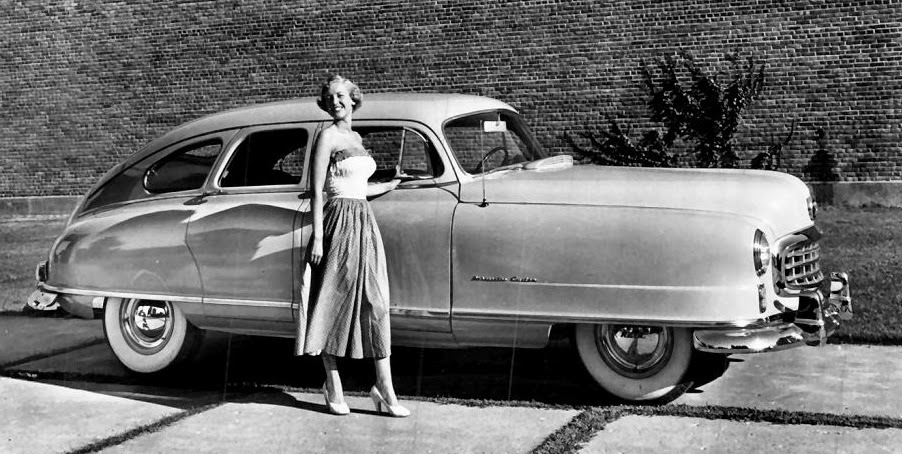
1949 Nash Ambassador partly camouflaged by model
The sides of Nash Airflytes were large areas of unadorned sheet metal.  By posing a tall model against the car, it was hoped that this styling defect could be deflected.  More than one Nash publicity photo used this tactic.  Attractive cars from other companies would have models posing behind the vehicle so as not to distract.

1949 Nash two-door version
The lack of a rear door post made the two-door Airflytes even more bland than the four-door versions.  But the wider door seen here gave the car a slightly more streamlined appearance.

Looking down at a 1949 Nash
In its day, many non-owners of Airflytes joked that the car looked like an "upside-down bath tub."  The reasoning behind that observation is made pretty clear in this image.

Rear view of 1949 Nash following a Nevada Atomic Bomb test
There are plenty of photos showing rear views of Nash Airflytes on the Internet, but I prefer to use public domain or publicity images where possible.  Hence this government photo following a test where cars were scattered around Ground Zero for blast effect assessment.

Thursday, December 4, 2014

Styling Crime?: 1953-55 MG TF

Most post- World War 2 MG T-series sports cars were exported to the United States.  The TC series (1945-49) and TD series of 1950-53 were especially beloved.  That affection led to difficulties while MG was readying the completely restyled MGA for production (I wrote about it here).  The primary problem was the interim, facelifted 1953-55 MG TF and the nature of its facelift, the subject of this post.

For background information on the various T-series MGs, click here.

Was the facelift a Styling Crime?  It seemed so for TC and TD true believers, as best I recall.

Me?  Well, I rather liked the TF's looks.  While the classical, upright stance of previous T-series roadsters had been eliminated, the new hood (bonnet), grille and headlamp schemes (those where the most visible changes) created a more aggressive appearance while remaining in the classic 1930s British sporting car mode.

Gallery

1951 MG TD - Shannons auction photo
The TD was a slightly filled-out version of the rather spindly TC (see link, above).  Come to think of it, the TD came in for some criticism thanks to those changes.  Note the horizontal hood line, the nearly-vertical grille and freestanding headlamps.


1954 MG TD - Barrett-Jackson auction photos
Here we see the hood line sloping downwards a little, the grille leaning backwards and the headlamps partly sunk into the slightly modified fenders (wings).

Was the MG TF really a Styling Crime?  Only for ultra-traditionalist TC and TD fans, say I.

Monday, December 1, 2014

Chrysler Pacifica, Neither This Nor That

The Chrysler Pacifica was marketed during the 2004-2008 model years.  Background information is here.

The concept behind the Pacifica seems to have been a vehicle blending characteristics of a station wagon ("break" in England and other places) and a crossover sport-utility (SUV).  The emphasis was closer to the station wagon than the SUV.  In other words, the Pacifica was a wide station wagon with slightly higher roofline than a conventional sedan or wagon.  A crossover SUV is also essentially a station wagon, but it has a tall cabin and usually sits higher off the ground than a Pacifica.

When they first appeared, Pacificas were surprising due to their comparative bulk.  They weren't ugly, so their disappointing sales level was due to other factors including unreliability (see the above link for more on this).  To me, its defects included its size -- large for a car, but with little more carrying capacity than a station wagon.  Besides, station wagons were becoming a rare species in the American market thanks to the advent of the SUV and its tamer crossover variation.  If a buyer's need is carrying a lot of bulky stuff, then a SUV makes more sense than any kind of station wagon.

It is interesting that Toyota introduced its Venza, a Pacifica-like vehicle, right after the Pacifica's demise.

Gallery

2004 Chrysler Pacifica front 3/4 view
The background looks a lot like California's Malibu.

2004 Chrysler Pacifica side view

2004 Chrysler Pacifica rear 3/4 view
This offers a sense of the vehicle's bulk.

2009 Toyota Venza
The Venza is Toyota's version of the Pacifica.

2008 Ford Edge
The Edge is less sedan-like than the Pacifica and Venza, though it was based on the Mazda 6 platform.  What it shares with the others is a chubby body.  Unlike the Pacifica, it was successful in the marketplace.

Thursday, November 27, 2014

Cheap, Obsolete Ford Anglias and Populars

For nearly 15 years after the end of World War 2, Ford's English branch continued building a pre-war design featuring shrunken (for the car was indeed small) mid-1930s styling elements.  These cars were exported to other parts of Europe and even to the United States.  Another production source was Australia.  But these English Fords held a coveted market niche: they were amongst the cheapest cars on the planet.

I am mostly referring to the Ford Anglia, but the design was continued 1953-59 as the Ford Popular. A four-door variant produced 1939-1953 was the Ford Prefect.  The Anglia and Prefect brands were continued into the 1960 following a complete redesign not covered in this post.

Not having grown up in England, and given the similarity of the cars shown below, I'm hoping that I'm correctly presenting the model years and model names for the images below.

Gallery

Ford 7Y - ca. 1938
The Anglia name appeared on this car in the Fall of 1939, but the redesign of the Y line was produced starting with 1938 models.

Ford Anglia - 1940 advertisement
It seems Ford was still making cars in England in the year after World War 2 started.  Note the changed grille -- retro compared to the more aerodynamic looking 7Y grille, above.

Ford Anglia - 1948 - American advertisement
The three-element grille was used for only one model year, according to one source.  Click to enlarge a little.

Ford Anglia - 1949-53 E-494A
The Anglia front has reverted to pre-1940 7Y form.

Ford Anglia & Prefect - 1952 advertisement
Ford featured both brands in a number of advertisements and brochures around this time.  The Prefect was more expensive and featured four doors instead of two and had a different grille, fenders (wings) and trunk (boot).  But otherwise the cars were essentially the same.  Click to enlarge.

Ford Popular - ca. 1953
Compare to the 7Y photo at the top.  This design was continued through the 1959 model year even though it was thoroughly out of date.

There really isn't much to say about Anglia styling.  The "package" was small and Ford stylists shrunk circa-1936 American large-car styling features onto it.  Moreover, because it was an entry-level automobile, it was designed to be manufactured for the lowest possible cost.  Perhaps that is the reason for those odd little headlamps perched on the fenders; with a larger budget, they might have been better integrated with the rest of the styling.