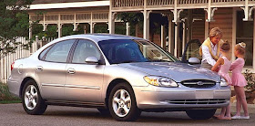
This post deals with the styling of what I consider the second-generation Taurus that, as it happened, was not as well received in the marketplace as the initial design. Jack Telnack was in charge of Ford styling when the second-generation car was developed.
The redesigned Taurus was given a soft overall shape that was softened further by use of rounded details inside and out. One practical defect was that the Taurus' trunk was smaller than many potential buyers probably wanted. Let's take a closer look.
This is a 2001 Taurus, a slightly facelifted version of the 1996 car. The rounded side windows are the same as in the earlier version. The front has minor changes, but retains the character of the initial design. The trunk seems a little taller.
An image of the 1996-vintage Taurus I grabbed off the Internet because it shows the car from the side. The small trunk height is apparent. Note how the shoulder character sculpting is soft like the general body shape. Something more crisp could have provided some contrast to good effect.
A rear view of a car of the same vintage showing the low trunk and a strongly rounded backlight (rear window). Plus more rounding in the tail light assembly. The only really straight line on the exterior is the rub strip along the doors.
This photo shows the 1996-vintage Taurus to its best advantage. I was always fond of the shaping of the hood and front end.
I think the reason for my fondness for the Taurus front end was because it reminded me of the hood shaping of the classic 1953 Studebaker coupe, shown here. This is a puzzling Internet-grab image, because I'm not sure when the photo was taken, though it probably dates to 1953. The car is in as-new condition. The girl's swim suit is early 1950s style, and the same might be said for the house. And the background countryside reminds me of the South Bend area near the Studebaker proving grounds. Nevertheless, for some reason I can't quite rule out the possibility that it is a carefully staged comparatively recent photo; perhaps it has to do with how sharp the image of the car is. Assuming this is a publicity photo, it's interesting that the girl is blocking the view of part of the car. I think this was done to emphasize how low the car is, because the Studebaker coupe was very low compared to other 1953 American cars. The girl is clearly taller than the car, and placing her a short distance in front of the roof makes the car seem even lower than it actually is.
The reason I include this image is that it shows the Studebaker from a similar, if flipped, point of view as the red Taurus above it. The Studebaker has 50s features such as sealed beam headlamps with frenched bevels and high front fenders. But if you mentally strip those details away, the result is something like the Taurus' sculpting.
Here is a Champion Starliner in the Studebaker Museum in South Bend, Indiana. I include this picture because lighting and camera angles combine to dampen the effect of the comparatively sharp fold at the front of the hood. Again, potential kinship with the Taurus can be apparent, given a little imagination. I have no idea if Telnack or one of his stylists was inspired by the Studebaker, but I do wonder.


No comments:
Post a Comment