An interesting example is the Encore, a small crossover SUV introduced by Buick a few years ago. Back in its glory years, General Motors positioned Buick right below Cadillac in its brand hierarchy, with Oldsmobile, Pontiac and Chevrolet trailing off towards the low price end. Brand identity was reinforced by styling details such as grilles with vertical bars, "portholes" on the front fenders, the Sweepspear side accent, along with lesser elements.
Times changed, and General Motors sank into a bankruptcy that forced the elimination of the Saturn and Pontiac brands (Oldsmobile was killed a few years before). Remaining brands are Chevrolet, Buick and Cadillac, along with exclusively truck-and-SUV GMC.
Embarrassed in the early 1980s by car models based on the same platform that looked very similar across most of its brands, GM moved to restore the visual distinctiveness its brands had during the 1940s and 50s. This effort was strongly in place by the time of the 2009 bankruptcy and has continued since then. Buick, being placed above Chevrolet in the GM hierarchy, seems to be seeking to retain its near-luxury image, even amongst its models that fall into the mid-price slot. Its strategy has been to revive early-1950s styling cues in modified form and retain them from model year to model year.
So when the small Encore model was introduced, many of those styling details were crammed onto its small form. Shall we take a look?
1952 Buck Super
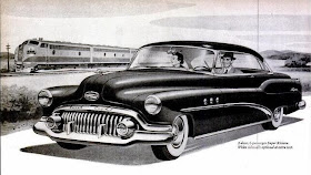
To set the stage, this Buick advertising illustration shows the styling cues from the brand's heyday. Note the vertical grille bars, the non-functional portholes, the Sweepspear, the crest on the front of the hood, and the character line sculpting on the hood. These details made it perfectly clear that the car was indeed a Buick; no real need for the word "Buick" on the upper grille bar.
2013 Buck LaCrosse
The LaCrosse is Buick's current top-of-the-line sedan. The grille has vertical bars and a stylized crest. Air vents are atop the fenders, a gesture to the old porthole theme. A character line on the sides echoes the Sweepspear.
2013 Buck Verano
Veranos are smaller than LaCrosses, but retain the grille and vent details. Missing is the Sweepspear, though I suppose the up-sweep character line along the bottom of the doors might be interpreted as an upside-down spear.
2013 Buck Encore
The quite small Encore takes the Verano's brand identification details pretty much as given, even the side-sculpting theme. The result is a too-busy look. But I think that has more to do with the somewhat confused appearance from the rear door hinges on back than the retention of Buick styling cues. I would tidy up the clutter below the front impact panel, enlarge the rear door windows and eliminate or tone down the lower side character indentation for starters.


No comments:
Post a Comment