He and his firm did considerable automobile styling work. Early in his career he provided designs for Hupmobile. But he is best known for Studebaker designs created by professional car stylists he employed. As was his right for marketing and other business purposes, Loewy was credited as the designer. The same can be said for General Motors' Harley Earl who seldom lifted a pencil yet set GM's design themes for three decades.
Below are images of cars Loewy had created for himself. Presumably these reflected his personal taste or otherwise dealt with some design ideas he wished to investigate.
1941 Lincoln Continental
One of his best known custom cars. The removable roof section above the front seat makes the car a coupe de ville, unlike stock Continental coupes.
I consider this the best of Loewy's personal designs.
1941 Cadillac 62 Convertibe
Loewy purchased this car in 1943; this is the only photo of it I could find on the Internet. The fenderline is based on that found on some 1942 Buick models.
1954 Jaguar XK140
Unlike the previous two examples, this design incorporates no styling features of the host brand.
This view shows details in the spirit that Chrysler's Virgil Exner used on concept cars a few years later.
1957 BMW 507
Again, totally unlike the host design, a classic by Albrecht von Goertz.
Its general feeling is suggestive of Loewy's classic 1962 Studebaker Avanti in this photo from an unknown source.
1959 Cadillac - Barrett-Jackson photos
The passenger compartment is stock '59 Caddy, the rest is Loewy. The front is rather ugly, though a design purist might praise it for being simple and functional.
Rear styling is more successful. Loewy eliminated the large, bizarre tailfins. The side light assembly on the rear fender is a questionable touch.
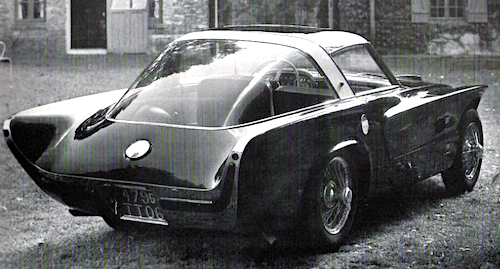
1960 Lancia Flaminia
Loewy and his wife pose by his customized Lancia. He retained the large grille opening, but reshaped its profile.
Many Flaminia coupés had custom bodies, so Loewy's effort needs evaluation on its own terms. My take is that the front is needlessly fussy. The aerodynamic spoiler on the roof does relate to the C-pillar but spoils the roofline's visual flow.
Again, the rear styling is better than the front's. That said, I find the backlight window too large and the C-pillar too thin. This and the previous image are from unknown sources.
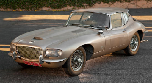
1966 Jaguar XKE
Bonhams photos of a car in need of restoration. Many consider XKE design a classic, though I don't like its proportions. Loewy gave it a new front end that's not as good as the original.
The rear got a revised C-pillar / window profile along with minor changes to the tail lights and other minor items.


The 1959 Cadillac appears to be sporting Studebaker wheel covers, but I guess he can lay claim to them. A couple of these have some kind of feature on the hood straight in front of the driver like on the Avanti, if a different shape. I always thought that was cool on the Avanti although it wasn't even a fake air intake or for clearance of anything. And there are hints of Avanti in several of them in various other ways too.
ReplyDeleteWhat's wrong with the proportions of the XKE is too much hood. A more raked windshield would fix that. The angle is verticalish even for 1960.