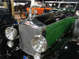
Those designs varied in quality. Some became iconic. Others were nondescript and changed periodically by the marque's designers. A few designs were rather odd or even ugly. This post presents three examples of the latter kind.
All the photos below were taken by me at the Nethercutt museum in June. Click on them to enlarge.
1932 Rolls-Royce Phantom II Croydon Victoria
Perhaps the most iconic radiator grille design is that of Rolls-Royce.
1932 Packard Twin-Six Convertible Roadster
Also iconic is Packard's theme.
1931 Daimler Double Six 50 Royal Limousine
Rolls-Royce's main English rival was Daimler. Its radiator grille design was distinctive, but never really attractive. The link here mentions that the shapes at the top were derived from tubing on early radiators, though a quick search did not turn up an example of this. To me, Daimler grilles always seemed odd, awkward. Not in the same league as the Rolls grille. Nevertheless, Daimlers were often favored by the Royal Family.
1928 Diana Light Straight Eight Sedan Deluxe
Diana was a minor, "assembled" American car. Its radiator grille design is soft and lumpy. It might have been inspired by the design used on a Belgian luxury car.
1928 Minerva AM Convertible Town Cabriolet
That Belgian luxury marque was the Minerva, shown here. Its radiator grille design is soft, not as strongly shaped as Rolls and Packard grilles. To me the result is a weak looking front end, not an optimal design/marketing solution.


Much later Daimlers that were slightly retrimmed Jaguar sedans continued that kind of grille shell with the ribs.
ReplyDeleteThe Diana was targeted towards women drivers, so maybe Moon (Diana's parent company) thought that a softer, rounded grille would be more appropriate than an angular, sharper grille?
ReplyDelete