By the late 1940s the technology had improved, but car tops remained comparatively rounded because of a perceived marketing need to accommodate passengers wearing hats. Continued use of flat panes of glass for side windows meant that doors had to have fairly straight profiles above the car's belt line. This also might have influenced the need for curved tops because a smooth transition between the surfaces was probably considered desirable.
But automobile design is largely fashion-driven, and too long a stretch of one style usually brings on a reaction. So it was for the 1957 model year in America. That year General Motors introduced new bodies for Buick, Oldsmobile and Cadillac, and these featured tops that were even more rounded than those of the previous bodies introduced for 1954. Ford featured a roof that was slightly flatter on top than those of its 1955 facelift. But it was Chrysler Corporation's 1957 redesign that had noticeably thinner, flatter roofs along with other interesting styling features. Thin, flat roofs became popular and were the dominant theme for that part of a car until the 1980s when wind tunnel based aerodynamics began to seriously influence the shape of automobiles.
Oldsmobile brochure spread - 1957
The 1957 Oldsmobile re-design actually wasn't bad, given that American styling was into one of its baroque periods, one where comparatively complicated metal shaping and dramatic two-color paint schemes were very popular with buyers. The problem for Oldsmobile and Buick was that their 1957 designs struck few potential customers are being an advance over 1954-56 styling. Worse, the rounded tops made the cars seem heavy -- doubtless an effect intended by GM styling head Harley Earl. Worst of all for General Motors was the appearance of the 1957 Chrysler re-design which instantly made GM cars seem out of date and created panic in the corporation's styling department.
Plymouth advertisement introducing the 1957 line
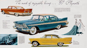
"Suddenly, it's 1960" was a powerful advertising theme, not so much because it suggested that 1957 Plymouths were years ahead of the competition, but mostly because Plymouth's styling validated the claim. The thin, flat roof gave the design a light, airy look -- something missing in the Oldsmobiles shown above. Plus, the cars were lower than previous models, and this was emphasized in advertising images where the cars were often posed with people behind them to lend scale and further validation of the futuristic appearance.
Although Plymouths had tail fins, for many years now consider a styling joke, they actually enhanced the appearance of Plymouth hardtop convertibles such as the one seen in the ad. That's because the position and shape of the fin's curve visually nests the "greenhouse" area, making the car seem even more low than it is.
Plymouth brochure spread - 1957
The Plymouths shown here are practical sedans rather than sporty hardtops. The images are artist renderings that were often subject to distortion, though these seem essentially correct. My sense is that the roofs of sedans might have been a bit more rounded that those for hardtops. The door pillars and window framing also add some visual bulk. Even so, those Plymouths look more lithe than the 1957 Oldsmobiles.


No comments:
Post a Comment