Thursday, September 29, 2016

Felice Boano's Classic Lancia Aurelia B20

I am far from alone thinking that Italian automobile design was at its zenith during the late 1940s and most of the 1950s.  One fine example is the Lancia Aurelia type B20 coupé built 1951-1958.  (Italian Wikipedia entry here -- you might need to have your computer translate.)

Styling was by Felice Mario Boano (1903-1989) whose career is dealt with on this Italian Wikipedia page.  As best I can tell, he was associated with Ghia at the time the B20 was designed, but since series production was planned, Ghia personnel were not involved beyond the prototype stage.  Before long, production was handed over to the Pininfarina firm.  Some minor modifications were presumably made later by Farina and not Boano.

Gallery

This is Boano's 1951 prototype B20.  A nice, trim Italian design that nicely blends the traditional vertical Lancia grille with the modern, "envelope" body.

The later 1951 Pininfarina pre-production prototype looks the same from this front three-quarter angle aside from the Farina badge on the front fender.  Some tail light details were changed from the Boano version.

Side view of a 1953 B20 berlinetta GT 2500.  The side window profile is yet another demonstration that BMW's famous shape was far, far from original.

Front view of a 1953 B20 berlinetta GT 2500.  The turn indicators are too close to the auxiliary air intakes that, in turn, should not have been so rectangular.  The edges of the openings nearest the grille should have been angled to match the grille's curves nearby.  The turn lights could then have been made square and placed at the outer edges of the intakes to form a unified composition.

Rear three-quarter view of what looks like a 1953 vintage B20.  What we see is basically a fastback design.  However, it ever-so-slightly flows in the manner of 1941-1948 Chrysler Corporation cars.  Very subtle: a unitary-curve fastback would have made the car look heavier if the trunk height at the rear was the same as shown.

Monday, September 26, 2016

Lexus NX = Toyota RAV4 Huge Facelift

Toyota's Lexus Brand has done well for many years with its RX series crossover SUV.  But management felt there was room in the brand's lineup for a smaller, less-expensive crossover.  Voila!! the 2015 Lexis NX crossover (more information here).

In order to create this new model economically, Lexus went to Toyota's RAV4 to form the basis for the NX body.  The result is a SUV with the same wheelbase as the RAV, but slightly longer, wider and higher.  Also, as many of Lexus' new styling theme details as possible were crammed onto the RAV's basic structure.

Gallery

Two NXs are shown here sporting the spiky, angular look Lexus deems necessary for brand identification.  I find it an overly-contrived visual mess of superficial detailing.

This is a 2013 Toyota RAV4 posed almost the same as the NX in the previous image.  The windshield and cut lines for the hood, front strike panel and front door are the same or very nearly so for both cars.

Here we see various creases and cut-lines converging on the tail light assembly.  This is a sensible way to tie design elements together, but I think there are too many of those elements.  The side treatment of the tail light assembly is well into cliché territory, looking very similar to that of the current Nissan Maxima, for instance.  Sculpting on the trunk panel repeats the double-L (for Lexus) theme of the grille, an especially awkward bit of styling.

The additional length and height of the NX, as compared to the RAV, can be seen in these rear views.  The RAV has less overhang and its roofline is more curved.  The NX has a higher belt line, resulting in smaller side windows.  Rear doors and the gas filler doors are in the same positions in both cars, though cut lines differ.

This NX side view features the sheet metal folds and planes that catch and emphasize light originating above the car.  Because there are so many of these light-catching details, the overall impression is busyness.

The RAV4 looks dull by comparison, and could have used a higher belt line anchor at the front and perhaps a horizontal character line about two-thirds up the doors.  Otherwise, it's a superior design to the frantic NX.

Thursday, September 22, 2016

Pinin Farina's Lancia Florida 4-Door Hardtop

For better or worse (for sentimental reasons, I'll side with "worse"), automobile styling is now pretty much internationalized.  That is, nowadays design students can cross borders for training by faculty members from several countries.  Styling studios usually employ designers from other countries along with native-born stylists.  Even design directors might be from elsewhere.  In addition, some car companies maintain styling studios in more than one country.

The internationalization process began in the 1930s when General Motors and Ford sent Americans to work at or manage design studios in some of their European subsidiaries.  But the phenomenon I'm thinking about actually started seriously at some indefinite time around, say, 1970.

Now consider the years around 1950.  Aside from Ford and GM subsidiaries and a few Detroit-influenced designs such as the Volvo PV 444 and Peugeot 203, cars tended to have a national look.  That is, French cars usually seemed French, English cars English, German cars German and Italian cars Italian.

But even in those days there were hints of internationalized designs to come.  This post's example is the Lancia Aurelia B56 "Florida" prototype cars of 1955 (short reference here).  It was designed by the Pininfarina carozzeria, but I'm not sure if Battista "Pinin" Farina himself was the designer or if the work was done under other hands.

Although the Florida is very much Italian-looking, it has some important features that are distinctly mid-1950s American.  These are (1) a wraparound windshield, and (2) having a four-door hardtop convertible body type.  The term "hardtop convertible" was used in the USA for cars with conventional steel tops, but lacking a passenger greenhouse B-pillar and thus having the breezy appearance of a convertible coupe with the canvas top raised and side windows rolled down.  For the 1955 model year, General Motors introduced four-door cars with the same feature, and other brands joined in as soon as they could.  B-pillarless cars left the market when strong rollover-related safety regulations appeared.

The first link above mentions that four Floridas were built.  Three had four doors and one was a two-door hardtop.

Gallery

Four-door hardtops were previewed at General Motors' 1953 Motorama by this Cadillac Orleans show car.  Like the later Lancia Florida, it features a wraparound windshield, four doors and no exposed B-pillar.

A poor-quality image of the Orleans seen from the side.  The rear doors are hinged by the C-pillar, but there seems to be a stub B-pillar to anchor the door latches.

As mentioned, production 4-door hardtops began to appear in 1955.  The example shown here (click on image to enlarge) is a Buick Special.  Unlike the Orleans, the rear doors are hinged on the stub B-pillar.

This is a four-door Lancia Aurelia B56 Florida from 1955.  It seems considerably larger than production Aurelia B10s and B12s, though the stretched B15 might have been about this size (though with a longer greenhouse and shorter hood).  An odd feature is the collection of lights at the front, especially those smallish ones on the fenders.

Side view.  The wheel openings are not classically rounded and remind me of those found on the 1954 Motorama Oldsmobile Cutlass and F-88 show cars, not to mention the production '54 Buick Skylark convertible coupe.

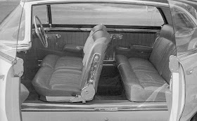
Interior view.  Note the complete lack of a B-Pillar.  Also the right-hand drive steering wheel position, a feature shared with production Aurelias.  As in France for many years, even though cars drove on the right sides of streets and roads, many luxury cars featured English-style right-hand drive.  A prestige or snob feature, I presume.

Rear three-quarter view.  The modest sail panels at the rear of the greenhouse blend into rear fender top-ridges.  This is emphasized by the two-tone paint scheme, yet another Detroit-influenced characteristic.  Those large tail lights suggest 1950s America and not Italy.  The recessed backlight is serviced by two wiper blades.

This is the sole two-door Florida.  Despite those major and lesser American touches, the overall design retains an Italian feeling.  Contributing factors include the basic proportions and the simplified major surfaces.

Monday, September 19, 2016

Corvair Insurance: 1962 Chevrolet Chevy II

The 1960 model year found each of America's "Big Three" automobile makers introducing "compact" cars (in the American sense at the time) in light of increading sales of smaller imported cars such as the Volkswagen Beetle as well as American Motors' Rambler and Studebaker's Lark.

Chevrolet's entry was the Corvair, which I wrote about here, a radical (for the USA) design featuring a rear-mounted air cooled motor.  Shortly after it was introduced, Chevrolet management realized that Corvair sales would be eclipsed by the conventional Ford Falcon.  So, as this Wikipedia entry reports, a crash program was started to produce a car that could compete with the Falcon.  The entry quotes stylist Clare MacKichan regarding how rapidly the design had to be productionized ... a matter of around 18 months instead of the usual three or four years.

The first-generation Chevy II (1962-1965 model years) was almost exactly the same size as the Corvair and Falcon.  Respective wheelbases were 110, 108 and 109.5 inches (2,794, 2,743 and 2,781 mm) and overall lengths were 183, 180 and 181 inches (4,648, 4,572 and 4,593 mm).

Back around 1960, entry level American cars were seldom very exciting from a design standpoint.  The Chevy II fit that pattern well, being bland and having no distinct character -- though the same could easily be said about the Falcon as well.

Gallery


1962 Chevy II four-door sedan.  The American tail fin era was in the process of winding down, so the design is that of an unadorned "three box" style.  Greenhouse windows are large and the hood and trunk lid are about at fender level, this giving the car an airy look.  The side strip relates well to both the headlight and tail light ends of the fender.

This side view of a Chevy II hardtop provides a better look at the C-pillar that is wider at the top than on its bottom.  This is a subtle touch then helps to give the greenhouse a lighter appearance.  The thin roof is another important contributor to that effect.  That curved character line that passes around the rear wheel opening and finally touches the upper edge of the back bumper is not strictly necessary.

One nice feature of the relentlessly horizontal front end theme is the lack of quad headlights.  So far as I'm concerned, the American variety of quad headlights circa 1957-1970 almost always degraded a car's design.

Chevy II's rear design is simple, but enough in the way of insets and other metal folding details adds interest to what otherwise might have been a visually sterile zone.  Still, the design does not excite.

Thursday, September 15, 2016

What Were They Thinking?: Pininfarina's Lancia PF 200 "Jet Fighter"

The saying goes that "even the best of them make mistakes."  Battista "Pinin" Farina (1893-1966), founder of the Pininfarina carrozzeria, is revered as a master automobile body designer.  I, however, tend to think of him as a stylist capable of the very best work, yet who often enough produced mediocre and even bad designs.  While it's likely that others at his firm had a hand in design, especially by the 1960s, Farina the padrone was ultimately responsible for product approval even if he did not do any of the work.

I am not aware of any book-length biography of Farina, so I can't be sure how active he was in the early 1950s when he was approaching age 60.  But my guess is that he was still heavily involved styling the cars his company built.

Which brings us to the strange 1952-55 Lancia Aurelia PF 200 (where PF = Pinin Farina), a Lancia model B52. A little background information can be found here and here.  It is pointed out that the PF 200's styling seems to have been inspired by jet fighters -- the almost-round grille opening looking similar to nose air intakes of the Russian MiG-15, the French Dassault Ouragan, the American F-84 Thunderjet and others.

Farina, it seems, was temporarily afflicted with the same disease as Detroit stylists.  Car design having evolved from collections of discrete items (separate headlights, fenders, trunks, hoods, etc.) to all-encompassing "envelope" bodies (the 1949 Ford, for instance), stylists began looking at jet fighters, science fiction space ships and even insects for inspiration.  At this time, Italian designers tended to treat automobiles as automobiles and not rocket ships.  However, they did stray from time to time, and the PF 200 is a good example of that.  At least only about half a dozen were ever built.

Gallery


This is a 1952 PF 200 Coupé.  Its wheelbase is long and the passenger greenhouse is comparatively short because the car only seats two people.  The wraparound backlight assembly seem to be inspired by 1947-52 Studebaker Starlight Coupes.  The trunk lid tapers in a boat-tail manner, though storage space might have been reasonably adequate, given that the sheet metal forward of the lid extends well into the greenhouse.  There is an odd decoration forward of the rear wheel opening.  It is associated with an air intake presumably for brake cooling, though its openings are mere slits.  In summary, the car is poorly proportioned and details are mostly odd and badly located.  What on earth could Farina been thinking?

Here is a PF 200 spider ("speeder," roadster) from about 1953.  The body is about the same as that of the lower body of the Coupé in the photos above.  The spider's windshield is not curved; rather, it is flat and can be pivoted down.  Note the different front protection arrangement (though neither car has more than sketchy frontal protection).

This set of photos shows a 1953-vintage PF 200 Coupé.  Internal grille details differ as does the front bumper arrangement (it's slightly improved).  No rear brake air intakes.


The main difference from the 1952 PF 200 is the treatment of the aft part of the greenhouse.  Rather than the Starlight Coupe- like backlight, we find a nearly-flat backlight nestled between sail panels that extend to the rear of the car.  Quarter window positions are blanked, though there seem to be four louvres to help exhaust cabin air.  The boat-tail trunk lid styling is also gone.  The poor-quality lower photo was taken at the 1954 Paris auto show.

Monday, September 12, 2016

1953 Buick Wildcat Concept Car

Concept cars, show cars, dream cars -- whatever one chooses to call them -- come in two basic varieties.

Some are flashy, far-out designs.  A few might exist as excuses for young members of styling staffs to let off creative steam.  Others might be public relations gestures intending to cast the carmaker as a far-seeing firm.  Or maybe the two possibilities are combined in one car.

Other such cars are intended to prepare the buying public for features on production cars due for release within the next few years.  At one extreme are thinly disguised versions of future production models.  At the other are a few details on one of those flashy, futuristic dream cars.

General Motors' Motorama traveling shows of the 1950s included concept cars of all stripes because the company was rich and could afford both the shows and those custom-made cars.  The first major Motorama was held in 1953  Nearly all the concept cars in that show were geared to preview features on GMs major Oldsmobile, Buick and Cadillac redesigns for the 1954 model year.  Among these was the Buick Wildcat, the first of a series of Wildcat show cars appearing in 1953-55 Motoramas.

Gallery

Four Wildcats were built, one is known to survive.  The above photo was taken at an automobile show, but not at the New York Waldorf-Astoria Motorama.  Buick was not to produce a two-passenger sporty car for many years, so that Wildcat feature can be disregarded.

Here is a heavily retouched publicity photo of the '53 Wildcat.  GM used a lot of airbrush-enhanced photos in the early 1950s.  The objective was to clarify a car's features by eliminating distractions such as reflections of sharp highlights.  The result is an artificial look when seen in good-quality reproduction, but the photos probably worked best when coarsely screened for newspaper use -- the main publicity target in those days.


Two views of the black Wildcat displayed at the Waldorf.

One Wildcat was given a hard roof.  It also had a circular rear wheel opening, unlike the other Wildcats.  This car also carried a Sweepspear extension that flows over the opening, a feature already in production on 1953 Buick Skylark convertibles.

General view of a 1953 Buick Wildcat.

1954 Buick Skylark.  The curved trunk lid and ridges are watered-down versions of the Wildcat's.

1954 Buick Special convertible.  Its facial details were previewed on the Wildcat.  The headlight housings are about the same, and both originated on the 1951 Buick XP-300 experimental car.  The pointed "Dagmar" bumper guards are similar to those on the Wildcat.  The Wildcat's grille (derived from the XP-300) has concave bars, while the production Buick's are convex.  Photo from Auctions America,


These sales photos (lower from Auctions America) show the fender line on '54 Buick Special convertibles.  Aside from the sculpting where the rear fender starts, the fender lines of the Wildcat and these Buicks are similar, including the low humps at the rear.

Seen from the front three-quarters, the Wildcat has pleasing looks.  It would look better if those Buick "portholes" that normally were on front fender sides were not placed atop the fenders where they are hard to see.  They should have been eliminated.  The two air intakes on the hood do help enliven an otherwise bland surface, but other treatments might have done that job better.  The worst part of the design is the trunk lid -- oddly shaped, weird detailing.

Thursday, September 8, 2016

Lancia Aurelia Berlina

The once-respected Italian marque Lancia (founded 1906) has been reduced to producing a single model, the Ypsilon, a fancied-up Fiat 500.  I fear for Lancia's future.

After World War 2, and long before being taken over by Fiat, Lancia introduced one of Italy's first true post-war cars, the Aurelia.  The name Aurelia is that of one of the famous ancient roads that led to Rome.  The original berlina (sedan) design was produced 1950 through 1955.

The English-language entry on the Aurelia is here.  For more detail, you might link to the Italian-language entry here and, if possible, have your computer translate.

Styling has been credited to Amedeo Piatti, though this source suggests that Pinin Farina might have been brought in to consult 1948-49 when the Aurelia was being developed.  In any case, Farina did design the 1947 Lancia Aprilia Bilux.  (The Aprilia was a prewar Lancia model whose production was resumed after the war).


Here is a photo of the Bilux.  Compare to the Aurelias in the Gallery below.  The cars seem quite similar from their B-pillars aft.

Gallery


Three views of the Aurelia type 10 B, produced 1950-53.


Two images of a the lengthened 1952 Lancia Aurelia berlina allungata, type B 15.  For some reason this car sits higher off the ground than regular Aurelias.


The final Aurelia berlina was the B 12, built 1954-55.  Design differences were fairly minor aside from the awkwardly raised front fender line.  They include: front-door wing vents; deletion of wand-type turn-indicatiors; revised tail lights; and the addition of running lights by the grille and turn-indicator lights on the front fenders.

The Aurelia's initial styling seems a little influenced by American designs known to its development team in 1948, but its overall character is that of classic late 1940s and 1950s Italian design.  The fender treatment is similar to that of the mid-1941 Packard Clipper, and the one-piece curved windshield might have been a Detroit influence.  Overall, the Aurelia's design might be called pleasant.

Monday, September 5, 2016

1955 Chevrolet Biscayne Concept Car

The Chevrolet Biscayne was one of a batch of what are now called concept cars shown at the 1955 version of General Motors' Motorama.  That was a 1950s cars-plus-entertainment show that usually debuted in New York's Waldorf-Astoria hotel and then moved on to a few other large cities.

A discussion of the Biscayne can be found here.  Like many other GM 1950s dream cars (what they were popularly called at the time), the Biscayne was to have been destroyed. But by a quirk of fate it was not, and is now part of the Bortz collection of concept cars.  Some background on this can be found here and here.

The Biscayne is interesting because its size.  It was designed at a time when American sedans were becoming wider and longer.  I couldn't find size statistics, but estimating from photos, my best guess is that the Biscayne's wheelbase was about 108 inches (2,743 mm), in the range of "compact" cars introduced by GM, Ford and Chrysler for the 1960 model year or early 2000s Ford Mondeos.

The nicest feature in my opinion is the treatment of the passenger greenhouse.  It's light and airy while the roof's side curves and the C-pillars add the right touch of solidity.  The interaction of the aft side windows, the backlight (back window) and C-pillars works very well.  The side sculpting that extends around to the rear is also well handled.  In contrast, the front end has a number of odd features.

Gallery


Here are two studio photos of the Biscayne.  The windshield is doubly wrapped -- around to the sides and up and over to blend with the car's top.  Production windshields with these features would appear on some 1959 GM cars.

The five images below seem to have been taken at the same photo shoot because the same house is in the background.  Colors vary due to aging of the original photos.  I adjusted these internet-based images as best my iMac would allow.


The Biscayne's rear is cleaner than the front.  And there are bumpers of a flimsy sort, unlike the unprotected front.


The two side views above help show the size of the car.  They also illustrate door hinging and the black & white photo offers a peek at the interior with its large (by present standards) steering wheel.  The rear-hinged "suicide" doors probably were included to eliminate the engineering required for a stiffened half-B-pillar such as was used on GM's 1956 production four-door hardtops.  However, the classic early-1960s Lincoln Continentals did have rear-hinged doors for backseat passengers, though with a stub B-pillar.

A closer view of the front end.  The bug-eyed, toothy look is distinctive, but in an odd sort of way.  A production version would have required a bumper even in those pre-regulation days.  And that addition would have destroyed the the entire frontal design theme aside from the headlight arrangement.  A production Biscayne with today's technologies might retain the general appearance of the show car's front, though the fender fronts would have to be rearranged.